Estimate a harmonic seasonal model using GLS with a log-transformed series
Explain how to use logarithms to linearize certain non-linear trends
Apply non-linear models to time series
Explain when to use non-linear models
Simulate a time series with an exponential trend
Fit a time series model with an exponential trend
Preparation
Read Sections 5.7, 5.9, 5.11
Learning Journal Exchange (10 min)
Review another student’s journal
What would you add to your learning journal after reading another student’s?
What would you recommend the other student add to their learning journal?
Sign the Learning Journal review sheet for your peer
Class Activity: Simulate an Exponential Trend with a Seasonal Component (15 min)
We will simulate code that has a seasonal component and impose an exponential trend.
Figures
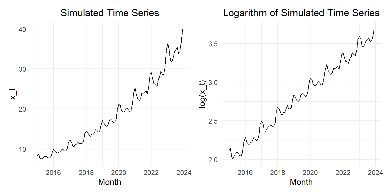
Figure 1 shows the simulated time series and the time series after the natural logarithm is applied.
Show the code
set.seed(12345)n_years <-9# Number of years to simulaten_months <- n_years *12# Number of monthssigma <- .05# Standard deviation of random termz_t <-rnorm(n = n_months, mean =0, sd = sigma)dates_seq <-seq(floor_date(now(), unit ="year"), length.out=n_months +1, by="-1 month") |>floor_date(unit ="month") |>sort() |>head(n_months)sim_ts <-tibble(t =1:n_months,dates = dates_seq,random =arima.sim(model=list(ar=c(.5,0.2)), n = n_months, sd =0.02),x_t =exp(2+0.015* t +0.03*sin(2* pi *1* t /12) +0.04*cos(2* pi *1* t /12) +0.05*sin(2* pi *2* t /12) +0.03*cos(2* pi *2* t /12) +0.01*sin(2* pi *3* t /12) +0.005*cos(2* pi *3* t /12) + random ) ) |>mutate(cos1 =cos(2* pi *1* t /12),cos2 =cos(2* pi *2* t /12),cos3 =cos(2* pi *3* t /12),cos4 =cos(2* pi *4* t /12),cos5 =cos(2* pi *5* t /12),cos6 =cos(2* pi *6* t /12),sin1 =sin(2* pi *1* t /12),sin2 =sin(2* pi *2* t /12),sin3 =sin(2* pi *3* t /12),sin4 =sin(2* pi *4* t /12),sin5 =sin(2* pi *5* t /12),sin6 =sin(2* pi *6* t /12)) |>mutate(std_t = (t -mean(t)) /sd(t)) |>as_tsibble(index = dates)plot_raw <- sim_ts |>autoplot(.vars = x_t) +labs(x ="Month",y ="x_t",title ="Simulated Time Series" ) +theme_minimal() +theme(plot.title =element_text(hjust =0.5) )plot_log <- sim_ts |>autoplot(.vars =log(x_t)) +labs(x ="Month",y ="log(x_t)",title ="Logarithm of Simulated Time Series" ) +theme_minimal() +theme(plot.title =element_text(hjust =0.5) )plot_raw | plot_log
Figure 1: Time plot of the time series (left) and the natural logarithm of the time series (right)
We will compute the (natural) logarithm of the time series values before fitting any linear models. So, our response variable will be \(\log(x_t)\), rather than \(x_t\).
Even though there is no visual evidence of curvature in the trend for the logarithm of the time series, we will start by fitting a model that allows for a cubic trend. (In practice, we would probably not fit this model. However, there are some things that will occur that are helpful to understand the underlying process.)
Note that neither the quadratic nor the cubic terms are statistically significant in this model. We will eliminate the cubic term and fit a model with a quadratic trend.
Quadratic Model
Quadratic Model
We now fit a quadratic model to the log-transformed time series.
Full Quadratic Model
The full model with a quadratic trend is written as:
As we would expect, all the terms are statistically significant. (They were all significant in the previous model, so it is not surprising that they are still significant.)
Reduced Quadratic Trend: Model 3
This model is reduced to include only the Fourier series terms for \(i=1\).
All the terms in this parsimonious model are statistically significant.
Linear Model
Linear Model
Even though the quadratic terms were statistically significant, there is no visual indication that there is a quadratic trend in the time series after taking the logarithm. Hence, we will now fit a linear model to the log-transformed time series. We want to be able to compare the fit of models with a linear trend to the models with quadratic trends.
Full Linear Model
First, we fit a full model with a linear trend. We can express this model as:
We reduce the model to see if a more parsimonious model will suffice. This model contains a linear trend and the Fourier series terms associated with \(i=1\) and \(i=2\).
Both of these models have very low AIC, AICc, and BIC values.
We will take a deeper look at the residuals of these two models to assess if there is evidence of autocorrelation in the random terms. We compute the autocorrelation function and the partial autocorrelation function of the residuals for both. If there is evidence of autocorrelation, we will use the GLS algorithm to fit the models, since it will take into account the autocorrelation in the terms.
Autocorrelation of the Random Component
Investigating Autocorrelation of the Random Component
Recall that if there is autocorrelation in the random component, the standard error of the parameter estimates tends to be underestimated. We can account for this autocorrelation using Generalized Least Squares, GLS, if needed.
Reduced Quadratic Trend: Model 1
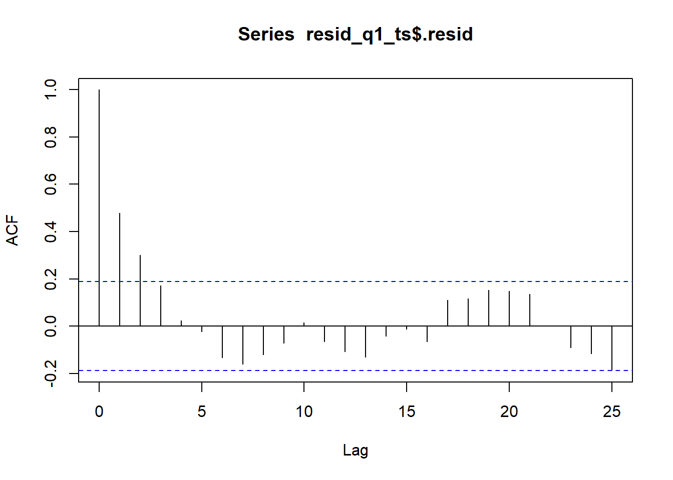
Figure 2 illustrates the ACF of the reduced model 1 with quadratic trend.
Figure 2: ACF of reduced model 1 with a quadratic trend
Notice that the residual correlogram indicates a positive autocorrelation in the values. This suggests that the standard errors of the regression coefficients will be underestimated, which means that some predictors can appear to be statistically significant when they are not.
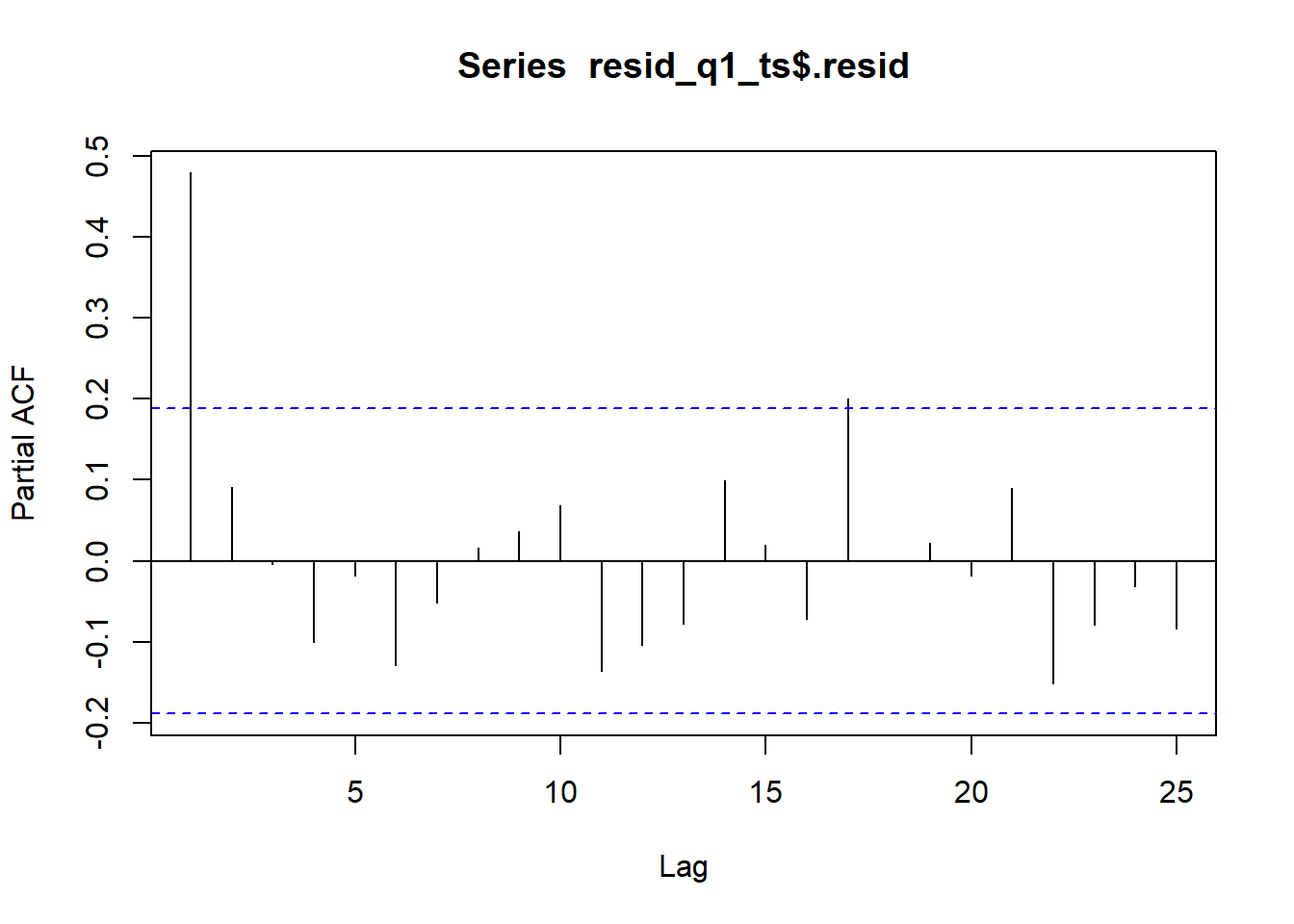
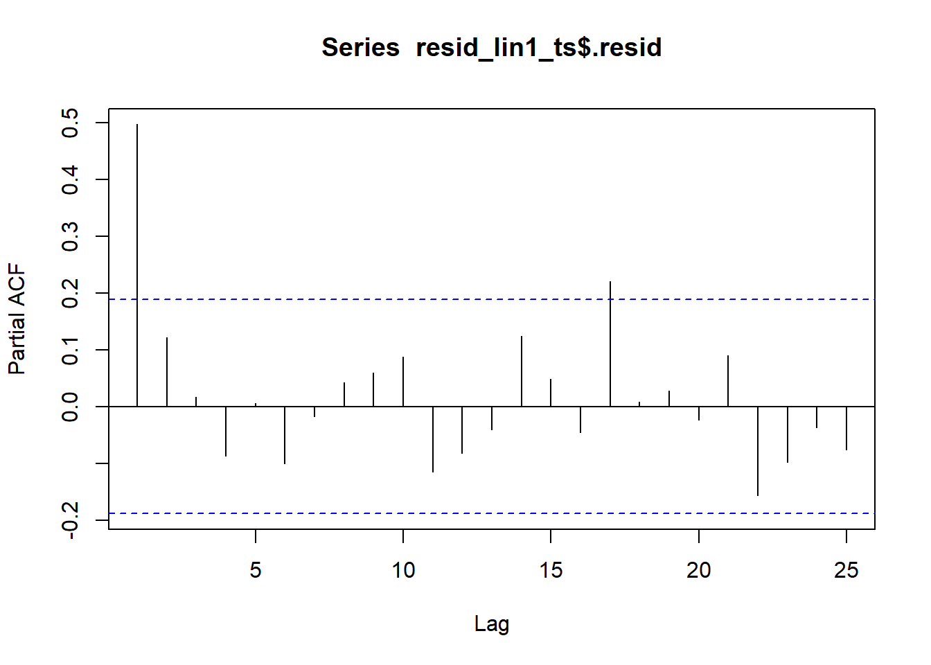
Figure 3 illustrates the PACF of the reduced model 1 with quadratic trend.
Show the code
pacf(resid_q1_ts$.resid, plot=TRUE, lag.max =25)
Figure 3: PACF of reduced model 1 with a quadratic trend
Only the first partial autocorrelation is statistically significant. The partial autocorrelation plot indicates that an \(AR(1)\) model could adequately model the random component of the logarithm of the time series. Recall that in Chapter 5, Lesson 1, we fitted a linear regression model using the value of the partial autocorrelation function for \(k=1\). This helps account for the autocorrelation in the residuals.
The first few partial autocorrelation values are:
Show the code
pacf(resid_q1_ts$.resid, plot=FALSE, lag.max =10)
Partial autocorrelations of series 'resid_q1_ts$.resid', by lag

     1      2      3      4      5      6      7      8      9     10
 0.479  0.091 -0.004 -0.101 -0.018 -0.129 -0.051  0.016  0.037  0.069
The partial autocorrelation when \(k=1\) is approximately 0.479. We will use this value as we recompute the regression coefficients.
The quadratic term is not statistically significant in this model! After accounting for the autocorrelation in the random component, the quadratic component of the trend is not statistically significant. This is a great example of an instance where ordinary linear regression leads to errant results.
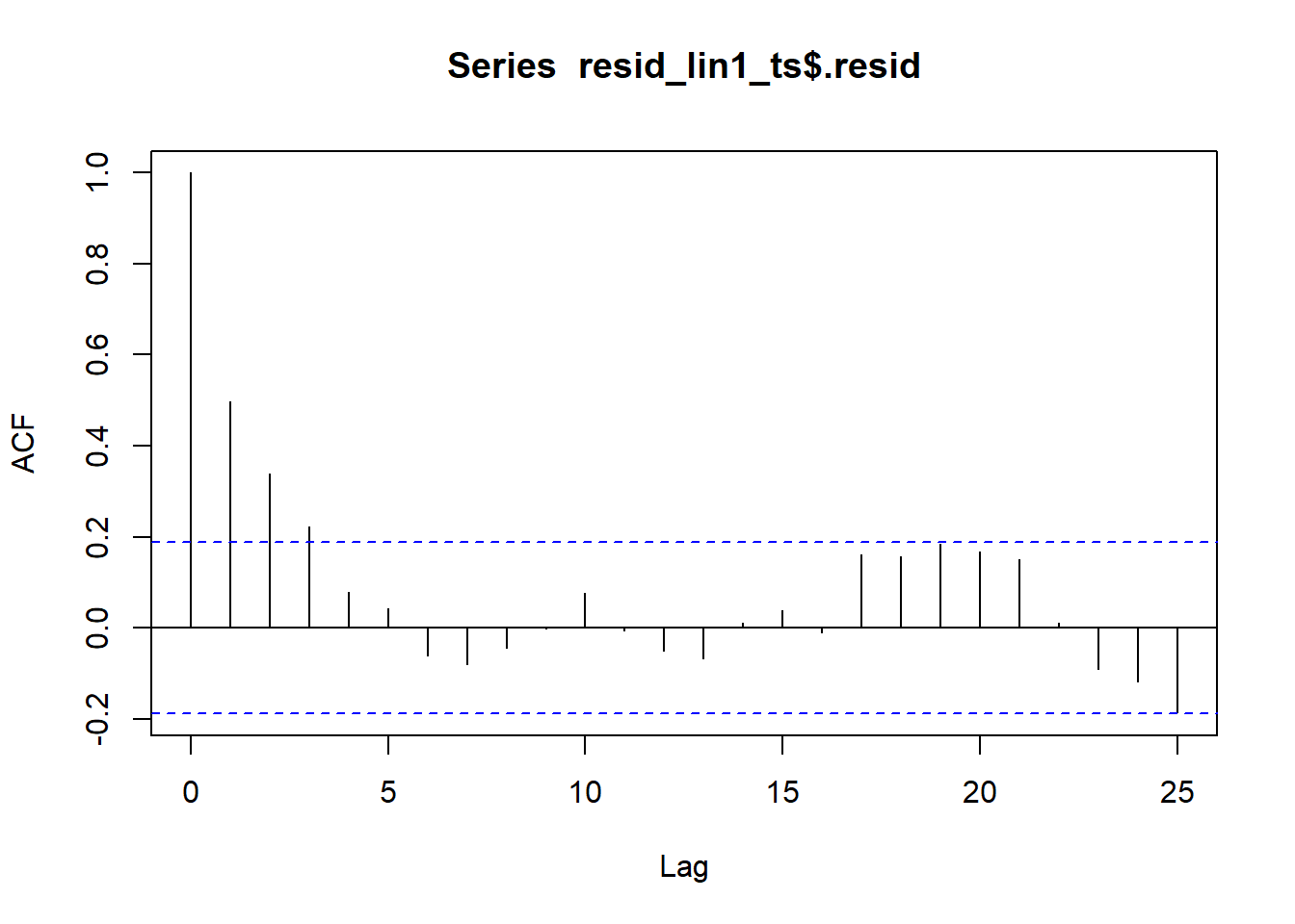
We now consider the reduced model 1 where the trend is linear.
Reduced Linear Trend: Model 1
Figure 4 illustrates the ACF of the reduced model 1 with linear trend.
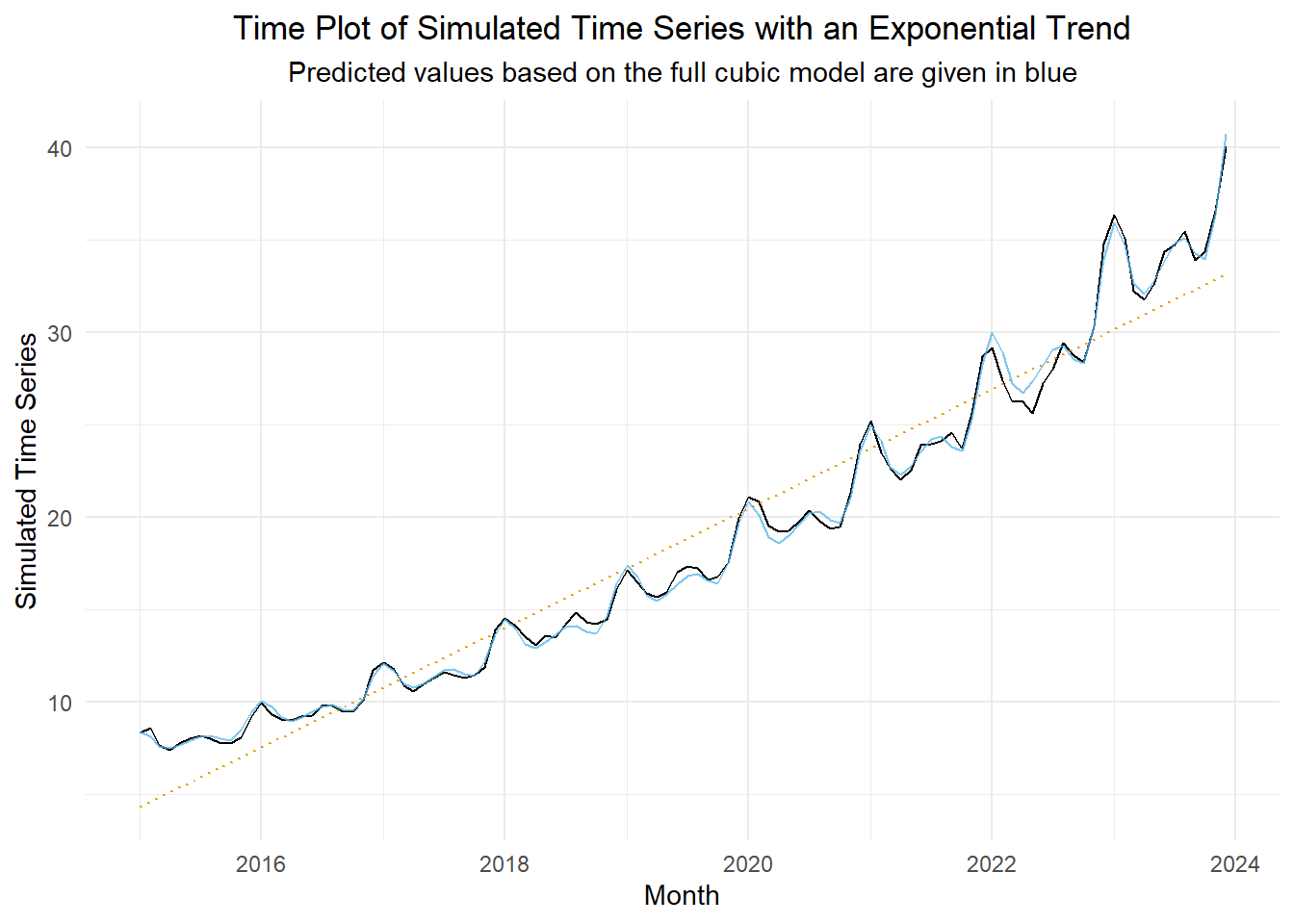
Figure 6 illustrates the original time series (in black) and the fitted model (in blue). For reference, a dotted line illustrating the simple least squares line is plotted on this figure for reference. It helps highlight the exponential shape of the trend.
Show the code
forecast_df <- reduced_linear_lm1 |>forecast(sim_ts) |># computes the anti-log of the predicted values and returns them as .meanas_tibble() |> dplyr::select(std_t, .mean) |>rename(pred = .mean)sim_ts |>left_join(forecast_df, by ="std_t") |>as_tsibble(index = dates) |>autoplot(.vars = x_t) +geom_smooth(method ="lm", formula ='y ~ x', se =FALSE, color ="#E69F00", linewidth =0.5, linetype ="dotted") +geom_line(aes(y = pred), color ="#56B4E9", alpha =0.75) +labs(x ="Month",y ="Simulated Time Series",title ="Time Plot of Simulated Time Series with an Exponential Trend",subtitle ="Predicted values based on the full cubic model are given in blue" ) +theme_minimal() +theme(plot.title =element_text(hjust =0.5),plot.subtitle =element_text(hjust =0.5) )
Figure 6: Time plot of the time series and the fitted linear regression model
Comparison of the Fitted Coefficients to the Simulation Parameters
Comparison of Model Coefficients
Note that the mean of the \(x_t\) values is \(\bar x_t = 18.699\), and the standard deviation is \(s_t = 8.691\).
Notice how well this matches the original model used to simulate the data.
\[\begin{align*}
x_t &= e^{
2 + 0.015 t +
0.03 ~ \sin \left( \frac{2 \pi \cdot 1 t }{ 12 } \right) + 0.04 ~ \cos \left( \frac{2 \pi \cdot 1 t }{ 12 } \right) +
0.05 ~ \sin \left( \frac{2 \pi \cdot 2 t }{ 12 } \right) + 0.03 ~ \cos \left( \frac{2 \pi \cdot 2 t }{ 12 } \right) +
0.01 ~ \sin \left( \frac{2 \pi \cdot 3 t }{ 12 } \right) + 0.005 ~ \cos \left( \frac{2 \pi \cdot 3 t }{ 12 } \right) +
z_t
}
\end{align*}\] where \(z_t = 0.5 z_{t-1} + 0.2 z_{t-2} + w_t\) and \(w_t\) is a white noise process with standard deviation of 0.02.
Small-Group Activity: Retail Sales (20 min)
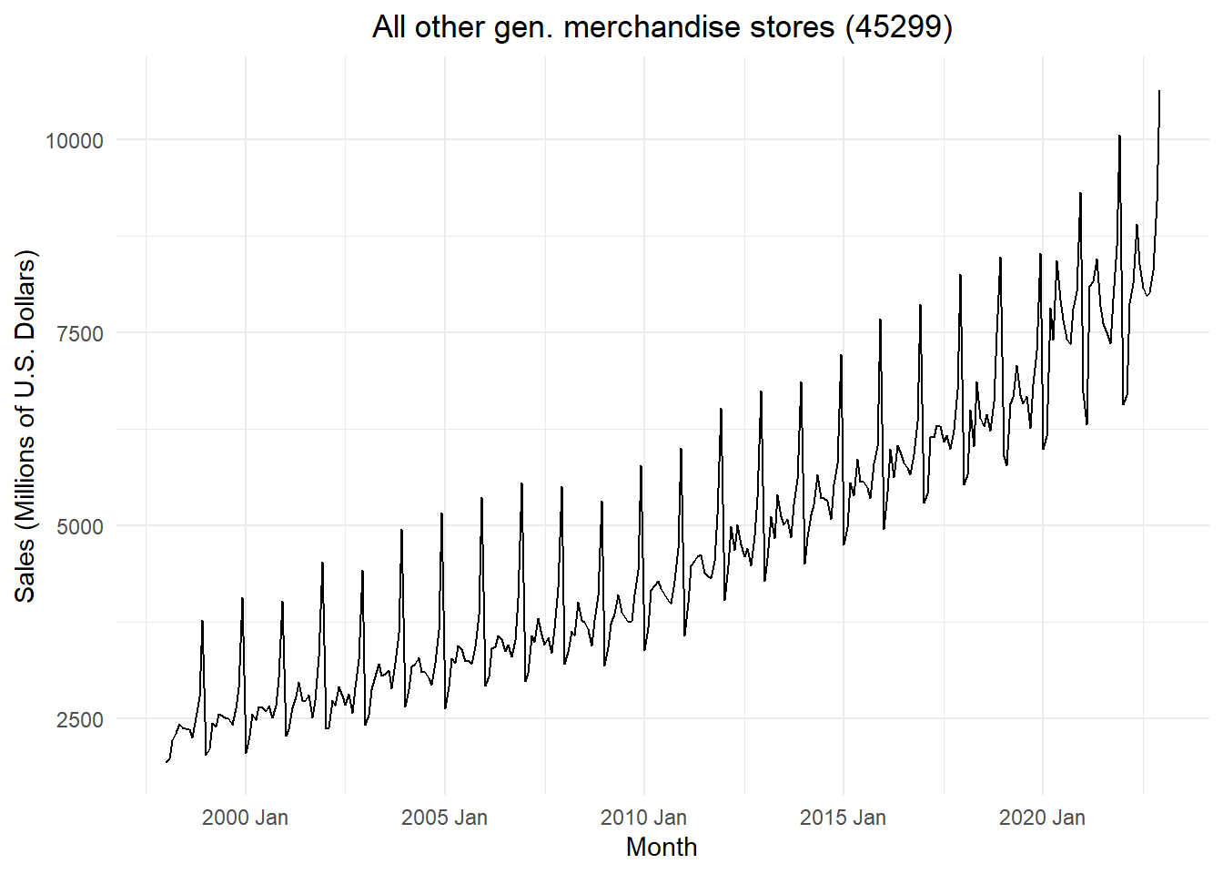
Figure 7 gives the total sales (in millions of U.S. dollars) for the category “all other general merchandise stores (45299).”
Show the code
# Read in retail sales data for "all other general merchandise stores"retail_ts <- rio::import("https://byuistats.github.io/timeseries/data/retail_by_business_type.parquet") |>filter(naics ==45299) |>filter(as_date(month) >=my("Jan 1998")) |>as_tsibble(index = month)retail_ts |>autoplot(.vars = sales_millions) +labs(x ="Month",y ="Sales (Millions of U.S. Dollars)",title =paste0(retail_ts$business[1], " (", retail_ts$naics[1], ")") ) +theme_minimal() +theme(plot.title =element_text(hjust =0.5))
Figure 7: Time plot of the total monthly retail sales for all other general merchandise stores (45299)
Check Your Understanding
Use Figure 7 to explain the following questions to a partner.
What is the shape of the trend of this time series?
Which decomposition would be more appropriate: additive or multiplicative? Justify your answer.
Apply the appropriate transformation to the time series.
Fit appropriate models utilizing the Fourier terms for seasonal components.
Determine the “best” model for these data. Justify your decision.
Plot the fitted values and the time series on the same figure.
Do the following to explore a cubic trend model with all the seasonal Fourier terms.
Fit a full model with a cubic trend and the logarithm of the time series for the response, including all the Fourier seasonal terms. (Be sure to include the linear and quadratic components of the trend.)
Fit a full model with a cubic trend and the logarithm of the time series for the response, but use indicator seasonal variables. (Be sure to include the linear and quadratic components of the trend.)
Compare the coefficients on the linear, quadratic, and cubic terms between the two models above. Why would we observe this result?
Why does the coefficient on the intercept term differ in the two models?
Class Activity: Anti-Log Transformation and Bias Correction on Simulated Data (10 min)
Forecasts for a Simulated Time Series
We can use the forecast() function to predict future values of this time series. Table 2 displays the output of the forecast() command. Note that the column labeled x_t (i.e. \(x_t\)), representing the time series is populated with information tied to a normal distribution. The mean and standard deviation specified are the estimated parameters for the distribution of the predicted values of \(\log(x_t)\). If you raise \(e\) to the power of the mean, you get the values in the .mean column.
Show the code
# Fit model (OLS)sim_reduced_linear_lm1 <- sim_ts |>model(sim_reduced_linear1 =TSLM(log(x_t) ~ std_t + sin1 + cos1 + sin2 + cos2 + sin3 + cos3))# Compute forecastn_years_forecast <-5n_months_forecast <-12* n_years_forecastnew_dat <-tibble(t = n_months:(n_months + n_months_forecast )) |>mutate(dates =seq(max(dates_seq), length.out=n_months_forecast +1, by="1 month") ) |>mutate(std_t = (t -mean(pull(sim_ts, t))) /sd(pull(sim_ts, t)),sin1 =sin(2* pi *1* t /12),cos1 =cos(2* pi *1* t /12),sin2 =sin(2* pi *2* t /12),cos2 =cos(2* pi *2* t /12),sin3 =sin(2* pi *3* t /12),cos3 =cos(2* pi *3* t /12),sin4 =sin(2* pi *4* t /12),cos4 =cos(2* pi *4* t /12),sin5 =sin(2* pi *5* t /12),cos5 =cos(2* pi *5* t /12),cos6 =cos(2* pi *6* t /12) ) |>as_tsibble(index = dates)sim_reduced_linear_lm1 |>forecast(new_data = new_dat)
Table 2: Output of the forecast() command for the simulated time series
.model
dates
x_t
.mean
t
std_t
sin1
cos1
sin2
cos2
sin3
cos3
sim_reduced_linear1
2024-12-01
t(N(3.7, 0.00055))
40.714
108
1.708
0
1
0
1
0
1
...
sim_reduced_linear1
2025-01-01
t(N(3.8, 0.00056))
43.133
109
1.74
0.5
0.866
0.866
0.5
1
0
...
sim_reduced_linear1
2025-02-01
t(N(3.7, 0.00056))
41.625
110
1.772
0.866
0.5
0.866
-0.5
0
-1
...
sim_reduced_linear1
2025-03-01
t(N(3.7, 0.00056))
39.159
111
1.804
1
0
0
-1
-1
0
...
⋮
⋮
⋮
⋮
⋮
⋮
⋮
⋮
⋮
⋮
⋮
⋮
⋮
sim_reduced_linear1
2029-11-01
t(N(4.5, 6e-04))
90.307
167
3.592
-0.5
0.866
-0.866
0.5
-1
0
...
sim_reduced_linear1
2029-12-01
t(N(4.6, 6e-04))
101.132
168
3.624
0
1
0
1
0
1
...
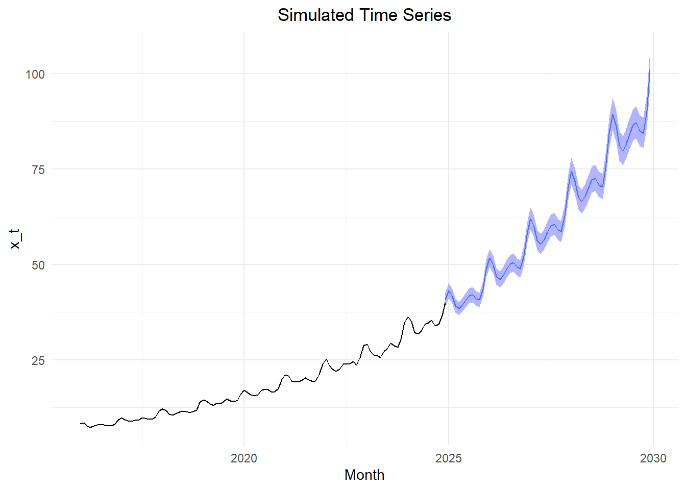
Figure 8 illustrates the forecasted values for the time series.
Figure 8: Forecasted values of the time series with 95% confidence bands
Bias Correction
The forecasts presented above were computed by raising \(e\) to the power of the predicted log-values. Unfortunately, this introduces bias in the forecasted means. This bias tends to be large if the regression model does not fit the data closely.
The textbook points out that the bias correction should only be applied for means, not for simulated values. This means that if you are simulating transformed values, and you apply the inverse of your original transformation, the resulting values are appropriate.
When we apply the inverse transform to the residual series, we introduce a bias. We can account for this bias applying one of two adjustments to our mean values. The theory behind this transformations is alluded to in the textbook, but is not essential.
There are two common patterns observed in the residual series: (1) Gaussian white noise or (2) Non-Normal values.
We can use the skewness statistic to assess the shape of the residual series. When the skewness is less than -1 or greater than 1, we say that the distribution is highly skewed. For skewness values between -1 and -0.5 or between 0.5 and 1, we say there is moderate skewness. If skewness lies between -0.5 and 0.5, the distribution is considered roughly symmetric.
Log-Normal Correction
Normally-Distributed Residual Series
If the residual series follows a normal distribution, we multiply the means of the forecasted values \(\hat x_t\) by the factor \(e^{\frac{1}{2} \sigma^2}\):
where \(\left\{ \hat x_t: t = 1, \ldots, n \right\}\) gives the values of the forecasted series, and \(\left\{ \hat x_t': t = 1, \ldots, n \right\}\) is the adjusted forecasted values.
Emperical Correction
Non-Normally Distributed Residual Series
If the residual series lacks normality , then we can adjust the forecasts \(\left\{ \hat x_t \right\}\) as follows:
From this, we observe that for the simulated data, \(R^2 = 0.998\). This indicates that the model explains a high proportion of the variation in the data. The log-normal adjustment is \(1.00025\), and the emperical adjustment is \(1.00023\). Both of these values are extremely close to 1, so they will have a negligible impact on the predicted values.
This result does not generalize. In other situations, there can be a substantial effect of this bias on the predicted means.
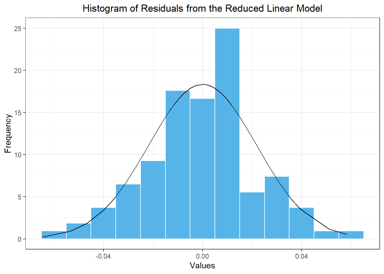
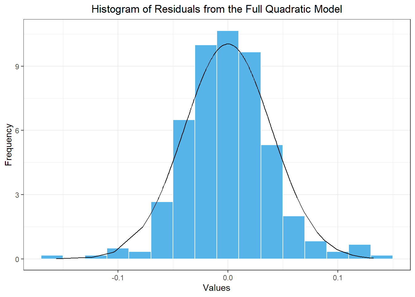
Histogram of residuals
Figure 9 gives a histogram of the residuals and compute the skewness of the residual series.
Show the code
sim_resid_df <- sim_reduced_linear_lm1 |>residuals() |>as_tibble() |> dplyr::select(.resid) |>rename(x = .resid) sim_resid_df |>mutate(density =dnorm(x, mean(sim_resid_df$x), sd(sim_resid_df$x))) |>ggplot(aes(x = x)) +geom_histogram(aes(y =after_stat(density)),color ="white", fill ="#56B4E9", binwidth =0.01) +geom_line(aes(x = x, y = density)) +theme_bw() +labs(x ="Values",y ="Frequency",title ="Histogram of Residuals from the Reduced Linear Model" ) +theme(plot.title =element_text(hjust =0.5) )
Figure 9: Histogram of the values in the residual series based on the model with a linear trend and seasonal Fourier terms where i≤3
We can use the command skewness(sim_resid_df$x) to compute the skewness of these residuals: -0.135. This number is close to zero (specifically between -0.5 and 0.5,) so we conclude that the residual series is approximately normally distributed. We can apply the log-normal correction to our mean forecast values.
Class Activity: Apple Revenue (10 min)
We take another look at the quarterly revenue reported by Apple Inc. from Q1 of 2005 through Q1 of 2012
Visualizing the Time Series
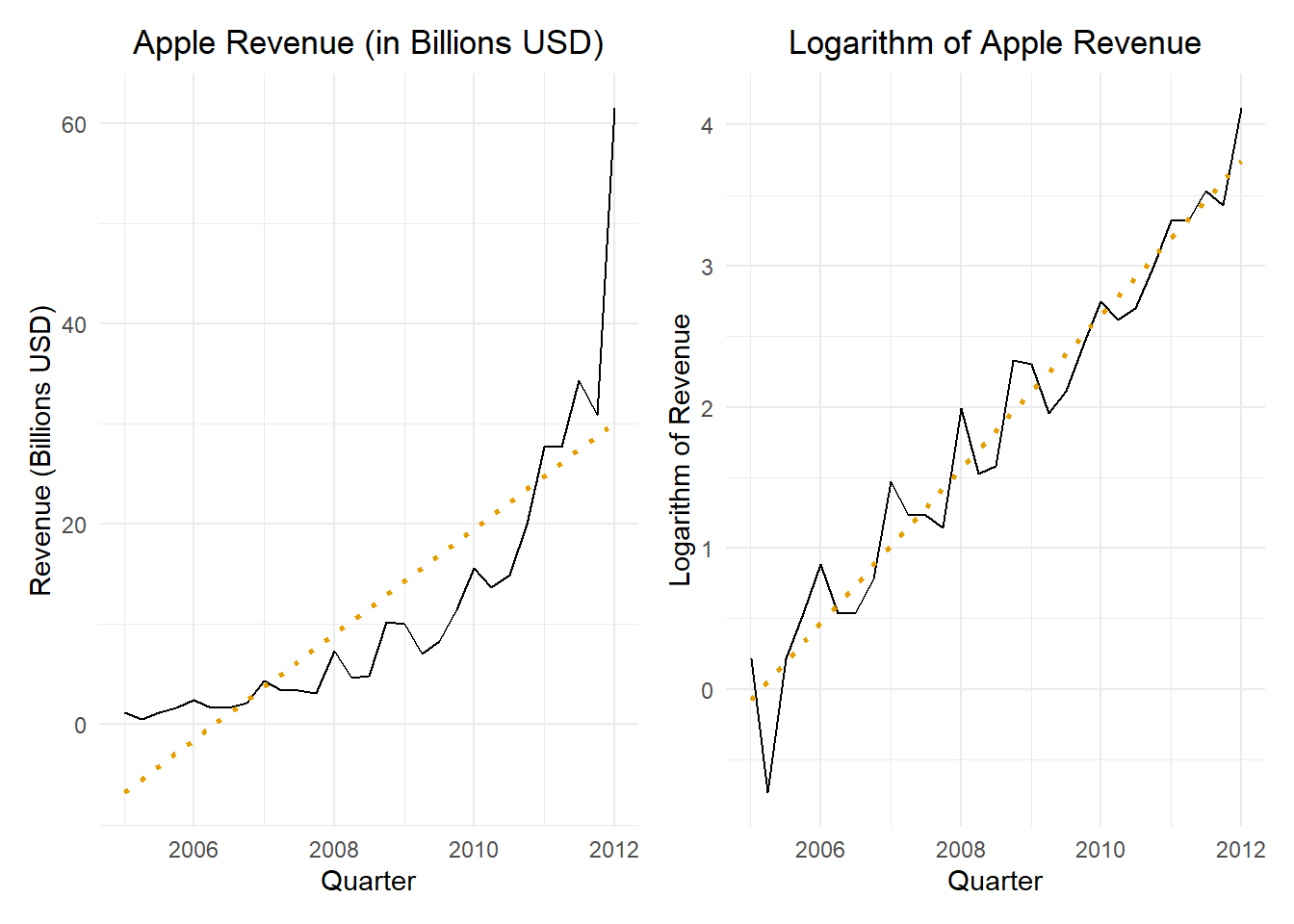
Figure 10 gives the time plot illustrating the quarterly revenue reported by Apple from the first quarter of 2005 through the first quarter of 2012.
Show the code
apple_raw <- rio::import("https://byuistats.github.io/timeseries/data/apple_revenue.csv") |>mutate(dates =round_date(mdy(date), unit ="quarter")) |>arrange(dates)apple_ts <- apple_raw |>filter(dates <=my("Jan 2012")) |> dplyr::select(dates, revenue_billions) |>mutate(t =1:n()) |>mutate(std_t = (t -mean(t)) /sd(t)) |>mutate(sin1 =sin(2* pi *1* t /4),cos1 =cos(2* pi *1* t /4),cos2 =cos(2* pi *2* t /4) ) |>as_tsibble(index = dates)apple_plot_regular <- apple_ts |>autoplot(.vars = revenue_billions) +stat_smooth(method ="lm", formula = y ~ x, geom ="smooth",se =FALSE,color ="#E69F00",linetype ="dotted") +labs(x ="Quarter",y ="Revenue (Billions USD)",title ="Apple Revenue (in Billions USD)" ) +theme_minimal() +theme(plot.title =element_text(hjust =0.5))apple_plot_transformed <- apple_ts |>autoplot(.vars =log(revenue_billions)) +stat_smooth(method ="lm", formula = y ~ x, geom ="smooth",se =FALSE,color ="#E69F00",linetype ="dotted") +labs(x ="Quarter",y ="Logarithm of Revenue",title ="Logarithm of Apple Revenue" ) +theme_minimal() +theme(plot.title =element_text(hjust =0.5))apple_plot_regular | apple_plot_transformed
Figure 10: Apple quarterly revenue figures (in billions of U.S. dollars) from Q1 of 2005 to Q1 of 2012; the figure on the left presents the revenue in dollars and the figure on the right gives the logarithm of the quarterly revenue; a simple linear regression line is given for reference
Finding a Suitable Model
We start by fitting a cubic trend to the logarithm of the quarterly revenues. The full model is fitted here:
Show the code
# Cubic model with standardized time variableapple_full_cubic_lm <- apple_ts |>model(apple_full_cubic =TSLM(log(revenue_billions) ~ std_t +I(std_t^2) +I(std_t^3) + sin1 + cos1 + cos2 )) # Note sin2 is omittedapple_full_cubic_lm |>tidy() |>mutate(sig = p.value <0.05)
The quadratic trend term is not statistically significant. Nevertheless, we will still fit a reduced model with a quadratic trend but we will omit the non-signficant seasonal Fourier term, cos1.
Show the code
# Quadratic trend with standardized time variableapple_reduced_quad_lm1 <- apple_ts |>model(apple_reduced_quad1 =TSLM(log(revenue_billions) ~ std_t +I(std_t^2) + sin1 + cos2 )) # Note sin2 is omittedapple_reduced_quad_lm1 |>tidy() |>mutate(sig = p.value <0.05)
The coefficient on the cos1 seasonal Fourier term is not statistically significant. We now fit a reduced model that only contains the significant terms from the full model with a linear trend.
Show the code
# Linear trend with standardized time variableapple_reduced_linear_lm1 <- apple_ts |>model(apple_reduced_linear1 =TSLM(log(revenue_billions) ~ std_t + sin1 + cos2 )) # Note sin2 is omittedapple_reduced_linear_lm1 |>tidy() |>mutate(sig = p.value <0.05)
Table 3: Comparison of the AIC, AICc, and BIC values for the models fitted to the logarithm of the simulated time series.
Model
AIC
AICc
BIC
apple_full_cubic
-84
-76.8
-73.1
apple_full_quad
-82.5
-77.2
-73
apple_reduced_quad1
-81.3
-77.5
-73.1
apple_full_linear
**-84.4**
-80.6
-76.2
apple_reduced_linear1
-83.2
**-80.6**
**-76.4**
We will apply the apple_reduced_linear1 model.
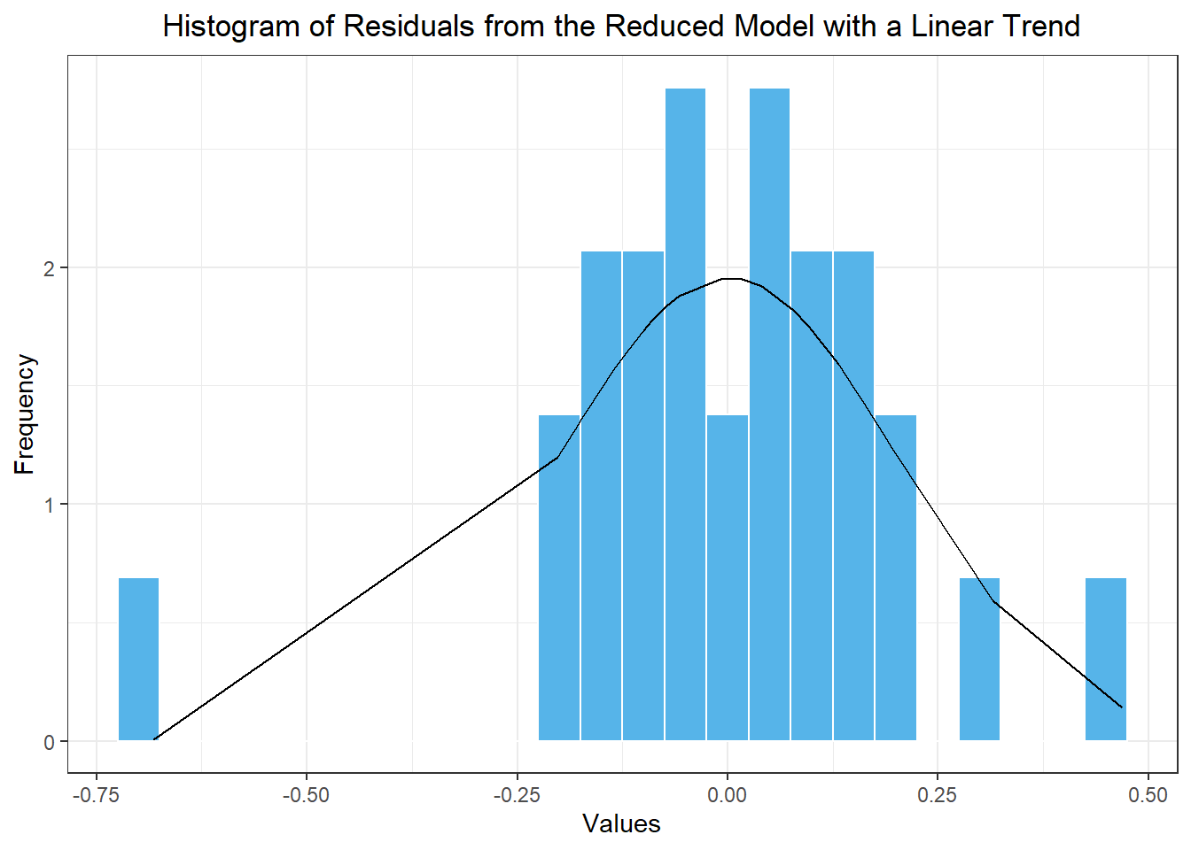
Using the Residuals to Determine the Appropriate Correction
The residuals of this model are illustrated in Figure 11.
Show the code
apple_resid_df <- model_combined |> dplyr::select(apple_reduced_linear1) |>residuals() |>as_tibble() |> dplyr::select(.resid) |>rename(x = .resid) apple_resid_df |>mutate(density =dnorm(x, mean(apple_resid_df$x), sd(apple_resid_df$x))) |>ggplot(aes(x = x)) +geom_histogram(aes(y =after_stat(density)),color ="white", fill ="#56B4E9", binwidth =0.05) +geom_line(aes(x = x, y = density)) +theme_bw() +labs(x ="Values",y ="Frequency",title ="Histogram of Residuals from the Reduced Model with a Linear Trend" ) +theme(plot.title =element_text(hjust =0.5) )
Figure 11: Histogram of the residuals from the reduced model with a linear trend component
Using the command skewness(apple_resid_df$x), we compute the skewness of these residuals as: -0.799. This number is not close to zero (it is between -1 and -0.5) indicating moderate skewness. We would therefore apply the empirical correction to our mean forecast values.
Applying the Correction Factor
Table 4 summarizes some of the corrected mean values. Note that in this particular case, the corrected values are very close to the uncorrected values.
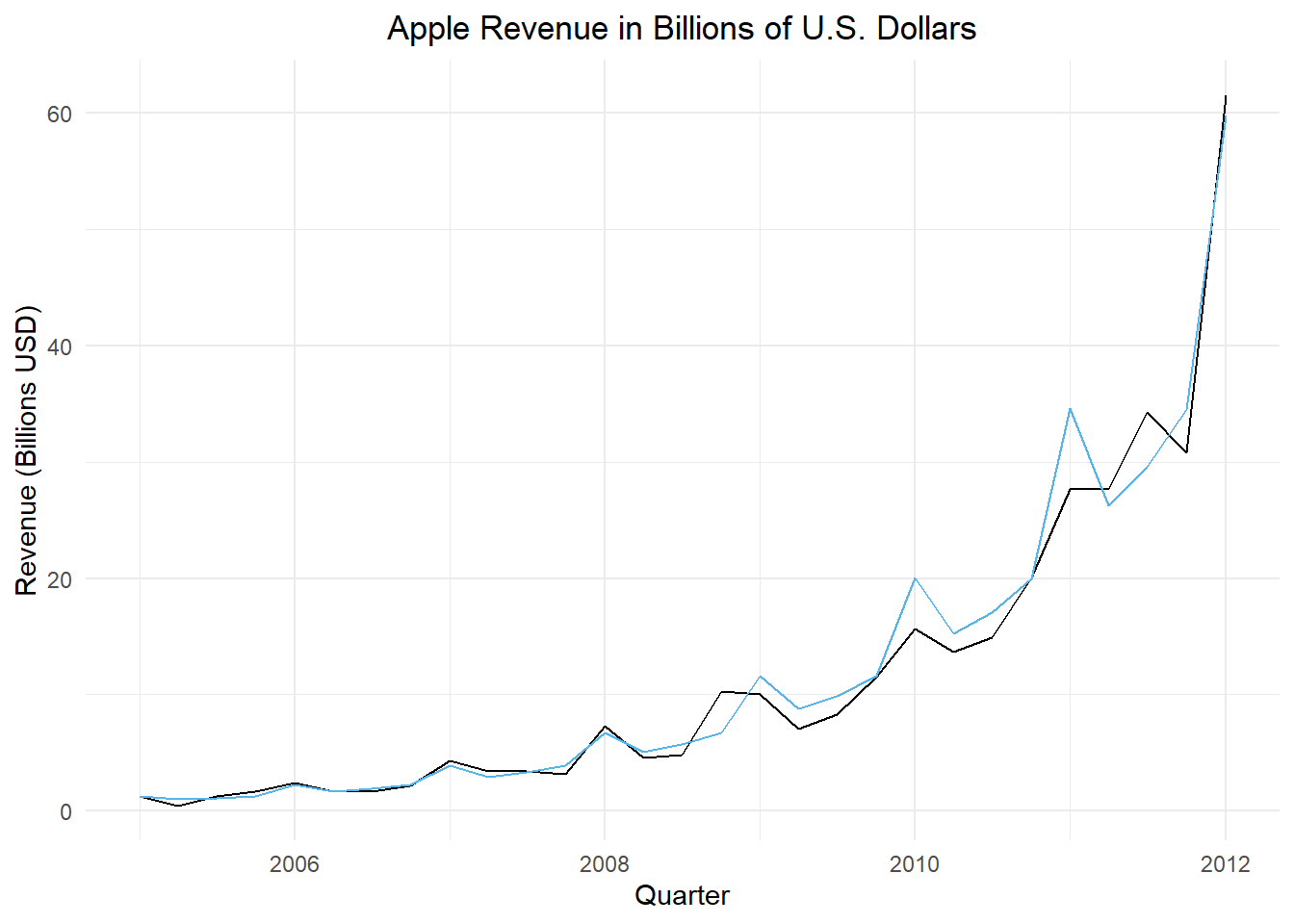
apple_ts |>autoplot(.vars = revenue_billions) +geom_line(data = apple_pred, aes(x = dates, y = .mean_correction), color ="#56B4E9") +labs(x ="Quarter",y ="Revenue (Billions USD)",title ="Apple Revenue in Billions of U.S. Dollars" ) +theme_minimal() +theme(plot.title =element_text(hjust =0.5))
Figure 12: Apple Inc.’s quarterly revenue in billions of U.S. dollars through first quarter of 2012 (in black) and the fitted regression model (in blue)
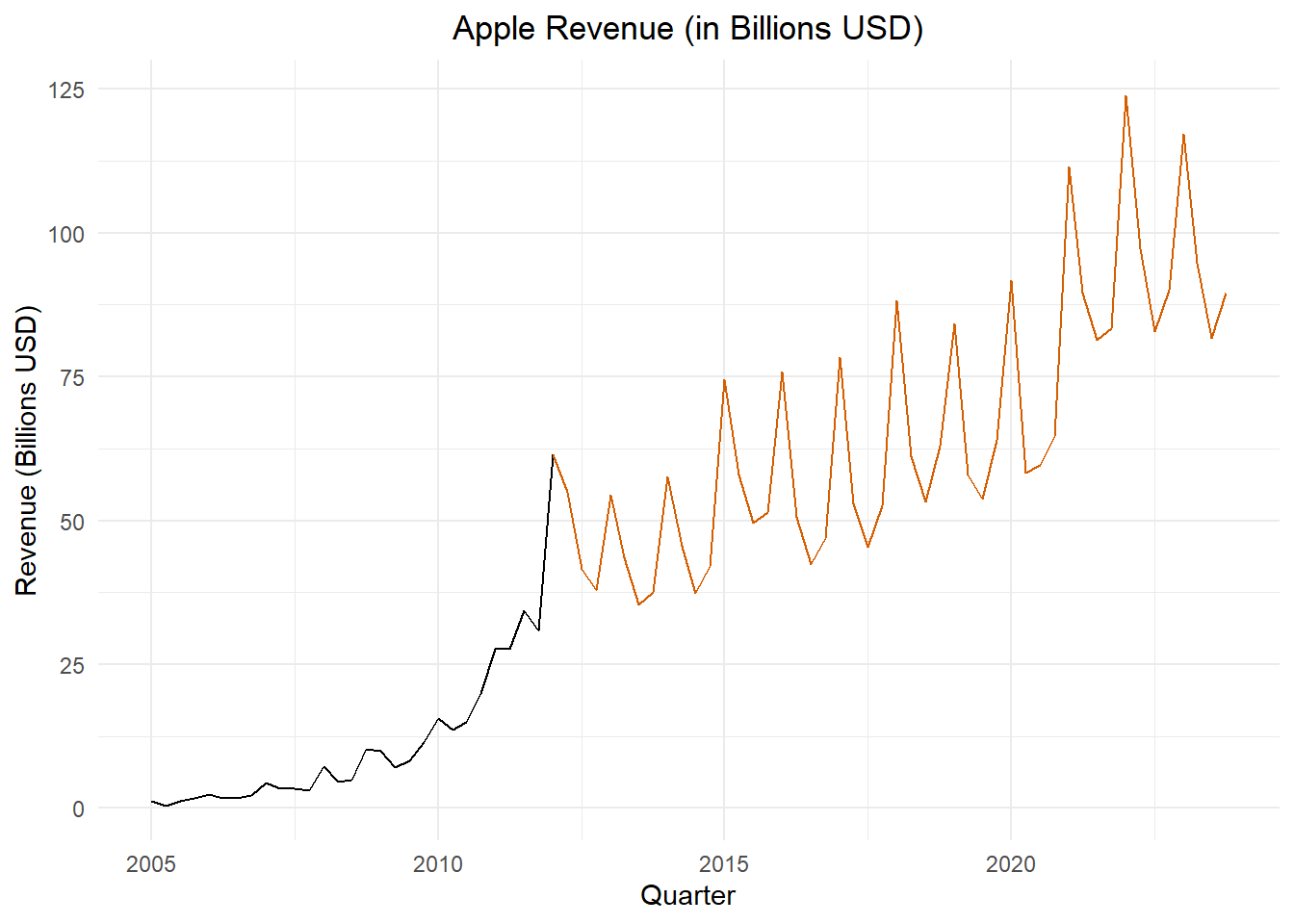
This time series was used as an example. We are obviously not interested in forecasting future values using this model. However, this is an excellent example of real-world exponential growth in a time series with a seasonal component. Limiting factors prevent exponential growth from being sustainable in the long run. After 2012, the Apple quarterly revenues follow a different, but very impressive, model. This is illustrated in Figure 13.
Figure 13: Apple Inc.’s quarterly revenue in billions of U.S. dollars; values beginning with the first quarter of 2012 are shown in orange
Choose One of the Following Small-Group Activities (25 min)
Small-Group Activity: Retail Sales (All Other General Merchandise Stores)
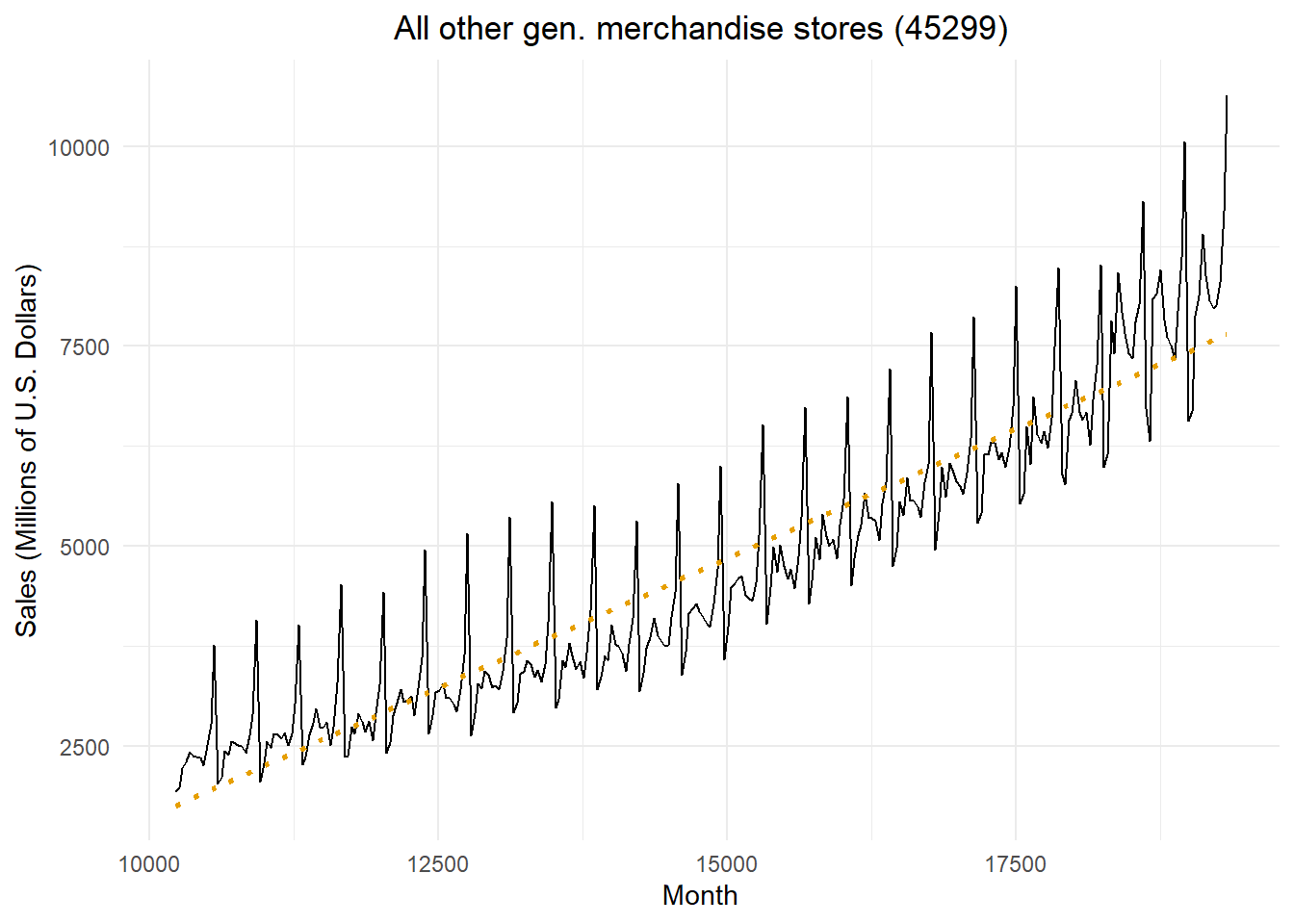
The code below downloads and gives the time plot for the total monthly sales in the United States for retail stores with the NAICS category 45299, “All Other General Merchandise Stores.” The time plot is given in Figure Figure 14.
Show the code
# Read in retail sales data for "all other general merchandise stores"retail_ts <- rio::import("https://byuistats.github.io/timeseries/data/retail_by_business_type.parquet") |>filter(naics ==45299) |>filter(as_date(month) >=my("Jan 1998")) |>mutate(t =1:n()) |>mutate(std_t = (t -mean(t)) /sd(t)) |>mutate(cos1 =cos(2* pi *1* t /12),cos2 =cos(2* pi *2* t /12),cos3 =cos(2* pi *3* t /12),cos4 =cos(2* pi *4* t /12),cos5 =cos(2* pi *5* t /12),cos6 =cos(2* pi *6* t /12),sin1 =sin(2* pi *1* t /12),sin2 =sin(2* pi *2* t /12),sin3 =sin(2* pi *3* t /12),sin4 =sin(2* pi *4* t /12),sin5 =sin(2* pi *5* t /12) ) |>as_tsibble(index = month)retail_ts |>autoplot(.vars = sales_millions) +stat_smooth(method ="lm", formula = y ~ x, geom ="smooth",se =FALSE,color ="#E69F00",linetype ="dotted") +labs(x ="Month",y ="Sales (Millions of U.S. Dollars)",title =paste0(retail_ts$business[1], " (", retail_ts$naics[1], ")") ) +theme_minimal() +theme(plot.title =element_text(hjust =0.5))
Figure 14: Time plot of the total monthly retail sales for all other general merchandise stores (45299)
Check Your Understanding
Use the retail sales data to do the following.
Select an appropriate fitted model using the AIC, AICc, or BIC critera.
Use the residuals to determine the appropriate correction for the data.
Forecast the data for the next 5 years.
Apply the appropriate correction to the forecasted values.
Plot the fitted (forecasted) values along with the time series.
Small-Group Activity: Industrial Electricity Consumption in Texas
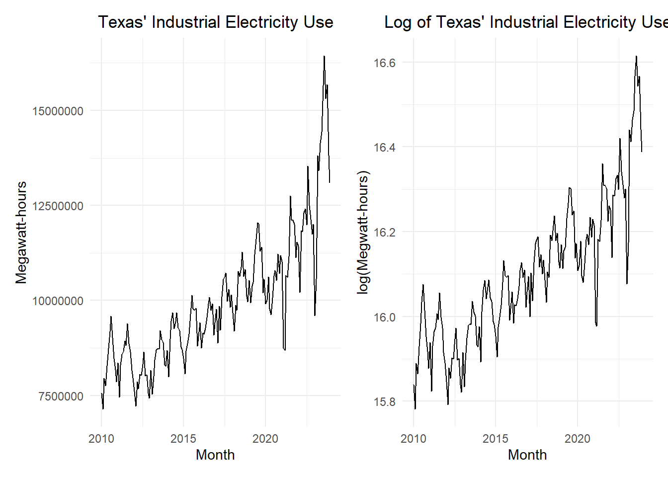
These data represent the amount of electricity used each month for industrial applications in Texas.
Show the code
elec_ts <- rio::import("https://byuistats.github.io/timeseries/data/electricity_tx.csv") |> dplyr::select(-comments) |>mutate(month =my(month)) |>mutate(t =1:n(),std_t = (t -mean(t)) /sd(t) ) |>mutate(cos1 =cos(2* pi *1* t /12),cos2 =cos(2* pi *2* t /12),cos3 =cos(2* pi *3* t /12),cos4 =cos(2* pi *4* t /12),cos5 =cos(2* pi *5* t /12),cos6 =cos(2* pi *6* t /12),sin1 =sin(2* pi *1* t /12),sin2 =sin(2* pi *2* t /12),sin3 =sin(2* pi *3* t /12),sin4 =sin(2* pi *4* t /12),sin5 =sin(2* pi *5* t /12) ) |>as_tsibble(index = month)elec_plot_raw <- elec_ts |>autoplot(.vars = megawatthours) +labs(x ="Month",y ="Megawatt-hours",title ="Texas' Industrial Electricity Use" ) +theme_minimal() +theme(plot.title =element_text(hjust =0.5) )elec_plot_log <- elec_ts |>autoplot(.vars =log(megawatthours)) +labs(x ="Month",y ="log(Megwatt-hours)",title ="Log of Texas' Industrial Electricity Use" ) +theme_minimal() +theme(plot.title =element_text(hjust =0.5) )elec_plot_raw | elec_plot_log
Check Your Understanding
Use the Texas industrial electricity consumption data to do the following.
Select an appropriate fitted model using the AIC, AICc, or BIC critera.
Use the residuals to determine the appropriate correction for the data.
Forecast the data for the next 5 years.
Apply the appropriate correction to the forecasted values.
Plot the fitted (forecasted) values along with the time series.
Figure 15 gives the total sales (in millions of U.S. dollars) for the category “all other general merchandise stores (45299),” beginning with January 1998.
Show the code
# Read in retail sales data for "all other general merchandise stores"retail_ts <- rio::import("https://byuistats.github.io/timeseries/data/retail_by_business_type.parquet") |>filter(naics ==45299) |>mutate(t =1:n()) |>mutate(std_t = (t -mean(t)) /sd(t)) |>mutate(cos1 =cos(2* pi *1* t /12),cos2 =cos(2* pi *2* t /12),cos3 =cos(2* pi *3* t /12),cos4 =cos(2* pi *4* t /12),cos5 =cos(2* pi *5* t /12),cos6 =cos(2* pi *6* t /12),sin1 =sin(2* pi *1* t /12),sin2 =sin(2* pi *2* t /12),sin3 =sin(2* pi *3* t /12),sin4 =sin(2* pi *4* t /12),sin5 =sin(2* pi *5* t /12) ) |>filter(as_date(month) >=my("Jan 1998")) |>as_tsibble(index = month)retail_ts |>autoplot(.vars = sales_millions) +labs(x ="Month",y ="Sales (Millions of U.S. Dollars)",title =paste0(retail_ts$business[1], " (", retail_ts$naics[1], ")") ) +theme_minimal() +theme(plot.title =element_text(hjust =0.5))
Figure 15: Time plot of the total monthly retail sales for all other general merchandise stores (45299)
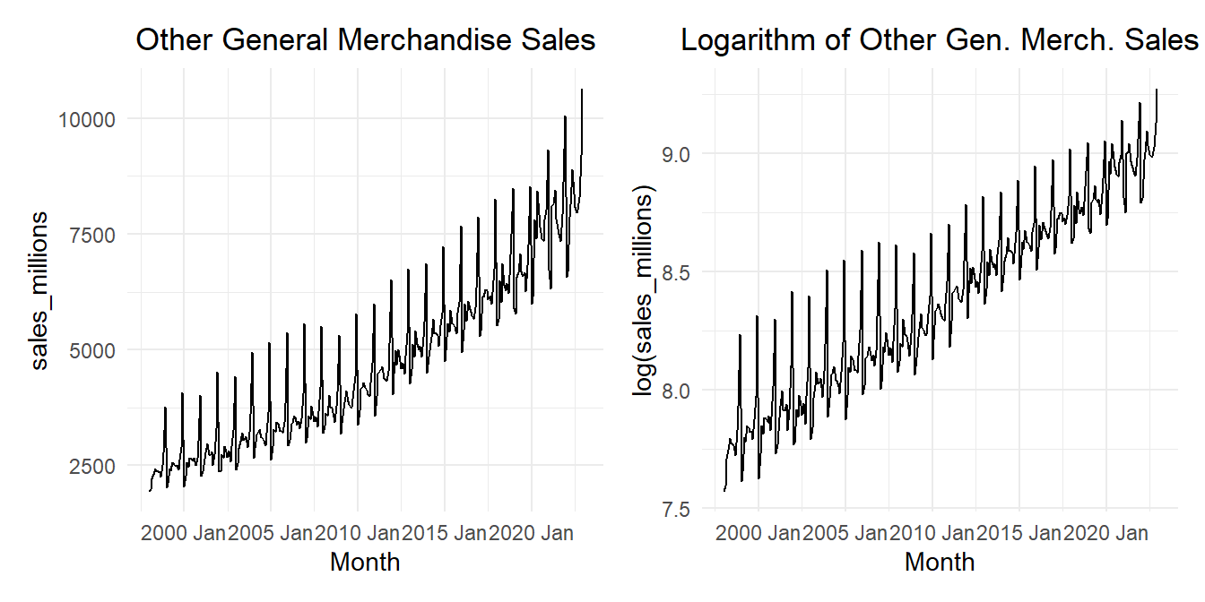
Figure 16 shows the “All other general merchandise” retail sales data.
Show the code
plot_raw <- retail_ts |>autoplot(.vars = sales_millions) +labs(x ="Month",y ="sales_millions",title ="Other General Merchandise Sales" ) +theme_minimal() +theme(plot.title =element_text(hjust =0.5) )plot_log <- retail_ts |>autoplot(.vars =log(sales_millions)) +labs(x ="Month",y ="log(sales_millions)",title ="Logarithm of Other Gen. Merch. Sales" ) +theme_minimal() +theme(plot.title =element_text(hjust =0.5) )plot_raw | plot_log
Figure 16: Time plot of the time series (left) and the natural logarithm of the time series (right)
We will now compare the models we fitted above. #tbl-ModelComparison2 gives the AIC, AICc, and BIC of the models fitted above. In addition, other models with a reduced number of Fourier terms are included. For example, the model labeled reduced_quadratic_fourier_i5 includes linear and quadratic trend terms but also the Fourier terms where \(i \le 5\).
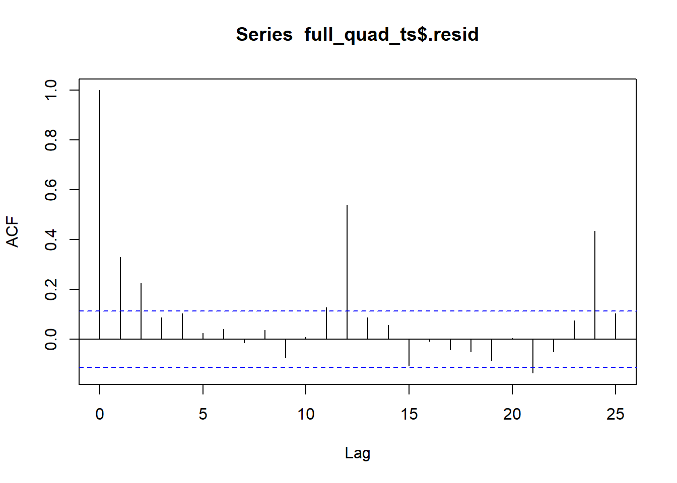
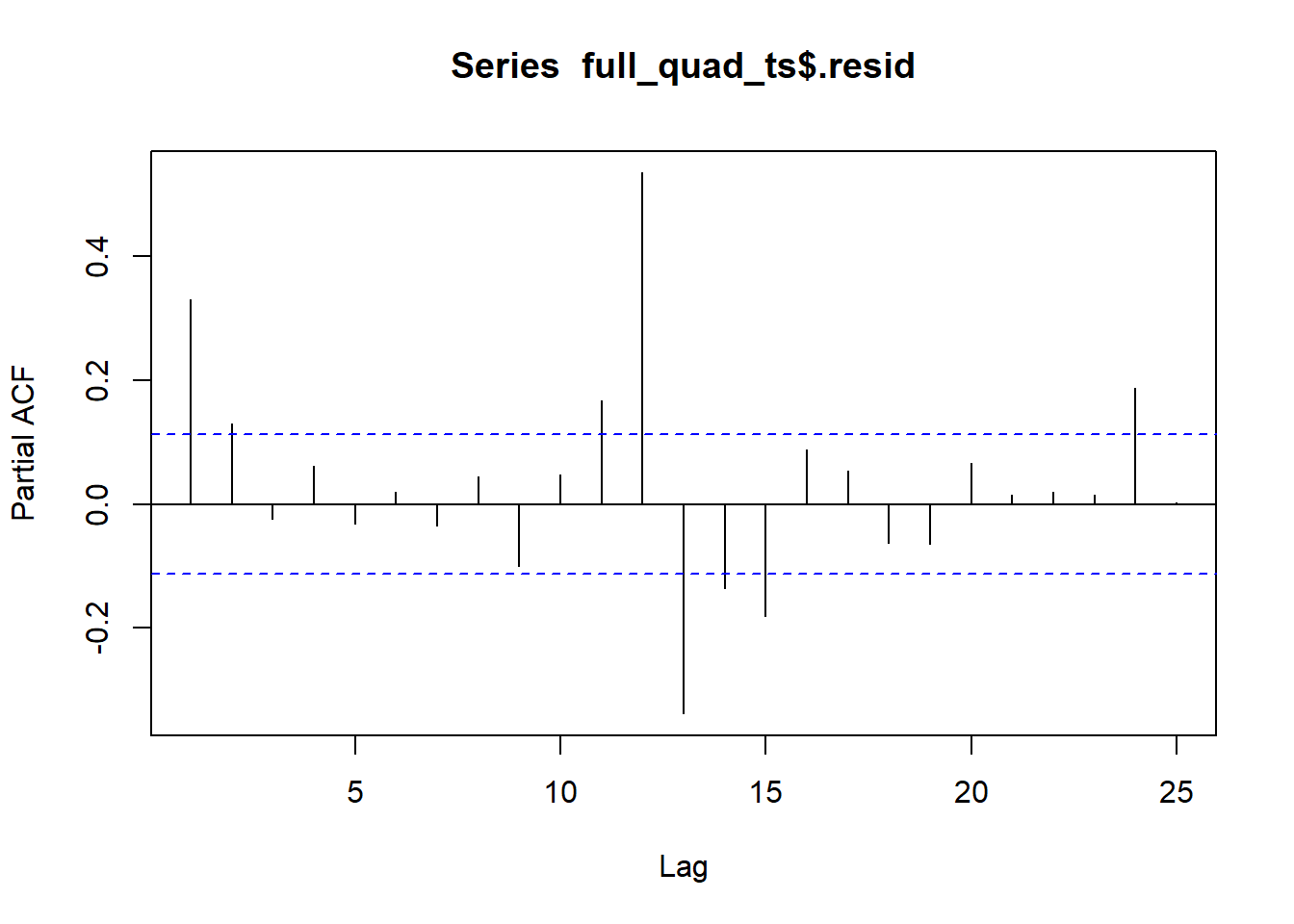
Figure 18: PACF of the full model with a quadratic trend
Applying Genearlized Least Squares, GLS
Recall that in Chapter 5, Lesson 1, we fitted a linear regression model using the value of the partial autocorrelation function for \(k=1\). This helps account for the autocorrelation in the residuals.
We will use the PACF when \(k=1\) to apply the GLS algorithm. The first few partial autocorrelation values are:
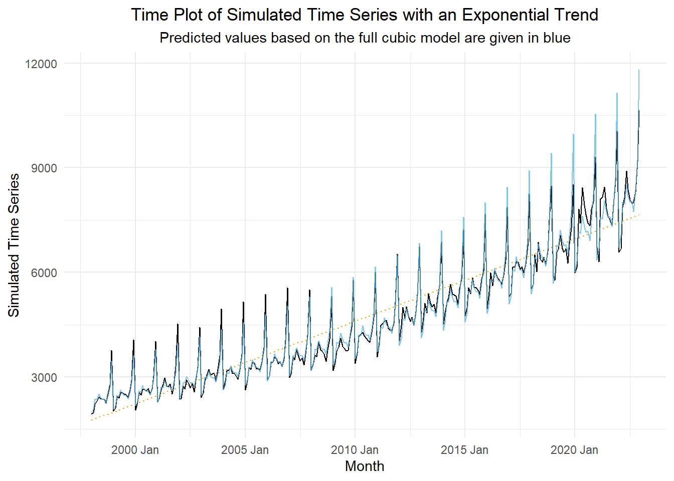
Figure 19 illustrates the original time series (in black) and the fitted model (in blue). For reference, a dotted line illustrating the simple least squares line is plotted on this figure for reference. It helps highlight the exponential shape of the trend.
Show the code
forecast_df <- full_quad_lm |>forecast(retail_ts) |># computes the anti-log of the predicted values and returns them as .meanas_tibble() |> dplyr::select(std_t, .mean) |>rename(pred = .mean)retail_ts |>left_join(forecast_df, by ="std_t") |>as_tsibble(index = month) |>autoplot(.vars = sales_millions) +geom_smooth(method ="lm", formula ='y ~ x', se =FALSE, color ="#E69F00", linewidth =0.5, linetype ="dotted") +geom_line(aes(y = pred), color ="#56B4E9", alpha =0.75) +labs(x ="Month",y ="Simulated Time Series",title ="Time Plot of Simulated Time Series with an Exponential Trend",subtitle ="Predicted values based on the full cubic model are given in blue" ) +theme_minimal() +theme(plot.title =element_text(hjust =0.5),plot.subtitle =element_text(hjust =0.5) )
Figure 19: Time plot of the time series (left) and the natural logarithm of the time series (right)
Check Your Understanding
Use the retail sales data to do the following.
Select an appropriate fitted model using the AIC, AICc, or BIC critera.
Use the residuals to determine the appropriate correction for the data.
Forecast the data for the next 5 years.
Apply the appropriate correction to the forecasted values.
Plot the fitted (forecasted) values along with the time series.