install.packages("pacman")Plots Trends, and Seasonal Variation
Chapter 1: Lesson 2
Learning Outcomes
Use technical language to describe the main features of time series data
- Define time series analysis
- Define time series
- Define sampling interval
- Define serial dependence or autocorrelation
- Define a time series trend
- Define seasonal variation
- Define cycle
- Differentiate between deterministic and stochastic trends
Plot time series data to visualize trends, seasonal patterns, and potential outliers
- Plot a “ts” object
- Plot the estimated trend of a time series by computing the mean across one full period
Preparation
- Read Sections 1.1-1.4
Learning Journal Exchange (15 min)
- Review another student’s journal
- What would you add to your learning journal after reading your partner’s?
- What would you recommend your partner add to their learning journal?
- Sign the Learning Journal review sheet for your peer
Vocabulary and Nomenclature Matching Activity (5 min)
Comparison of Deterministic and Stochastic Trends in Time Series (10 min)
Time Series with a Stochastic Trend
The following app illustrates a few realizations of a stochastic trend.
- If a stochastic time series displays an upward trend, can we conclude that trend will continue in the same direction? Why or why not?
Time Series with a Deterministic Trend
The figure below illustrates realizations of a deterministic trend. The data fluctuate around a sine curve.
Class Activity: Importing Data and Creating a tsibble Object (5 min)
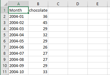
Recall the Google Trends data for the term “chocolate” from the last lesson. The cleaned data are available in the file chocolate.csv. Here are the first few rows of the csv:
Packages
If you haven’t already, install the pacman package.
We will use pacman in place of library() to load packages because it reads simpler and downloads packages if you don’t have them.
Then load the following packages.
Not every package here is used every day, but these are the most common. You can expect to load these every time, then load extra packages as they are needed.
pacman::p_load(
  tidyverse,  # ggplot, mutate(), cleaning...
  tsibble,    # as_tsibble()
  fable,      # model(...), forecast(), tidy(), glance()...
  feasts,     # ACF(), PACF()
  ggtime,     # autoplot() for tsibbles
  patchwork,  # + and / for ggplots
  rio         # import()
)
Import the Data
Use the code below to import the chocolate data and convert it into a time series (tsibble) object. You can click on the clipboard icon in the upper right-hand corner of the box below to copy the code.
# read in the data from a csv
chocolate_month <- rio::import("https://byuistats.github.io/timeseries/data/chocolate.csv") |>
  # creating a date column
  mutate(dates = ym(Month))

# create a tibble including variables dates, year, month, value
chocolate_tibble <- chocolate_month |>
  transmute(
    dates,
    year  = year(dates),
    month = month(dates),
    value = chocolate
  )

# create a tsibble where the index variable is the year/month
chocolate_month_ts <- chocolate_tibble |>
  mutate(index = tsibble::yearmonth(dates)) |>
  as_tsibble(index = index)

# generate the ts plot
choc_plot <- autoplot(chocolate_month_ts, .vars = value) +
  labs(
    x = "Month",
    y = "Searches",
    title = "Relative Number of Google Searches for 'Chocolate'"
  ) +
  theme(plot.title = element_text(hjust = 0.5))

choc_plot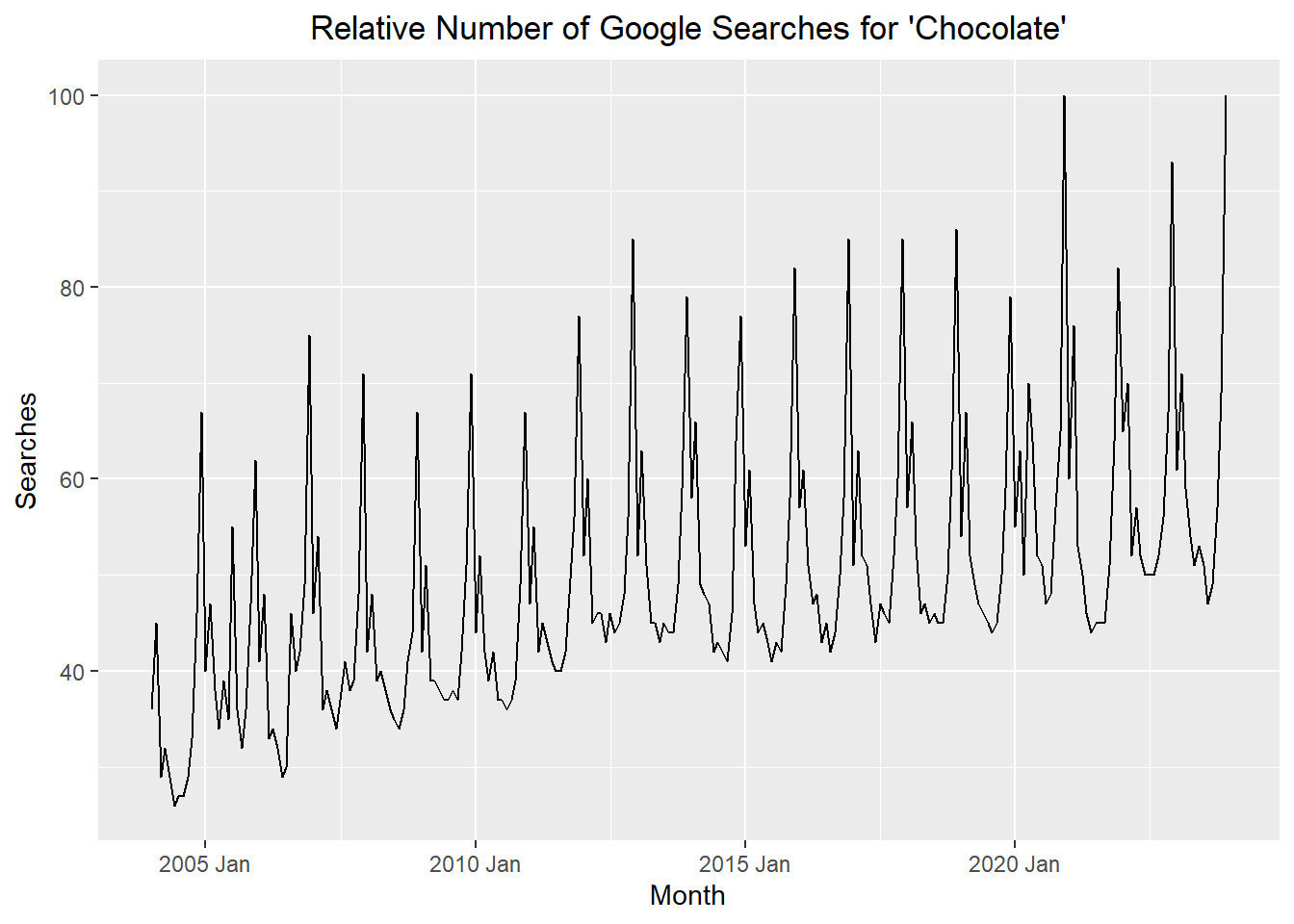
Explore R commands summarizing time series data
Estimating the Trend: Annual Aggregation (10 min)
To help visualize what is happening with a time series, we can simply aggregate the data in the time series to the annual level by computing the mean of the observations in a given year. This can make it easier to spot a trend.
For the chocolate data, when we average the data for each year, we get:
Aggregation
chocolate_annual_ts <- summarise(
    index_by(chocolate_month_ts, year),
    value = mean(value)
  )

#chocolate_annual_ts
Table
chocolate_annual_ts |>
  as.data.frame() |>
  concat_partial_table(nrow_head = 6, nrow_tail= 3, decimals = 4) |>
display_table()| year | value |
|---|---|
| 2004 | 35.5 |
| 2005 | 41.75 |
| 2006 | 41.5833 |
| 2007 | 43.1667 |
| 2008 | 41.6667 |
| 2009 | 43.5 |
| ⋮ | ⋮ |
| 2021 | 55.0833 |
| 2022 | 59.5 |
| 2023 | 60.1667 |
The first plot is the time series plot of the raw data, and the second plot is a time series plot of the annual means.
Show the code
# monthly plot
mp <- autoplot(chocolate_month_ts, .vars = value) +
  labs(
    x = "Month",
    y = "Searches",
    title = "Relative Number of Google Searches for 'Chocolate'"
  ) +
  theme(plot.title = element_text(hjust = 0.5))

# yearly plot
yp <- autoplot(chocolate_annual_ts, .vars = value) +
  labs(
    x = "Year",
    y = "Searches",
    title = "Mean Annual Google Searches for 'Chocolate'"
  ) +
  scale_x_continuous(breaks = seq(2004, max(chocolate_month_ts$year), by = 2)) +
  theme(plot.title = element_text(hjust = 0.5))

mp / yp # uses patchwork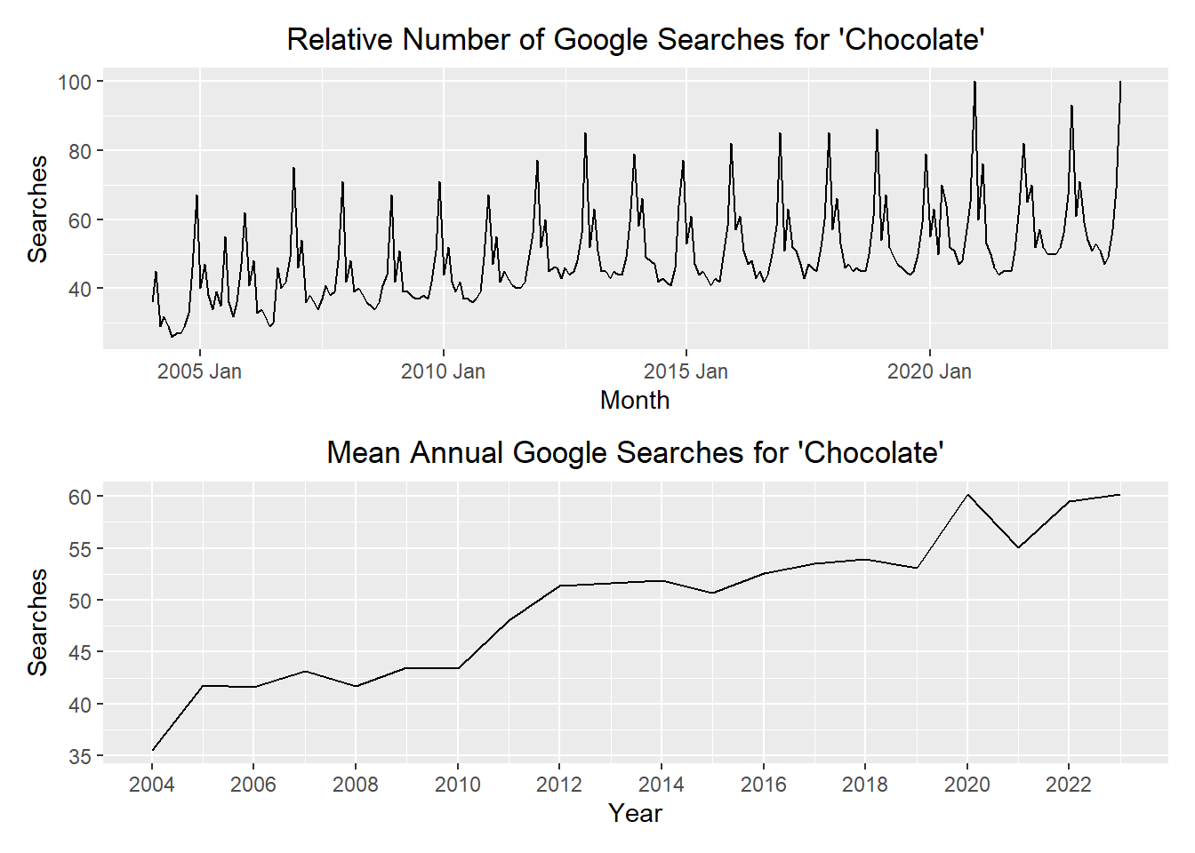
If you want to superimpose these plots, it would make sense to align the mean value for the year with the middle of the year. Here is a plot superimposing the annual mean aligned with July 1 (in blue) on the values of the time series (in black).
Show the code
chocolate_annual_ts <- summarise(
    index_by(chocolate_month_ts, year),
    value = mean(value)
  ) |>
  mutate(index = tsibble::yearmonth( mdy(paste0("7/1/",year)) )) |>
  as_tsibble(index = index)

# combined plot
autoplot(chocolate_month_ts, .vars = value) +
  geom_line(data = chocolate_annual_ts,
            aes(x = index, y = value),
            color = "#56B4E9") +
  labs(
    x = "Month",
    y = "Searches",
    title = "Relative Number of Google Searches for 'Chocolate'"
  ) +
  theme(plot.title = element_text(hjust = 0.5))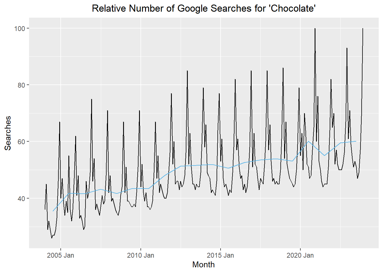
Homework Preview (5 min)
- Review upcoming homework assignment
- Clarify questions