library(tidyverse)
library(mosaic)
library(rio)
library(car)

math <- import('https://byuistats.github.io/BYUI_M221_Book/Data/MathSelfEfficacy.xlsx')Simple Linear Regression
Review
Consider the relationship between Score on a math exam and a student’s self-reported Confidence Rating.
Question: What is the explanatory (aka independent) variable,
Answer:
Question: What is the response (aka the dependent) variable,
Answer:
Plot the relationship:
plot(Score ~ ConfidenceRatingMean, data = math)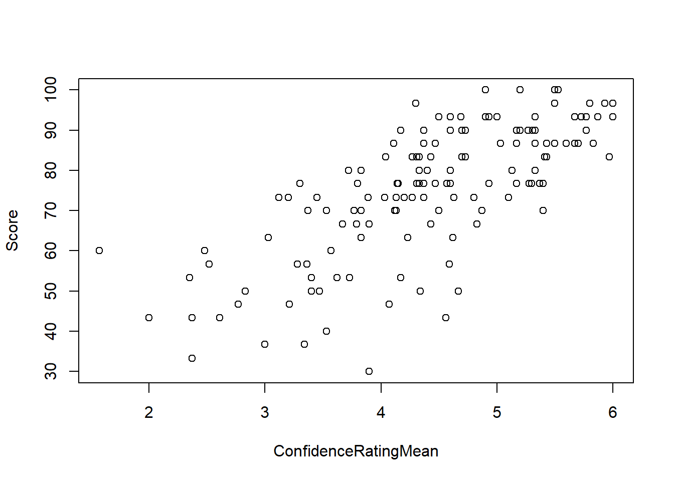
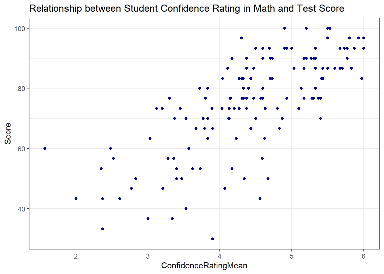
ggplot(math, aes(x = ConfidenceRatingMean, y = Score )) +
  geom_point(color = "darkblue") +
  theme_bw() +
  labs(
    title = "Relationship between Student Confidence Rating in Math and Test Score"
) 
Question: Does the relationship appear linear?
Answer:
Question: What is the direction of the relationship? Answer:
Question: What do you think is the strength of the relationship? (Strong/Moderate/Weak) Answer:
Question: What is the correlation coefficient, r? Answer:
cor(Score ~ ConfidenceRatingMean, data = math)[1] 0.7278648Linear Regression Equation
Recall that the correlation coefficient,
Linear Regression allows us to find a functional relationship between X and Y:
This is a reframing of the familiar
We can estimate the slope and intercept of the line that “best fits” the data and use that line to make predictions.
NOTE: As before, Greek letters signify population parameters in statistics while Latin letters are often used for sample statistics. We estimate
In R
Recall that when we had a quantitative response variable and a categorical explanatory variable we could use the t.test() if the categorical variable had 2 levels or the aov() function if the categorical variable had multiple levels. We used the same notation for both:
t.test(y ~ x, data = dat) and aov(y ~ x, data = dat)
The aov() function output wasn’t as useful as the t.test() by itself, so we typically assigned a name to the aov() output then used summarize() to get the test statistic and p-value. We could also extract “residuals”.
The same paradigm works for estimating the linear relationship between 2 quantitative variables, but we need to introduce a new function: lm(). The ‘lm’ stands for “linear model”. The relationship notation remains the same:
lm(y ~ x, data = dat)
except aov() the lm() output by itself doesn’t give us test statistics and p-values. We will also use the summarize() function to get our test statistics.
Let’s fit a linear model estimating the slope and intercept of the line that best fits the relationship between Confidence Rating and Test Score:
math_lm <- lm(Score ~ ConfidenceRatingMean, data = math)
summary(math_lm)
Call:
lm(formula = Score ~ ConfidenceRatingMean, data = math)

Residuals:
    Min      1Q  Median      3Q     Max
-38.200  -6.163   1.292   7.567  23.422

Coefficients:
                     Estimate Std. Error t value Pr(>|t|)
(Intercept)            18.690      4.610   4.054  8.4e-05 ***
ConfidenceRatingMean   12.695      1.022  12.424  < 2e-16 ***
---
Signif. codes:  0 '***' 0.001 '**' 0.01 '*' 0.05 '.' 0.1 ' ' 1

Residual standard error: 11.27 on 137 degrees of freedom
Multiple R-squared:  0.5298,    Adjusted R-squared:  0.5264
F-statistic: 154.4 on 1 and 137 DF, p-value: < 2.2e-16confint(math_lm, level = .92) 4 % 96 %
(Intercept) 10.55863 26.82150
ConfidenceRatingMean 10.89262 14.49703The lm() output includes only the slope and the intercept.
Question: How do we interpret the intercept of 18.69?
Answer:
Question: How do we interpret the slope of 12.69 in context?
Answer:
Question: What is the expected score on a test of someone who ranks themselves 5 in confidence?
Answer:
Plotting the Regression Line
Base R
Scatter plots by themselves are nice, but we would also like to see the regression line. Simple graphics in R can be augmented by using some functions. The abline() function in base R, when executed right after a graphing function can add lines. We’ve used this to add vertical lines and horizontal line already in class. We can also use this function to add a regression line. We simply insert our linear model output into the abline() function as follows:
plot(Score ~ ConfidenceRatingMean, data = math)
abline(math_lm)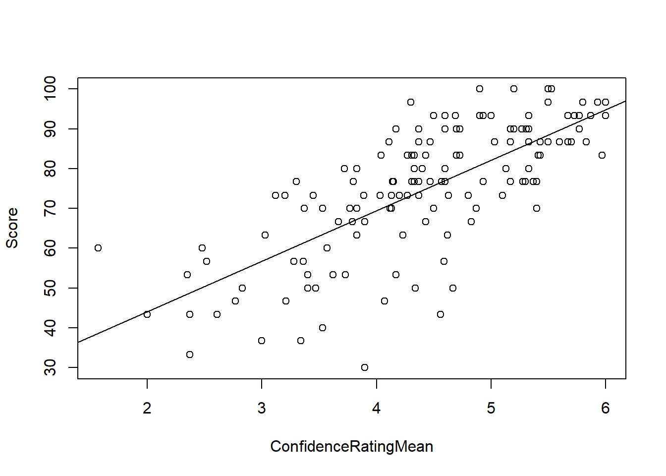
Just as with the other plotting functions we’ve used, we can change the color, type and width of the line:
plot(Score ~ ConfidenceRatingMean, data = math, pch = 16, main = "Title")
abline(math_lm, col = "purple", lwd = 3, lty = 3)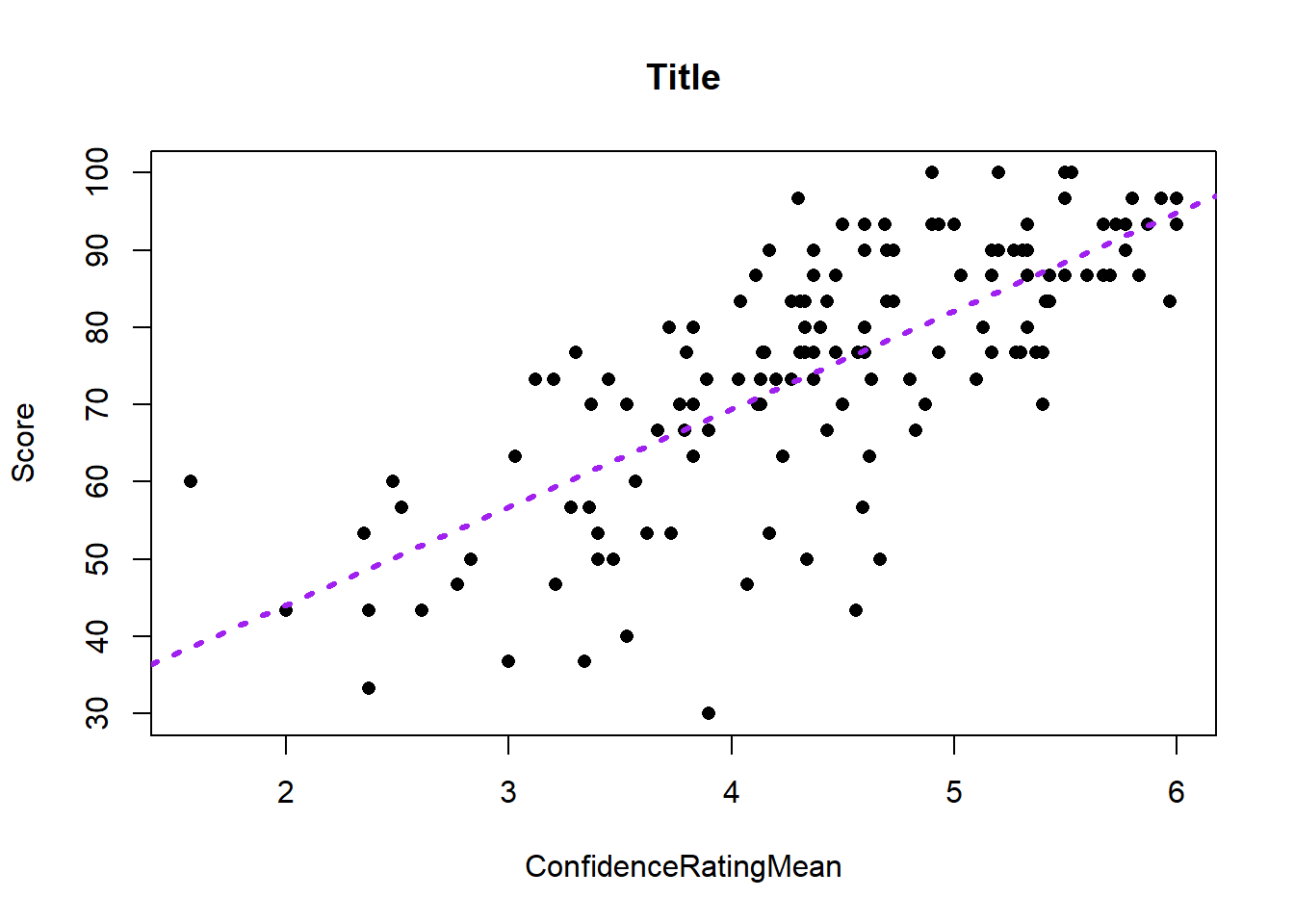
GGPlot
Using ggplot(), we can simply add a geom_smooth() geometry and specify the method of “smoothing” as a linear model:
ggplot(math, aes(x = ConfidenceRatingMean, y = Score )) +
  geom_point(color = "darkblue") +
  theme_bw() +
  labs(
    title = "Relationship between Student Confidence Rating in Math and Test Score"
  ) +
  geom_smooth(method="lm")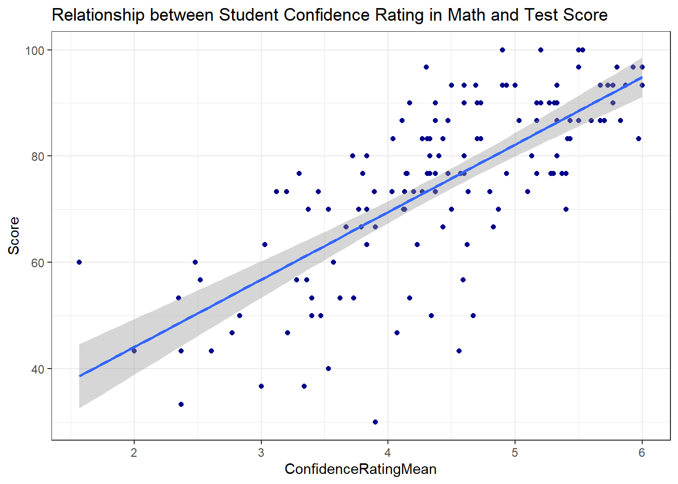
By default, this gives us a confidence interval for the slope of the regression line. We can turn that off by forcing the “standard error” to be FALSE:
ggplot(math, aes(x = ConfidenceRatingMean, y = Score )) +
  geom_point(color = "darkblue") +
  theme_bw() +
  labs(
    title = "Relationship between Student Confidence Rating in Math and Test Score"
  ) +
  geom_smooth(method="lm", se = FALSE)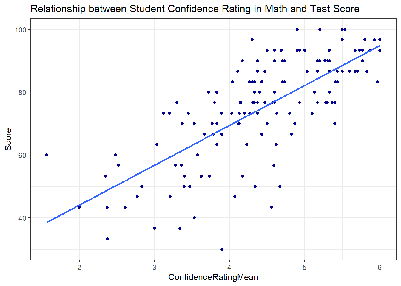
Hypothesis Testing for Regression
A linear equation has 2 parameters: Slope and Intercept. In most situations, the intercept isn’t very interesting by itself and is often absurd. We are most often only interested in the slope
These are the same for all simple linear regression questions.
To get the p-value and test statistics, we use the summary() function as we did with aov:
summary(math_lm)
Call:
lm(formula = Score ~ ConfidenceRatingMean, data = math)

Residuals:
    Min      1Q  Median      3Q     Max
-38.200  -6.163   1.292   7.567  23.422

Coefficients:
                     Estimate Std. Error t value Pr(>|t|)
(Intercept)            18.690      4.610   4.054  8.4e-05 ***
ConfidenceRatingMean   12.695      1.022  12.424  < 2e-16 ***
---
Signif. codes:  0 '***' 0.001 '**' 0.01 '*' 0.05 '.' 0.1 ' ' 1

Residual standard error: 11.27 on 137 degrees of freedom
Multiple R-squared:  0.5298,    Adjusted R-squared:  0.5264
F-statistic: 154.4 on 1 and 137 DF,  p-value: < 2.2e-16
We can also calculate confidence intervals for the slope by using the confint() function. This function requires you to tell it which model to extract a confidence intervals from. You can specify which parameter you’re interested in, and the level of confidence:
# input the model into the following function:
confint(math_lm, level = .95)
2.5 % 97.5 %
(Intercept) 9.573588 27.80654
ConfidenceRatingMean 10.674297 14.71535How do we interpret this confidence interval for a slope?
Technically correct: 95% Confident that the true population slope is within (10.674297, 14.71535)
Contextual Explanation: For every 1 unit increase in Confidence Rating, test scores go up by between (10.674297, 14.71535) on average.
Regression Requirements (Is our P-value sus?)
There are certain requirements for all statistical tests to be valid. For means, we needed to make sure that the Central Limit Theorem applied. This meant that we had a large enough sample size (N>30) or that the population itself was normally distributed.
For ANOVA, we had to check that the residuals were normally distributed and that the population standard deviations were the same.
Regression analysis has 5 requirements to be valid. While this sounds daunting, in practice we can check most of them very quickly.
- Relationship between X and Y is Linear
- The residuals,
- The Variance of the error terms is constant for all values of X
- The X’s are fixed and measured without error (i.e. X’s can be considered as known constants)
- The observations are independent
The linear relationship is assessed visually with the scatter plot. If there is obvious curvature or non-linearity then fitting a line isn’t the best model.
We check the normality of the residuals with a qqPlot() exactly as with the aov() output.
Recall that with ANOVA, we had to check that the variation in each group was roughly the same (largest standard deviation was less than twice as large as the smallest standard deviation). For a quantitative explanatory variable, we can’t calculate the standard deviation for a specified level of
Constant variance in regression is checked with a new plot that looks at how the predicted values relate to the residuals. This is important because we want our predictions to be “wrong” about the same regardless of the value of the prediction. We’re looking for random scatter.
Requirement 4 cannot be analyzed directly. It is important because because
Requirement 5 also cannot be analyzed, but random sampling usually satisfies this requirement.
# Requirement 1:  Check for linear relationship
ggplot(math, aes(x=ConfidenceRatingMean, y = Score)) +
  geom_point()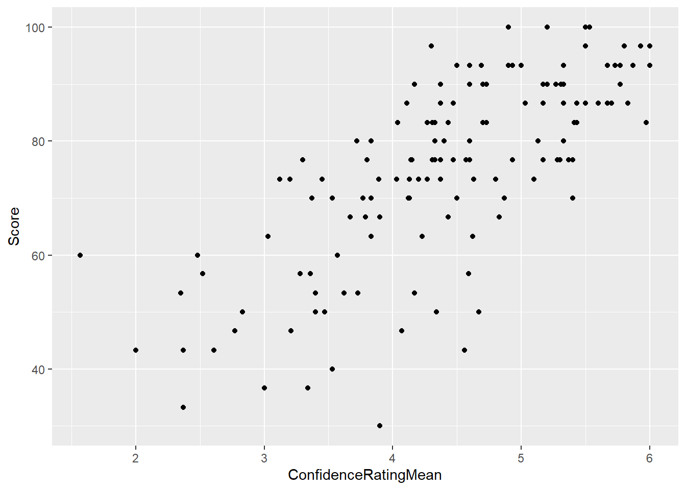
# Req 2: Normality of residuals:
qqPlot(math_lm$residuals)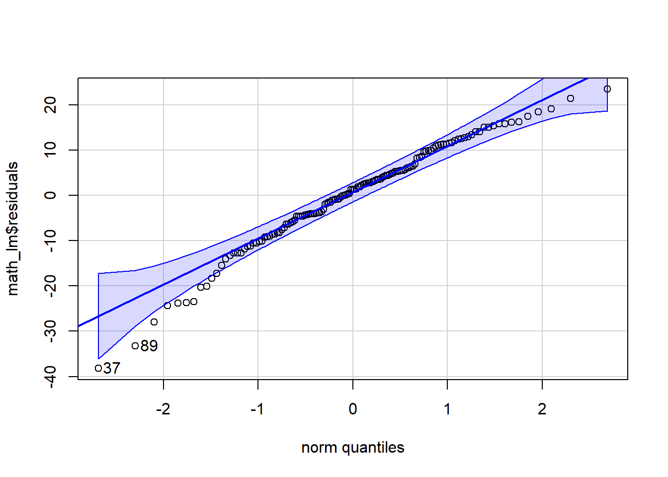
[1] 37 89# Req 3: Constant variance (look odd patterns). When you put lm() output into the plot function it gives you several different plots. The residual plots we're most interested in are 1 and 2
plot(math_lm, which = 1)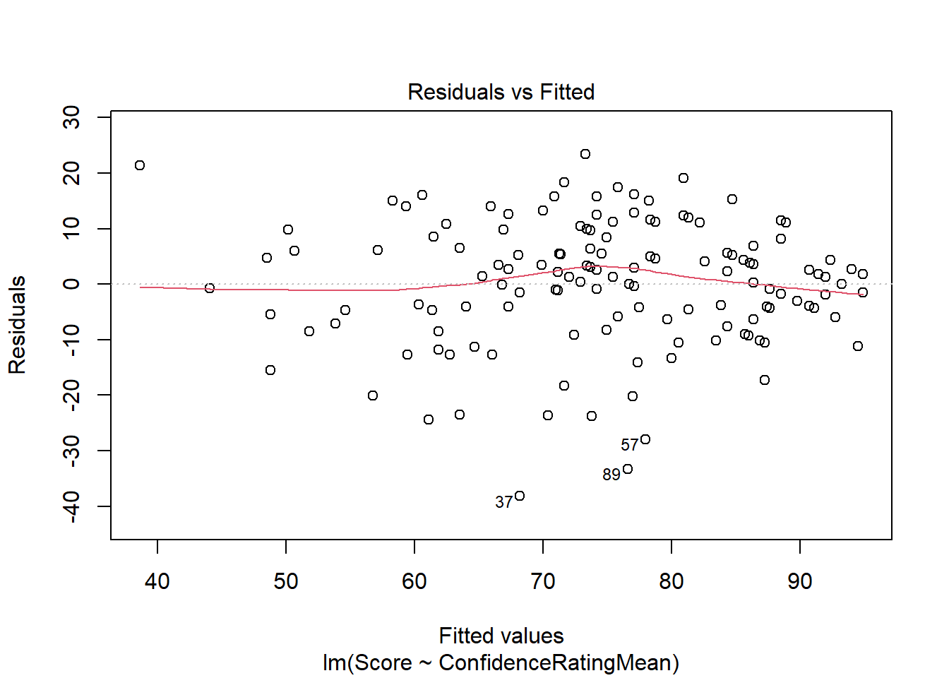
Your Turn
Let’s loot at the relationship between Alcohol Consumption compared to life expectancy for selected countries.
alcohol <- import('https://raw.githubusercontent.com/byuistats/Math221D_Cannon/master/Data/life_expectancy_vs_alcohol_consumption.csv')Question: What is the repsponse variable?
Answer:
Question: What is the explanatory variable?
Answer:
Make a presentation-worthy scatterplot using ggplot() including a regression line:
Question: Describe in words the nature of the relationship between the 2 variables (direction/strength/linearity) Answer:
Calculate the correlation coefficient:
Question: What is the the correlation coefficient,
Answer:
Perform a linear regression analysis for the relationship between alcohol consumption and life expectancy.
# Save your linear model:

# Check for constant variance:

# Check the normality of the residuals Question: What is the slope of the regression line?
Answer:
Question: Interpret the slope of the regression line in context of the problem:
Answer:
Question: What is the intercept of the regression line?
Answer:
Question: Interpret the intercept of the regression line in context of the problem:
Answer:
Question: What do you conclude about the slope of the regression line?
Answer:
Question: What is the confidence interval for the slope?
Question: Give a 1-sentence interpretation of the confidence interval in context of your research question:
Answer: