library(tidyverse)
library(mosaic)
library(rio)
library(ggplot2)

sw <- read_csv('https://raw.githubusercontent.com/byuistats/Math221D_Cannon/master/Data/StarWarsData_clean.csv')Summarizing Categorical Data
Summarizing Categorical Data
In this section we will show how to summarize data numerically and visually. We will be using survey responses about Star Wars. The survey was carried out by FiveThirtyEight about the first 6 Star Wars films. The survey contains demographic information as well as movie rankings and character favorability rankings.
Load the Data and Libraries
Numerical Summaries
One Variable
We typically summarize categorical variables with counts or proportions. When we want to summarize a single categorical variable by itself, we can use the table() function to get counts. For example, if we want to tabulate the favorability of Han Solo:
table(sw$`Favorability_Han Solo`)
Neither favorably nor unfavorably (neutral)
                                         44
                         Somewhat favorably
                                        151
                       Somewhat unfavorably
                                          8
                           Unfamiliar (N/A)
                                         15
                             Very favorably
                                        610
                           Very unfavorably
                                          1
This shows us the counts of respondents in each response category.
We can also use the prop.table() function to get the proportion of respondents, rather than the counts, by inputing a table.
prop.table(table(sw$`Favorability_Han Solo`))
Neither favorably nor unfavorably (neutral)
                                0.053075995
                         Somewhat favorably
                                0.182147165
                       Somewhat unfavorably
                                0.009650181
                           Unfamiliar (N/A)
                                0.018094089
                             Very favorably
                                0.735826297
                           Very unfavorably
0.001206273 NOTE: The prop.table() function needs a table as an input, not a data column.
Question: What percent of respondents are “Very favorable” towards Han Solo?
Answer:
Question: What percent of respondents are “Very unfavorable” towards Han Solo?
Answer:
Two Variables
We can use Contingency Tables to examine associations between 2 categorical variables. A contingency table displays the counts of combinations of 2 categorical variables each being represented as a row or a column. It is easy to create a contingency table in R by inputting 2 data columns into the table() function. The resulting table will have rows and columns which correspond to the order of input table(row, column).
Let’s contrast gender with whether or not a respondent is a fan of Star Wars (Are You a Fan of SW):
table(sw$Gender, sw$`Are You a Fan of SW?`)
          No Yes
  Female 158 238
  Male   119 303
We can include row and column totals by wrapping our table in the addmargins() function as follows:
addmargins(table(sw$Gender, sw$`Are You a Fan of SW?`))
          No Yes Sum
  Female 158 238 396
  Male   119 303 422
  Sum    277 541 818
This can be used to get row or column percentages. Alternatively we can use the prop.table() function to get proportions.
prop.table(table(sw$Gender, sw$`Are You a Fan of SW?`))
                No       Yes
  Female 0.1931540 0.2909535
  Male   0.1454768 0.3704156
The default for prop.table() is to give the overall percentages (counts / table total). So the proportions add to 1 across the whole table.
We can specify row or column percentages by specifying a “margin.” In R, margin=1 corresponds to rows and margin = 2 corresponds to columns.
Compare the difference:
prop.table(table(sw$Gender, sw$`Are You a Fan of SW?`), margin = 1)
                No       Yes
  Female 0.3989899 0.6010101
  Male   0.2819905 0.7180095
This table sums to 1 across the rows, meaning that about 60% of Females are fans of Star Wars and about 72% of Males are fans.
Now look at margin = 2
prop.table(table(sw$Gender, sw$`Are You a Fan of SW?`), margin = 2)
                No       Yes
  Female 0.5703971 0.4399261
Male 0.4296029 0.5600739Question: What does this table show?
Answer:
NOTE: Which margin we choose to evaluate depends on the order we input columns into the table() function. Be sure to double check that you calculate the correct percentages.
Visual Summaries
Visually, bar charts are the optimal way to express categorical data. Pie charts, while very common, are problematic because of weaknesses in basic human perception.
We can use ggplot() with categorical variables to get summaries of counts using the geom_bar() geometry.
ggplot(sw, aes(x = `Are You a Fan of SW?`)) +
  geom_bar()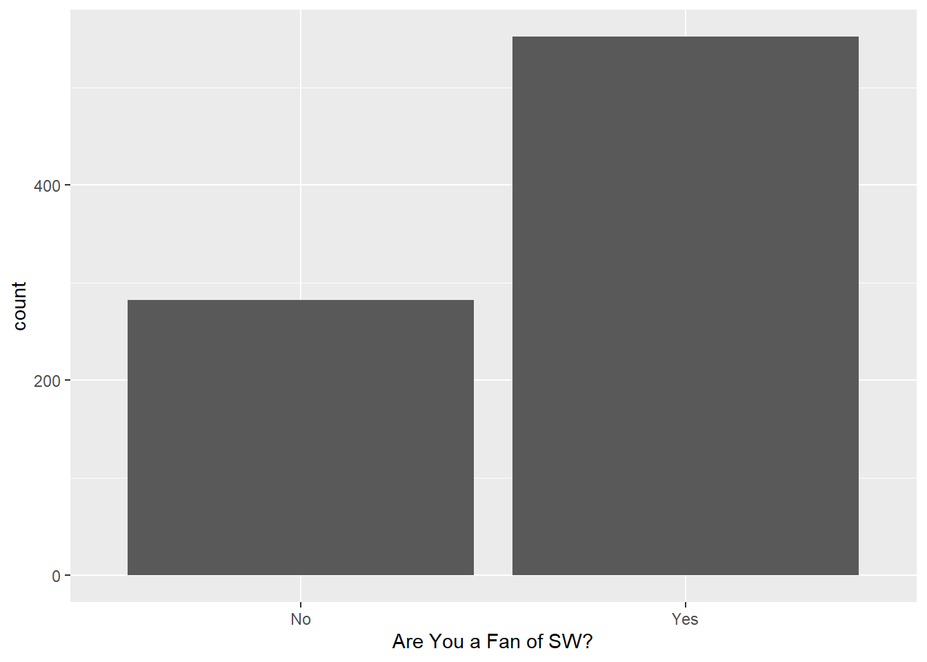
We can add another variable to the mix to look at things by gender using the fill= argument inside the aesthetics:
ggplot(sw, aes(x = who_shot_first, fill = Gender)) +
  geom_bar()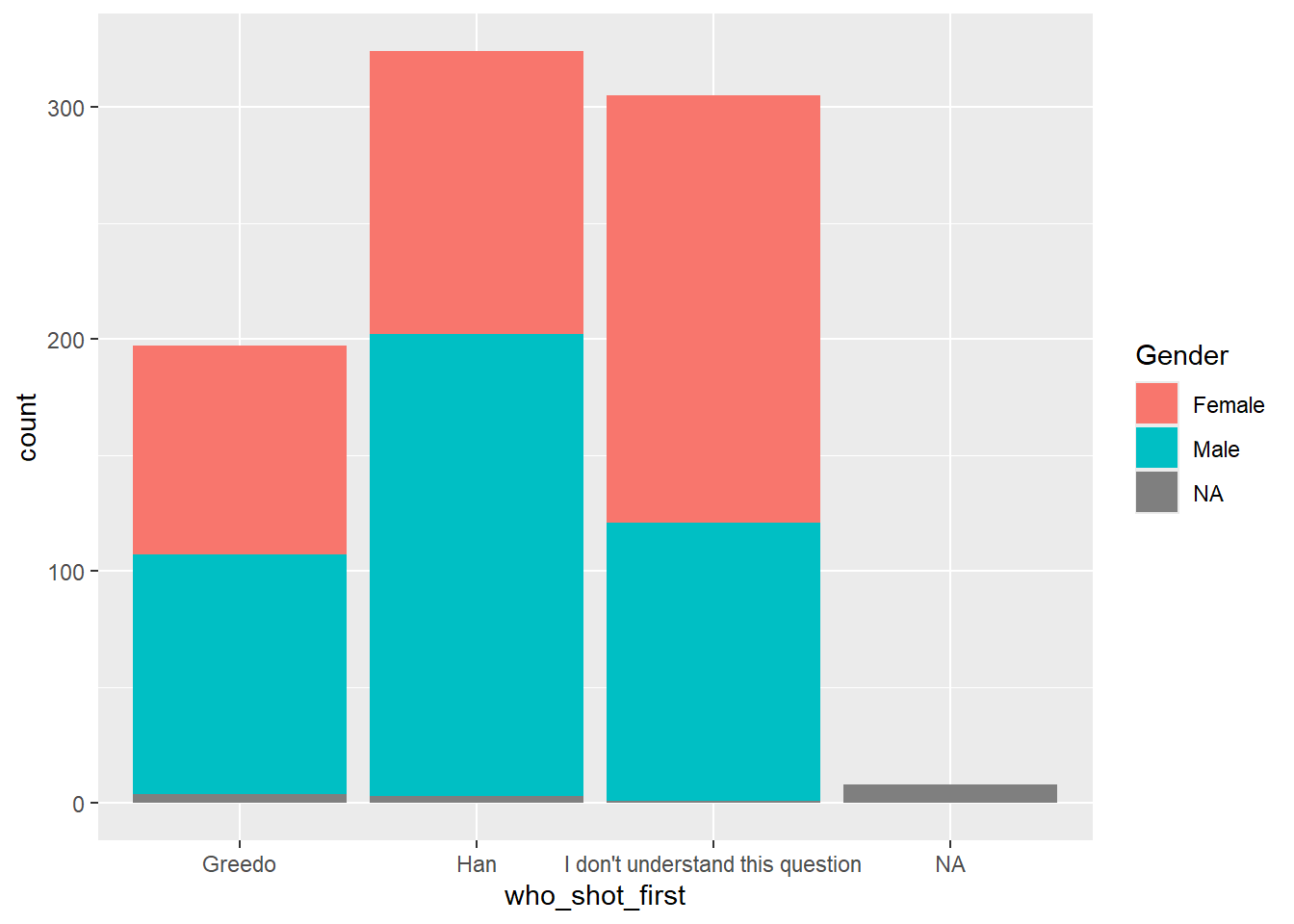
The default for geom_bar() is to stack bars. If we want side-by-side bars we can add a “position = ‘dodge’” to the geom_bar() function:
ggplot(sw, aes(x = who_shot_first, fill = Gender)) +
  geom_bar(position = "dodge")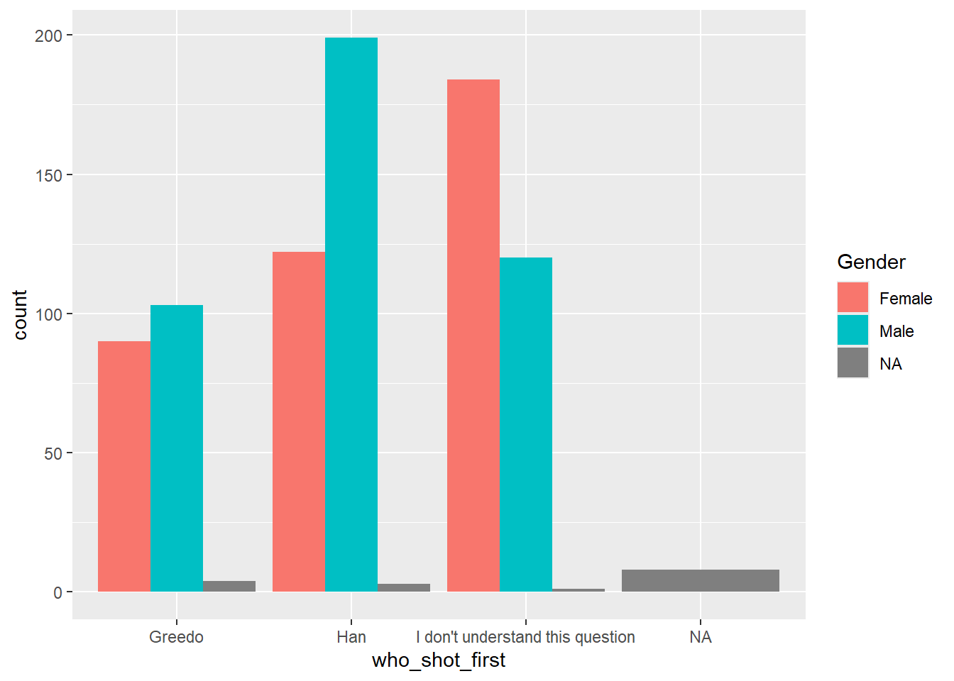
Dealing with missing values
The graphs above include missing values as its own category. The easiest way to deal with missing values is to create a subset of the data that is prepared for the graph we are interested in creating.
You can filter out the missing values using filter() or use the combination of select() with drop_na() in the following way:
shot_first_data <- sw %>%
  filter(who_shot_first != "",
         Gender != "")

# Or using drop_na()

shot_first_data <- sw %>%
  select(Gender, who_shot_first) %>%
drop_na()NOTE: The drop_na() function drops all rows with ANY missing values. If we use this function on the dataset with all the columns, we may end up losing information on the analysis of interest. This is why we do a select() first. that way we only delete rows missing relevant information.
Now look at the graph without missing values.
ggplot(shot_first_data, aes(x = who_shot_first, fill = Gender)) +
  geom_bar(position = "dodge")
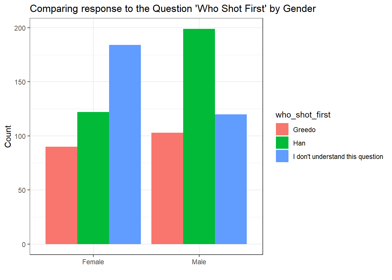
Cleaning up the Graph
The default visualization elements in ggplot() can always be improved. Here are some options for making the chart more readable:
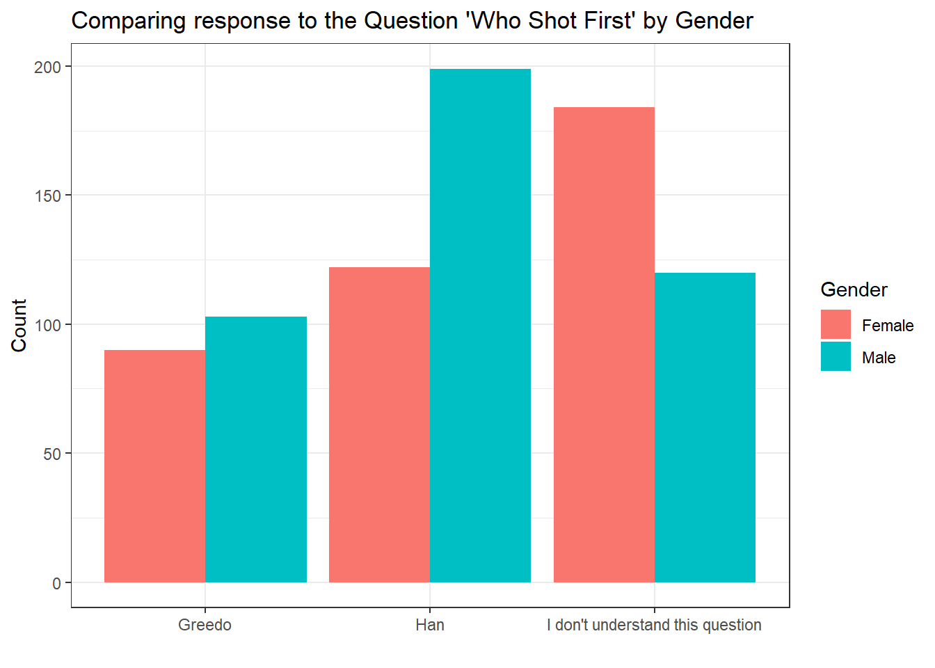
ggplot(shot_first_data, aes(x = who_shot_first, fill = Gender)) +
  geom_bar(position = "dodge") +
  theme_bw() +
  labs(
    x = "Which Character Shot First?",
    y = "Count",
    title = "Comparing response to the Question 'Who Shot First' by Gender"
  )
A Certain Point of View
With categorical variables, we can group differently depending on which comparisons we would like to emphasize. Above, we grouped by responses to “who shot first” and colored by gender. If we swap the x variable and the color, we get the same bars, but arranged differently.
ggplot(shot_first_data, aes(x = Gender, fill = who_shot_first)) +
  geom_bar(position = "dodge") +
  theme_bw() +
  labs(
    x = "",
    y = "Count",
    title = "Comparing response to the Question 'Who Shot First' by Gender"
  )
This different point of view makes it easier to see the breakdown of responses for each gender separately. We can see more clearly that the frequency of Females who do not understand the question is much more pronounced than on the Male side. Males, it seems largely agree that Han shot first.
Alternatively,
ggplot(shot_first_data, aes(x = who_shot_first, fill = Gender)) +
  geom_bar(position = "dodge") +
  theme_bw() +
  labs(
    x = "",
    y = "Count",
    title = "Comparing response to the Question 'Who Shot First' by Gender"
  )
Alternative to a side-by-side bar chart, we can “facet” the graph which splits up the panels on one of the variables. This can be useful when we want to emphasize specific comparisons.
Separating on Gender
ggplot(shot_first_data, aes(x = who_shot_first, fill = Gender)) +
  geom_bar() +
  facet_wrap(~Gender)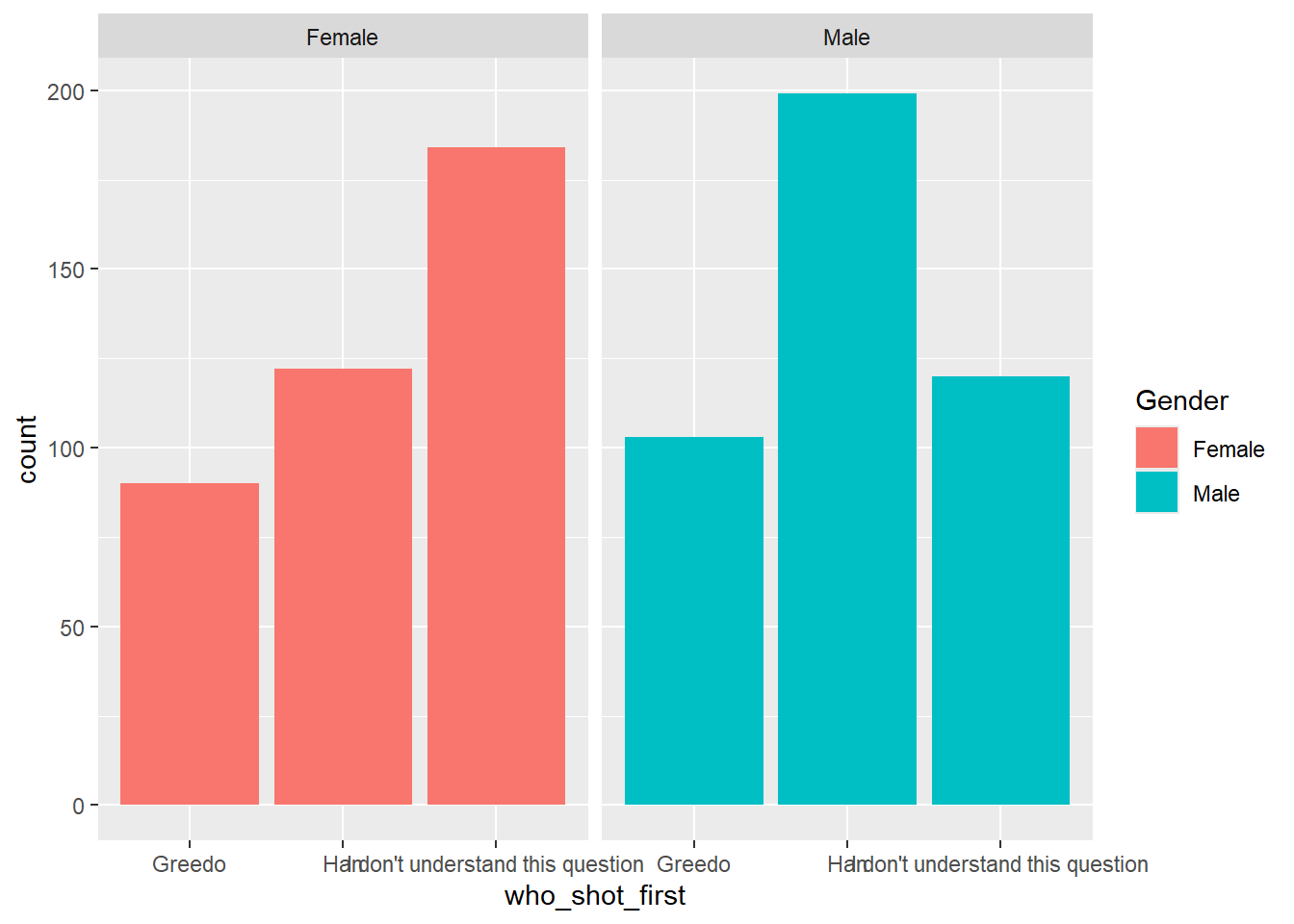
Separating on ‘Who Shot First’
ggplot(shot_first_data, aes(x = Gender, fill = Gender)) +
  geom_bar(position = "dodge") +
  facet_wrap(~who_shot_first)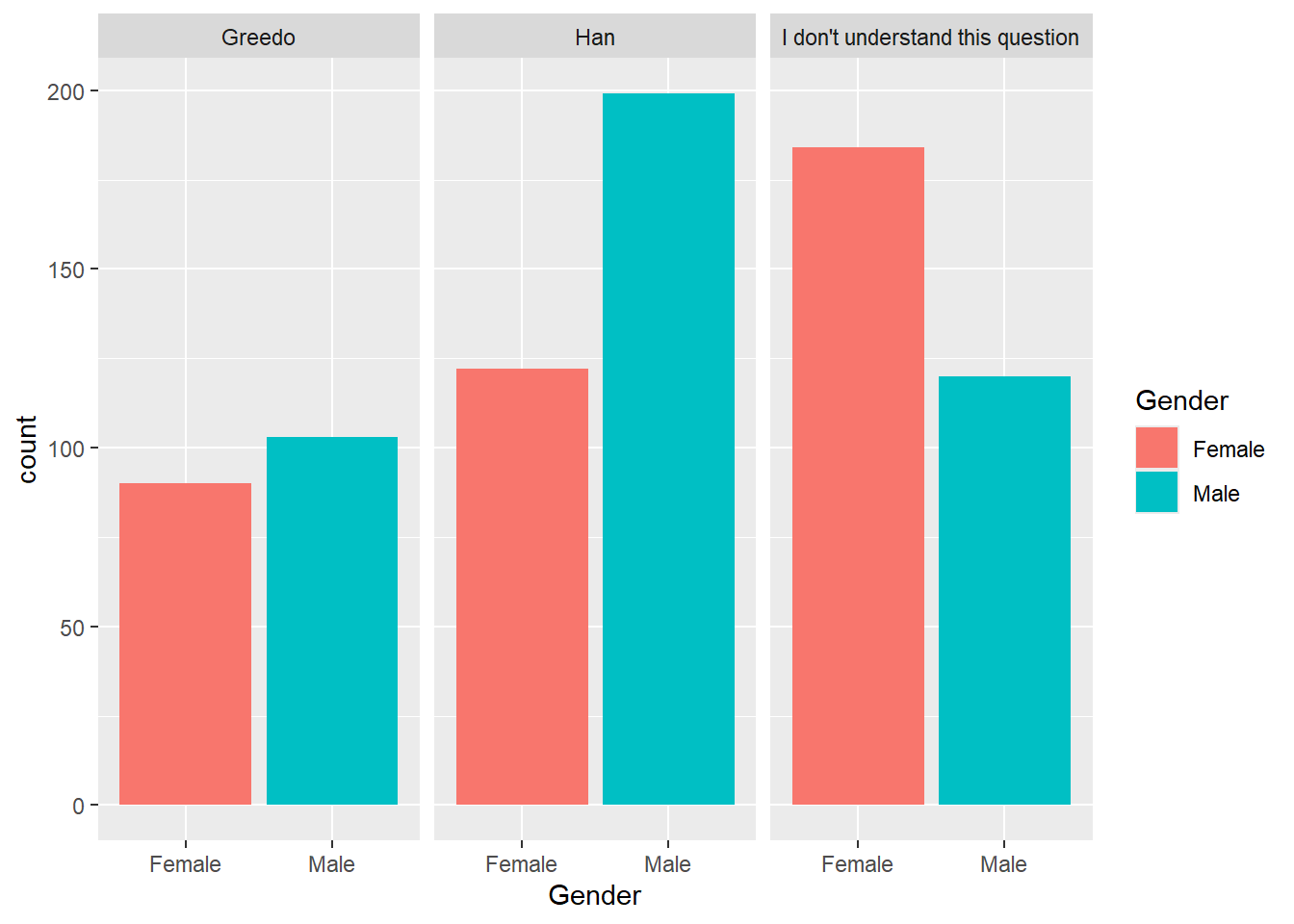
How you split the graph depends on which comparison is the most important. The first graph emphasizes the differences in how the question was answered. The second makes it easy to compare female and male responses.
Your Turn
Visualization
Create a bar chart for favorability of Han Solo by whether or not they are fans of Star Trek (fan_of_star_trek).
Start by making a new dataset called trekky that only includes the 2 relevant columns and drops the missing values.
trekky <- sw %>%Error in parse(text = input): <text>:4:0: unexpected end of input
2: trekky <- sw %>%
3:
^Question: What observations can you make based on the visualization?
Answer:
Proportion Table
We would like to compare what percent of female respondents do not understand the question compared to the percent of males who do not understand the question.
Create a proportion table that can answer this question:
Question: What percent of female respondents do not understand the question?
Answer:
Question: What percent of male respondents do not understand the question?
Answer: