## Warning: package 'knitr' was built under R version 4.0.3You can read the background on all tasks here. The “Details” link below each background will take you to the full task. If you would like to see all the individual tasks for each part of class you can review them on the Task List Page
This task is all about setting up the software. There are a lot of readings, but many of them are short. Getting this first step done correctly and soon will set you up for success in the rest of the semester.
This task is intended to get all of us on the same page in R. You will copy code from your readings and then improve the Research and Creative Works conference visulization from this Excel file. Even if you have used R before, this will be an excellent refresher. If you do not get the title of this task, watch this.
Before we can start to answer business questions we need to become familiar with our data. Often, you will want to start with the data dictionary (What is a Data Dictionary?). However, you can also just dive into the data and gain an understanding based on the variable names and types.
Beyond the variable descriptions is how the variables relate to each other. We can create tables or visualizations that summarize how different variables relate to each other. At this point, we are deepening our understanding as well as beginning our analysis.
Remember: Your job is to become the data expert, not the domain expert. You will build domain skills but you are not going to replace domain experts. People will depend on you to have a firm understanding of what data your company has available to answer domain-specific questions.
Use nycflights13::flights to practice your data summary and data investigation through visualization skills.
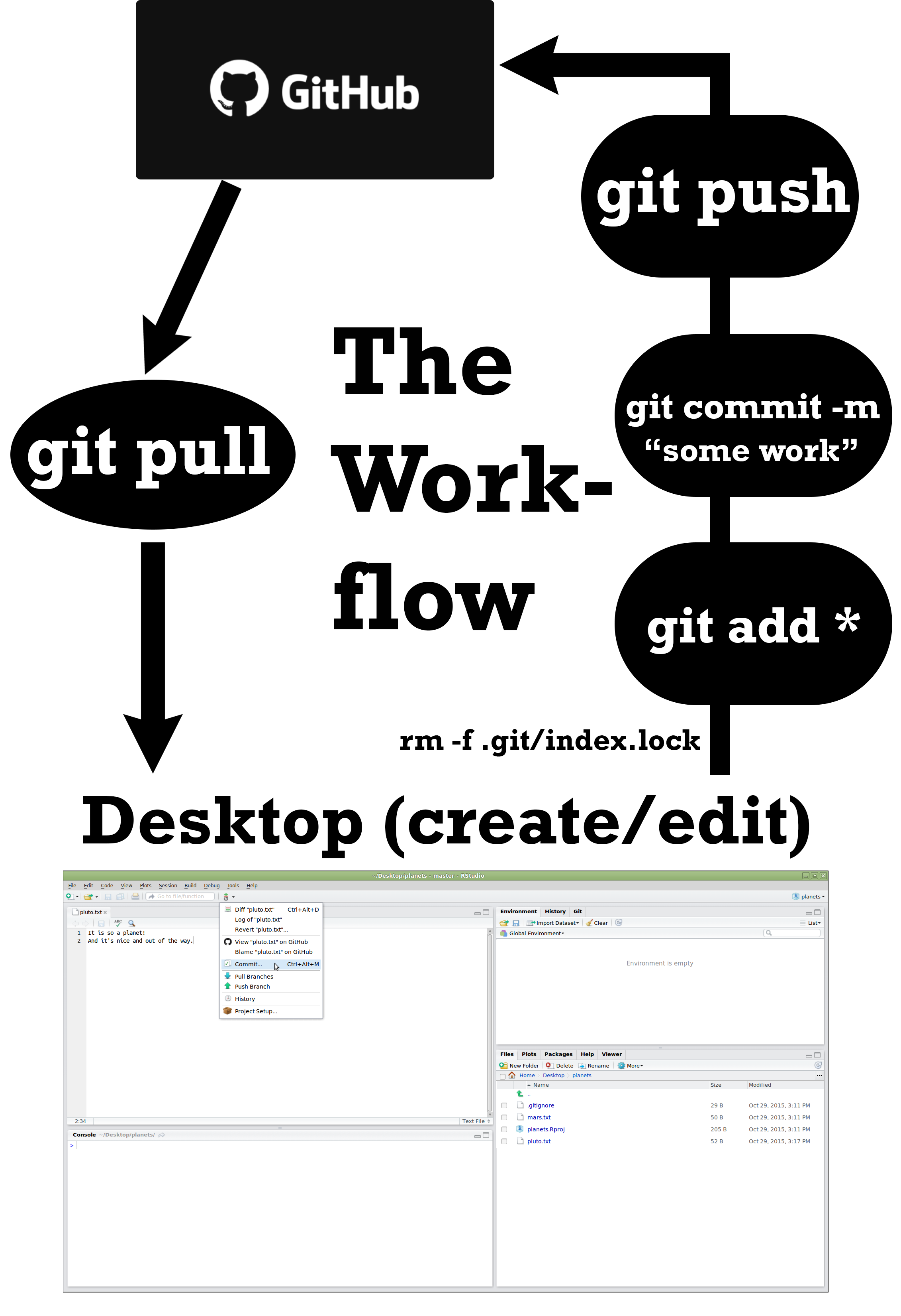
You have just been hired to a new data science team, and you need to collaborate on projects. The team lead told you to connect to your git repository on Github and edit the README.md in your repository. She wants you to describe who you are in a short paragraph.
The Our World in Data website has world data. It is nice that they have provided graphics and then the data that they used to generate the graphics. We are going to recreate some of their visualizations in R and then make them better.
Before we can start to answer business questions we need to become familiar with our data. Often, you will want to start with the data dictionary. However, you can also just dive into the data and gain understanding based on the variable names and types.
Beyond the variable descriptions is how the variables relate to each other. We can create tables or visualizations that summarize how different variables relate to each other. At this point we are deepeing our understanding as well as beginning our analysis.
Remember: Your job is to become the data expert not the domain expert. You will build domain skills but you are not going to replace domain experts. People will depend on you to have a firm understanding of what data your company has available to answer domain specific questions.
Use nycflights13::flights to practice your data summary and data investigation through visualization skills.
Finding good data takes time, and can take longer than the time to tidy your data. This task could easily take 3-6 hours to find the data you need for your semester project. After you find good data sources make sure to complete the remaining tasks.
The Our World in Data website has world data. It is nice that they have provided graphics and then the data that they used to generate the graphics. Once again, we are going to build visualizations in R using their data.
Data formats are varied and differ by domains and software. We could spend weeks on the different formats and file types that companies and governments use to store their data. We will practice with a few standard formats that are often used for storing data. In the future, you will most likely have to do some research to figure out other formats (but you can do it with R or Python). We have a challenge to read in the five formats of the DOW data and checking that they are all identical using all.equal(). One final note, your R script should do all the work. That is your script should download the files and/or read directly from the web location of the file.
With stock return data from the previous task, we need to tidy this data for the creation of a time series plot. We want to look at the returns for each six-month period of the year in which the returns were reported. Your plot should highlight the tighter spread of the DJIA as compared to the other two selection methods (DARTS and PROS). We need to display a table of the DJIA returns with months on the rows and years in the columns (i.e. “spread” the data).
Using global regular expression print (grep) and regular expressions (regex) to find character string patterns is a valuable tool in data analysis and is available with all operating systems and many different programming languages. It is a powerful tool once it is understood. The recently developed library(stringr) package makes these tools much easier to use. The three tasks below can be completed in many different ways. As a challenge, my code to complete this entire task less than 10 lines.
Over the campfire, you and a friend get into a debate about which college in Utah has had the best MLB success. As an avid BYU fan, you want to prove your point, and you go to data to settle the debate. You need a clear visualization that depicts the performance of BYU players compared to other Utah college players that have played in the major leagues. The library(Lahman) package has a comprehensive set of baseball data. It is great for testing out our relational data skills. We will also need a function to inflation adjust the player salaries - library(blscrapeR). See this guide for an example.
When we are visualizing data with categorical variables, we have to deal with character strings as groupings. The problem with summarizing categorical data in a table or a plot is how to order the groups. Using the concept of Factors allows us to dictate the order of these groupings for presentation. We will revisit the stock data from a previous task to create a table and a plot that has the months correctly labeled and ordered.
In 1978 Susan Easton Black penned an article in the Ensign title Even statistically, he is the dominant figure of the Book of Mormon. which makes some statistical claims about the Book of Mormon. We are going to use some of our “string” skills to count words and occurrences in the New Testament and in the Book of Mormon.
A car wash business wants to see if the temperature hurts their bottom line. They have point of sale data for the months of April, May, June, and July. You will need to aggregate the data into hourly sales totals and merge the sales data together with the temperature data to provide insight into the relationship between temperature and car wash sales.
We do not have a task due outside of class for today. During class, we will do a 1-hour coding challenge to give you practice for the coding challenge on the last day of class.
The stock market is overflowing with data. There are many packages in R that allow us to get quick access to information on publicly traded companies. Imagine that you and a friend each purchased about $1,000 of stock in three different stocks at the start of October last year, and you want to compare your performance up to this week. Use the stock shares purchased and share prices to demonstrate how each of you fared over the period you were competing (assuming that you did not change your allocations).
Interactive visualizations can often be powerful for data investigations. They let your team get at questions in real time. Use the Kroger (KR) stock price to build an interactive visualization of their performance over the last five years. Take some time to build a couple of different visualizations that show Krogers performance. See the task items below for a description.
Up to this point, we have dealt with data that fits into the tidy format without much effort. Spatial data has many complicating factors that have made handling spatial data in R complicated. Big strides are being made to make spatial data tidy in R. However; we are in the middle of the transition.
We will use library(USAboundaries), library(ggrepel), and library(sf) to make a map of the US and show the top 3 largest cities in each state. Specifically, you will use library(ggplot2) and the function geom_sf() to recreate the provided image.
We have been asked by the state of Idaho to visualize permitted well locations with a production of more than 5000 gallons and the spatial relationship of the large wells to the locations of large dams (surface area larger than 50 acres). They have provided a a shp file for us and given us a web address for the well, dam, and water locations. They would like to have the Snake River and Henrys Fork rivers plotted.
Their US map is projected to show the entire US. You will need to subset the data to Idaho and then reproject the map, so Idaho is not tilted.
This week we are going to get introduced to “big data” principles. We will discuss some of the issues and terminology but will not have any coding tasks associated with “big data”.
This week we will learn new coding techniques and visualization principles. Go back to task 11 and build your code into two or three functions that performs the same work for the tasks.
We do not have a task due outside of class for today. During class, we will do a 1-hour coding challenge to give you practice for the coding challenge on the last day of class.
Your first weekly project requires you to submit a review of 4-5 different data visualizations used to answer specific questions. Some fun websites are pudding.cool, wonkblog, fivethiryeight, and priceonomics (but you can use any website, blog, or article with a good visualization).
The submit word above will require you to create an account on slack. Our slack workspace is byuidwv.slack.com. You must use your @byui.edu email to create an account.
Hans Rosling is one of the most popular data scientists on the web. His original TED talk was very popular among my friends when it came out. We are going to create some graphics using his formatted data as our weekly case study. Note that we need to remove Kuwait from the data (discussion on this)
You just started your internship at a big firm in New York, and your manager gave you an extensive file of flights that departed JFK, LGA, or EWR in 2013. From this data (nycflights13::flights), which you can obtain in R (install.packages("nycflights13"); library(nycflights13)), your manager wants you to answer the following questions;
The world is a dangerous place. During 2015 and 2016 there was a lot of discussion in the news about police shootings. FiveThirtyEight reported on gun deaths in 2016. As leaders in data journalism, they have posted a clean version of this data in their GitHub repo called full_data.csv for us to use.
While their visualizations focused on yearly averages, our client wants to create commercials that help reduce the gun deaths in the US. They would like to target the commercials in different seasons of the year (think month variable) to audiences that could have the most impact in reducing gun deaths. Our challenge is to summarize and visualize seasonal trends accros the other variables in these data.
The Scientific American argues that humans have been getting taller over the years. As the data scientists that we are becoming, we would like to find data that validates this concept. Our challenge is to show different male heights across the centuries.
This project is not as severe as the two quotes below, but it will give you a taste of pulling various data and file formats together into “tidy” data for visualization and analysis. You will not need to search for data as all the files are listed here
It is 2010, and you are working for the Idaho restaurant commission, and they need your help getting a clearer picture of how restaurant construction changed across Idaho from 2008 to 2009. They provided you a dataset of all commercial construction in Idaho for those two years. The data has a variable Type with a general category called Food_Beverage_Service that has other buildings besides restaurants in the category. You will need to use the restaurant names (see restaurants data object) and some additional key words to create the correct subgroupings. Your client expects to provide new data for 2010 and 2011 so your script needs to do the work. Make sure you do not use Excel to manipulate anything.
In 1978 Susan Easton Black penned an article in the Ensign title Even statistically, he is the dominant figure of the Book of Mormon. which makes some statistical claims about the Book of Mormon. With our “string” skills we are going to check her result and build an improved statistic using using number of words between references.
We have transaction data for a few businesses that have been in operation for three months. Each of these companies has come to your investment company for a loan to expand their business. Your boss has asked you to go through the transactions for each business and provide daily, weekly, and monthly gross revenue summaries and comparisons. Your boss would like a short write up with tables and visualizations that help with the decision of which company did the best over the three month period. You will also need to provide a short paragraph with your recommendation after building your analysis.
In our course we are only looking at understanding and visualizing recorded time series data. If you would like to learn more about forecasting I would recommend Forecasting: Principles and Practice and for a quick introduction see here
Your data science income has ballooned, and you need to find somewhere to invest $25,000 that you have saved over the last year. You have a savvy investment friend that is kind enough to tell you ten stocks he has been watching during the last year. You will need to visualize the last five years performance to help in the in the conversation with your friend.
Your friend is going to give you his tickers at the beginning of your half-hour meeting with him (he is a busy friend). You will need to build an .Rmd file that will build a suite of visualizations rapidly for your conversation. You will need a series of stock performance graphics using library(dygraphs) and library(ggplot2). In real life, you might use one or the other, but this task is built to help you move from ts and xts to tidy objects for visualization.
Specifically, in class the Tuesday following this case study you will get 5 - 10 ticker symbols and will need to build visualizations quickly that allows you to answer questions about the stocks in a few seconds.
You have been asked to support a story for the local paper (that has a web presence) that looks back on the housing collapse and the early effects of residential construction. You have data on residential building permits from 1980 through 2010 for each county in the United States. Your colleague that is writing the article would like a few maps and graphics that highlight the single family building permit patterns across your state as well as the patterns in the US.
Remember the big story is the collapse of new building permits at the initial stages of the mortgage crisis. Make sure your graphics highlight the collapse in a clear and honest manner.
You can recreate CS 10 or find your own spatial data to display using leaflet.
This week we will learn new coding techniques and visualization principles. However, your case study will provide time to makes sure you have the semester project completed.
Your case study and weekly tasks will provide time to makes sure you have wrapped up the class and get set for a great future in data science. Make sure you have address all the end of semester items.
Please write your cover letter to me about the class that uses the syllabus to justify your grade. Your resume would be in the format you would provide to a job or internship.