library(tidyverse)
library(mosaic)
library(rio)
library(car)

sw <- read_csv('https://raw.githubusercontent.com/byuistats/Math221D_Cannon/master/Data/StarWarsData_clean.csv')Categorical Data Summaries - 2 Variables
Summarizing Bivariate Categorical Data
There are situations where you would like to study the relationship between 2 categorical variables.
In this section, we introduce numerical and graphical summaries of comparing categorical variables and discuss some quirks about dealing with categorical data.
Lesson Objectives
- Summarize bivariate data in contingency tables
- Calculate row and column percents
- Create side-by-side, grouped bar plots
A More Civilized Age
In this section, we will be using survey responses about Star Wars. The survey was carried out by FiveThirtyEight about the first 6 Star Wars films. The survey contains demographic information as well as movie rankings and character favorability rankings.
Load the Data and Libraries
Summarizing 2 Categorical Variables
Contingency Tables are used to examine associations between 2 categorical variables. A contingency table displays the counts of combinations of 2 categorical variables represented as a row or a column. It is easy to create a contingency table in R by inputting 2 data columns into the table() function.
The resulting table will have rows and columns which correspond to the order of input table(row, column).
Let’s contrast Gender with whether or not a respondent is a fan of Star Wars (Are You a Fan of SW):
table(sw$Gender, sw$`Are You a Fan of SW?`)
          No Yes
  Female 158 238
  Male   119 303
We can include row and column totals by inputting the table into the addmargins() function as follows:
addmargins( table(sw$Gender, sw$`Are You a Fan of SW?`) )
          No Yes Sum
  Female 158 238 396
  Male   119 303 422
  Sum    277 541 818
This table can be used to calculate column or row percents
QUESTION: Using the table above, what percent of Females are fans of Star Wars?
ANSWER:
QUESTION: What percent of Star Wars Fans are Female?
ANSWER:
NOTE: The denominator of a proportion corresponds to the “of”. When talking about proportion “of Males”, total males should be the denominator. The proportion “of Fans” means that the denominator should be the total number of fans. Proportion “of respondents” means the denominator should be the table total.
Calculating Proportions
When looking at a single categorical variable, we input a table into the prop.table() function to get proportions instead of counts. It’s slightly more complicated with 2 variables because there are several proportions that can be calculated. The denominator depends on what we’re interested in studying as illustrated above (percent of females? or percent of Fans?).
We can use the prop.table() function to get:
- Table Percents: Sum to 1 across the entire table
- Row Percents: Sum to 1 across rows
- Column Percents: Sum to 1 across columns
Table Proportions
The default for prop.table() is to give the overall percentages (counts / table total). So the proportions add to 1 across the whole table.
prop.table(table(sw$Gender, sw$`Are You a Fan of SW?`))
                No       Yes
  Female 0.1931540 0.2909535
  Male   0.1454768 0.3704156
For example, about 37% of respondents are male fans of Star Wars. About 19% of respondents are females who are not fans.
This is not typically the most interesting way to look at the data. We are more often interested in row or column proportions.
Row Proportions
We can specify row proportions by including another input into the prop.table() function. We specify which margin to use as the denominator.
Recall that the table() function will put the first input as the row and the second input as the column. To get row proportions, we tell R to divide by the row totals:
prop.table(table(sw$Gender, sw$`Are You a Fan of SW?`), margin = 1)
                No       Yes
  Female 0.3989899 0.6010101
Male 0.2819905 0.7180095QUESTION: What percent of males are fans of Star Wars?
ANSWER:
QUESTION: What percent of females are fans of Star Wars?
ANSWER:
Column Proportions
To get column proportions, specify margin = 2 (the second input in the table() function)
prop.table(table(sw$Gender, sw$`Are You a Fan of SW?`), margin = 2)
                No       Yes
  Female 0.5703971 0.4399261
Male 0.4296029 0.5600739QUESTION: What percent of Star Wars fans are females?
ANSWER:
QUESTION: What percent of Star Wars fans are males ?
ANSWER:
Visual Summaries
The best way to visualize 2 categorical variables is with a grouped, side-by-side bar plot. Soon we will learn a better way to make visualizations in R. For now, it’s a bit clunky to get the right type of graph that makes sense. But here’s the process:
- Create and name a contingency table. Your column variable will be how the bars are grouped, and the row variable will determine the colors of the grouped bars
- Input the table name into the
barplot()including the additional inputs:beside=TRUEwhich puts the bars next to each other, andlegend=TRUEwhich will add a legend showing which bars correspond to which colors - The default colors are atrocious. You can specify the colors by adding the additional input
col=c(2,3,4)orcol=c("lightblue", "lightgreen", "darkred",...)including as many colors as there are levels in the row variable.
Visually, bar plots are the optimal way to express categorical data. Pie charts, while very common, are problematic because of weaknesses in basic human perception.
tbl1 <- table(sw$Gender, sw$`Are You a Fan of SW?`)

barplot(tbl1, beside=TRUE, legend=TRUE)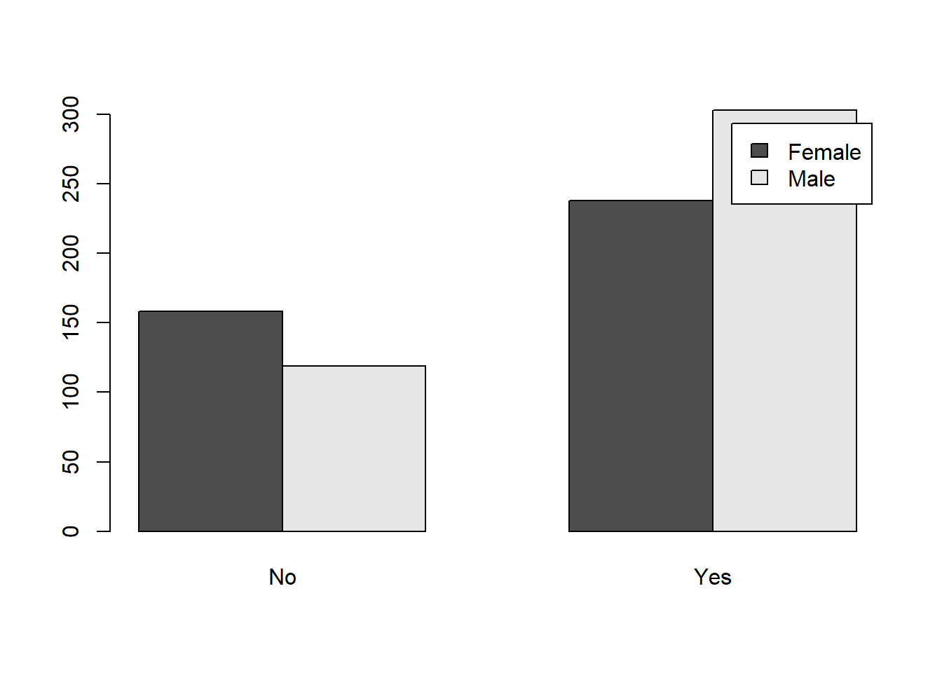
# Adding Color
barplot(tbl1, beside=TRUE, legend=TRUE, col=c(2, 4))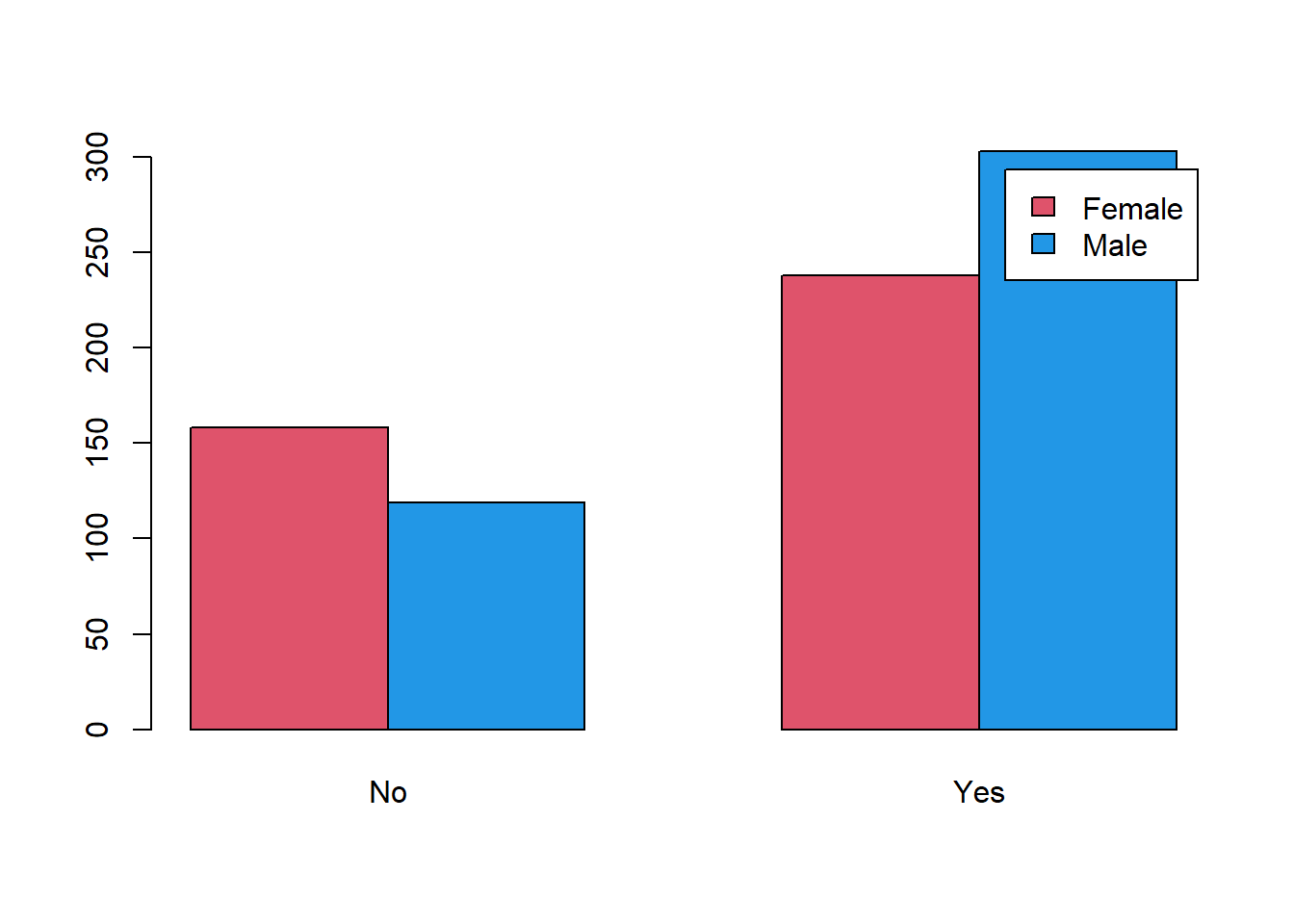
A Certain Point of View
The biggest challenge with categorical data is that rows and columns are interchangeable. There is no meaningful way to distinguish response and explanatory variables.
With categorical variables, we can group differently depending on which comparisons we would like to emphasize. Above, we grouped by whether or not respondents were fans and colored the bars by gender. If we swap the row variable and the column, we get the same output but arranged differently:
tbl2 <- table(sw$`Are You a Fan of SW?`, sw$Gender)

barplot(tbl2, beside=TRUE, legend=TRUE)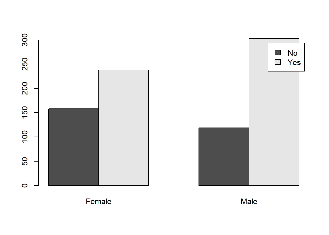
# Adding Color
barplot(tbl2, beside=TRUE, legend=TRUE, col=c(3, 5))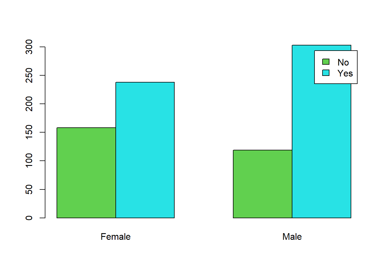
This different point of view makes it easier to compare the difference in fan status for each of the genders. The difference between Not Fan and Fan is much more pronounced on the Male side.
NOTE: Which graph is best will depend on which comparison is most important. It’s always easier to compare things that are grouped together.
Your Turn
Proportion Table
We would like to compare the relationship between Gender and Household Income.
Create and name a table that shows the percent of Genders in each of the income levels:
tbl3 <- table()Error in table(): nothing to tabulateQuestion: What percent of female respondents are in the 150,000+ category?
Answer:
Question: What percent of male respondents are in the 150,000+ category?
Answer:
Create a bar plot that compares the income distribution for each gender in the study:
barplot(tbl3, beside = TRUE, legend=TRUE)Error: object 'tbl3' not foundSwap the row and column inputs and create the bar plot with the opposite grouping:
tbl4 <- table()Error in table(): nothing to tabulatebarplot(tbl4, beside = TRUE, legend=TRUE)Error: object 'tbl4' not foundWhich chart is more interesting?