# Load the libraries
library(rio)
library(mosaic)
library(tidyverse)
library(car)

# Load the data
creativity <- import('https://github.com/byuistats/Math221D_Course/raw/main/Data/creativity_scores.csv')Categorical Data Summaries - One Variable
Introduction
In this section, you will learn:
- How to create a table in R with counts
- How to create a table in R with proportions
- How to create bar plots for counts
We will use the creativity data collected in class.
Don’t forget to load the libraries and the data by running the code chunk below:
Summarizing Categorical Data
So far, we have focused on summarizing quantitative data. For categorical data, we do our analysis and visualizations based on the counts of each of the levels. We must first make a table of counts or percentages, then create a visualization and perform the analysis.
We summarize categorical data numerically using counts or percentages, and visually using bar plots.
NOTE: Later we will learn a much better way to create bar plots using raw data, but for now, we have to create the summary tables first.
Creating a Table
To get a table of counts for a categorical variable, we use the table() function. For example, if we want to see a summary for “Major_Category”:
table(creativity$Major_Category)
      CS       DS       LA     Math    Psych      SCI Wildlife
8 15 3 3 28 11 23 WARNING: I hope it isn’t too much of a stretch at this point in the semester to show that you can nest functions. I will build this up step by step. The tricky part is keeping track of the parentheses so that all the input line up. To help make sure things line up, I will sometimes but extra spaces inside the parentheses so I can see the input more clearly.
You can put the table created above inside of the sort() function to order the table from smallest to lowest:
sort( table(creativity$Major_Category) )
      LA     Math       CS      SCI       DS Wildlife    Psych
       3        3        8       11       15       23       28
If we want to reverse the order to make it largest to smallest, we have to tell the sort() function to arrange the numbers from largest to smallest:
sort( table(creativity$Major_Category) , decreasing =TRUE)
   Psych Wildlife       DS      SCI       CS       LA     Math
      28       23       15       11        8        3        3
To represent this data visually, you can use the barplot()
barplot( sort( table(creativity$Major_Category) , decreasing=TRUE) )
Nesting multiple functions as demonstrated above can get a little messy. To clean this up a bit, we can name the sorted table and refer back to it as needed.
maj_cat_table <- sort(table(creativity$Major_Category), decreasing =TRUE)

barplot(maj_cat_table)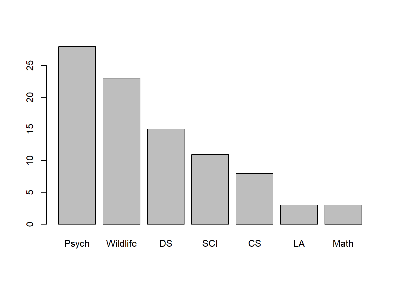
Sometimes the category labels are long and crowd out other names. If we want to change the font size of the labels, we can input the las = 2 argument into the barplot():
barplot(maj_cat_table, las=2)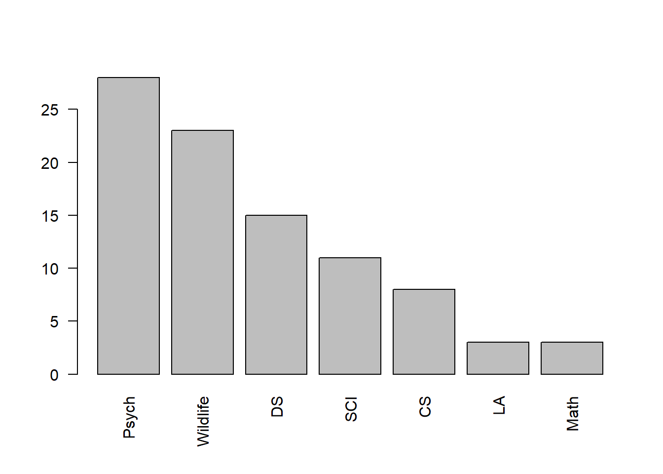
# NOTE: I believe `las` stands for "label axis style"Proportions
The above code chunks dealt with table of counts for each category. If we want to get percentages, we can input a table into the prop.table() function. This outputs the proportion in each group.
prop.table(table(creativity$Major_Category))
        CS         DS         LA       Math      Psych        SCI   Wildlife
0.08791209 0.16483516 0.03296703 0.03296703 0.30769231 0.12087912 0.25274725
This adds yet another layer in a set of nested functions. It is even more helpful to name our proportion table.
In the following code chunk, I will create a sorted proportion table that i can then use to create a bar plot.
prop_table_major <- sort(prop.table(table(creativity$Major_Category)), decreasing = TRUE)

barplot(prop_table_major, las=2)
Your Turn
QUESTION: Create a bar plot for BirthMonth that is ordered in decreasing order to see which birth month is most common among Brother Cannon’s students:
QUESTION: Create a bar plot for Most_Used_Social_Media among this sample of Brother Cannon’s students: