library(rio)
library(mosaic)
library(tidyverse)
library(car)

big5 <- import('https://raw.githubusercontent.com/byuistats/Math221D_Cannon/master/Data/All_class_combined_personality_data.csv')Quantitative Data Summaries - Multiple Groups
Introduction
In this section, we will review data types (categorical and quantitative) and demonstrate how to numerically and visually summarize a quantitative response variable for each level of a categorical explanatory variable.
Lesson Outcomes
- Create a table of summary statistics (
favstats()) for multiple groups
- Create side-by-side boxplots comparing multiple groups
- Interpret side-by-side boxplots for group comparisons
Load the data and libraries
We will use the Big 5 Personality data of a random sample of Brother Cannon’s students.
Categorical Data Review
Recall that a categorical variable in a dataset consists of labels identifying to which group or category the individual belongs. For example, if we collected data about voter registration, we could have 4 categories: Democrat, Republican, Independent, and Not Affiliated.
DEFINITION: Levels of a categorical variable are all the possible group identifiers. In the above example, the levels of voter registration would be Democrat, Republican, Independent, and Not Affiliated.
CODE: To view the levels of a categorical variable in R, we can input the column of interest into the unique() function, such as unique(voter_data$registration). for a dataset called voter_data with a column called registration which included how voters are registered, this code would output all the levels of the categorical variable.
Below, we will see how to use favstats() to get summary statistics broken out for every level of a categorical variable.
Summarizing a Quantitative Variable for Multiple Categories
Sometimes we would like to compare summary statistics between groups. Much of this class will be about how to make formal, rigorous comparisons between groups. But for now, let’s look at how to get different summaries of quantitative variables for multiple categories.
Summary Statistics
We can easily extend favstats() to output our favorite statistics for multiple groups.
We first must identify the quantitative response variable we want to compare, then tell R which categorical explanatory variable we would like to compare.
For example, we could compare agreeableness between the sexes. In this case, Agreeableness is the quantitative response variable and Sex(M/F) is the categorical explanatory variable.
# This gives us the summary statistics for Agreeableness across all groups
favstats(big5$Agreeableness)
min Q1 median Q3 max mean sd n missing
21 67 75 81 100 73.43457 13.24909 405 0# Adding the '~' tells R to break the data into groups (determined by the right side of the '~') and calculate the means of the variable on the left
favstats(big5$Agreeableness ~ big5$`Sex(M/F)`) big5$`Sex(M/F)` min Q1 median Q3 max mean sd n missing
1 F 21 69 77 85 100 75.92035 12.94640 226 0
2 M 25 63 73 79 94 70.29609 12.99218 179 0Visual Summaries by Group
We can use the exact same formula used for boxplot() as we used for favstats():
boxplot(big5$Agreeableness ~ big5$`Sex(M/F)`)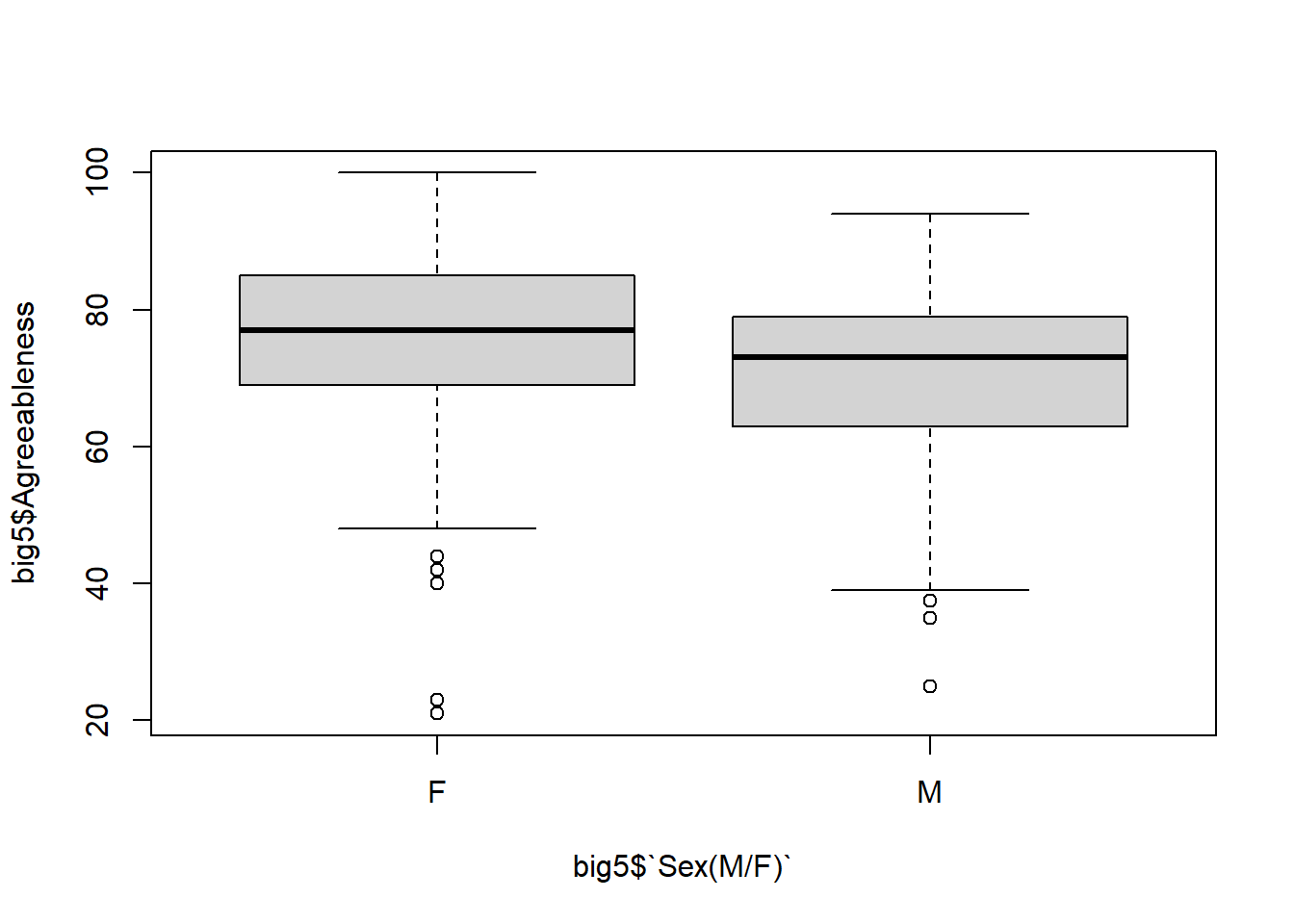
NOTE: We will use the formula data$response ~ data$explanatory for LOTS of functions this semester. They will always take the form y ~ x.
Improving Graphs
Throughout this course, we will ease into making better visualizations. For now, here are some basic techniques that will usually apply to all graphing functions in R:
# Changing color by sepecifying the `col = c()`
boxplot(big5$Agreeableness ~ big5$`Sex(M/F)`, col = c("red", "blue"))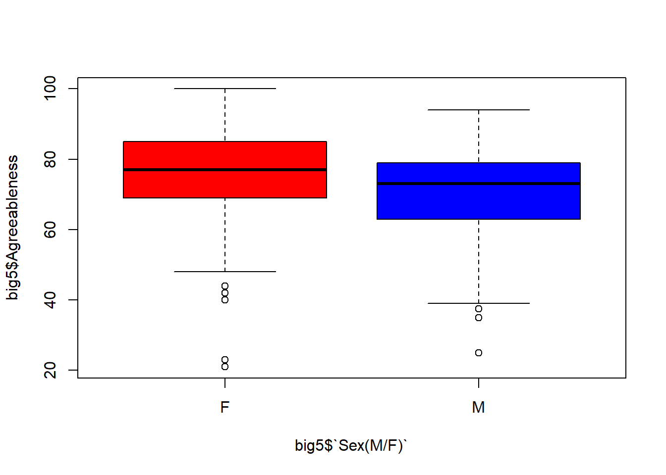
# R also assigns a numerical value to `col = `.  Try different numbers
boxplot(big5$Agreeableness ~ big5$`Sex(M/F)`, col = c(2,3))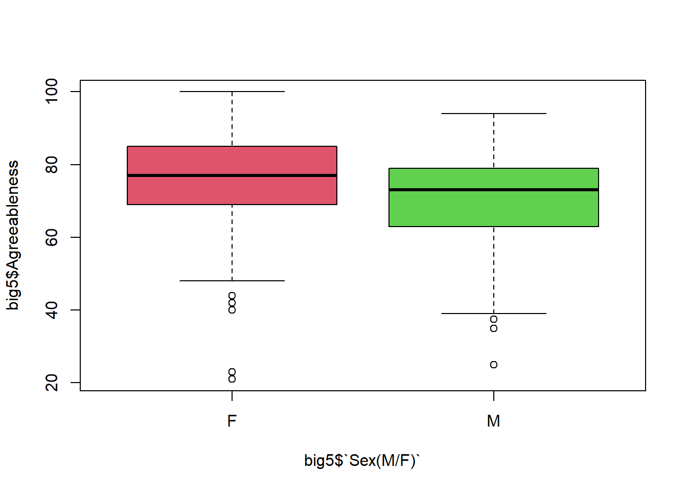
boxplot(big5$Agreeableness ~ big5$`Sex(M/F)`, col = c(4,6))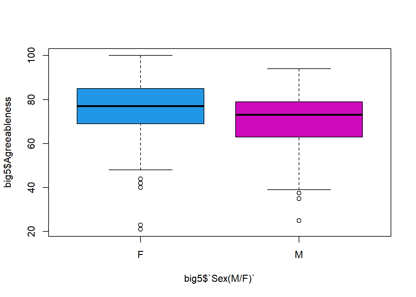
# Adding better axis labels using `xlab = ` and `ylab = `:
boxplot(big5$Agreeableness ~ big5$`Sex(M/F)`, xlab = "Biosex", ylab = "Trait Agreeableness")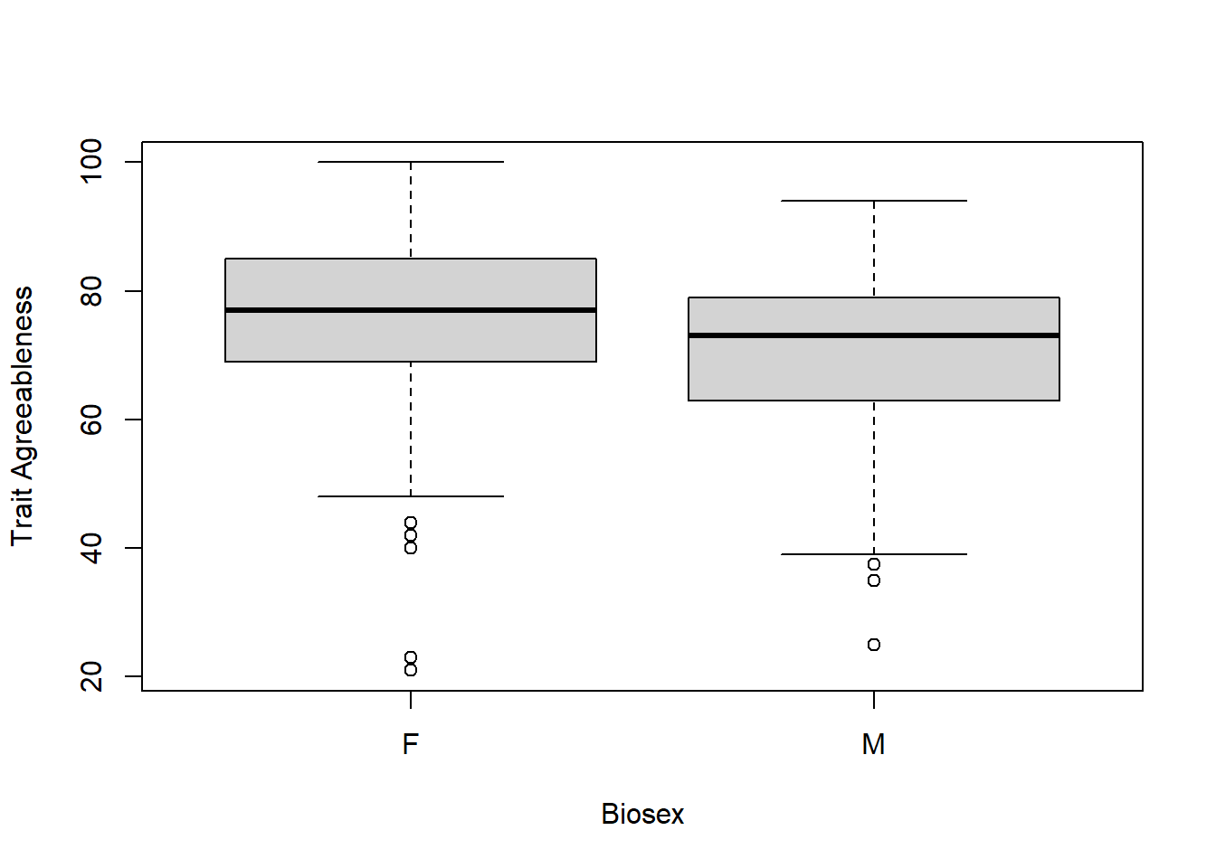
# Adding a title:
boxplot(big5$Agreeableness ~ big5$`Sex(M/F)`, main = "Comparing Agreeableness by Biosex")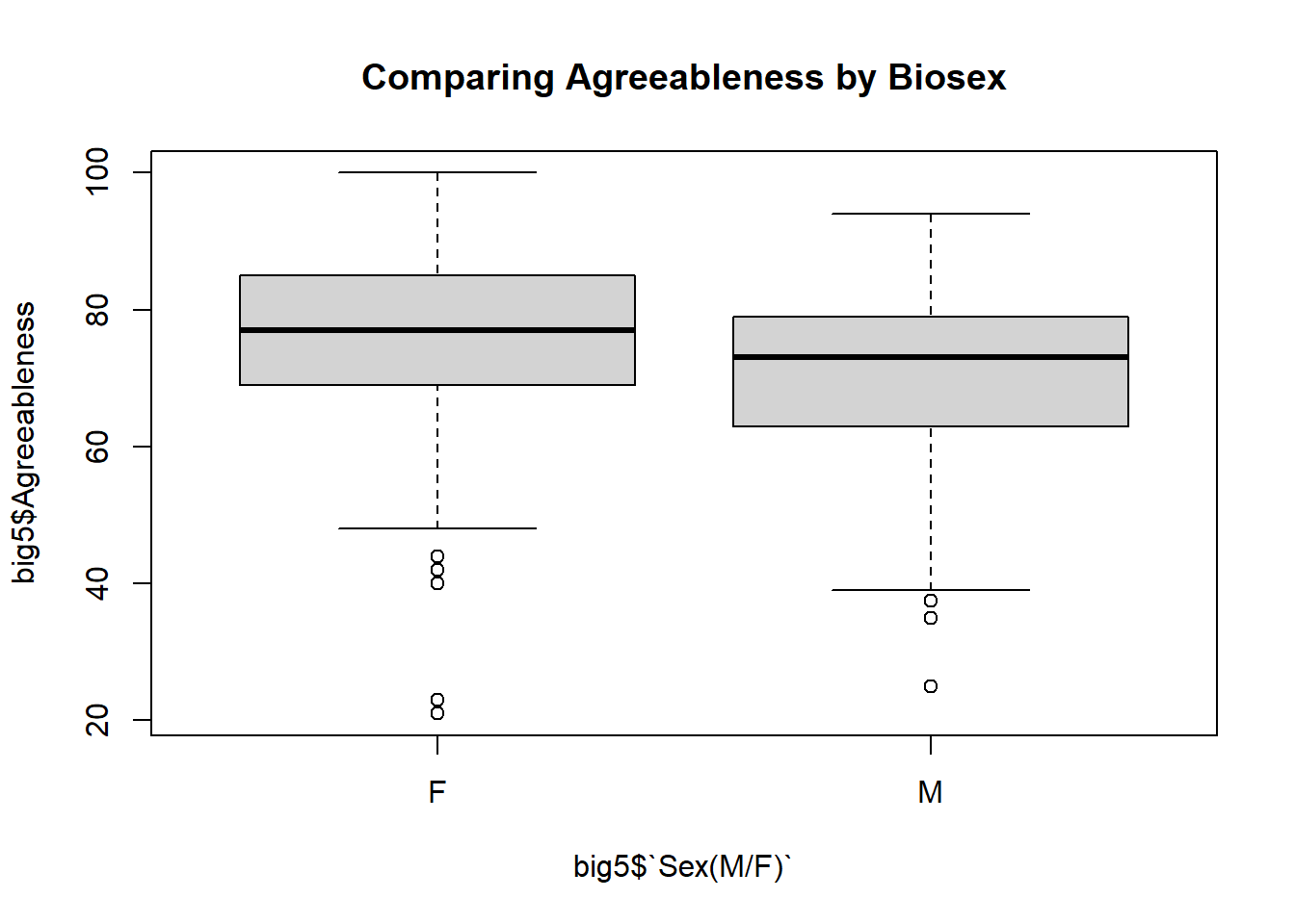
# Putting it all together:
boxplot(big5$Agreeableness ~ big5$`Sex(M/F)`,main = "Comparing Agreeableness by Biosex", xlab = "Biosex", ylab = "Trait Agreeableness", col = c(3, 4))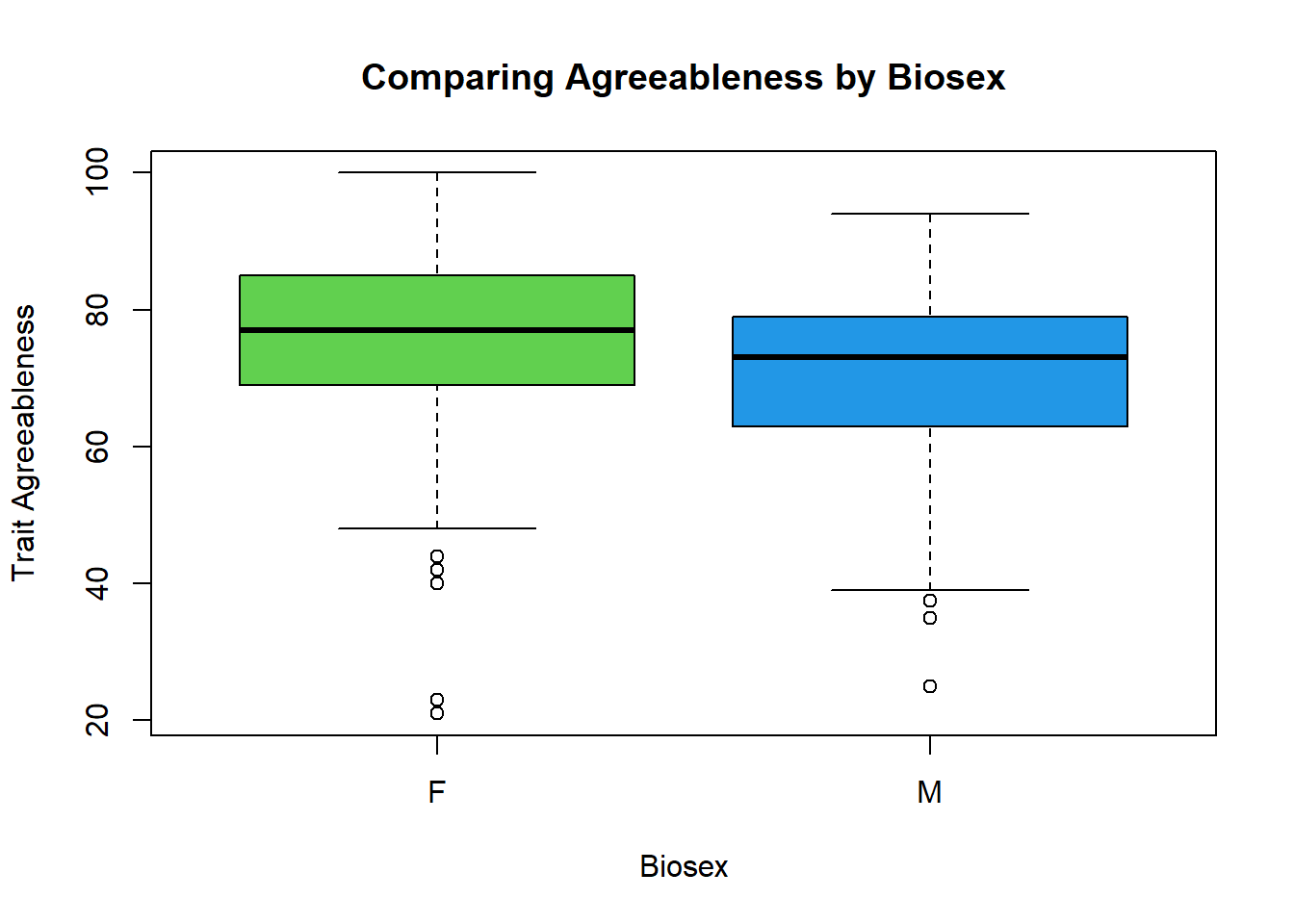
Your Turn
Create summary statistics for Conscientiousness based on course section:
Create side-by-side boxplot for Conscientiousness based on course section: