library(mosaic)
library(pander)
favstats(Y~X, data=YourDataSet)Describing Data
Numerical Summaries
Means, standard deviations, and sample size
In the following explanations
Ymust be a “numeric” vector of the quantitative response variable.Xis a qualitative variable. It would represent a treatment factor.YourDataSetis the name of your data set.
You can take a tidyverse approach or a mosaic package approach to calculating numerical summaries for each treatment.
Calculating treatment means for one factor:
Example code:
library(mosaic) mosaic is an R Package that is useful in the teaching of statistics to beginning programmers.
library(pander) pander is an R Package that makes R output look pretty
favstats( a function from the mosaic package that returns a set of favorite summary statistics Temp This is our response variable. From ?airquality you can see in the help file that Temp is the maximum daily temp in degrees F at La Gaurdia Aiport during 1973 ~ “~” is the tilde symbol. It can be interpreted as “y broken down by x”; “y modeled by x”; “y explained by x”, etc. Where y is on the left of the tilde and x is on the right. Month, “Month” is a column from the airquality dataset that can be treated as qualitative. data = airquality You have to tell R what dataset the variables Temp and Month come from. ‘airquality’ is a preloaded dataset in R. ) Functions must always end with a closing parenthesis. Click to view output Click to View Output.
When calculating treatment means for combinations of 2 or more factors you can use + or | to separate the factors. | (read as ‘vertical bar’ or ‘pipe’) has the advantage that in addition to calculating means for every factor level combination, favstats will also output the marginal means for each level of the last factor listed.
NOTE: unlike it’s use in the aov() command, using the * within favstats does not yield expected results and should NOT be used.
library(mosaic)
favstats(Y ~ X + Z, data = YourDataSet)
#OR
favstats(Y ~ X | Z, data = YourDataSet)
Example code:
library(mosaic) mosaic is an R Package that is useful in the teaching of statistics to beginning programmers.
favstats( a function from the mosaic package that returns a set of favorite summary statistics mpg This is a quantitative variable (numerical vector) from the mtcars dataset ~ “~” is the tilde symbol. It can be interpreted as “y broken down by x”; “y modeled by x”; “y explained by x”, etc. Where y is on the left of the tilde and x variables are on the right. am A qualitative variable from the mtcars dataset. It is coded as 0 and 1 and so therefore is treated as numeric. That is a key distinction when creating the model, but it does not matter when calling favstats(). + This allows us to create additional subgroups within ‘am’ for each level of ‘cyl’. cyl, A variable from the mtcars dataset with 3 distinct values: 4, 6, and 8. Though it is a numeric column we want to treat it as a factor. This is a key distinction when creating the model, but it does not matter when calling favstats(). data = mtcars You have to tell R what dataset the variables ‘mpg’, ‘am’, and ‘cyl’ come from. ‘mtcars’ is a preloaded dataset in R. ) Functions must always end with a closing parenthesis. Click to view output Click to View Output.
Notice that the first column in the output contains the factor level combinations of am and cyl. So, ‘0.4’ is interpreted as level 0 for am and level 4 for cyl. Or in other words, the summary statistics on that row are for automatic tranmission, 4 cylinder engine vehicles. The column label of ‘am.cyl’ indicates which factor is represented on which side of the period. The next example uses the same way of labeling the factor level combinations, but the column label is not as intuitive or helpful.
library(mosaic) mosaic is an R Package that is useful in the teaching of statistics to beginning programmers.
favstats( a function from the mosaic package that returns a set of favorite summary statistics mpg This is a quantitative variable (numerical vector) from the mtcars dataset ~ “~” is the tilde symbol. It can be interpreted as “y broken down by x”; “y modeled by x”; “y explained by x”, etc. Where y is on the left of the tilde and x variables are on the right. am A qualitative variable from the mtcars dataset. It is coded as 0 and 1 and so therefore is treated as numeric. That is a key distinction when creating the model, but it does not matter when calling favstats(). | Referred to as a vertical bar or pipe, this symbol further defines subgroups of the variable on its left, using the values of the variable on its right side cyl, A variable from the mtcars dataset with 3 distinct values: 4, 6, and 8. Though it is a numeric column we want to treat it as a factor. This is a key distinction when creating the model, but it does not matter when calling favstats(). data = mtcars You have to tell R what dataset the variables ‘mpg’, ‘am’, and ‘cyl’ come from. ‘mtcars’ is a preloaded dataset in R. ) Functions must always end with a closing parenthesis. Click to View Output Click to View Output.
Calculating treatment means for one factor:
library(tidyverse)
YourDataSet %>%
  Group_by(X) %>%
  Summarise(MeanY = mean(Y), sdY = sd(Y), sampleSize = n())
library(tidyverse) tidyverse is an R Package that is very useful for working with data.
airquality airquality is a dataset in R. %>% The pipe operator that will send the airquality dataset down inside of the code on the following line.
group_by( “group_by” is a function from library(tidyverse) that allows us to split the airquality dataset into “little” datasets, one dataset for each value in the “Month” column. Month “Month” is a column from the airquality dataset that can be treated as qualitative. ) Functions must always end with a closing parenthesis. %>% The pipe operator that will send the grouped version of the airquality dataset down inside of the code on the following line.
summarise( “summarise” is a function from library(tidyverse) that allows us to compute numerical summaries on data. aveTemp = “AveTemp” is just a name we made up. It will contain the results of the mean(…) function. mean( “mean” is an R function used to calculate the mean. Temp Temp is a quantitative variable (numeric vector) from the airquality dataset. ) Functions must always end with a closing parenthesis. ) Functions must always end with a closing parenthesis.
Press Enter to run the code. Click to View Output Click to View Output.
To calculate treatment means for each combination of factor levels of 2 or more factors, simply add the additional variable to the group_by() statement.
Example code:
library(tidyverse) tidyverse is an R Package that is very useful for working with data.
mpg mtcars is a dataset in preloaded in R. %>% The pipe operator that will send the mtcars dataset down inside of the code on the following line.
group_by( “group_by” is a function from library(tidyverse) that allows us to split the mtcars dataset into “little” datasets, one dataset for each combination of values in the ‘am’ and ‘cyl’ variables am, cyl ‘am’ and ‘cyl’ are both columns in mtcars. By listing them both here we are going to get output for each combination of ‘am’ and ‘cyl’ that exists in the dataset ) Functions must always end with a closing parenthesis. %>% The pipe operator that will send the grouped version of the airquality dataset down inside of the code on the following line.
summarise( “summarise” is a function from library(tidyverse) that allows us to compute numerical summaries on data. mean_mpg = “mean_mpg” is just a name we made up. It will contain the results of the mean(…) function. mean( “mean” is an R function used to calculate the mean. mpg mpg is a quantitative variable (numeric vector) from the mtcars dataset. ) Functions must always end with a closing parenthesis. ) Functions must always end with a closing parenthesis.
Press Enter to run the code. Click to View Output Click to View Output.
Graphical Summaries
Boxplots
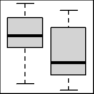
Graphical depiction of the five-number summary. Great for comparing the distributions of data across several groups or categories. Provides a quick visual understanding of the location of the median as well as the range of the data. Can be useful in showing outliers. Sample size should be larger than at least five, or computing the five-number summary is not very meaningful.
To make a boxplot in R use the function:
boxplot(object)
To make side-by-side boxplots:
boxplot(object ~ group, data=NameOfYourData, ...)
objectmust be quantitative data. R refers to this as a “numeric vector.”groupmust be qualitative data. R refers to this as either a “character vector” or a “factor.” However, a “numeric vector” can also act as a qualitative variable.NameOfYourDatais the name of the dataset containingobjectandgroup....implies there are many other options that can be given to theboxplot()function. Type?boxplotin your R Console for more details.
Example Code
Basic Single Boxplot
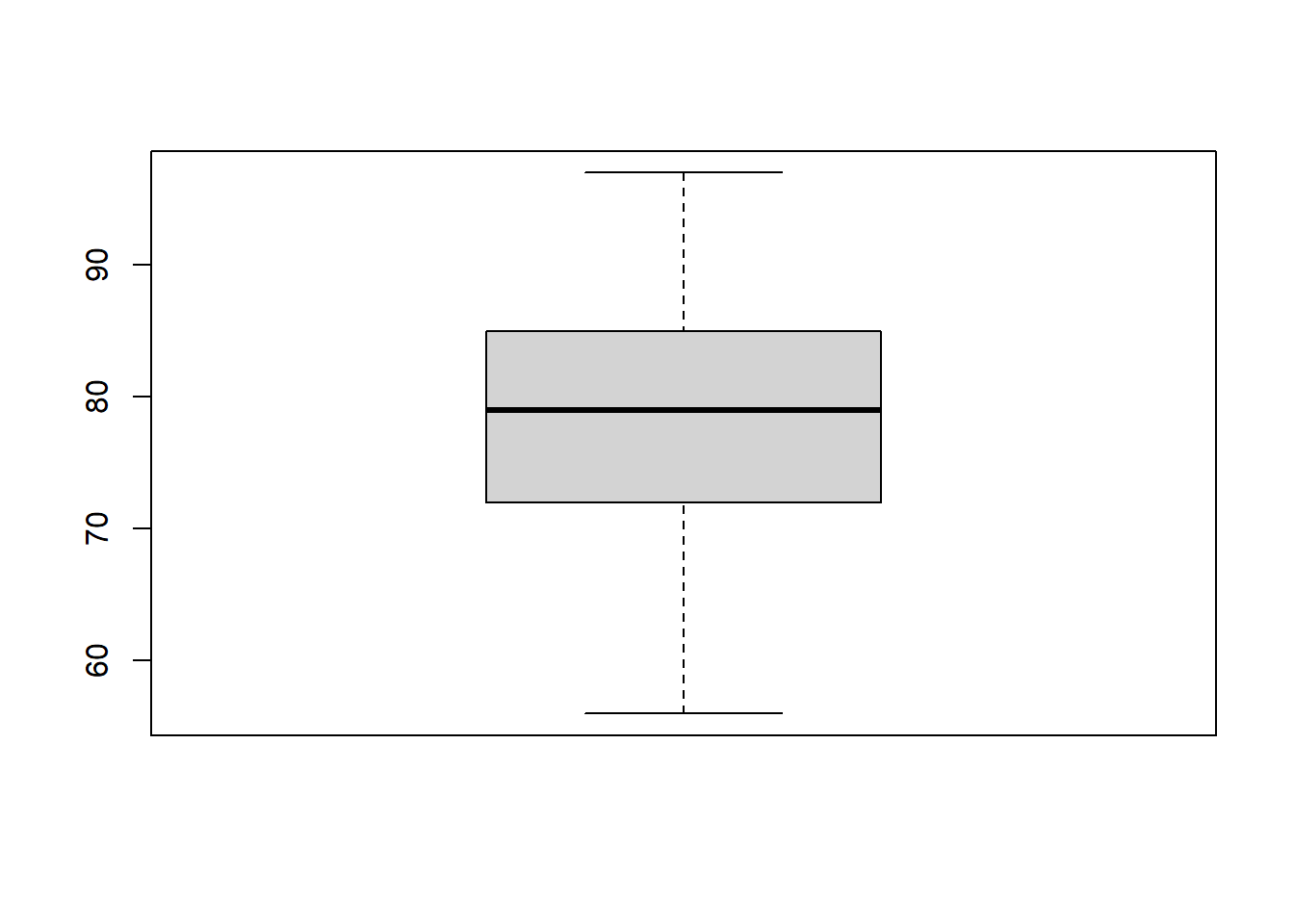
boxplot An R function “boxplot” used to create boxplots. ( Parenthesis to begin the function. Must touch the last letter of the function. airquality “airquality” is a dataset. Type “View(airquality)” in R to see it. $ The $ allows us to access any variable from the airquality dataset. Temp “Temp” is a quantitative variable (numeric vector) from the “airquality” dataset. )
Closing parenthesis for the function.
Press Enter to run the code. … Click to View Output.
More Useful… Basic Side-by-Side Boxplot
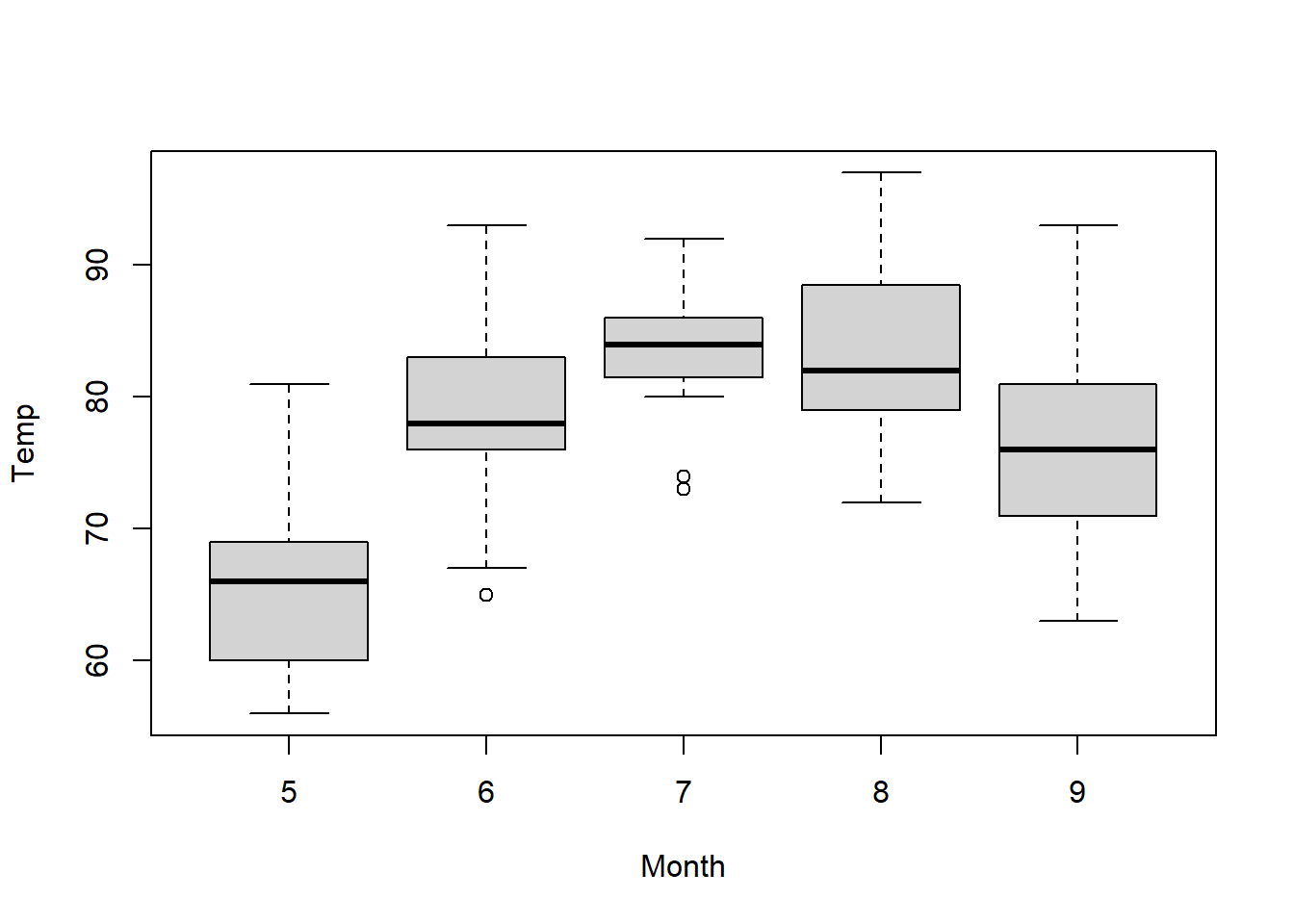
boxplot An R function “boxplot” used to create boxplots. ( Parenthesis to begin the function. Must touch the last letter of the function. Temp “Temp” is a quantitative variable (numeric vector) from the “airquality” dataset. ~ The ~ is used to tell R that you want one boxplot of the quantitative variable (“Temp”) for each group found in the qualitative variable (“Month”). Month “Month” is a qualitative variable (in this case a “numeric vector” defining months by 5, 6, 7, 8, and 9) from the “airquality” dataset. ,
The “,” is required to start specifying additional commands for the “boxplot()” function. data=airquality data= is used to tell R that the “Temp” and “Month” variables are located in the airquality dataset. Without this, R will not know where to find “Temp” and “Month” and the command will give an error. ) Functions always end with a closing parenthesis.
Press Enter to run the code. … Click to View Output.
Add Names under each Box
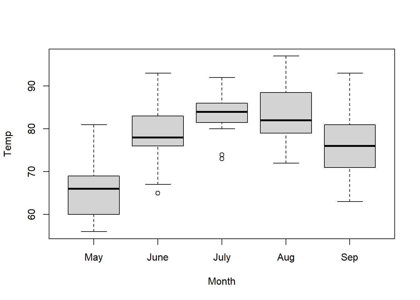
boxplot An R function “boxplot” used to create boxplots. ( Parenthesis to begin the function. Must touch the last letter of the function. Temp “Temp” is a quantitative variable (numeric vector) from the “airquality” dataset. ~ The ~ is used to tell R that you want one boxplot of the quantitative variable (“Temp”) for each group found in the qualitative variable (“Month”). Month “Month” is a qualitative variable (in this case a “numeric vector” defining months by 5, 6, 7, 8, and 9) from the “airquality” dataset. ,
The “,” is required to start specifying additional commands for the “boxplot()” function. data=airquality data= is used to tell R that the “Temp” and “Month” variables are located in the airquality dataset. Without this, R will not know where to find “Temp” and “Month” and the command will give an error. ,
The “,” is required to start specifying additional commands for the “boxplot()” function. names=c(“May”,“June”,“July”,“Aug”,“Sep”) names= is used to tell R what labels to place on the x-axis below each boxplot. ) Functions always end with a closing parenthesis.
Press Enter to run the code. … Click to View Output.
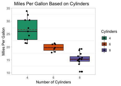
Add Color and Labels
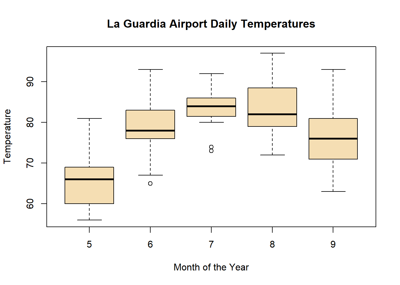
boxplot(Temp ~ Month, data=airquality This code was explained in the previous example code. , The comma is used to separate each additional command to a function. xlab=“Month of the Year” xlab= stands for “x label.” Use it to specify the text to print on the plot under the x-axis. The desired text must always be contained in quotes. , The comma is used to separate each additional command to a function. ylab=“Temperature” ylab= stands for “y label.” Use it to specify the text to print on the plot next to the y-axis. The desired text must always be contained in quotes. , The comma is used to separate each additional command to a function. main=“La Guardia Airport Daily Temperatures” main= stands for the “main label” of the plot, which is placed at the top center of the plot. The desired text must always be contained in quotes. , The comma is used to separate each additional command to a function. col=“wheat” col= stands for the “color” of the plot. The color name “wheat” is an available color in R. Type colors() in the R Console to see more options. The color name must always be placed in quotes. ) Functions always end with a closing parenthesis.
Press Enter to run the code. … Click to View Output.
To make a boxplot in R using the ggplot approach, first ensure
library(ggplot2)
is loaded. Then,
ggplot(data, aes(x=groupsColumn, y=dataColumn) +
geom_boxplot()
datais the name of your dataset.groupsColumnis a column of data from your dataset that is qualitative and represents the groups that should each have a boxplot.dataColumnis a column of data from your dataset that is quantitative.- The aesthetic helper function
aes(x= , y=)is how you tell the gpplot to make the x-axis have the values in yourgroupsColumnof data, the y-axis become yourdataColumn. Note ifgroupsColumnis not a factor, usefactor(groupsColumn)instead. - The geometry helper function
geom_boxplot()causes the ggplot to become a boxplot.
Example Code
Basic Single Boxplot
ggplot An R function “ggplot” used to create a framework for a graphic that will have elements added to it with the + sign. ( Parenthesis to begin the function. Must touch the last letter of the function. airquality “airquality” is a dataset. Type “View(airquality)” in R to see it. , The comma allows us to specify optional commands to the function. The space after the comma is not required. It just looks nice. aes( The aes or “aesthetics” function allows you to tell the ggplot how it should appear. This includes things like what the y-axis should become. y=Temp “y=” declares which variable will become the y-axis of the graphic. )
Closing parenthesis for the aes function. )
Closing parenthesis for the ggplot function. + The addition symbol + is used to add further elements to the ggplot.
geom_boxplot() The “geom_boxplot()” function causes the ggplot to become a boxplot. There are many other “geom_” functions that could be used.
Press Enter to run the code. … Click to View Output.
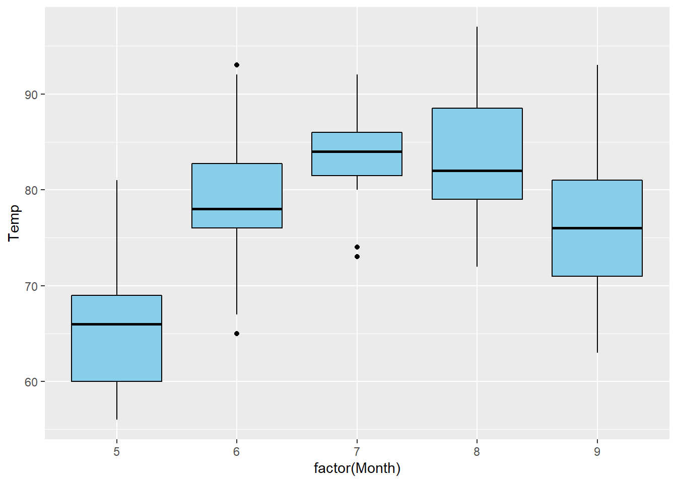
Side-by-side Boxplot and Color Change
ggplot An R function “ggplot” used to create a framework for a graphic that will have elements added to it with the + sign. ( Parenthesis to begin the function. Must touch the last letter of the function. airquality “airquality” is a dataset. Type “View(airquality)” in R to see it. , The comma allows us to specify optional commands to the function. The space after the comma is not required. It just looks nice. aes( The aes or “aesthetics” function allows you to tell the ggplot how it should appear. This includes things like what the x-axis or y-axis should become. x=factor(Month), “x=” declares which variable will become the x-axis of the graphic. Since Month is “numeric” we must use “factor(Month)” instead of just “Month”. y=Temp “y=” declares which variable will become the y-axis of the graphic. )
Closing parenthesis for the aes function. )
Closing parenthesis for the ggplot function. + The addition symbol + is used to add further elements to the ggplot.
geom_boxplot( The “geom_boxplot()” function causes the ggplot to become a boxplot. There are many other “geom_” functions that could be used. fill=“skyblue”, The “fill” command controls the color of the insides of each box in the boxplot. color=“black” The “color” command controls the color of the edges of each box. )
Closing parenthesis for the geom_boxplot function.
Press Enter to run the code. … Click to View Output.
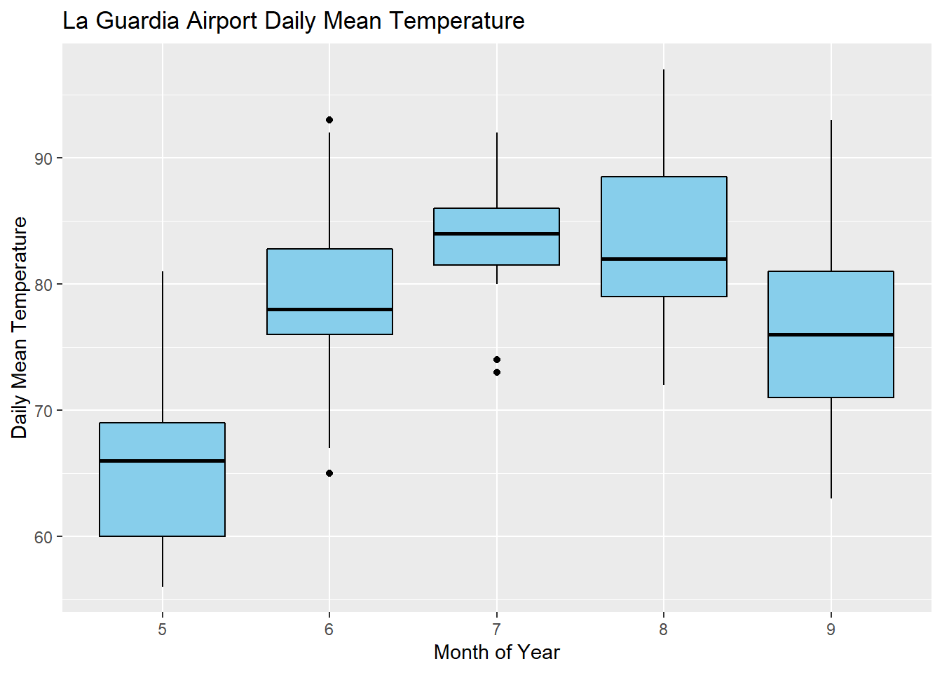
ggplot An R function “ggplot” used to create a framework for a graphic that will have elements added to it with the + sign. ( Parenthesis to begin the function. Must touch the last letter of the function. airquality “airquality” is a dataset. Type “View(airquality)” in R to see it. , The comma allows us to specify optional commands to the function. The space after the comma is not required. It just looks nice. aes( The aes or “aesthetics” function allows you to tell the ggplot how it should appear. This includes things like what the x-axis or y-axis should become. x=factor(Month), “x=” declares which variable will become the x-axis of the graphic. Since Month is “numeric” we must use “factor(Month)” instead of just “Month”. y=Temp “y=” declares which variable will become the y-axis of the graphic. )
Closing parenthesis for the aes function. )
Closing parenthesis for the ggplot function. + The addition symbol + is used to add further elements to the ggplot.
geom_boxplot( The “geom_histogram()” function causes the ggplot to become a histogram. There are many other “geom_” functions that could be used. fill=“skyblue”, The “fill” command controls the color of the insides of each box. color=“black” The “color” command controls the color of the edges of each box. )
Closing parenthesis for the geom_boxplot function. + The addition symbol + is used to add further elements to the ggplot.
labs( The “labs” function is used to add labels to the plot, like a main title, x-label and y-label. title=“La Guardia Airport Daily Mean Temperature”, The “title=” command allows you to control the main title at the top of the graphic. x=“Month of the Year”, The “x=” command allows you to control the x-label of the graphic. y=“Daily Mean Temperature” The “y=” command allows you to control the y-label of the graphic. )
Closing parenthesis for the labs function.
Press Enter to run the code. … Click to View Output.
Gallery
See what past students have done…
To make a histogram in plotly first load
library(plotly)
Then, use the function:
plot_ly(dataName, y=~columnNameY, x=~columnNameX, type="box")
dataNameis the name of a data setcolumnNameYmust be the name of a column of quantitative data. R refers to this as a “numeric vector.” This will become the y-axis of the plot.columnNameXmust be the name of a column of qualitative data. This will provide the “groups” forming each individual box in the boxplot.type="box"tells the plot_ly(…) function to create a boxplot.
Visit plotly.com/r/box-plots for more details.
Example Code
Hover your mouse over the example codes to learn more. Click on them to see what they create.
Basic Boxplot
plot_ly An R function “plot_ly” from library(plotly) used to create any plotly plot. ( Parenthesis to begin the function. Must touch the last letter of the function. airquality, “airquality” is a dataset. Type “View(airquality)” in R to see it. y= The y= allows us to declare which column of the data set will become the y-axis of the boxplot. In other words, the quantitative data we are interested in studying for each group. ~Temp, “Temp” is a quantitative variable (numeric vector) from the “airquality” dataset. The ~ is required before column names inside all plot_ly(…) commands. x= The x= allows us to declare which column of the data set will become the x-axis of the boxplot. In other words, the “groups” forming each separate box in the boxplot. ~as.factor(Month), since “Month” is a quantitative variable (numeric vector) from the “airquality” dataset we have to change it to a “factor” which forces R to treat it as a qualitative (groups) variable. The ~ is required before column names inside all plot_ly(…) commands. type=“box” This option tells the plot_ly(…) function what “type” of graph to make. In this case, a boxplot. )
Closing parenthesis for the plot_ly function.
Press Enter to run the code. … Click to View Output.
Change Color
plot_ly(airquality, y=~Temp, x=~as.factor(Month), type=“box”, This code was explained in the first example code. fillcolor=“skyblue”, this changes the fill color of the boxes in the boxplot to the color specified, in this case “skyblue.” line=list(color=“darkgray”, width=3), this “list(…)” of options that will be specified will effect the edges of the boxes in the boxplot. We are changing their color to “darkgray” and their width to 3 pixels wide. marker=list( this “list(…)” of options that will be specified will effect the outlying dots shown in the boxplots beyond the “fences” of each box. color = “orange”, this will change the color of the dots to orange. line = list(, this opens a list of options to specify for the “lines” around the “markers.” color = “red”, this will change the color of the lines around the outlier dots to red. width = 1 this will change the width of the lines around the outlier dots to 1 pixel. ) Functions always end with a closing parenthesis. ) Functions always end with a closing parenthesis. ) Functions always end with a closing parenthesis.
Press Enter to run the code. … Click to View Output.
Add Titles
plot_ly(airquality, y=~Temp, x=~as.factor(Month), type=“box”, fillcolor=“skyblue”, line=list(color=“darkgray”, width=3), marker = list(color=“orange”, line = list(color=“red”, width=1))) This code was explained in the above example code. %>% the pipe operator sends the completed plot_ly(…) code into the layout function.
layout( The layout(…) function is used for specifying details about the axes and their labels. title=“La Guardia Airport Daily Mean Temperatures” This declares a main title for the top of the graph. xaxis=list( This declares a list of options to be specified for the xaxis. The same can be done for the yaxis(…). title=“Month of the Year” This declares a title underneath the x-axis. ), Functions always end with a closing parenthesis. yaxis=list( This declares a list of options to be specified for the y-axis. title=“Temperature in Degrees F” This declares a title beside the y-axis. ) Functions always end with a closing parenthesis. ) Functions always end with a closing parenthesis.
Press Enter to run the code. … Click to View Output.
Understanding how a boxplot is created is the best way to understand what the boxplot shows.
How Boxplots are Made
- The five-number summary is computed.
- A box is drawn with one edge located at the first quartile and the opposite edge located at the third quartile.
- This box is then divided into two boxes by placing another line inside the box at the location of the median.
- The maximum value and minimum value are marked on the plot.
- Whiskers are drawn from the first quartile out towards the minimum and from the third quartile out towards the maximum.
- If the minimum or maximum is too far away, then the whisker is ended early.
- Any points beyond the line ending the whisker are marked on the plot as dots. This helps identify possible outliers in the data.
Scatterplot, with Means
Scatterplots of a catgorical variable on the x axis and quantitative variable on the y axis are sometimes called strip charts, or side-by-side strip charts. When sample sizes are not too big and there are not too many repeated value this type of chart is an excellent way to see the variability in the data without the abstraction of a boxplot. By plotting individual observations you also can see the size of the sample for each factor level. Including factor level means on the plot adds additional insight. The mean of each factor level is often connected with a line for visual impact.
To make a scatterplot use the function:
xyplot(y~x, data = mydata)
yis the quantitative response variable, i.e., “numeric vector.”xis the independent, explanatory variablemydatais the name of the dataset containingyandx.
This will return a scatterplot regardless of how your x variable is stored in R (numeric, character, factor). This function is flexible and with minimal effort can include averages or make an interaction plot. xyplot() is a part of the lattice package, which is loaded when the mosaic package is loaded.
Note: plot() from base R will also give a scatterplot, but only if the x variable is quantitative. If x is a character or factor variable the default is to return a boxplot plot.
Example Code
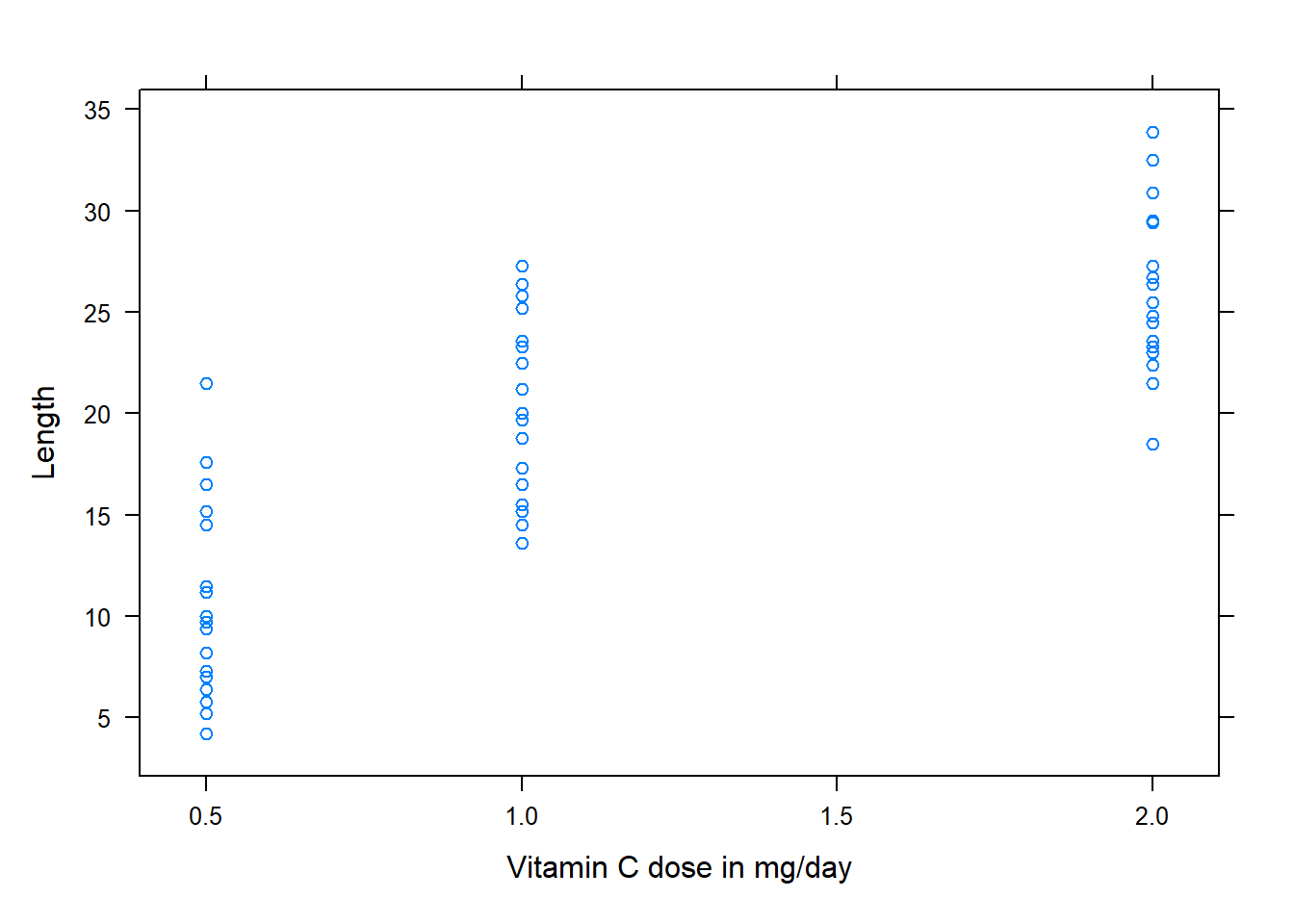
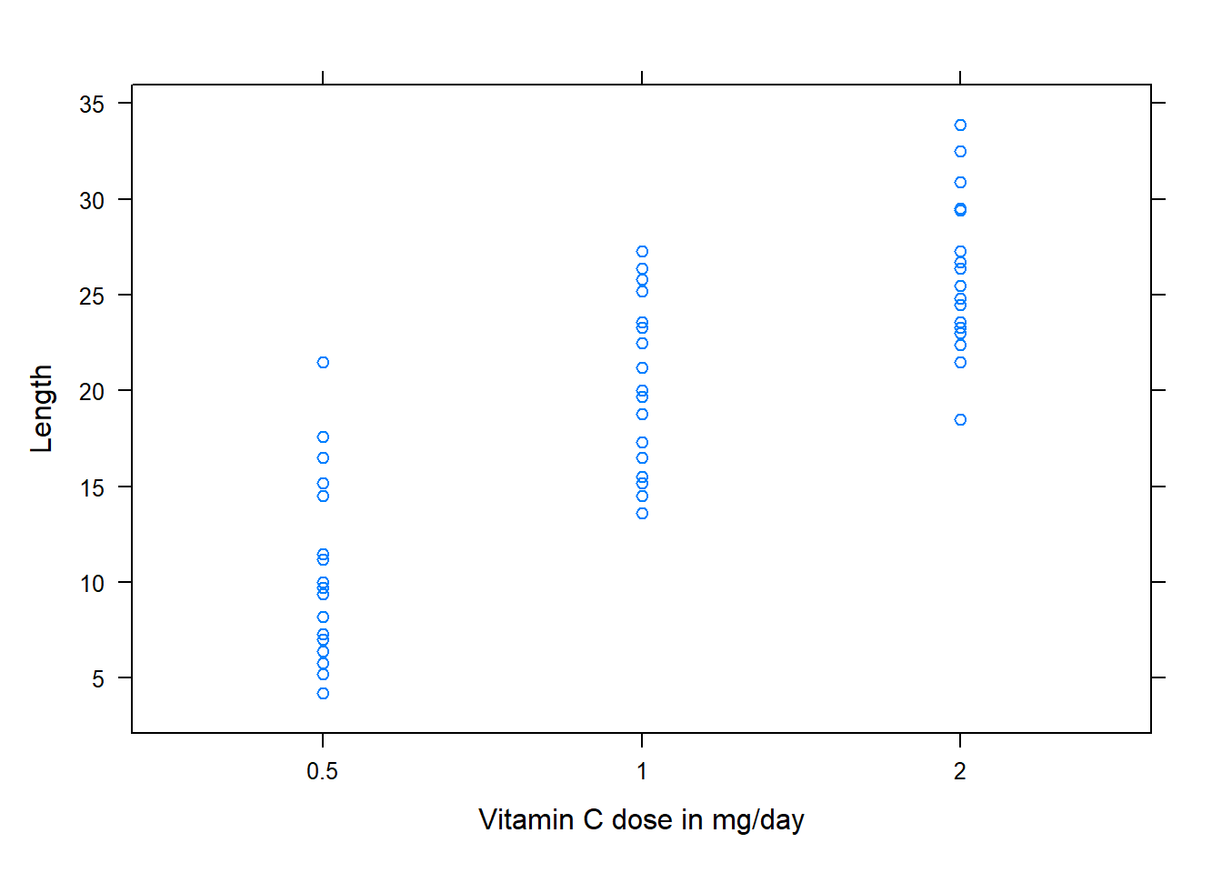
By reading the documentation for the dataset (visible when ?ToothGrowth is run in the console) we can see that our “x” variable, “dose”, is a numeric variable in R. Because of this the x-axis maintains the relative distance of doses on the x-axis.
xyplot An R function used to create a scatterplot. ( Parenthesis to begin the function. Must touch the last letter of the function. len “len” is a quantitative variable (numeric vector) from the “ToothGrowth” dataset that is being used as the response variable (y-axis) for this plot. ~ The ~ is used to tell R that you want a scatterplot with the quantitative variable “len” on the y-axis and the variable “dose” on the x-axis. dose “dose” is a quantitative variable (numeric vector) from the “ToothGrowth” dataset that is being used as the explanatory variable (x-axis) for this plot. ,
The “,” is required to start specifying additional commands for the function. data=ToothGrowth data= is used to tell R that the “len” and “dose” variables are located in the ToothGrowth dataset. Without this, R will not know where to find “len” and “dose”. Learn more about the dataset by entering ?ToothGrowth into the console. ,
The “,” is required to start specifying additional commands for the function. xlab = “Vitamin C dose in mg/day” xlab= allows you to specify an x-axis label. The units mg/day is explained in the dataset documentation, visible when ?ToothGrowth is run in the console. ,
The “,” is required to start specifying additional commands for the function. ylab = “Length” ylab= allows you to specify an y-axis label. ) Functions always end with a closing parenthesis.
Press Enter to run the code. … Click to View Output.
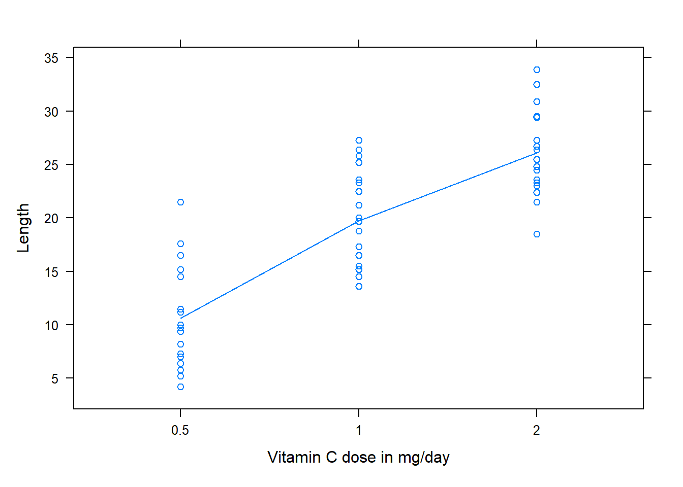
If you start with a numeric x variable, you may or may not want to convert it to a factor variable. Doing so will make each factor level, or category, equally spaced along the x-axis. It also “cleans up” the axis by removing additional tic-marks and axis values that aren’t needed. Compare the output of the previous example code with this example code. This example code converts our x variable of “dose” to a factor variable.
xyplot An R function used to create a scatterplot. ( Parenthesis to begin the function. Must touch the last letter of the function. len “len” is a quantitative variable (numeric vector) from the “ToothGrowth” dataset that is being used as the response variable (y-axis) for this plot. ~ The ~ is used to tell R that you want a scatterplot with the quantitative variable “len” on the y-axis and the variable “dose” on the x-axis. factor An R function to convert how data is stored in a variable. The variable input into this function will now be treated as a factor variable in this command ( Parenthesis to begin the function. Must touch the last letter of the function. dose “dose” is a quantitative variable (numeric vector) from the “ToothGrowth” dataset that is being used as the explanatory variable (x-axis) for this plot. Because it is an input to the factor function it will be treated as a factor variable ) Functions always end with a closing parenthesis. ,
The “,” is required to start specifying additional commands for the function. data=ToothGrowth data= is used to tell R that the “len” and “dose” variables are located in the ToothGrowth dataset. Without this, R will not know where to find “len” and “dose”. Learn more about the dataset by entering ?ToothGrowth into the console. ,
The “,” is required to start specifying additional commands for the function. xlab = “Vitamin C dose in mg/day” xlab= allows you to specify an x-axis label. The units mg/day is explained in the dataset documentation, visible when ?ToothGrowth is run in the console. ,
The “,” is required to start specifying additional commands for the function. ylab = “Length” ylab= allows you to specify an y-axis label. ) Functions always end with a closing parenthesis.
Press Enter to run the code. … Click to View Output.
To include the means on the plot and connect them with a line use this code
xyplot An R function used to create a scatterplot. ( Parenthesis to begin the function. Must touch the last letter of the function. len “len” is a quantitative variable (numeric vector) from the “ToothGrowth” dataset that is being used as the response variable (y-axis) for this plot. ~ The ~ is used to tell R that you want a scatterplot with the quantitative variable “len” on the y-axis and the variable “dose” on the x-axis. factor An R function to convert how data is stored in a variable. The variable input into this function will now be treated as a factor variable in this command ( Parenthesis to begin the function. Must touch the last letter of the function. dose “dose” is a quantitative variable (numeric vector) from the “ToothGrowth” dataset that is being used as the explanatory variable (x-axis) for this plot. Because it is an input to the factor function it will be treated as a factor variable ) Functions always end with a closing parenthesis. ,
The “,” is required to start specifying additional commands for the function. data=ToothGrowth data= is used to tell R that the “len” and “dose” variables are located in the ToothGrowth dataset. Without this, R will not know where to find “len” and “dose”. Learn more about the dataset by entering ?ToothGrowth into the console. ,
The “,” is required to start specifying additional commands for the function. xlab = “Vitamin C dose in mg/day” xlab= allows you to specify an x-axis label. The units mg/day is explained in the dataset documentation, visible when ?ToothGrowth is run in the console. ,
The “,” is required to start specifying additional commands for the function. ylab = “Length” ylab= allows you to specify an y-axis label. ,
The “,” is required to start specifying additional commands for the function. type =
The type argument allows you to add different types of lines to the plot. Run ?panel.xyplot() to read more about values for this argument c( Combines the following values into one vector. This allows me to pass multiple values as one input to “type =”. Useful for if I want to plot something in addition to the default of plotting points. ‘p’
This requests the points to be plotted. It is the default value. Other acceptable values for the type argument can be seen by running ?panel.xyplot() in the console. ,
The “,” is required to start specifying additional commands for the function. ‘a’ This requests the average for each factor level to be connected with a line. Other acceptable values for the type argument can be seen by running ?panel.xyplot() in the console. ) Functions always end with a closing parenthesis.
Press Enter to run the code. … Click to View Output.
To make a scatterplot in R using the ggplot approach, first ensure
library(ggplot2)
is loaded. Then,
ggplot(data, aes(x=groupsColumn, y=dataColumn) +
geom_point()
datais the name of your dataset.groupsColumnis a column of data from your dataset that is qualitative and represents the groups that should each have a boxplot.dataColumnis a column of data from your dataset that is quantitative.- The aesthetic helper function
aes(x= , y=)is how you tell the gpplot to make the x-axis have the values in yourgroupsColumnof data, the y-axis become yourdataColumn. Note ifgroupsColumnis not a factor, usefactor(groupsColumn)instead. - The geometry helper function
geom_point()causes the ggplot to become a scatterplot; or in other words to draw points to represent data.
Example Code
ggplot An R function “ggplot” used to create a framework for a graphic that will have elements added to it with the + sign. ( Parenthesis to begin the function. Must touch the last letter of the function. ToothGrowth “ToothGrowth” is a dataset. Type “View(ToothGrowth)” in R to see it. , The comma allows us to specify optional commands to the function. The space after the comma is not required. It just looks nice. aes( The aes or “aesthetics” function allows you to tell the ggplot how it should appear. This includes things like what the x-axis or y-axis should become. x=dose, “x=” declares which variable will become the x-axis of the graphic. y=len “y=” declares which variable will become the y-axis of the graphic. )
Closing parenthesis for the aes function. )
Closing parenthesis for the ggplot function. + The addition symbol + is used to add further elements to the ggplot.
geom_boxplot( The “geom_point()” function causes the ggplot to draw data as points, thus it become a scatterplot. There are many other “geom_” functions that could be used. color=“blue” The “color” command controls the color of the points. It can be confusing to know when to use “color” vs. “fill”. )
Closing parenthesis for the geom_boxplot function.
Press Enter to run the code. … Click to View Output.
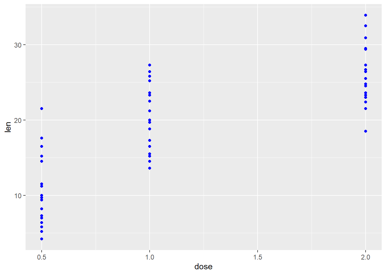
If you start with a numeric x variable, you may or may not want to convert it to a factor variable. You do this by using ‘factor(x)’ instead of just ‘x’ as shown below. Doing so will make each factor level, or category, equally spaced along the x-axis. It also “cleans up” the axis by removing additional tic-marks and axis values that aren’t needed.
ggplot(ToothGrowth, aes(x = factor(dose), y = len)) + geom_point(color = "blue")
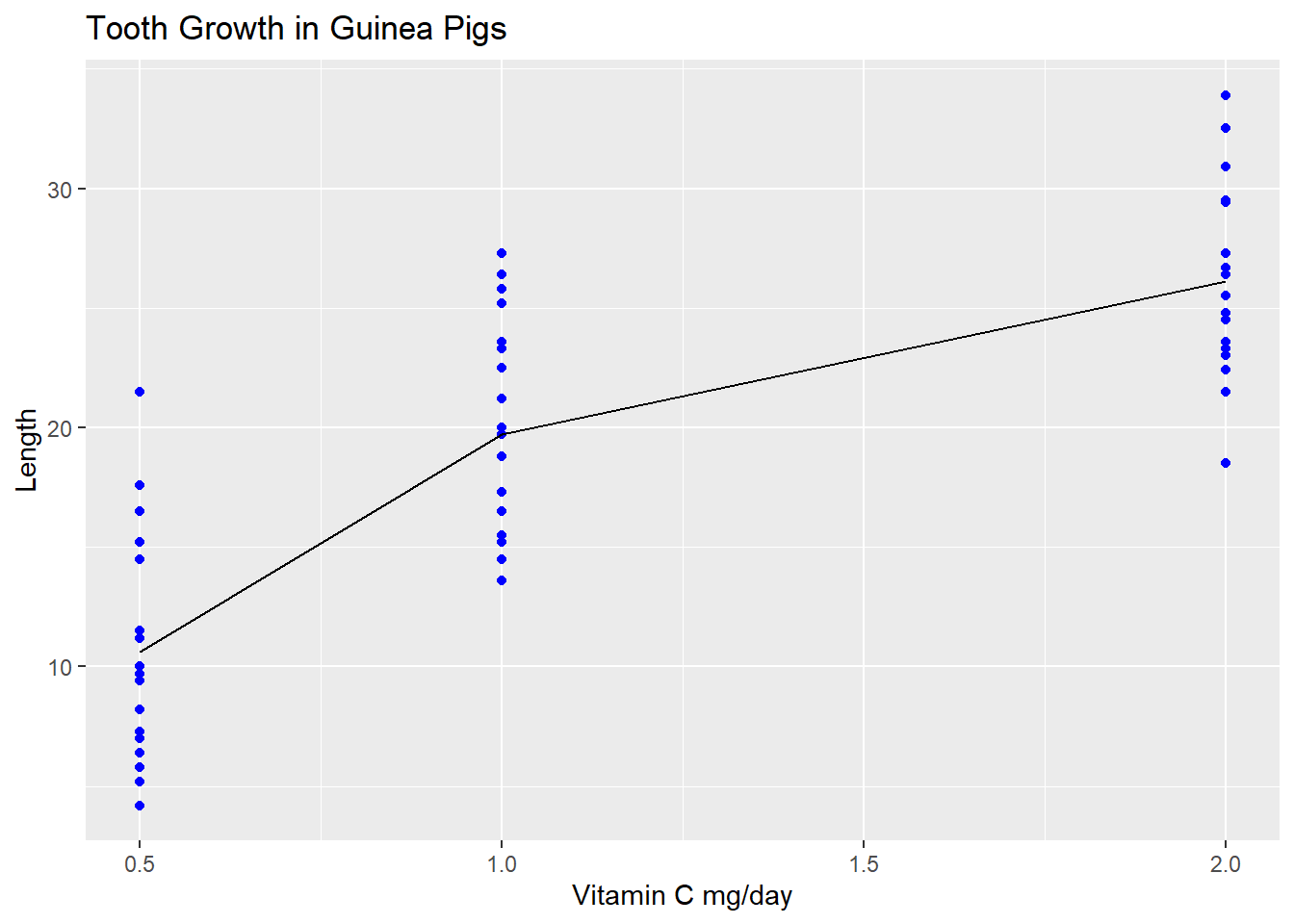
Adding averages to the plot and connecting them with a line requires a little more effort and is demonstrated in the code below. I also add some more descriptive labels to the chart.
Note the use of stat_summary to indicate I want to add a layer that plots a numerical summary, not the original data. Some geoms have stat summaries built in to them (like geom_bar or geom_boxplot), but in our case we have to define the summary.
In the stat_summary I provide additional arguments to the aesthetics helper function. Defining the aesthetics in ggplot() is like a global definition, all additional layers inherit those aesthetic mappings. Defining them in a geom_* or a stats_* allows you to add to or override what was defined in ggplot() for that layer only. The group aesthetic is required in order to use a line geometry. In this case, group could just as easily have been defined in ggplot(aes()).
ggplot An R function “ggplot” used to create a framework for a graphic that will have elements added to it with the + sign. ( Parenthesis to begin the function. Must touch the last letter of the function. ToothGrowth “ToothGrowth” is a dataset. Type “View(ToothGrowth)” in R to see it. , The comma allows us to specify optional commands to the function. The space after the comma is not required. It just looks nice. aes( The aes or “aesthetics” function allows you to tell the ggplot how it should appear. This includes things like what the x-axis or y-axis should become. x=dose, “x=” declares which variable will become the x-axis of the graphic. y=len “y=” declares which variable will become the y-axis of the graphic. )
Closing parenthesis for the aes function. )
Closing parenthesis for the ggplot function. + The addition symbol + is used to add further elements to the ggplot.
geom_point( The “geom_point()” function causes the ggplot to draw data as points, thus it become a scatterplot. There are many other “geom_” functions that could be used. color=“blue” The “color” command controls the color of the points. It can be confusing to know when to use “color” vs. “fill”. )
Closing parenthesis for the geom_boxplot function. + The addition symbol + is used to add further elements to the ggplot.
stat_summary( This function will calculate a statistical summary to be plotted on the chart fun = mean, fun is short for function. The summary function I want to apply to my y variable is “mean”. geom = “line”, The “geom=” argument is used to tell what kind of geometry should be drawn to represent the means. Here we are asking for the means to be connected with a line. aes( The aes or “aesthetics” function allows you to tell ggplot what variables should be mapped to what visual aspects of the chart; including what the x-axis or y-axis should become. Including it her means the aesthetic will only be applied to this layer. group = 1 indicates which variable should be grouped by when drawing multiple lines (one line for each factor level). We write the number 1 to indicate there is just 1 group; we are not further splitting the data. )
Closing parenthesis for the geom_boxplot function. )
Closing parenthesis for the geom_boxplot function. + The addition symbol + is used to add further elements to the ggplot.
labs( Function to edit labels of the plot x = “Vitamin C mg/day”, Edit the x-axis label y = “Length”, Edit the y-axis label title = “Tooth Growth in Guinea Pigs” Edit the chart title )
Closing parenthesis for the geom_boxplot function.
Press Enter to run the code. … Click to View Output.
Under construction.
Interaction Plot
These plots are used to visualize two categorical factors (mapped to the x-axis and the line color/type) and a quantitative response variable (displayed on the y-axis). A point for each factor level combination mean is plotted, and then points are connected with lines to aid the visual interpretation of the plot. Because they show two factors, they are ideal for two-way ANOVA.
Interaction plots are a great way to see factor effects. In particular, they can be helpful in understanding the nature of an interaction factor, or detecting the lack thereof. If the line segments in the plot are all (nearly) parallel, this is indicative that no interaction effect exists between the two factors. The more non-parallel the line segments, the more likely a significant interaction effect is present.
A formal hypothesis test should be conducted to determine the significance of an interaction term, since sometimes the hypothesis test result can run counter to what a quick visual inspection might suggest. When a significant interaction is present, an interaction plot can be a critical part of understanding the nature of the interaction.
If there are three factors in a study, multiple interaction plots can be used (one at each value of the third factor) to explore the nature of two-way and three-way interactions. This approach can be extended for analyses involving more than 3 factors. However, interactions involving more than 3 variables are rare in practice. Therefore, if more than 3 factors are present in an analysis, interaction plots are not usually used as an exploratory tool. Instead, statistical tests are used to find significant interactions, and then interaction plots are used to describe the nature of those interactions.
To make a scatterplot use the function:
interaction.plot(mydata$factor_x, mydata$factor_line, mydata$response)
mydatais the name of the dataset containing the factors and response.factor_xis factor (or string) variable that will be plotted on the x-axisfactor_lineis factor (or string) variable that will have different colored/types of lines on the plotyis the quantitative response variable, i.e., “numeric vector.”
Note, unlike the other plotting we have done so far, there is no data = argument. Each variable must be specified using the $ notation if it exists inside a dataset. There are many additional arguments to specify colors, line types, legend formatting, etc.
Example Code
By reading the documentation for the dataset (visible when ?ToothGrowth is run in the console) we can see that our “x” variable, “dose”, is a numeric variable in R. Because of this we convert it to a factor variable in the plot command with the factor() command. This changes the nature of dose only within that particular plot, not within the dataset generally.
interaction.plot( An R function used to create an interaction plot factor( A function to make a variable categorical. ToothGrowth Name of the dataset that contains the dose variable. $ The $ allows you to refer to a variable in a dataset by name dose “dose” is a quantitative variable (numeric vector) from the “ToothGrowth” dataset that is being used as the explanatory variable (x-axis) for this plot. ) parenthesis to close the factor function , separate arguments to a function with commas
ToothGrowth Name of the dataset that contains the variables. $ The $ allows you to refer to a variable in a dataset by name supp a different line will be drawn for each value of supp , separate arguments to a function with commas ToothGrowth Name of the dataset that contains the dose variable. $ The $ allows you to refer to a variable in a dataset by name len name of the response variable in ToothGrowth , separate arguments to a function with commas
ylab= argument to specify y-axis label “Tooth length” Label for the y-axis must be put in quotes , separate arguments to a function with commas xlab= argument to specify x-axis label “Dose (vitamin C mg/day)” Label for the x-axis must be put in quotes , separate arguments to a function with commas
trace.label= argument to specify the trace label which will appear in the legend “Delivery Method” Label for the trace factor must be put in quotes , separate arguments to a function with commas
main= argument to specify the chart title “Tooth Growth in Guinea Pigs” Chart title must be put in quotes ) parenthesis to close the interaction.plot function
Press Enter to run the code. … Toggle Output.
Because not all the line segments are parallel, you may begin to suspect an interaction is present. To determine if the interaction is significant you can do a hypothesis test for.
Note, an easy/slick method for changing the legend position does not (currently) exist for interaction.plot(), though some hacked solutions can be used.
You can adjust things like line color, plotting points, etc. as shown in this next example.
interaction.plot( An R function used to create an interaction plot factor( A function to make a variable categorical. ToothGrowth Name of the dataset that contains the dose variable. $ The $ allows you to refer to a variable in a dataset by name dose “dose” is a quantitative variable (numeric vector) from the “ToothGrowth” dataset that is being used as the explanatory variable (x-axis) for this plot. ) parenthesis to close the factor function , separate arguments to a function with commas
ToothGrowth Name of the dataset that contains the variables. $ The $ allows you to refer to a variable in a dataset by name supp a different line will be drawn for each value of supp , separate arguments to a function with commas ToothGrowth Name of the dataset that contains the dose variable. $ The $ allows you to refer to a variable in a dataset by name len name of the response variable in ToothGrowth , separate arguments to a function with commas
ylab= argument to specify y-axis label “Tooth length” Label for the y-axis must be put in quotes , separate arguments to a function with commas xlab= argument to specify x-axis label “Dose (vitamin C mg/day)” Label for the x-axis must be put in quotes , separate arguments to a function with commas
trace.label= argument to specify the trace label which will appear in the legend “Delivery Method” Label for the trace factor must be put in quotes , separate arguments to a function with commas
main= argument to specify the chart title “Tooth Growth in Guinea Pigs” Chart title must be put in quotes , separate arguments to a function with commas
type=
argument to specify whether lines, points, or both should be plotted ‘b’ b, in quotes, indicates lines and points should be drawn on the plot , separate arguments to a function with commas pch=
argument to specify shape of the points 16 an integer value from 0 to 25 is expected. , separate arguments to a function with commas lty=
argument to specify line type. 1 1 for a solid line. Line type can be specified with an integer from 0 - 6, or text “solid”. , separate arguments to a function with commas
col=
argument to specify colors to be used for different values of the trace factor, supp c( concatenate function used to create a vector “darkblue” color to be used for first value of supp. Can be given in name form, integer, or rgb specs ,
separate values in a vector with a comma “deeppink3” color to be used for first value of supp. Can be given in name form, integer, or rgb specs ) end the vector with a parenthesis ) parenthesis to close the interaction.plot function
Press Enter to run the code. … Toggle Output.
To make an interaction plot in R using the ggplot approach, first ensure
library(ggplot2)
is loaded. Then,
ggplot(data, aes(x=factor1, color=factor2, group=factor2, y=response) +
stat_summary(fun = mean, geom = "line")
datais the name of your dataset.factor1is a column of data from your dataset that is a qualitative factor whose values you want to plot along the x-axis.factor2is a column of data from your dataset that is a qualitative factor. You want to draw a different colored line for each value of this factor.responseis the name of the quantitative response variable in your dataset.- The aesthetic helper function
aes()is how you tell R which variables you want mapped to which aesthetics (i.e. visual attributes) of your chart. This is actually the input to themapping=argument, but for concisenessmapping=is usually not typed out.- The
groupaesthetic indicates that any summary statistics that are calculated should be calculated separately for each value offactor2. It’s similar to agroup_by()statement. - Because
factor2is also the value forcolor, each value offactor2will be represented with a different color.
- The
stat_summary()does two things:- calculates a summary statistic. In this case we tell it to calculate the mean for each factor level combination with the
fun = meancode.funstands for “function”. - indicates we want to connect the means with a line.
geomstands for our desired geometry, in this case lines.
- calculates a summary statistic. In this case we tell it to calculate the mean for each factor level combination with the
Note if one of your factor variables is not coded as a factor (e.g. it is numeric), use factor() to convert it to the correct data type.
Here is a basic interaction plot using ggplot2 package. In a later example we will add additional formatting, labels, etc.
ggplot An R function “ggplot” used to create a framework for a graphic that will have elements added to it with the + sign. ( Parenthesis to begin the function. Must touch the last letter of the function. ToothGrowth “ToothGrowth” is a dataset. Type “View(ToothGrowth)” in R to see it. , The comma allows us to specify optional commands to the function. The space after the comma is not required. It just looks nice.
aes( The aes or “aesthetics” function is actually an input to the mapping= argument. It allows you to which variable is mapped to aspects of the chart. This includes things like what the x-axis or y-axis should become. x= “x=” declares which variable will become the x-axis of the graphic. factor(dose), factor converts dose, a numeric variable, into a categorical variable color=supp, declares that each value of supp will be represented with a different color group=supp, declares that each value of supp must be drawn separately. We specify the geometry to be drawn later with geom. y=len declares which variable will become the y-axis of the graphic. )) close the aes and ggplot functions with a parenthesis + The addition symbol is used to add/tweak chart elements.
stat_summary( this adds a layer to the chart that will show summary statistics fun = mean, “mean” is the function used to get a summary statistic geom=“line” The geometry used on the chart will be lines ) parenthesis to close the stat_summary function
Press Enter to run the code. … Toggle Output.
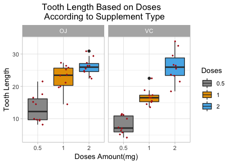
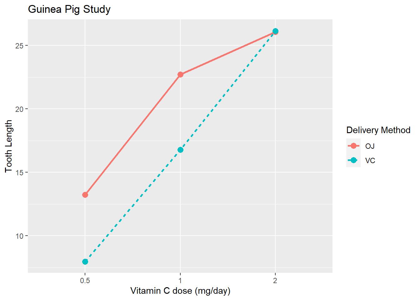
Add different line types, points for each factor level mean, and improved labelling
Look at the code below and notice that with the exception of the group aesthetic, a label is applied to each aesthetic mapping. linetype and color have the same label and R is smart enough to therefore combine the legend for these two aesthetic mappings into one legend. If the labels are not identical, each aesthetic will have a unique legend.
ggplot An R function “ggplot” used to create a framework for a graphic that will have elements added to it with the + sign. ( Parenthesis to begin the function. Must touch the last letter of the function. ToothGrowth “ToothGrowth” is a dataset. Type “View(ToothGrowth)” in R to see it. , The comma allows us to specify optional commands to the function. The space after the comma is not required. It just looks nice.
aes( The aes or “aesthetics” function is actually an input to the mapping= argument. It allows you to which variable is mapped to aspects of the chart. This includes things like what the x-axis or y-axis should become. x= “x=” declares which variable will become the x-axis of the graphic. factor(dose), factor converts dose, a numeric variable, into a categorical variable color=supp, declares that each value of supp will be represented with a different color group=supp, declares that each value of supp must be drawn separately. We specify the geometry to be drawn later with geom. linetype=supp, declares that each value of supp will be represented with a different line type y=len declares which variable will become the y-axis of the graphic. )) close the aes and ggplot functions with a parenthesis + The addition symbol is used to add/tweak chart elements.
stat_summary( this adds a layer to the chart that will show summary statistics fun=mean, “mean” is the function used to get a summary statistic geom=“line”, The geometry used on the chart will be lines size=1 Change the line thickness ) parenthesis to close the stat_summary function + The addition symbol is used to add/tweak chart elements.
stat_summary( this adds a layer to the chart that will show summary statistics fun=mean, “mean” is the function used to get a summary statistic geom=“point”, The geometry used on the chart will be points size=3 Change the size of the points ) parenthesis to close the stat_summary function + The addition symbol is used to add/tweak chart elements.
labs( use this layer to change chart labels x=“Vitamin C dose (mg/day)”, Put the x-axis label in quotes
y=“Tooth Length”, Put the x-axis label in quotes
title=“Guinea Pig Study”, Put the chart title in quotes
color=“Delivery Method”, Put the color label in quotes
linetype=“Delivery Method” Put the linetype label in quotes ) Close labs with a parenthesis
Press Enter to run the code. … Toggle Output.
Under construction.