28 U.S. Cities
Readings
- Using SF package with tidyverse
- Chapter 6.2 and 6.4 ggplot2: Elegant Graphics for Data Analysis
- To see all the methods for an simple features column, run
methods(class = 'sfc')
- To see all the methods for an simple features column, run
- USA Boundaries
USAboundariesandUSAboundariesDataare finicky to install correctly. Consider using this code to install the package:install.packages(“USAboundaries”, repos = “https://ropensci.r-universe.dev”, type = “source”)install.packages(“USAboundariesData”, repos = “https://ropensci.r-universe.dev”, type = “source”)
- (optional/extra) SF R package Read through the section titled, “sfc: simple feature geometry list-column.”
Guided Instruction
This file contains explanations and “fill-in-the-blank” coding exercises (along with solutions at the bottom of the file) to help you prepare for the task. It assumes you have done the reading.
Up to this point, we have dealt with data that fits into the tidy format without much effort. Spatial data has many complicating factors that have made handling spatial data in R complicated.
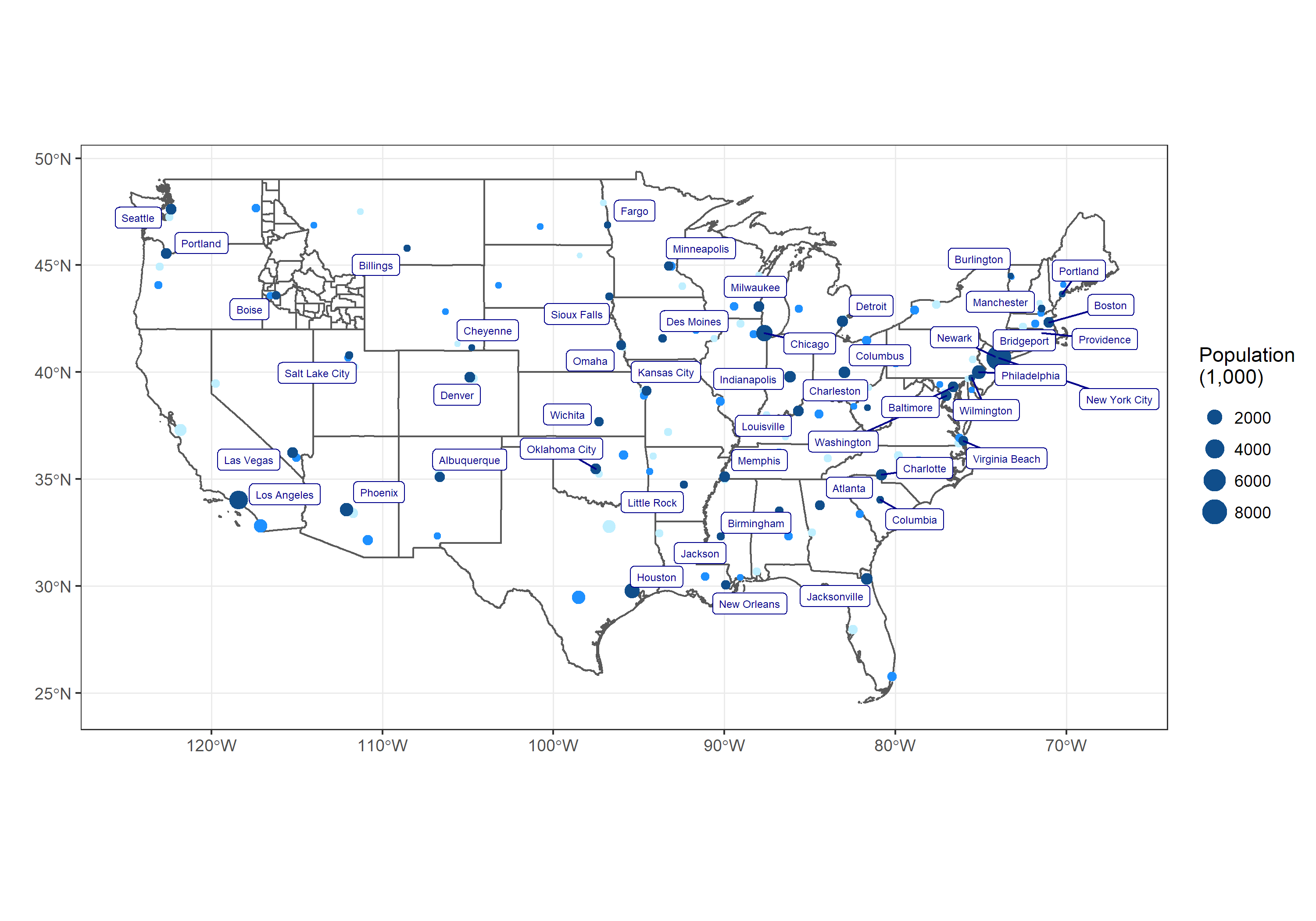
We will use library(USAboundaries) and library(sf) to make a map of the US and show the top three largest cities in each state. Specifically, you will use library(ggplot2) and the function geom_sf() to recreate the provided image.
We want to create a map of the United States that plots the three largest cities (according to population) in each state - colored according to their rank. We also want to draw the shapes of the Idaho counties on the same plot.
- Create a map of the 48 continguous United States where each state is outlined and where the counties of Idaho are outlined. Here are some hints to keep in mind for this task
- From
library(USAboundaries)useus_states()andus_counties()to get the state and county shape geometries - Remember that R has some helpful variables called
state.nameandstate.abb
- From
- Create a dataset that only contains rows for the top 3 cities in each of the 48 continuous states and has a column that contains their ranking (either a 1, 2, or 3).
- From
library(USAboundaries)useus_cities()to get a starting dataset and then do your wrangling from there.
- From
- Use the wrangled data to fully recreate this image (right click image to view in new window if it is too small to see well):

- The labels don’t have to be in exactly the same spot, just be sure that they aren’t covering up each other or the data.
- Notice that the color of the points does not map to population size, rather it indicates the city’s population rank (1st, 2nd or 3rd) within the state.
- Note that
fill = NAingeom_sf()will not fill the polygons with a grey color, rather it makes the fill transparent. - To add the labels to the image consider using
library(ggrepel). - The labels may not look correct until you save the map as a larger image.
- Save your chart as a .png image. Try using ggsave() with width = 15 and height = 10. What happens if you change the width and height?
- Render the
.qmd. Push the.png,.qmd,.md, and.htmlfiles to your GitHub repository.
Submit
In I-learn submit a link to the .md file on GitHub.