6 Gapminder Part 2
Reading
This may be the most important reading of the semester since we will use these transformation skills extensively the rest of the semester.
Guided Instruction
Read and complete the exercises in the .qmd file (you may wish to Render the file first for easier reading): data wrangling with dplyr
Hans Rosling is one of the most popular data scientists on the web. His original TED talk, The best stats you’ve ever seen set a new bar for data visualization.
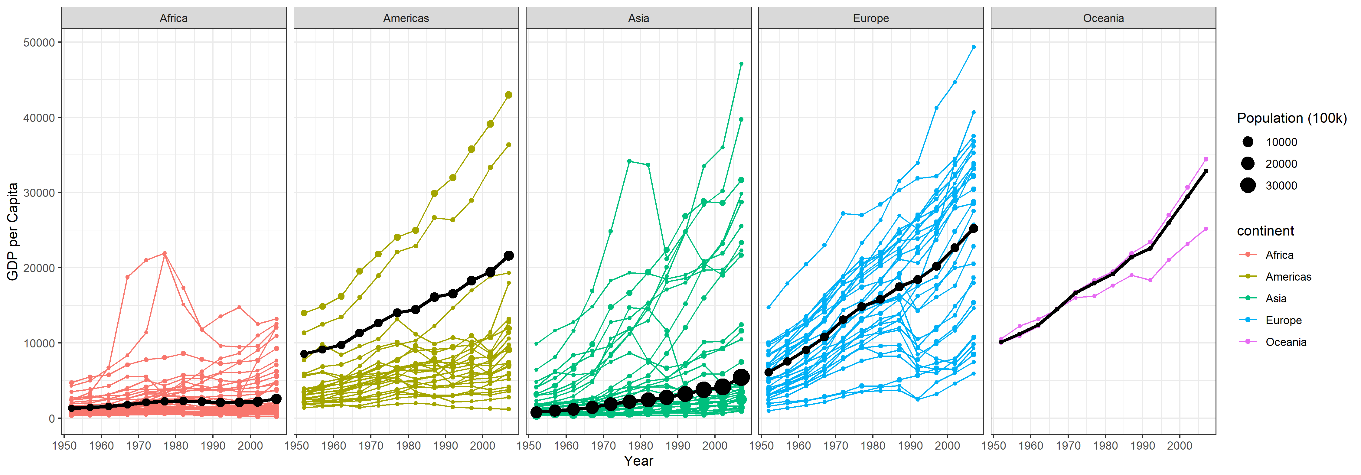
- Look at GDP over time. Recreate the graphic shown below using gapminder dataset from
library(gapminder)(get them to match as closely as you can).- Remove Kuwait from the data.
- Use
library(tidyverse)to load ggplot2 and dplyr, and use theme_bw() to duplicate basic plot formatting. - Build a weighted average data set using
weighted.mean()and GDP withsummarise()andgroup_by(). - You will need to use the weighted average dataset you create in the previous step to make the black lines and dots that show the continent weighted average.
- Build an
.qmdfile to complete this task. - Render your
.qmd, then push all the files created in the rendering process into your GitHub repository.

- Render the updated
.qmdfile. Push all the files created in the rendering process into your GitHub repository.
Submit
In I-learn submit a link to the .md file on GitHub.