3 Combining Data
The tasks in this unit will help prepare you to do the following:
- Organize your data into tidy data, in particular utilizing
tidyr’s pivot, separate, and/or unite commands. - Load data from a variety of formats, utilizing tempfiles as appropriate.
- Combine data tables by binding and/or joining, as appropriate.
The case studies, which appears at the end of this unit, give you an opportunity to demonstrate mastery of the objectives above.
3.1 Task: Tidy Data Reading
- Read R4DS: Tidy Data. As you read, do at least two the practice exercises from each of section. Get as far as you can in one hour. You are welcome to perform your computations in a script (.R) or markdown (.Rmd) file.
- When you are done, push your work to your GitHub repo. Then pick at least two exercises you would like to discuss (perhaps ones that were very helpful, or very difficult). Be prepared to share them with your team.
3.2 Task: Tidy Stock Data
In 1973 Princeton University professor Burton Malkiel said,
A blindfolded monkey throwing darts at a newspaper’s financial pages could select a portfolio that would do just as well as one carefully selected by experts.
In 1990 the Wall Street Journal took Burton up on his challenge. They ran this challenge until 2002 and pitted random dart throwing selections to expert picks.
We have access to stock return data through 1998. Open the dataset and get familiar with it. The “PROS” rows contain returns that professional investors were able to achieve at that date. The “DARTS” rows contain returns of stocks that were selected by monkeys randomly throwing darts. The “DJIA” are returns for stocks in the Dow Jones Industrial Average. The Dow Jones Industrial Average is a group of 30 stocks for large companies with stable earnings. This “index” of stocks is one of the oldest, most closely watched indices in the world and is designed to serve as a proxy, or indicator, of the United States economy in general. (Learn about about “the Dow”.)
We want to look at the returns for each six-month period of the year in which the returns were reported. Your plot should highlight the tighter spread of the DJIA as compared to the other two selection methods (DARTS and PROS). We also need to tidy the data in order to display a table of the DJIA returns with months on the rows and years in the columns (i.e. pivot wider on the data).
You may also find these optional reading links useful as you complete the tasks below:
- R4DS: Writing/Saving Data
- .rds vs. .Rdata (By the way, contrary to what the article suggests, I don’t believe saving your workspace is a good idea unless you think you’ll need it. It just slows down your computer. That’s the point of a script or markdown file, all the code is already saved so you can reproduce the workspace if necessary.)
-
The code below uses the appropriate functions in
library(readr)to read in the.rdsfile found on GitHub. Note in particular that the “#raw=true” line on the URL is needed to actually access the raw data from GitHub. You will need to install and load thereadrpackage before running this line.read_rds("https://github.com/byuistats/data/blob/master/Dart_Expert_Dow_6month_anova/Dart_Expert_Dow_6month_anova.RDS?raw=true") Create a time series plot that shows the six-month returns (y-axis) across time (x-axis) for PROS, DARTS, and DJIA.
-
Now we need to “tidy” the data. Use the contestant_period column to create new month_end and year_end columns. (Try using separate() and/or extract() from
tidyr.)- Bonus: Try saving your data as a
.rdsobject.
- Bonus: Try saving your data as a
Using the new columns created above, write code that outputs a tibble of the DJIA returns that matches (as closely as possible) the table shown below (aka, “pivot_wider” the data).
Knit your document, keeping the
.mdfile, and push your work to GitHub. Come ready to share with your team.
| Month | 1990 | 1991 | 1992 | 1993 | 1994 | 1995 | 1996 | 1997 | 1998 |
|---|---|---|---|---|---|---|---|---|---|
| January | - | -0.8 | 6.5 | -0.8 | 11.2 | 1.8 | 15 | 19.6 | -0.3 |
| February | - | 11 | 8.6 | 2.5 | 5.5 | 3.2 | 15.6 | 20.1 | 10.7 |
| March | - | 15.8 | 7.2 | 9 | 1.6 | 7.3 | 18.4 | 9.6 | 7.6 |
| April | - | 16.2 | 10.6 | 5.8 | 0.5 | 12.8 | 14.8 | 15.3 | 22.5 |
| May | - | 17.3 | 17.6 | 6.7 | 1.3 | 19.5 | 9 | 13.3 | 10.6 |
| June | 2.5 | 17.7 | 3.6 | 7.7 | -6.2 | 16 | 10.2 | 16.2 | 15 |
| July | 11.5 | 7.6 | 4.2 | 3.7 | -5.3 | 19.6 | 1.3 | 20.8 | 7.1 |
| August | -2.3 | 4.4 | -0.3 | 7.3 | 1.5 | 15.3 | 0.6 | 8.3 | -13.1 |
| September | -9.2 | 3.4 | -0.1 | 5.2 | 4.4 | 14 | 5.8 | 20.2 | -11.8 |
| October | -8.5 | 4.4 | -5 | 5.7 | 6.9 | 8.2 | 7.2 | 3 | - |
| November | -12.8 | -3.3 | -2.8 | 4.9 | -0.3 | 13.1 | 15.1 | 3.8 | - |
| December | -9.3 | 6.6 | 0.2 | 8 | 3.6 | 9.3 | 15.5 | -0.7 | - |
3.3 Task: Tidy Stock Data - Part 2
- Install the
tidyquantpackage and use thetq_get()function withget = "stock.prices"to get daily stock prices for Disney (DIS), Netflix, (NFLX), and Pinterest (PINS). Specify intq_get()that you want stock prices from January 1, 2020 to December 31, 2021. - We want to compare the opening and closing prices for each stock. Reformat the data as necessary to create a line chart that has: date on the x-axis, price on the y-axis, color representing “open” or “close”, and faceted by stock name.
- Next, load this data set that contains daily adjusted stock prices and trade volumes for three healthcare companies. Reformat it to have a
date,stock,volume, andadjustedcolumn. Here is an example of what the data should look like:
| date | stock | volume | adjusted |
|---|---|---|---|
| 1 2020-01-02 | UNH | 2543400 | 284. |
| 2 2020-01-02 | IQV | 1925900 | 156. |
| 3 2020-01-02 | LLY | 2204200 | 128. |
- Push your prep work to GitHub and be prepared to share your code with the class.
3.4 Task: Same data - Different formats
Data formats are varied and differ by domains and software. We could spend weeks on the different formats and file types that companies and governments use to store their data. We will practice with a few standard formats that are often used for storing data. In the future, you will most likely have to do some research to figure out other formats (but you can do it with R or Python). We now have a challenge to read in the five formats of the DOW data from a previous task and check that they are all identical using all.equal().
One final note, your R code should do all the work. That is your code should download the files and/or read directly from the web location of the file, rather than storing the files locally on your machine.
Scan these readings for help with the task. You don’t need to read every part of each reading, rather scan them.
- Chapter 11: R for Data Science - Data Import
- Chapter 6: R for Data Science - Scripts
- haven R Package
- readxl R Package
- openxlsx R package
- downloader R Package
- rio R package - A Swiss-Army Knife for Data I/O
-
Use the appropriate functions in
library(readr)andlibrary(haven)to read in four of the five files (skip the.xlsxfile) found on GitHub. Give each a different name, so you can compare them later. Note that you’ll need to append?raw=trueto the end of a URL on GitHub in order to access the raw data (rather than the html page hosting the data). As an example, the following code usesread_rds()to load the.rdsformat.my_url_rds <- "https://github.com/byuistats/data/blob/master/Dart_Expert_Dow_6month_anova/Dart_Expert_Dow_6month_anova.RDS?raw=true" my_data_rds <- read_rds(my_url_rds) -
For the excel file, you’ll need
library(readxl). Unfortunately, theread_xlsx()command requires the file to reside on your computer (so a web address doesn’t work). You can uselibrary(downloader)andlibrary(fs), along with thetempfile()command to circumvent this limitation. Run the following code, and come to class ready to explain what each line of code does.my_url_xlsx <- "https://github.com/byuistats/data/blob/master/Dart_Expert_Dow_6month_anova/Dart_Expert_Dow_6month_anova.xlsx?raw=true" temp <- tempfile() downloader::download(url = my_url_xlsx, destfile = temp, mode = "wb") my_data_xlsx <- readxl::read_xlsx(temp) fs::file_delete(temp) -
Now use
rio::import()to download all 5 files, including the excel file. You’ll have to install and load theriopackage first, of course. Note thatriouseslibrary(readr),library(haven),library(readxl), andlibrary(openxlsx)as appropriate. Here is an example that loads the.rdsformat (notice that there is no need forurl()with this version).my_url_rds <- "https://github.com/byuistats/data/blob/master/Dart_Expert_Dow_6month_anova/Dart_Expert_Dow_6month_anova.RDS?raw=true" my_data_rds_rio <- rio::import(my_url_rds) You’ve imported 10 files, all of which should represent the same data. Use the
all.equal()function to check that these files you have imported into R are in fact the same. Check the help function (use?all.equal) to see how to ignore differences in attributes.-
Use one of the files to make a visualization showing the performance of the Dart, DJIA, and Pro stock selections.
- Include a boxplot, the jittered returns, and the average return in your graphic.
3.5 Task: CPI Food Price Averages
This article tracks the Consumer Price Index average food price in the United Kingdom. The author notes a drop in food prices in February 2020 and attributes that to the Corona Virus pandemic. She has 1 chart in her article. The data used to create that chart can be found in these excel files, one file for each month of data:
- https://byuistats.github.io/M335/data/cpi_food_uk/cpiaverageprices201910.xlsx
- https://byuistats.github.io/M335/data/cpi_food_uk/cpiaverageprices201911.xlsx
- https://byuistats.github.io/M335/data/cpi_food_uk/cpiaverageprices201912.xlsx
- https://byuistats.github.io/M335/data/cpi_food_uk/cpiaverageprices202001.xlsx
- https://byuistats.github.io/M335/data/cpi_food_uk/cpiaverageprices202002.xlsx
- https://byuistats.github.io/M335/data/cpi_food_uk/cpiaverageprices202003.xlsx
The article is on Medium, which means if you frequent that site often then you won’t be able to see the image. Here is a screen capture of the image if the article won’t show. If this occurs for you, message your instructor in slack for the text of the article.
-
Load in the data sets.
- Start by manually opening the first file in Excel. You will see that there are no column names, and that the data starts on the 3rd row. As such, you’ll need to use the
col_namesandskipoptions to load the data. Here’s an example of how to load the first data set.
url1910 <- "https://byuistats.github.io/M335/data/cpi_food_uk/cpiaverageprices201910.xlsx"
d1910 <- import(url1910, skip = 2, col_names = c("item_num","name","price"))
d1910 %>% glimpse()
Load the 5 remaining data sets.
- Start by manually opening the first file in Excel. You will see that there are no column names, and that the data starts on the 3rd row. As such, you’ll need to use the
-
Let’s wrangle the data to prepare to build the chart. Here are some tips.
- Use
select()to make sure each data set has the same columns (with same column names) - Use
mutate()to add a column for the date. The functionas.Date()will format things as a date. - Use
rbind()to combine the data sets together, stacking them on top of each other. - At this point you need the mean for each date, so use your skills from the previous unit to get this.
- Use
-
Recreate the chart found in the web article (which hopefully loads below).
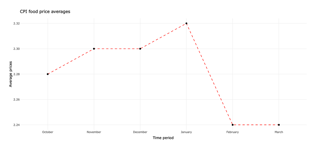
Some of the food items used to calculate the CPI changed starting in February 2020: some were removed and others were added. One could argue that the dip in the CPI was due to the change in items rather than a result of the Corona Virus. With any time remaining, create 1 or 2 charts that investigate this hypothesis.
Upload your work to GitHub, being ready to share what you did via an
.mdfile in your class repository.
3.6 Task: Begin Case Study 3
Each case study throughout the semester will ask you to demonstrate what you’ve learned in the context of an open ended case study. The individual prep activity will always include a “being” reading which will lead to an in class discussion.
Complete the Being Reading section of Case Study 3. This will require that you review a research paper and come to class with two or three things to share.
This case study is unique because it involves many datasets stored in different formats. Pick at least two datasets in different formats and try loading them into R. Explore the data, and come to class with questions about column name definitions or variable distributions.
This case study has you visualize how male height changes across time. On paper, create a rough sketch of a chart that compares height and time. List the aesthetics (x, y, color, group, label, etc.), the geometries, any faceting, etc., that you want to appear in your visualization. Then construct on paper an outline of the table of data that you’ll need to create said visualization. You do not need to actually perform any computations in R, rather create rough hand sketches of the visualization and table that you can share with your team in class.
With any remaining time, feel free to start transferring your plans into code, and perform the wrangling and visualizing with R.
3.7 Task: Relational Data Reading
- Read R4DS Chapter 13: Relational data. As you read, do at least two practice exercises from each section. Get as far as you can in one hour. Perform your computations in a markdown
.Rmdfile, so you can share you.mdfile in class. - When you are done, push your work to your GitHub repo. Then pick at least two exercises you would like to discuss (perhaps ones that were very helpful, or very difficult). Be prepared to share them with your team.
3.8 Task: Flight Relations
In Case Study 1 we used the flights tibble from the nycflights13 package to answer questions about flight delays. That same package contains four other tibbles that are related to flights and can help us answer more complex questions. Run data(package = "nycflights13") to see a list of the tibbles with a brief description.
For this task we are trying to answer two questions:
- What is the relationship between departure delays and age of the plane?
- What is the relationship between airline carrier and age of the plane?
- Join the
flightsandplanestibbles. - For each flight, calculate the age of the plane that was used.
- Create a new column that groups age into 0-10, 11-20, 21-30, and >30. The
case_when()function orcut()function will work well. - Create a chart that looks at the distribution of departure delays by age group. Do you notice any patterns?
- Continue to work with your age data, but join on the
airlinestibble so you have the full name of the carrier.
- Create a chart that looks at the distribution of age by carrier. Do you notice any patterns?
- Create a third chart using any variable(s) you think will be related to age. (You can use any/all of the other tibbles in the
nycflights13package.) Did you find any patterns?
3.9 Task: The Best Baseball Managers
There are many websites, podcasts, and even databases dedicated to tracking professional sports. In 2021, The Grueling Truth published an article listing the top 5 managers in major league baseball (MLB). We are going to use the Sean Lahman’s baseball database to explore patterns and double check the statistics in the article.
-
The Grueling Truth article states “[Bobby] Cox…is one of only four managers to have won the award [Manager of the Year] in both the American and National League.”
- Find a table in
library(Lahman)with data relevant to this statement. You also need to find a table that will tell you what Bobby Cox’splayerIDis. - Wrangle the data to create a new table that will directly allow us to assess the truth of this statement.
- Note: I believe this statement is referring only to the BBWAA award. The TSN award is mentioned separately in the article.
- What do you learn?
- Find a table in
-
The article also states “[Joe] McCarthy has the numbers. His winning percentage is the best all-time for managers with more than 300 games.”
- Find a table in
library(Lahman)with data relevant to this statement. - Wrangle the data to create a new table that will directly allow us to assess the truth of this statement.
- What do you learn?
- Find a table in
Create a new dataframe with the full name of each manager, the manager’s winning percentage, and the number of awards received by the manager. Then create a chart to show the relationship between winning percentage and number of awards received. Label any outliers in your plot with the full name of the manager.
With any extra time, explore additional relationships between awards and game outcomes.
3.10 Task: To Pivot, or Not To Pivot
That is the question. When do we need to pivot our data, and when can we leave it as is? Wider formats are often easier for humans to read and parse in a large grid. However, the tidyverse generally assumes your data is presented in a longer format. If our data has been stored in a wide format, we’ll have to first pivot longer before we can do anything with the data. On the other hand, we may have to pivot wider to create a visual display of the data that’s easier for humans to process.
Consider the following data, with an accompanying chart.
-
https://byuistats.github.io/DS350_2022/files/to-pivot-or-not/spain-covid-cases-hospital-icu-deaths.csv (Source.)
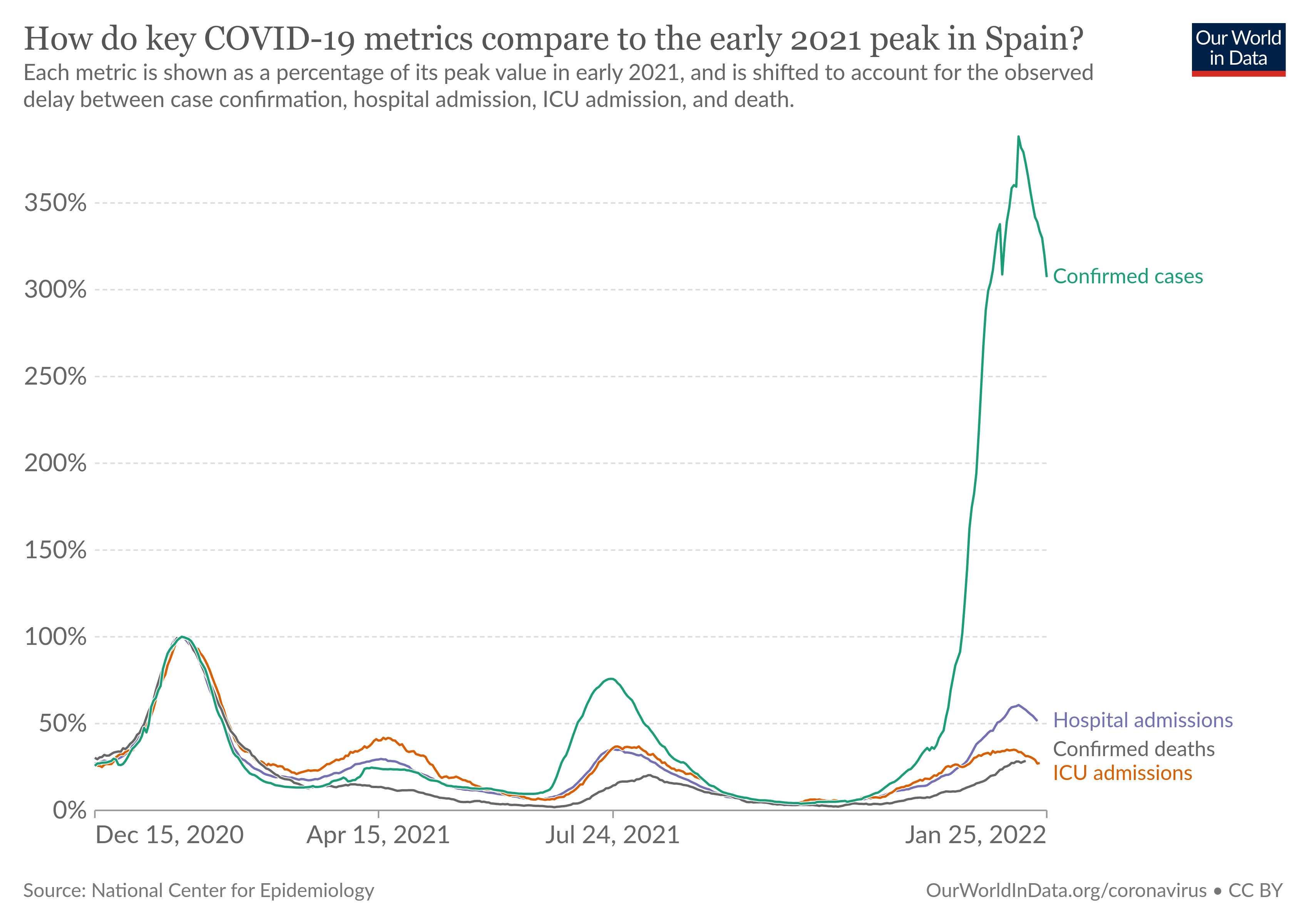
The following code uses pivot_longer to appropriately wrangle the last 4 columns of the data set into two columns (type and value), and then constructs a bare bones (ignoring theme elements) plot to visualize the data.
my_d0 <- rio::import("https://byuistats.github.io/DS350_2022/files/to-pivot-or-not/spain-covid-cases-hospital-icu-deaths.csv")
my_d0 %>% glimpse()
## Rows: 1,825
## Columns: 7
## $ Entity           <chr> "Germany", "Germany", "Germany", "Germany", "Germany"…
## $ Code             <chr> "DEU", "DEU", "DEU", "DEU", "DEU", "DEU", "DEU", "DEU…
## $ Day              <date> 2020-10-01, 2020-10-02, 2020-10-03, 2020-10-04, 2020…
## $ confirmed_cases  <dbl> 9.4, 10.0, 10.7, 11.1, 12.0, 12.9, 14.0, 15.1, 16.2, …
## $ confirmed_deaths <dbl> 2.8, 3.1, 3.4, 3.9, 4.4, 4.6, 4.9, 5.5, 5.8, 6.6, 7.0…
## $ icu_flow         <dbl> NA, NA, NA, NA, NA, NA, NA, NA, NA, NA, NA, NA, NA, N…
## $ hospital_flow    <dbl> 8.2, 9.3, 10.3, 11.4, 12.0, 12.4, 13.2, 13.7, 14.5, 1…
my_tidy0 <- my_d0 %>%
  filter(Entity == "Spain") %>%
  pivot_longer(cols = c(-Entity,-Code,-Day),
               names_to = "type",
               values_to = "value")
my_tidy0 %>% glimpse()
my_tidy0 %>%
  ggplot(aes(x = Day, y = value, color = type)) +
  geom_line()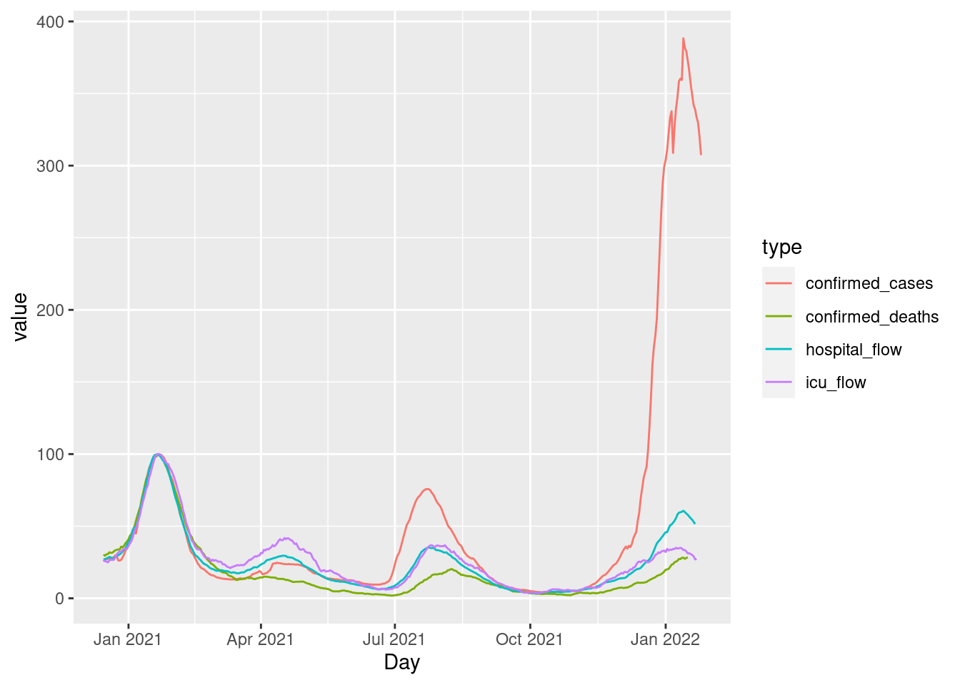
This rough visualization can certainly be improved, but the wrangling phase and basic plot creation is complete. Our goal in this task is to practice this process several times, on various data sets, asking each time if pivoting is needed.
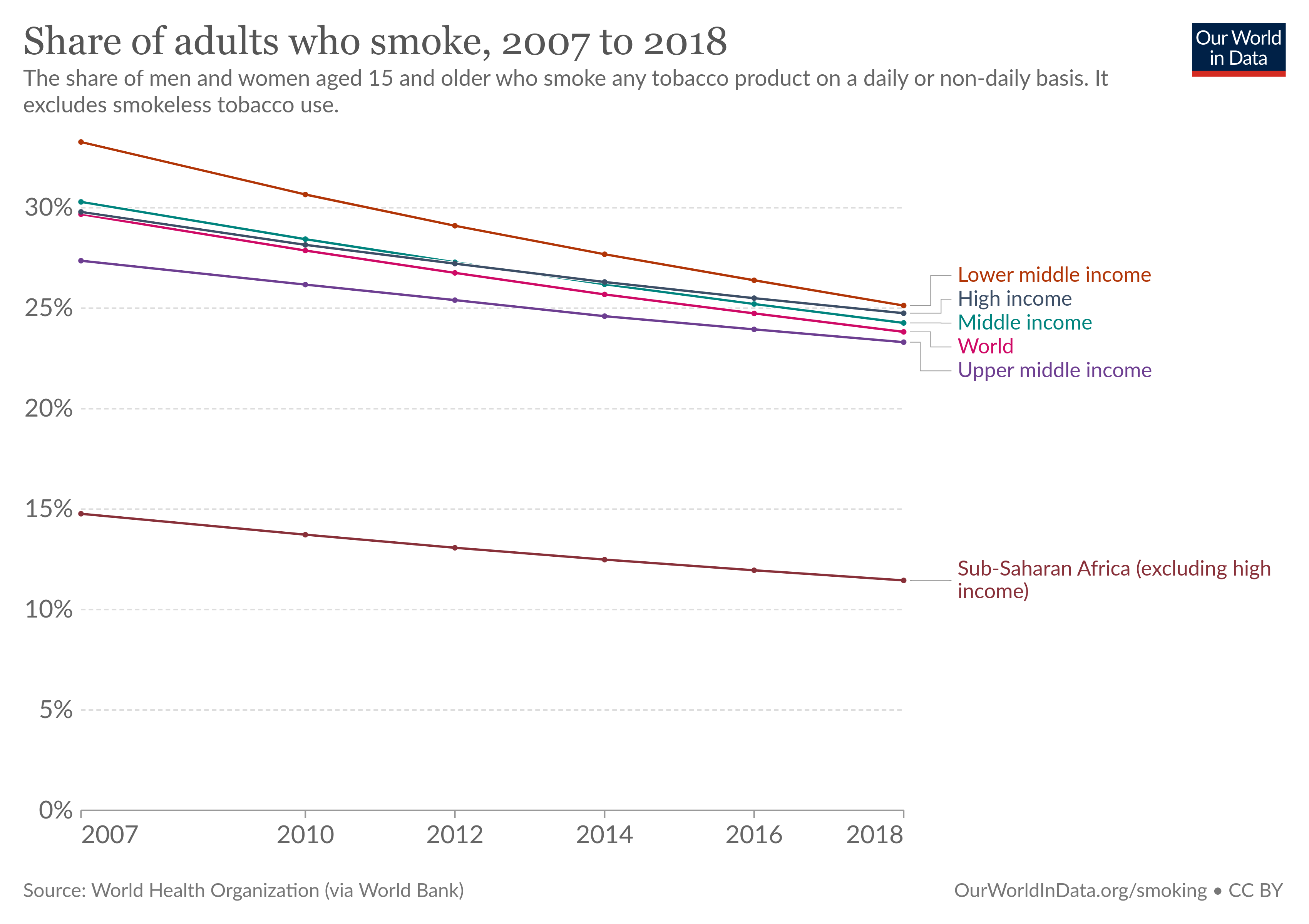
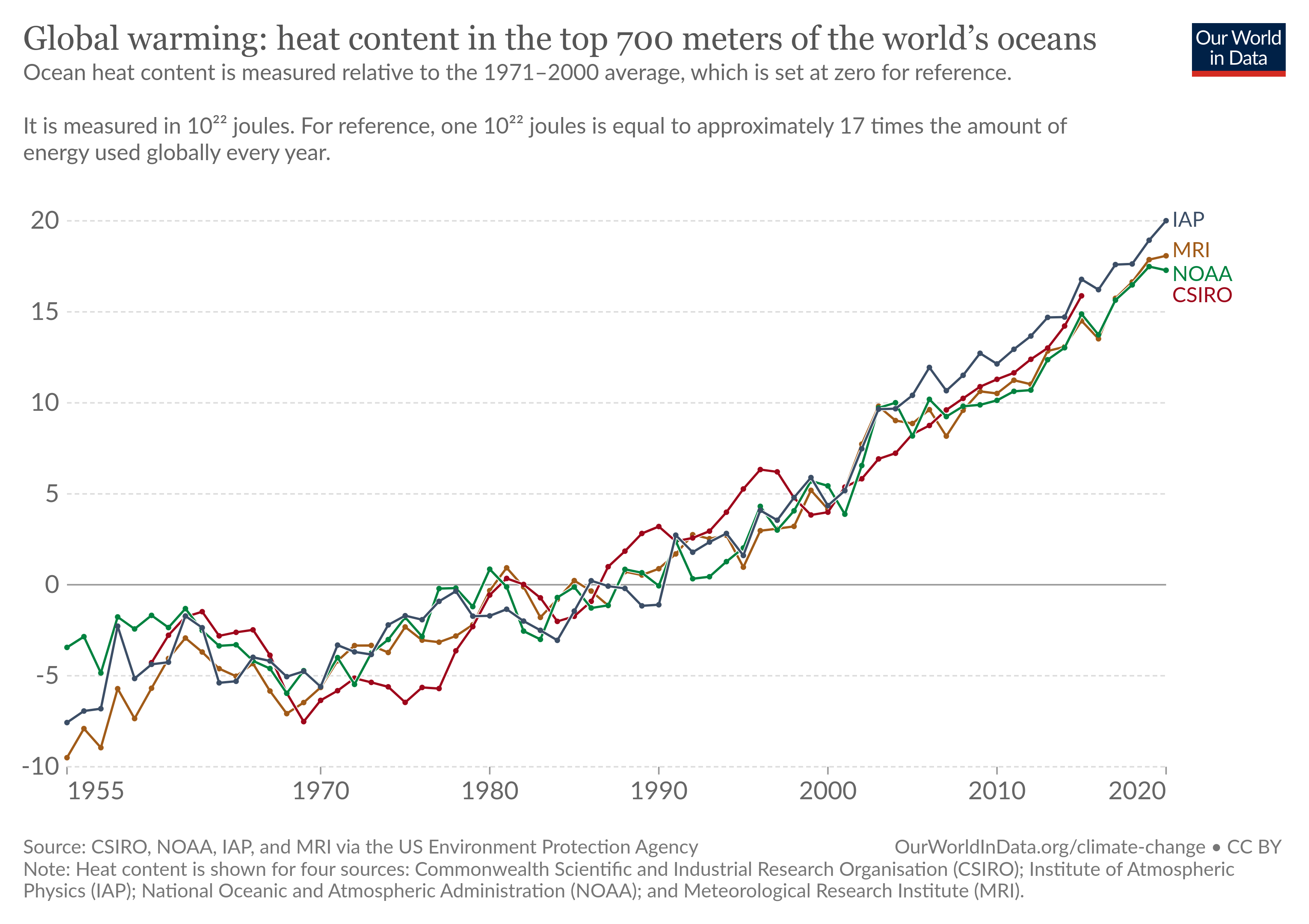
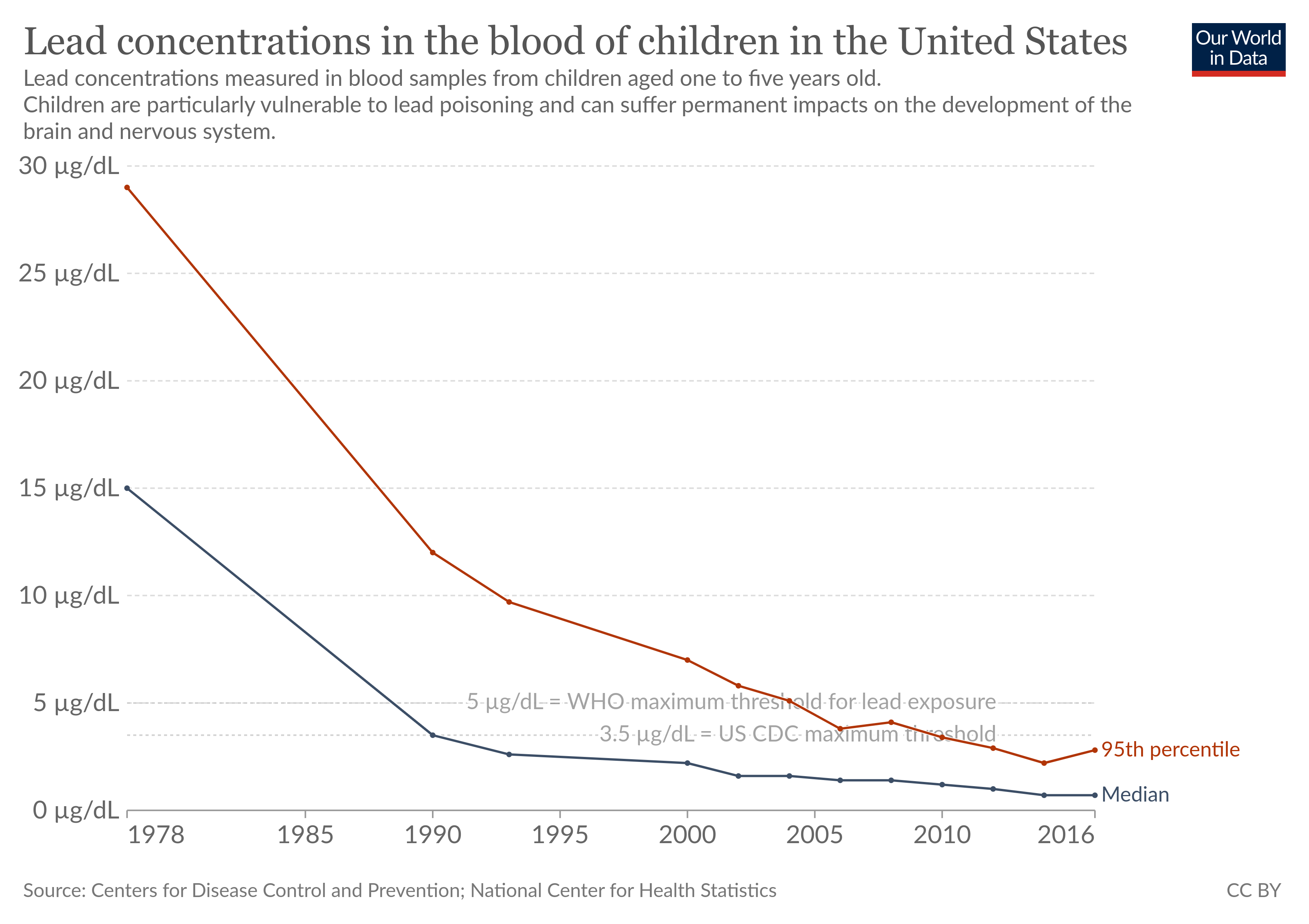
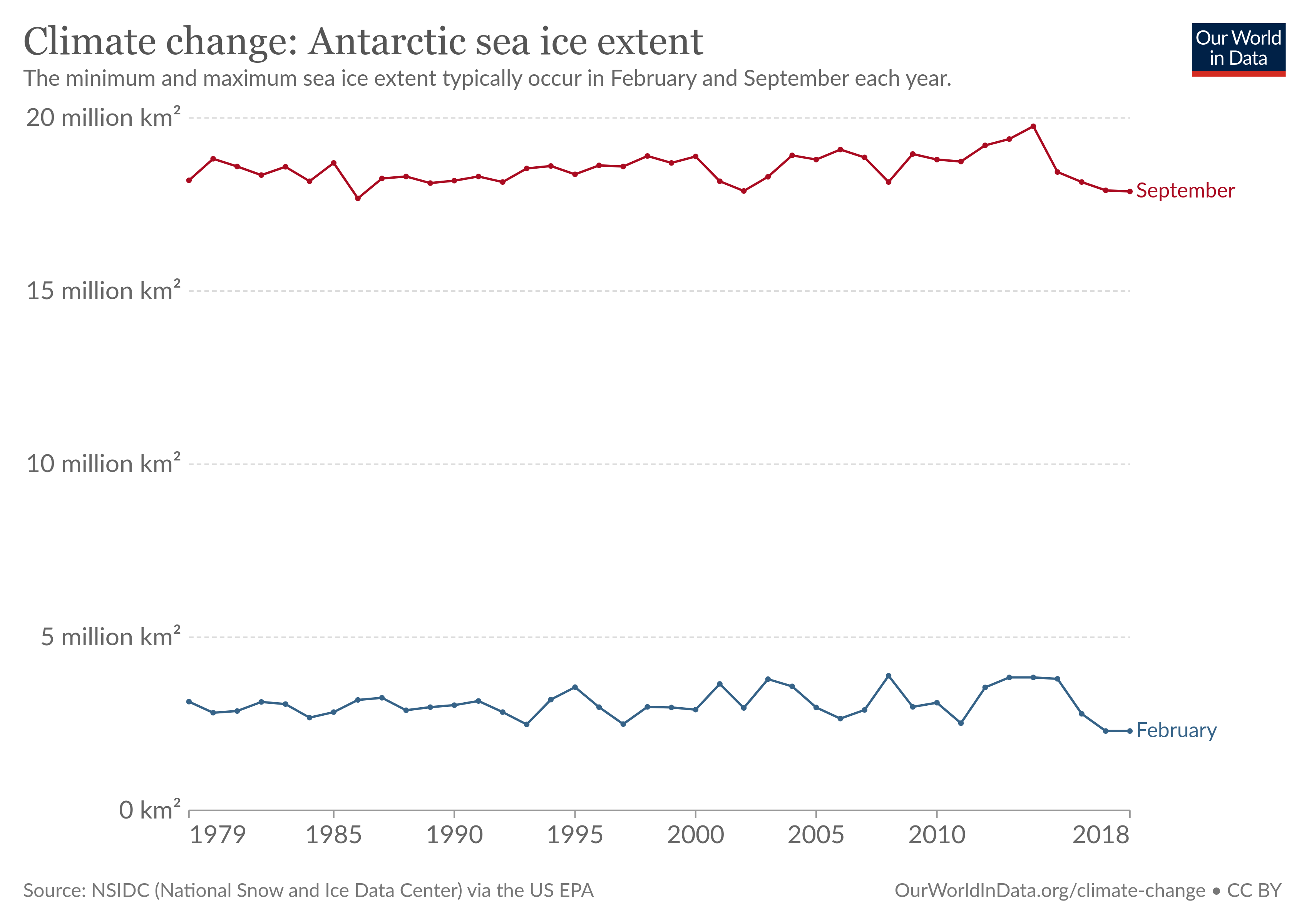
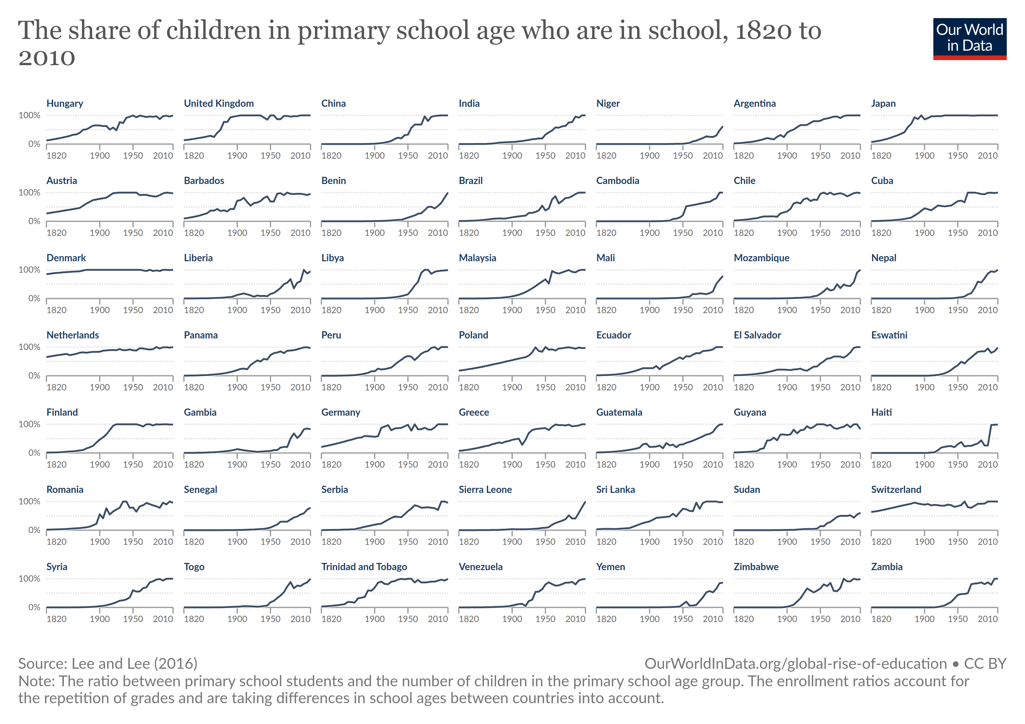
There are 6 visualizations below, each with a link to their accompanying data and the source location on OurWorldInData. Appropriately wrangle the data to create a rough visualization. Some will need a pivot_longer() command, while others won’t. Once you have made each basic visualization, add in theme elements (title, labels, caption, axes, annotations, etc.) that you have struggle with before. If you’re already a pro at adding titles, then skip it and focus on something you can improve.
https://byuistats.github.io/DS350_2022/files/to-pivot-or-not/share-of-adults-who-smoke.csv (Source.)
https://byuistats.github.io/DS350_2022/files/to-pivot-or-not/climate-change-ocean.csv (Source.)
https://byuistats.github.io/DS350_2022/files/to-pivot-or-not/access-drinking-water-stacked.csv (Source. Make sure you look up the difference between
geom_barandgeom_col. Feel free to pick 4 groups, instead of all 10, when you filter. It’s OK if your initial rough visualization doesn’t have the bars in the correct order. )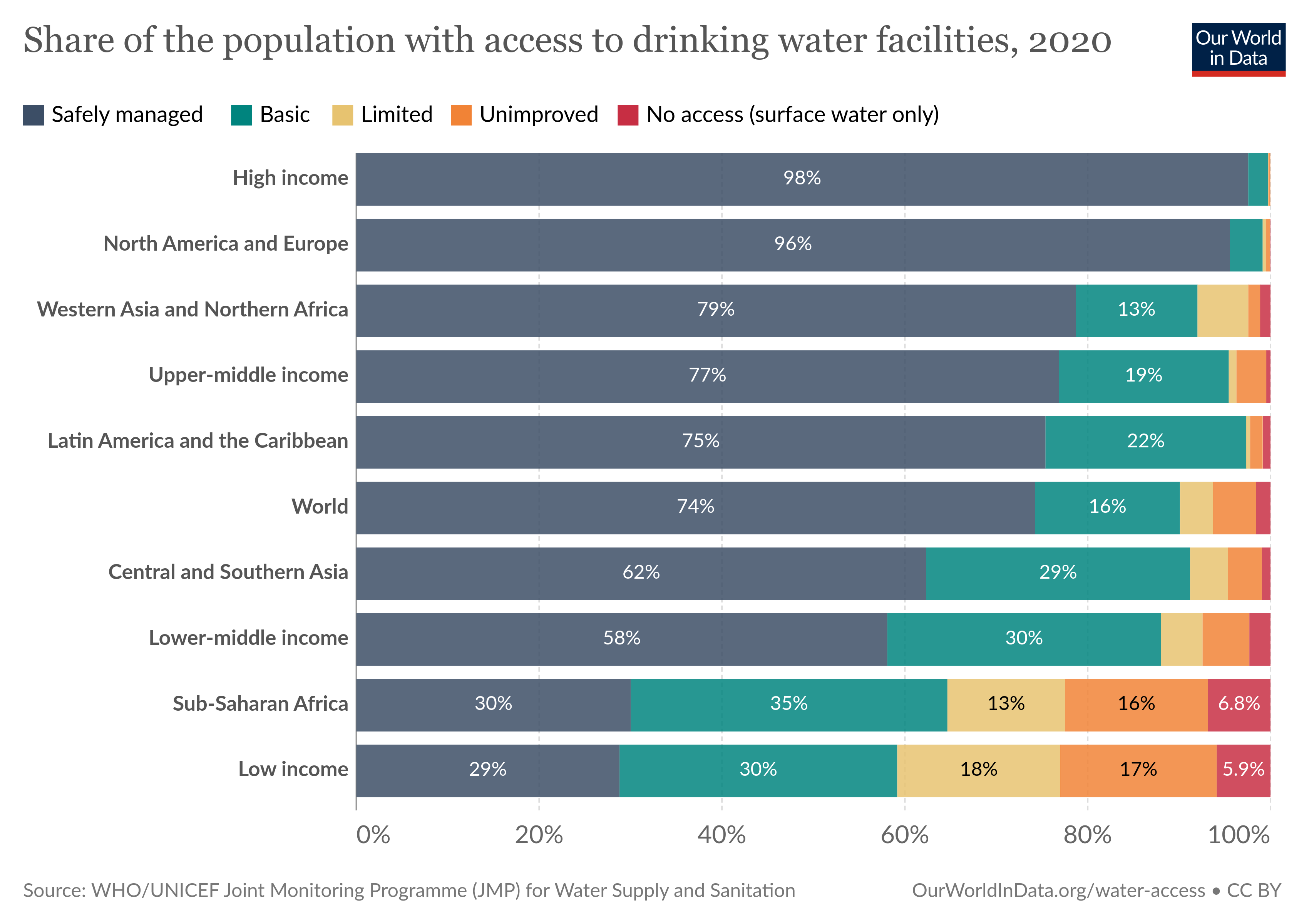
https://byuistats.github.io/DS350_2022/files/to-pivot-or-not/lead-blood-usa-children.csv (Source.)
https://byuistats.github.io/DS350_2022/files/to-pivot-or-not/climate-change-antarctica.csv (Source.)
https://byuistats.github.io/DS350_2022/files/to-pivot-or-not/primary-enrollment-selected-countries.csv (Source. Feel free to filter to include 4 countries, rather than 49, and get them in a 2 by 2 grid.)
3.11 Task: Child Mortality Visualization
The Our World in Data website publishes articles and graphics that provide insight into world data. Once again, we are going to build visualizations in R using their data. This time we will use the financing_healthcare dataset in the ourworldindata package. These readings may help with this task.
Here are your tasks.
-
Explore the world data contained in
financing_healthcareand find an interesting relationship between child mortality rates and another variable.- Use
devtools::install_github("drsimonj/ourworldindata")to install the package containing the financing_healthcare dataset. - After loading the
ourworldindatapackage, read the financing healthcare help file (?financing_healthcare) to understand the variables better. - Create at least three rough graphics that help you explore the data and understand child mortality (
child_mortcolumn). These graphs do not need to look good, and can be created using base R functions if you choose.
- Use
-
Create a graphic you could use in a final presentation to communicate something interesting about child mortality.
- This graphic should have a strong message, be well labeled, and use skills you learned from Chapter 28: Graphics for Communication.
- In your .Rmd, file, add a short description of the message you are trying to communicate in your graph.
3.12 Task: Begin Case Study 4
Each case study throughout the semester will ask you to demonstrate what you’ve learned in the context of an open ended case study. The individual prep activity will always include a “being” reading which will lead to an in class discussion.
Complete the Being Reading section of Case Study 4. This will require that you read an article(s), and come to class with two or three things to share.
Download the data for the case study and begin exploring it. This data for this project is stored accross many talbes. Your goal at this point is to simply to understand the data better. What tables will be relevant to the task at hand. Be prepared to share any questions you have about the data with your team.
This case study has you create a clear visualization that depicts the performance of BYU players compared to other Utah college players that have played in the major leagues. Create a rough sketch of a chart you think would answer this. List the aesthetics (x, y, color, group, label, etc.), the geometries, any faceting, etc., that you want to appear in your visualization. Then construct on paper an outline of the table of data that you’ll need to create said visualization. Which tables will you need to join together? You do not need to actually perform any computations in R, rather create rough hand sketches of the visualization and table that you can share with your team in class. This is all part of “Understanding the Problem” and “Making a Plan.”
With any remaining time, feel free to start transferring your plans into code, and perform the wrangling and visualizing with R.
3.13 Task: Improve a Previous Task
- Choose an old task you got stuck on, or would like to develop further. Spend this prep time improving the old task.
- Push your work to GitHub so you can share it with your classmates.
- Be prepared to share something new you learned, or something you still have questions about.
3.14 Task: Finish Case Study 3
Finish Case Study 3 and submit it. There is no other preparation task. The goal is to free up time to allow you to focus on and complete the case study.
3.15 Task: Coding Challenge Prep
Miller’s law, or “The Magical Number Seven, Plus or Minus Two,” argues that the number of objects an average human can hold in short-term memory is 7, plus or minus 2. It’s almost as if humans have a built in RAM (working memory). We can increase this amount through a process known as chunking, where we brake down information and then group it together in a meaningful way. “These chunks can be highly subjective because they rely on an individual’s perceptions and past experiences.” The process of chunking can take on many forms:
- Creating a concept map.
- Using the method of loci to form a mind palace.
- Creating a lesson plan to teach others the key concepts you want to group together.
- Listing everything learned, and then grouping items together into logical units.
- Creating a few key examples, that you thoroughly understand, that illustrate the entire spectrum of ideas (this is on the same vein of a mind palace, but rather than a location, it’s now examples).
- etc.
You might ask, “Why do I need to chunk together the information, when I can just look it up?” Look forward a bit into the future and imagine you have landed a job interview. Often these interviews involve a technical coding challenge of some sort, where your job is to demostrate your skill set in a short amount of time. Yes, you can look up anything you want on the internet, but this takes up valuable time. If you commit to memory and rapid recall a few key important items that you know will be valuable in such a situation, you can display a far greater range of abilities during your limited time. You don’t have to store in memory every single item learned. Pick and choose the skills that seem the most valuable for the job you hope to obtain. Then chunk these skills together into logically cohesive units that help you recall and use them rapidly.
Throughout the rest of this semester, we will end each unit with a Practice Coding Challenge, to help you prepare for the Final Coding Challenge (held during finals week). These practice coding challenges are to be completed in 1 hour. Each coding challenge will be scored on an EMRN scale. The practice coding challenges (at the end of units 3, 4, and 5) will not count towards your final grade, rather are there to provide you practice and feedback for how you are doing. The final coding challenge does contribute to your final grade, as described in the syllabus.
The goal of this task is to give you some time to prepare for the first coding challenge by chunking together the material we have learned up to this point.
-
Briefly review the links above related to Miller’s law, concept maps, mind palaces, etc. Then decide on a way that you believe will help you organize the material we have learned into logically cohesive chunks. Spend the rest of your hour on this task working towards chunking together the information we’ve learned. At the end of the hour, ask yourself the following metacognition questions:
- Am I on the right track?
- What can I do differently?
- Who can I ask for help?
- What worked well?
- What could I have done better?
- Can I apply this to other situations?
3.16 Task: Career and Internship Prep
After finishing the first four case studies you have enough data skills to begin solving data problems for other people. Every company uses data, and you can find data-related roles in any industry including healthcare, manufacturing, marketing, and education.
- Use a job posting website (such as LinkedIn or Indeed) to search for entry data-related jobs and internships. “Data Analyst” is a great search term to begin with. “Business Analyst” and “Data Scientist” may also bring up good results. If you know exactly what type of job you want after graduation, use that in your search.
- Pick 5 job or internship postings you might be interested in applying to.
- Read through the requirements of each job posting. Take notes on which requirements you feel prepared for, which requirements you feel unprepared for, and which requirements line up with the skill taught in this class.
- Be prepared to share your notes with your teams.
3.17 Task: Finish Case Study 4
Finish Case Study 4 and submit it. There is no other preparation task. The goal is to free up time to allow you to focus on and complete the case study.
3.18 Task: Practice Coding Challenge
Coding challenges are an opportunity for you to demonstrate the data and programming skills you’ve gained this semester. The challenges have a 1 hour time limit. This limit gives you experience working under deadlines and pressure, which will be a benefit during your job search.
The 1 hour time limit may not be enough time to perfectly finish the challenge. If you get stuck on something, remember you have other skills you need to show off! Leave the part you’re stuck on and move on to another part of the challenge.
- Find a place where you can focus for 1 hour on the coding challenge. Make sure you have everything you need (laptop charger, water bottle, etc.)
- When you are ready begin, go to our class I-Learn page for the instructions. You will submit your work in I-Learn.
- During class, we’ll have a discussion about the coding challenge.