Case Studies (7&8)
Case Study 7: Scripture study
Background
In 1978 Susan Easton Black penned an article in the Ensign titled Names of Christ in the Book of Mormon. This article claims “even statistically, he is the dominant figure of the Book of Mormon”. We are going to use our string skills to study word occurrences in the Book of Mormon and gather evidence to support the article.
Being Readings
The being readings for this case study are:
Read the article(s) and come to class with two or three things to share. These could be a favorite quote, a question you had while reading, a thought or idea inspired by the reading, etc.
Resources
Here are quick links to the doing readings and accompanying R cheat sheets that you previously encountered in this unit:
Feel free to make use of Google searches, stack overflow, etc., as you wrangle and visualize the data.
Tasks
-
For this case study you will need to load two datasets.
- Load the scripture data lds-scriptures.csv. Take time to examine the dataset so you understand how it is organized.
- Load the Savior names data BoM_SaviorNames.rds. The
namecolumn in this dataset is the only column you need.
-
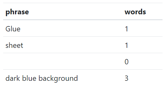
Write a function that takes two inputs: a string, and a regular expression pattern. The function should search the string for pattern matches and then count the number of words between each match. The output should be a tibble with a column for the phrase between matches and a column for the word count. For example:
- If I gave your function the string “Glue the sheet to the dark blue background” and the regex pattern “the|to”, your function should return this:

-
For each book in the Book of Mormon, use your function to count the number of words between each reference to the Savior.
- Hint: Because the original data is organized by verse, you’ll need to consider how to deal with the end of one verse and the start of another.
Create a visualization that allows you to compare the distribution of “words between Savior references” between books in the Book of Mormon. Write a short description about any patterns you notice.
Create an R Markdown report that has the charts and descriptions mentioned above.
Case Study 8: Building the past
Background
You have been asked to support a story for the local news website that looks back on the housing collapse and the early effects of residential construction. You have data on residential building permits from 1980 through 2010 for each county in the United States. Your colleague that is writing the article would like a few maps and graphics that highlight the single family building permit patterns across your state as well as the patterns in the US.
Remember the big story is the collapse of new building permits at the initial stages of the mortgage crisis. Make sure your graphics highlight the collapse in a clear and honest manner.
Being Readings
The being readings for this case study are:
Watch the videos and come to class with two or three things to share. These could be a favorite quote, a question you had while reading, a thought or idea inspired by the reading, etc.
Resources
Here are quick links to packages that you previously encountered in this unit:
You may also enjoy exploring the geofacet package. Feel free to make use of Google searches, stack overflow, etc., as you wrangle and visualize the data.
Tasks
-
Use the
library(USAboundaries)package to get two spatial data sets. One for all US states, and the other for counties of a state of your choice (for example, counties of Idaho).- Look through your state data and county data and see if you can identify the columns containing the FIPS numbers. You will need these columns to merge this spatial data to our building permit data.
-
Read in the
permitsdata from thedevtools::install_github("hathawayj/buildings")package. Wrangle the data into two separate data sets. One data set should look at single family permits at the state level for all US states. The other should look at single family permits at the county level for the state of your choice.- Look through your permit data and identify the FIPS columns. Use these columns to join the state and country permit data to the state and county spatial data.
Create at least one chart that shows, for each US state, the trend in single family building permits over time.
Create at least one chart that shows, for each county in your chosen state, the trend in single family building over time.
Create at least one additional chart that could be useful for the news article.
Make sure at least one (if not all) of your charts displays the data using some sort of spatial/geographical representation (so geofacets, a chloropleth map, etc.). Write a short paragraph summarizing insights from your graphics and the choices you made during your visualization process.
Create an R Markdown report that has the charts and descriptions mentioned above.