Chapter 4 Inferential Decision Making
4.1 Introduction
Much of the material in this chapter was taken from the MATH 221 textbook.
Links to referenced pages:
- Hypothesis Tests
- Confidence Intervals
- Inference for Two Proportions
Before we move into this chapter, it’s important to make sure that the meaning of statistical inference is clear.
In chapter 3 of Good Charts, Scott Berinato discusses the differences between declarative and exploratory data visualizations. He states that exploratory visualizations are designed, as the name suggests, to explore data. Generally they’re for understanding what information is contained in the data, figuring out what further analysis can be conducted, and answering broad, surface level questions. Declarative visualizations, on the other hand, are usually more in-depth and detailed and are usually created to answering specific questions. They are for making statements and establishing something about the data. In a similar way, statistics can be separated into descriptive and inferential statistics. Most of what we’ve done so far in this course falls under the descriptive statistics category - using tables, graphs, etc. to describe data. This works great if we have population data, because tables and graphics can provide powerful insight that may not be obvious from raw data. Descriptive statistics is limited though when we only have sample data because descriptive statistics can only describe data that we already have, and not the entire population. This is where inferential statistics comes in.
Whenever sample data is used to make a conjecture about a characteristic of a population, it is called making inference. Inferential statistics represents a collection of methods that can be used to make inferences about a population. Hopefully the significance of this sinks in - through inferential statistics we are able to learn about a population even if we don’t have data for that entire population.
It is important to note, however, that when we infer something about a population based on sample data we aren’t stating that our inference is established truth. In fact, to claim that anything we learn from statistics is definitively true would be incorrect. All we can say is that there is strong evidence to support or reject assumptions made about the data. That said, “when statistical inference is performed properly, the conclusions about the population are almost always correct.” -Statistics Notebook
4.2 Hypothesis Testing
The foundational assumption that is tested in statistics is called the null hypothesis. The null hypothesis is a statement about the population that represents the status quo, conventional wisdom, or what is generally accepted as true. Using the made-up Toyota Camry example from the last chapter, the null hypothesis is:
\[ H_0: \text{ 1% of all Toyota Camrys have a defect in the braking system.} \]
The purpose of a statistical study or experiment is to see if there is sufficient evidence against the null hypothesis. If there is sufficient evidence, we reject the null hypothesis. If the null hypothesis is rejected, it is rejected in favor of another statement about the population: the alternative hypothesis. In our example, let’s assume Toyota wants to know if more than 1% of the population has a defective braking system. The alternative hypothesis would then be:
\[ H_a: \text{ More than 1% of all Toyota Camrys have a defect in the braking system} \]
Notice that both the null and alternative hypotheses are statements about the population, not just the sample being tested. Again, the goal is to determine if what is observed in the sample can be assumed to be true in the population.
There is a formal procedure for testing the null and alternative hypotheses, called a hypothesis test. In a hypothesis test, the null hypothesis is always assumed to be true. If there is sufficient evidence against the null hypothesis, it is rejected. The evidence against the null hypothesis is assessed using a number called the \(P\)-value. The P-value is the probability of obtaining a result (called a test statistic) at least as extreme as the one you calculated, assuming the null hypothesis is true. We reject the null hypothesis if the \(P\)-value is small, say less than 0.05. If we assume that only 1% of Camrys have the defective braking system, the \(P\)-value is the probability of observing a number of defective cars that is as large or larger than that which was observed in the test sample.
For this example (again, which is completely made up), the \(P\)-value was determined to be 0.68. Assuming the null hypothesis is true, the probability of observing defects in the braking system at least as often as was observed in the test sample was 0.68. This is a very large value. So, it is not surprising to have observed the number of defects in the sample in this case. The probability that these differences could occur due to chance is very high. The conclusion is that the null hypothesis should not be rejected.
If the \(P\)-value is low, the null hypothesis is rejected. If this probability is large, the null hypothesis is not rejected.
Hypothesis tests sometimes lead accidentally to incorrect conclusions because we use data from samples (as opposed to data from entire populations). When random samples are selected, some of the samples will contain disproportionately few or many cars with defects, just by chance.
Think about drawing marbles from a container in which most of the marbles are white and a few are red. Each marble represents a Toyota Camry, and the red marbles represent Camrys with defective brakes.
If you choose a random sample of the marbles in the jar, you might get all the red marbles in your sample, just by chance. This might lead you to conclude that there are many red marbles in the container, which is false. This is like Toyota rejecting the null hypothesis when it is true, because their sample contains more Camrys with bad brake systems than it should—just due to chance.
Likewise, when drawing marbles from your container, you might select none of the red marbles. This may lead you to conclude that there are no red marbles in the container, or very few, which is also false. This is like Toyota failing to reject the null hypothesis when it is false, because their sample contains fewer cars with bad brakes than it should—again, just due to chance.
Notice that if you draw only one marble, it will be either white or red, and you will be in one of the situations discussed in the previous two paragraphs. On the other hand, if you draw a larger sample, say 40, the chances are you will get a pretty good idea of the proportion of red to white marbles. Certainly better than if you only draw one marble. This emphasizes the role of sample size in making inference; in general, the larger the sample size the better we understand the population.
Such errors are no one’s fault; they are an inherent part of hypothesis testing. They make it impossible for us to be certain of the conclusions we draw using the statistical process. The thing to remember is that if we carry out the process correctly, our results are correct often enough to be very useful.
For more information about hypothesis testing, look at the Making Inference section of the Statistics Notebook.
Note: This course will focus on Chi-Squared testing, but there are several other types of hypothesis tests available to statisticians depending on the circumstances of their test and data. More information about some of them can be found under the “Making Inference” tab in the Statistics Notebook. The course Intermediate Statistics (MATH 325) covers these different tests in more depth.
4.3 Confidence Intervals

90%, 95%, and 99% Confidence Intervals
In statistics, we usually don’t know the exact values of the population parameters so we use statistical methods to approximate them. For example, we might take a random sample from the population, calculate the sample mean, and use that value as an estimate for the population mean. The sample mean is an example of a point estimator because it is a single value, or a point. There are also interval estimators, which instead offer a range, or interval, of values which are likely to contain the value we are trying to estimate. Arguably the most common interval estimator is the confidence interval.
Here is an app that might help you visualize how confidence intervals work. Note that this app isn’t perfect, it isn’t great at consistently capturing the population mean 95% of the time like it should if the confidence interval is accurate. The concept of the population mean falling within the 95% confidence interval 95% of the time (in theory anyway) is the main take away.
You might try adjusting the sample size and observing the effect that has on the size of each interval.
4.3.1 Definition and Interpretation
First, a confidence interval is always associated with some percentage. For example, a 95% confidence interval. Second, we find confidence intervals for values. Perhaps the most common confidence interval is a 95% confidence interval for the mean. The correct interpretation of this 95% confidence interval would be: “We are 95% confident that the true mean lies within the lower and upper bounds of the confidence interval.”
Notice that with this interpretation we aren’t saying anything about the exact value of the population mean, we are simply giving a range of values that the mean is very likely to lie in.
Example
Consider the 95% confidence interval for the true mean of 25 rolls of a fair die. We find the 95% confidence interval to be: (2.37,3.71). When we interpret this confidence interval, we say, “We are 95% confident that the true mean is between 2.37 and 3.71.”
The word, “confident” implies that if we repeated this process many, many times, 95% of the confidence intervals we would get would contain the true mean μ. It does not imply anything about whether or not one specific confidence interval will contain the true mean.
We do not say that “there is a 95% probability (or chance) that the true mean is between 2.37 and 3.71.” The probability that the true mean μ is between 2.37 and 3.71 is either 1 or 0.
4.3.2 Finding a Confidence Interval
More often than not, confidence intervals will be 95% confidence intervals. Think back to the 68-95-99.7% Rule for Bell-Curves from last chapter, especially note the 95. Assuming the data is approximately normally distributed, then approximately 95% of the data lies within two standard deviations of the mean. Thus, by computing the values that are two standard deviations away from the mean on either side we compute the 95% confidence interval; with the upper bound of the CI being the mean plus two standard deviations (\(\mu + 2\sigma\)), and the lower bound being the mean minus two standard deviations (\(\mu - 2\sigma\)).
Another way to think of this is to say that if the data is approximately normally distributed then the true mean will lie within the 95% confidence interval approximately 95% of the time, or within two standard deviations of the sample mean 95% of the time.
For a step-by-step example of finding a confidence interval and a real-world example, see How to Determine the Confidence Interval for a Population Proportion.
4.4 Comparing Proportional Measures
The ability to taste the chemical Phenylthiocarbamide (PTC) is hereditary. Some people can taste it, while others cannot. Even though the ability to taste PTC was observed in all age, race, and sex groups, this does not address the issue about whether men or women are more likely to be able to taste PTC.
Further exploration of the PTC data allows us to investigate if there is a difference in the proportion of men and women who can taste PTC. The following contingency table summarizes Elise Johnson’s results:
| Can Taste PTC? | Female | Male | Total |
|---|---|---|---|
| No | 15 | 14 | 29 |
| Yes | 51 | 38 | 89 |
| Total | 66 | 52 | 118 |
Researchers want to know if the ability to taste PTC is a sex-linked trait. This can be summarized in the following research question: Is there a difference in the proportion of men and the proportion of women who can taste PTC? The hypothesis is that there is no difference in the true proportion of men who can taste PTC compared to the true proportion of women who can taste PTC.
\[ H_0: \text{There is no difference in the proportion of PTC tasters for men and women} \]
\[ H_a: \text{There is a difference in the proportion of PTC tasters for men and women} \]
A sample of 66 females and 52 males were provided with PTC strips and asked to indicate if they could taste the chemical or not. (This research was approved by the BYU-Idaho Institutional Review Board.)
When working with categorical data, it is natural to summarize the data by computing proportions. If someone has the ability to taste PTC, we will call this a success. The sample proportion is defined as the number of successes observed divided by the total number of observations. For the females, the proportion of the sample who could taste the PTC was:
\[ \overbrace{\hat{p}_1}^\text{Proportion of females PTC tasters} = \frac{x_1}{n_1} = \frac{51}{66} \]
This is approximately 77.3% of the people who were surveyed. For the males, the proportion who could taste PTC was:
\[ \overbrace{\hat{p}_2}^\text{Proportion of male PTC tasters} = \frac{x_2}{n_2} = \frac{38}{52} \]
This works out to be about 73.1%.
Recall the hypotheses described earlier. In simpler terms, they can be read as:
\[
H_0: p_1 = p_2
\]
\[ H_1: p_1 \neq p_2 \]
If the null hypothesis is true, then the proportion of females who can taste PTC is the same as the proportion of males who can taste PTC.
The test statistic is a z, and is given by: \[ z = \frac{(\hat{p}_1 - \hat{p}_2) - (p_1 - p_2)}{\sqrt{\hat{p}(1-\hat{p})(\frac{1}{n_1} + \frac{1}{n_2)})}} \]
where:
\[
\begin{array}{lll}
n_1= \text{sample size for group 1:} & n_1 = 66 & \text{(number of females)} \\
n_2= \text{sample size for group 2:} & n_2 = 52 & \text{(number of males)} \\
\hat p_1= \text{sample proportion for group 1:} & \hat p_1 = \frac{x_1}{n_1} = \frac{51}{66} & \text{(proportion of females who can taste PTC)}\\
\hat p_2= \text{sample proportion for group 2:} ~ & \hat p_2 = \frac{x_2}{n_2} = \frac{38}{52} & \text{(proportion of males who can taste PTC)}\\
\hat p= \text{overall sample proportion:} & \hat p = \frac{x_1+x_2}{n_1+n_2} = \frac{89}{118} & \text{(overall proportion who can taste PTC)}\\
\end{array}
\]
In our case: \[ z = \frac{(\frac{51}{66} - \frac{38}{118}) - (0)}{\sqrt{\frac{89}{118}(1-\frac{89}{118})(\frac{1}{66} + \frac{1}{52)})}} \]
Assume we use \(\alpha = 0.05\) to help us make our decision of whether to reject or accept the null hypothesis.
After plugging in our values, we end up with \(z = 0.526\). When converted to a P-value, we get \(\text{P-value} = 0.599 > 0.05 = \alpha\). We fail to reject the null hypothesis. In English we say, there is insufficient evidence to suggest that the true proportion of males who can taste PTC is different from the true proportion of females who can taste PTC.
Men and women appear to be able to taste PTC in equal proportions. There is not enough evidence to say that one gender is able to taste PTC more than the other. It appears that the ability to taste PTC is not a sex-linked trait.
4.4.1 Comparing Proportions Using Confidence Intervals
During the mid 1800’s, European foxes were introduced to the Australian mainland. These predators have been responsible for the reduction or extinction of several species of native wildlife.

Royal Botanic Gardens in Cranbourne, Victoria, Australia - from flickr.com
The Royal Botanic Gardens Cranbourne is a 914 acre (370 ha) conservation reserve outside Melbourne, Australia. Predation by foxes has been an ongoing problem in the gardens. To reduce the risk to native species, a systematic program of killing foxes was implemented.
One way to monitor the presence of foxes is to look for fox tracks in specific sandy areas, called sand-pads. Before beginning a systematic effort to reduce the fox population, ecologists observed fox tracks in the sand-pads 576 out of the 950 times the sand-pads were observed. After eliminating some of the foxes, the ecologists observed fox tracks in the sand-pads 268 times out of the 1359 times they checked the sand-pads . The ecologists want to know if there is a difference in the proportion of times fox tracks are observed before versus after the intervention to reduce the fox population.
One way to compare two proportions is to make a confidence interval for the difference in the proportions.
The equation for the confidence interval for the difference of two proportions may look a little daunting at first, but with some practice, it is not too difficult.
Before we compute the confidence interval, we first organize our data and calculate some statistics that will be useful later. We divide the data into two groups: before foxes were targeted (Group 1) and after (Group 2). For each group, let \(x_1\) and \(x_2\) represent the number of times fox prints were observed in the sand-pads before and after the ecologists began systematically eliminating the foxes, respectively. Similarly, Let \(n_1\) and \(n_2\) be the number of times the ecologists checked the sand-pads in the before and after periods, respectively.
Fox Tracks Data
| Before Intervention | After Intervention | Combined Data | |
|---|---|---|---|
| Fox Tracks Observed | \(x_1 = 576\) | \(x_2 = 268\) | \(x_1 + x_2 = 576 + 268 = 844\) |
| Total Observations | \(n_1 = 950\) | \(n_2 = 1359\) | \(n_1 + n_2 = 950 + 1359 = 2309\) |
Again, we will compute \(\hat p\) for each group.
For group 1: \[ \hat p_1 = \frac{x_1}{n_1} = \frac{576}{950} \]
For group 2: \[ \hat p_2 = \frac{x_2}{n_2} = \frac{268}{1359} \]
An equation of the confidence interval for the difference between two proportions is computed by combining all the information above: \[ \left( \left( \hat p_1 -\hat p_2 \right) - z^* \sqrt{ \frac{\hat p_1 \left( 1 - \hat p_1 \right)}{n_1} + \frac{\hat p_2 \left( 1 - \hat p_2 \right)}{n_2} } , ~ \left( \hat p_1 -\hat p_2 \right) + z^* \sqrt{ \frac{\hat p_1 \left( 1 - \hat p_1 \right)}{n_1} + \frac{\hat p_2 \left( 1 - \hat p_2 \right)}{n_2} } \right) \]
The lower bound for a 95% confidence interval for the difference of the proportions of times fox prints are observed in the sand-pads is:
\[ \displaystyle{ \left( \hat p_1 -\hat p_2 \right) - z^* \sqrt{ \frac{\hat p_1 \left( 1 - \hat p_1 \right)}{n_1} + \frac{\hat p_2 \left( 1 - \hat p_2 \right)}{n_2} } } \]
\[ \displaystyle{ = \left( \frac{576}{950} - \frac{268}{1359} \right) - 1.96 \sqrt{ \frac{\frac{576}{950} \left( 1 - \frac{576}{950} \right)}{950} + \frac{\frac{268}{1359} \left( 1 - \frac{268}{1359} \right)}{1359} } } \]
\[ \displaystyle{ = 0.372 } \]
and the upper bound is:
\[ \displaystyle{ \left( \hat p_1 -\hat p_2 \right) + z^* \sqrt{ \frac{\hat p_1 \left( 1 - \hat p_1 \right)}{n_1} + \frac{\hat p_2 \left( 1 - \hat p_2 \right)}{n_2} } } \]
\[ \displaystyle{ = \left( \frac{576}{950} - \frac{268}{1359} \right) + 1.96 \sqrt{ \frac{\frac{576}{950} \left( 1 - \frac{576}{950} \right)}{950} + \frac{\frac{268}{1359} \left( 1 - \frac{268}{1359} \right)}{1359} } } \]
\[ \displaystyle{ = 0.447 } \]
So, the 95% confidence interval for the difference in the proportions is:
\[ (0.372, 0.447) \]
Note: If we switch the way we label group 1 and group 2, then our confidence interval would have the opposite signs: \((-0.447, -0.372)\), which would still lead to the same conclusions that \((0.372, 0.447)\) will.
To interpret this confidence interval, we say, “We are 95% confident that the true difference in the proportions of times fox prints will appear in the sand-pads is between 0.372 and 0.447.”
Notice that zero is not in this confidence interval, so zero is not a plausible value for \(p_1 - p_2\). Based on this result, it is reasonable to conclude that the proportion of times foxes are observed in the sand-pads is not the same before and after the effort to reduce their population. It seems that the work to reduce the number of foxes is having an effect on their presence in the reserve.
In order for us to assume that it’s likely that the efforts had made no difference, 0 would have to lie in the confidence interval. This is because the confidence interval gives us the likely values for the difference between before and after the changes were made, so if 0 isn’t in the confidence interval then it’s statistically unlikely that the difference is 0.
Assumptions for a Confidence Interval
There are some assumptions that need to be met if we want to use a confidence interval in this way and have our results be valid. All four of these must be met. (See above in the PTC example for the meaning of these symbols if you’ve forgotten)
\[ \begin{array}{} n_1 \cdot \hat p_1 \ge 10 \newline n_2 \cdot \hat p_2 \ge 10 \newline n_1 \cdot \left(1-\hat p_1\right) \ge 10 \newline n_2 \cdot \left(1-\hat p_2\right) \ge 10 \end{array} \]
In the fox tracks example, all of the requirements are satisfied:
\[ \begin{array}{} n_1 \cdot \hat p_1 = 950 \cdot 0.606 = 576 \ge 10 \newline n_2 \cdot \hat p_2 = 1359 \cdot 0.197 = 268 \ge 10 \newline n_1 \cdot \left(1-\hat p_1\right) = 950 \cdot (1-0.606) = 374 \ge 10 \newline n_2 \cdot \left(1-\hat p_2\right) = 1359 \cdot (1-0.197) = 1091 \ge 10 \end{array} \]
Thus, we would conclude that our use of the confidence interval was valied and assume that our inference made using the results is accurate.
4.5 Chi-Squared Test of Independence
People often wonder whether two things influence each other. For example, people seek chiropractic care for different reasons. We may want to know if those reasons are different for Europeans than for Americans or Australians. This question can be expressed as “Do reasons for seeking chiropractic care depend on the location in which one lives?”
This question has only two possible answers: “yes” and “no.” The answer “no” can be written as “Motivations for seeking chiropractic care and one’s location are independent.” (The statistical meaning of “independent” is too technical to give here. However, for now, you can think of it as meaning that the two variables are not associated in any way. For example, neither variable depends on the other.) Writing the answer “no” this way allows us to use it as the null hypothesis of a test. We can write the alternative hypothesis by expressing the answer “yes” as “Motivations for seeking chiropractic care and one’s location are not independent.” (Reasons for wording it this way will be given after you’ve been through the entire hypothesis test.)
When we have our observed counts in hand, software will calculate the counts we should expect to see, if the null hypothesis is true. We call these the “expected counts.” The software will then subtract the observed counts from the expected counts and combine these differences to create a single number that we can use to get a P-value. That single number is called the χ2 test statistic. (Note that χ is a Greek letter, and its name is “ki”, as in “kite”. The symbol χ2 should be pronounced “ki squared,” but many people pronounce it “ki-square.”)
4.5.1 Assumptions
The following requirements must be met in order to conduct a χ2 test of independence:
- You must use simple random sampling to obtain a sample from a single population.
- Each expected count must be greater than or equal to 5. Let’s walk through the rest of the chiropractic care example.
A study was conducted to determine why patients seek chiropractic care. Patients were classified based on their location and their motivation for seeking treatment. Using descriptions developed by Green and Krueter, patients were asked which of the five reasons led them to seek chiropractic care :
- Wellness: defined as optimizing health among the self-identified healthy
- Preventive health: defined as preventing illness among the self-identified healthy
- At risk: defined as preventing illness among the currently healthy who are at heightened risk to develop a specific condition
- Sick role: defined as getting well among those self-perceived as ill with an emphasis on therapist-directed treatment
- Self care: defined as getting well among those self-perceived as ill favoring the use of self vs. therapist directed strategies The data from the study are summarized in the following contingency table:
| Location | Wellness | Preventive Health | At Risk | Sick Role | Self Care | Total |
|---|---|---|---|---|---|---|
| Europe | 23 | 28 | 59 | 77 | 95 | 282 |
| Australia | 71 | 59 | 83 | 68 | 188 | 469 |
| United States | 90 | 76 | 65 | 82 | 252 | 565 |
| Total | 184 | 163 | 207 | 227 | 535 | 1316 |
The research question was whether people’s motivation for seeking chiropractic care was independent of their location: Europe, Australia, or the United States. The hypothesis test used to address this question was the chi-squared (χ2) test of independence. (Recall that the Greek letter χ is pronounced, “ki” as in “kite.”)
The null and alternative hypotheses for this chi-squared test of independence are: \[ H_0: \text{The location and the motivation for seeking treatment are independent} \] \[ H_a: \text{The location and the motivation for seeking treatment are not independent} \] When the Test statistic (\(\chi^2 = 49.743\)) is calculated, we get a p-value that is essentially 0, which is lower than our \(\alpha = 0.05\) and thus we reject the null hypothesis.
4.5.2 Interpretation
If the null hypothesis is true, then the interpretation is simple, the two variables are independent. End of story. However, when the null hypothesis is rejected and the alternative is concluded, it becomes interesting to interpret the results because all we know now is that the two variables are somehow associated.
One way to interpret the results is to consider the individual values of \[ \frac{(O_i - E_i)^2}{E_i} \] which, when square-rooted are sometimes called the Pearson residuals. \[ \sqrt{\frac{(O_i - E_i)^2}{E_i}} = \frac{(O_i - E_i)}{\sqrt{E_i}} \] The Pearson residuals allow a quick understanding of which observed counts are responsible for the χ2 statistic being large. They also show the direction in which the observed counts differ from the expected counts.
4.6 Chi-Squared Goodness of Fit Test
As was stated in Section 2.1, the most important distribution in statistics is the Normal Distribution, but there are many different ways that data can be distributed. In a lot of cases, data will naturally adhere to predefined distributions. Heights and weights generally follow a normal distribution, repeated rolls of a fair die will follow a uniform distribution (no possibility is more likely than another), etc. The point is, given a particular scenario, we can often expect how data will be distributed. Suppose I flipped a coin 100 times and ask you to guess how many times the coin would land on a head. You would probably guess close to 50. This is because you’re familiar with the expected distribution of coin toss results.
We gain a lot of power in statistics when we know the properties of the distribution of data, so it is very beneficial for us to know whether or not the population follows a known or expected distribution. Remember though, that it’s very likely that the data we’ll have access to will only be a sample of the population. Even if the sample data follows an expected distribution the population may not, and vice versa. This is where the Chi-Squared Goodness of Fit Test comes into play. It allows us to infer whether or not data follow a particular distribution using the observed values we already have and the values we would expect if it does follow that assumed distribution.
We create our test statistic for the test using the following formula:
\[ \sum\frac{(O_i - E_i)^2}{E_i} \]
where \(O_i\) = the \(i^{th}\) observed value from our data and \(E_i\) = the corresponding value we expect the data value to be if it does in fact follow the expected distribution. So for each value in our data we’ll:
- find the difference between our value and what we would expect it to be under the expected distribution
- square that difference
- divide that value by the expected value that corresponds with the observed value
(Steps 1-3 are repeated for each value in our data)
- add up all of the values obtained in step 3.
Notice that because each difference is squared the test statistic will never be negative. Also, if each observed value is the exact same as the expected value then our test statistic would be 0.
4.6.1 Hypotheses
Remember, when we perform a statistical test we are really testing some hypotheses that we have about data. We are trying to determine if our belief about the data is likely to be valid or if we need to adjust our belief.
For a chi-squared goodness of fit test, the hypotheses take the following form:
\[ H_o: \text{The data are consistent with a specified distribution.} \]
\[ H_a: \text{The data are not consistent with a specified distribution.} \]
Once we have our test statistic, we can find the probability of obtaining that value if the null hypothesis is true (again, this probability is called a p-value). If our p-value is below our predetermined \(\alpha\), usually 0.05, then we infer that our belief about the data is likely flawed and that our data does not follow the expected distribution.
4.6.2 Assumptions
The chi-square goodness of fit test is appropriate when the following conditions are met:
- The data are from a simple random sample
- The groups being studied are categorical (qualitative variables)
- There are at least five expected observations per group.
4.6.3 Benford’s Law
Let’s take a look at Benford’s law as an example of how to use the chi-square goodness of fit test.
“Benford’s law (also called the first digit law) states that the leading digits in a collection of data set are probably going to be small. For example, most numbers in a set (about 30%) will have a leading digit of 1, when the expected probability is 11.1% (i.e. one out of nine digits). This is followed by about 17.5% starting with a number 2. This is an unexpected phenomenon; If all leading numbers (0 through 9) had equal probability, each would occur 11.1% of the time. To put it simply, Benford’s law is a probability distribution for the likelihood of the first digit in a set of numbers.”
> Benford’s Law - Statistics How To
For example: 3, 0.312, and 3,541,946 all have 3 as their first digit.
In essence, Benford’s law states that there is a predictable distribution for the first digit of each number in a set of numbers. That distribution is shown below:
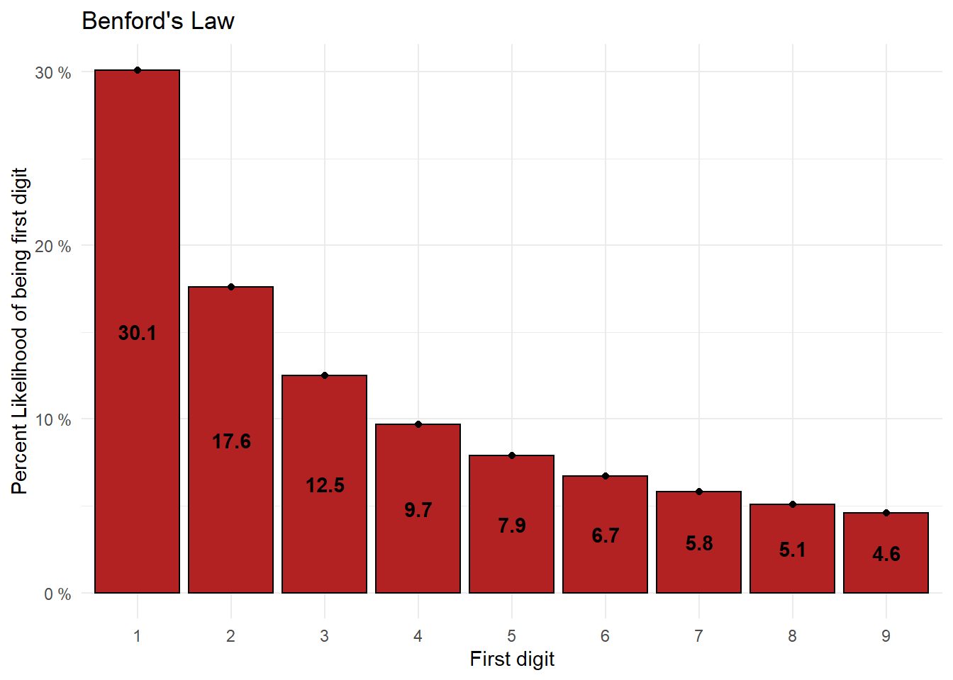
| FirstDigit | 1 | 2 | 3 | 4 | 5 | 6 | 7 | 8 | 9 |
| Percent | 30.1 | 17.6 | 12.5 | 9.7 | 7.9 | 6.7 | 5.8 | 5.1 | 4.6 |
One of the implications of this law is that it is statistically more likely that a town’s population will be in the 1000s than in the 900s. That might seem a little strange, but there is a lot supporting this law.
If you are interested in learning more about the history or workings of Benford’s Law, here are some links you can go to:
- Simon Newcomb and “Natural Numbers” (Benford’s Law)
- A Quick Introduction to Benford’s Law
- Benford’s Law
- Benford’s Law - Statistics How To (Same as the source of the quote that was linked above)
"Benford’s law doesn’t apply to every set of numbers, but it usually applies to large sets of naturally occurring numbers with some connection like:
- Companies’ stock market values,
- Data found in texts — like the Reader’s Digest, or a copy of Newsweek.
- Demographic data, including state and city populations,
- Income tax data,
- Mathematical tables, like logarithms,
- River drainage rates,
- Scientific data.
The law usually doesn’t apply to data sets that have a stated minimum and maximum, like interest rates or hourly wages. If numbers are assigned, rather than naturally occurring, they will also not follow the law. Examples of assigned numbers include: zip codes, telephone numbers and Social Security numbers."
– Statistics How To
This law is both surprising and interesting. To see it in action, take a look at a sample of population data of California cities and towns taken from the 2010 Census.
| city | population | FirstDigit |
|---|---|---|
| Los Angeles | 3792621 | 3 |
| San Diego | 1307402 | 1 |
| San Jose | 945942 | 9 |
| San Francisco | 805235 | 8 |
| Fresno | 494665 | 4 |
| Sacramento | 466488 | 4 |
| Long Beach | 462257 | 4 |
| Oakland | 390724 | 3 |
| Bakersfield | 347483 | 3 |
| Anaheim | 336265 | 3 |
This is only the first 10 observations, but if we take the first digit of the populations of every California city and town listed in the 2010 Census and plot them on a histogram, we get this:

The distribution doesn’t look exactly like what we would expect from Benford’s, but it’s not far off. It’s difficult to say conclusively just from the visualization whether or not this data follows Benford’s Law, so at this point we might perform a Chi-Squared Goodness of Fit test to determine statistically whether or not this data is likely to follow the expected distribution associated with Benford’s Law. Rather than do that here though, let’s first look at a similar example.
Another Example - U.S. County Populations
In this example, we’ll again use the 2010 Census data but use the entire country for our data. Suppose we wanted to know if Benford’s Law applies to the county populations across the U.S. We can use a Goodness of Fit to infer whether or not U.S. county populations fit the expected distribution.
(Note: the table shows 10 random rows from the data containing all counties)
| state | county | population | FirstDigit |
|---|---|---|---|
| Tennessee | Unicoi County | 18313 | 1 |
| Iowa | Emmet County | 10302 | 1 |
| New York | Madison County | 73442 | 7 |
| Tennessee | Fayette County | 38413 | 3 |
| New Hampshire | Carroll County | 47818 | 4 |
| Missouri | Holt County | 4912 | 4 |
| New York | Allegany County | 48946 | 4 |
| Arkansas | Polk County | 20662 | 2 |
| Minnesota | Freeborn County | 31255 | 3 |
| South Carolina | Lee County | 19220 | 1 |
Here is the plot of the distribution for all U.S. Counties:
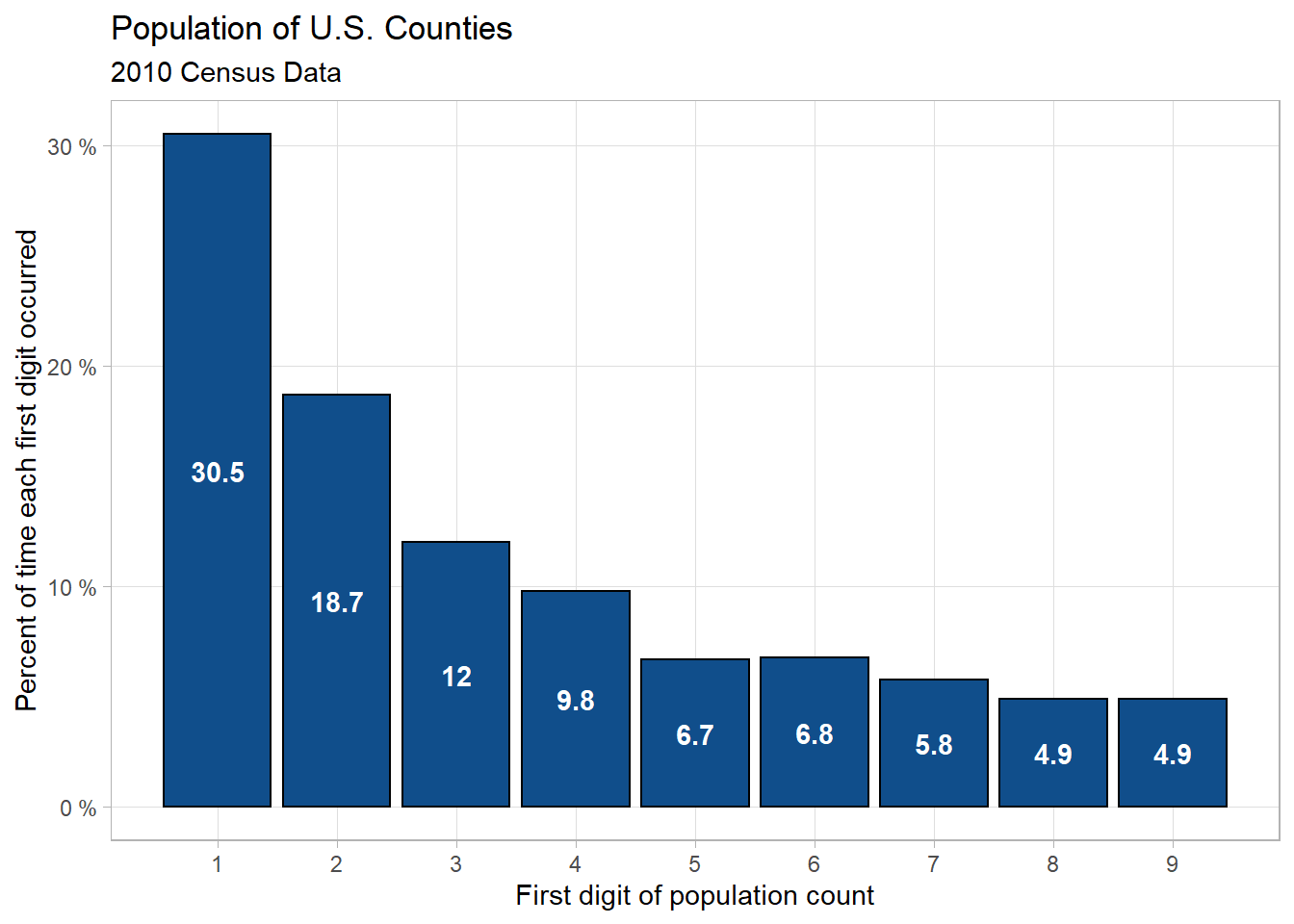
This distribution again looks very close to what we would expect form Benford’s Law, but we need to perform a Chi-Squared Goodness of Fit test first to be more certain.
We need to state our hypotheses so that we know exactly what we’re trying to learn through this test. That will allow us to know how to change our thoughts/behavior as a result. The hypotheses for a Goodness of Fit test are quite simple.
The null hypothesis is:
\[ H_0: \text{The distribution of first digits of county populations in the U.S.} \\ \text{is consistent with Benford's Law.} \]
and the alternative hypothesis is:
\[ H_a: \text{The distribution of first digits of county populations in the U.S.} \\ \text{is } \textbf{not} \text{ consistent with Benford's Law.} \]
For this test we will set our significance level (\(\alpha\)) at 0.05 This is the value that we will compare our p-value against to determine if what is observed in the sample is statistically likely to be observed in the population as well.
Before we can compare a p-value against our alpha, we first need to compute a test statistic. We’ll then use that test statistic in the context of our distribution to calculate our p-value.
The chi-squared test statistic obtained using our data is:
9.8513
Here is an idea of what is happening with the hypothesis test we are conducting.
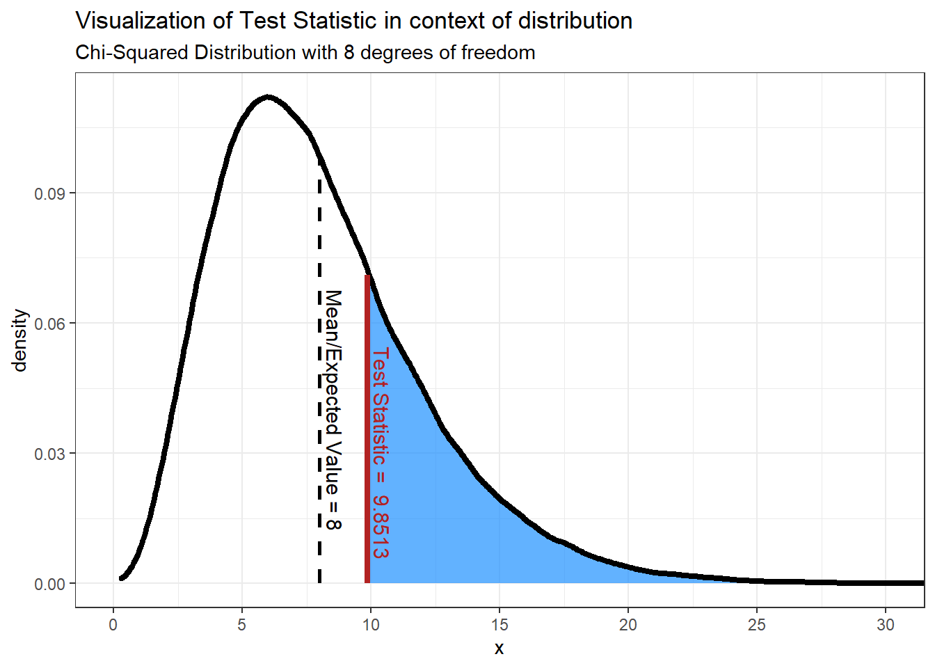
We’re doing a Chi-Squared test, hence using the Chi-Squared distribution. For Normal distributions the mean and variance determine the shape and position of the distribution, but for Chi-Squared distributions it’s based instead on the degrees of freedom. It’s okay if the idea of degrees of freedom are unfamiliar, but in Chi-Squared distributions the number of degrees of freedom is equal to the number of levels minus 1. We have 9 levels (1 level for each of the digits 1-9), so
\[ df = 9-1 = \textbf{8 degrees of freedom} \]
As a note, in Chi-Squared distributions it just so happens that the mean is equal to the degrees of freedom.
Now that we have the test statistic, we now find the probability of finding that value or one more extreme assuming the null hypothesis is correct. We do this by finding the area under the curve that is at least as extreme as our test statistic - the shaded area in the graph above. In order to reject the null hypothesis we need this area to be less than or equal to our alpha level, or 0.05 in our case. In other words, 5% or less of the area under the curve should be shaded. It should seem obvious looking at the graph that more than 5% is shaded, but let’s compute the p-value anyway. We can calculate the p-value by using a Chi-Squared test. The p-value produced is:
0.2756
Our p-value, 0.2756, is greater than our \(\alpha\) so we fail to reject the Null Hypothesis and therefore infer that the county populations for U.S. counties follow Benford’s Law.
As a note, here is an example of what the graph might look like if we found a test statistic that would result in the null hypothesis being rejected:
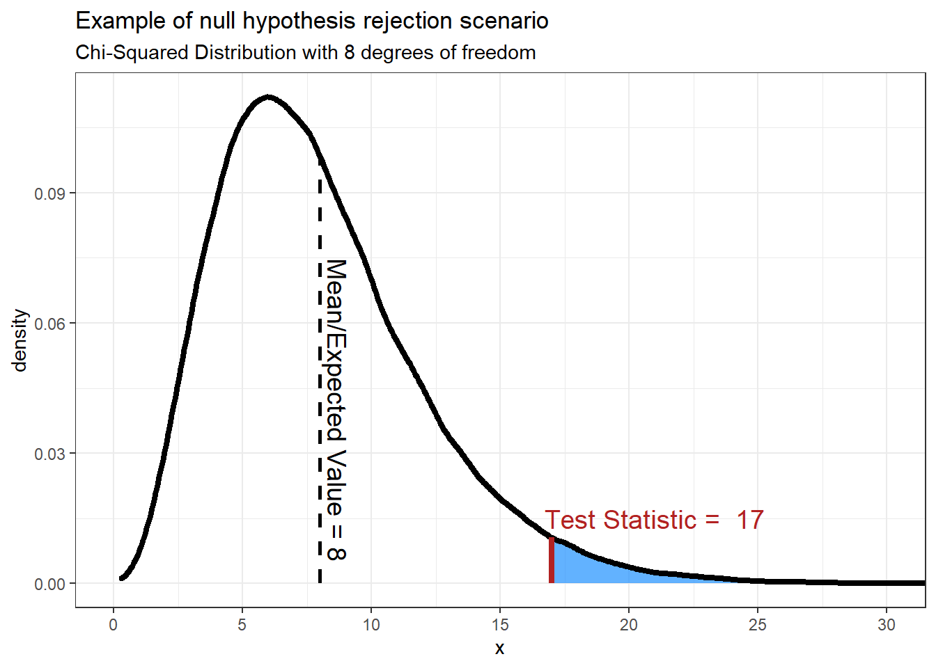
The p-value produced from this test statistic is 0.0301.
This should make sense that the we would reject the null hypothesis, or assume that the data does not follow the expected distribution, when the test statistic is large. Recall that based on the formula for finding the test statistic, the test statistic will be larger when the difference between the observed and expected values are larger. If the difference between expected and observed values are small the test statistic will be small.
Applications of Benford’s Law
"One practical use for Benford’s law is fraud and error detection. It’s expected that a large set of numbers will follow the law, so accountants, auditors, economists and tax professionals have a benchmark for what the normal levels of any particular number in a set are.
In the latter half of the 1990s, accountant Mark Nigrini found that Benford’s law can be an effective red-flag test for fabricated tax returns; True tax data usually follows Benford’s law, whereas made-up returns do not.
The law was used in 2001 to study economic data from Greece, with the implication that the country may have manipulated numbers to join the European Union.
Ponzi schemes can be detected using the law. Unrealistic returns, such as those purported by the Maddoff scam, fall far from the expected Benford probability distribution (Frunza, 2015)."
– Statistics How To
As was shown with the county population example above, one way to check whether or not data follows Benford’s Law is using the Goodness of Fit test.
Chapter 6 of this book contains a link to a tool that you can use to perform the Goodness of Fit test. Below are a couple of examples of using this tool, one where the data follows Benford’s Law and one where it does not. The data used is taken from the data4benfords data connected to this course, specifically the waitlist data in the benford_data4 file. The data was consists of counts of people on waitlists for various medical treatments and procedures in Finland and Spain.
When using this tool, all you should need to do is enter the observed counts from the data and the proportion that those values should appear under the expected distribution.The values in the “Percent Expected” column are the proportions associated with Benford’s Law.
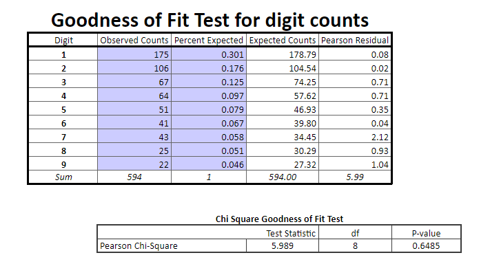
Finland Waitlist Counts
Remember that if the p-value is above 0.05 then we fail to reject the null hypothesis, where our null hypothesis is that the data follows Benford’s Law. Here our p-value is well above 0.05, so we assume that the waitlist count data for Finland does indeed follow the expected distribution associated with Benford’s Law.

Spain Waitlist Counts
The p-value here is well below 0.05. Note that it almost certainly isn’t actually 0, but rather is just some very small value with too many decimal places to show up in this tool. Either way, with this p-value we would reject the null hypothesis and infer that the Spain waitlist data does not follow Benford’s Law.
Benford’s Law isn’t perfect, so this doesn’t automatically mean that Spain lied or has errors in their waitlist data. Nor does it mean that Finland wasn’t lying or incorrect in their data. If it was your job to investigate medical procedure waitlist fraud, however, then you might be suspicious of Spain hospitals and look into it further to find out if there’s more to the story.
The test statistics for the Benford’s Goodness of Fit tests were computed using the BenfordTests R package.
Citation:
Dieter William Joenssen (2015). BenfordTests: Statistical Tests for Evaluating Conformity to Benford’s Law. R package version 1.2.0. https://CRAN.R-project.org/package=BenfordTests