Chapter 1 Describing Data
1.1 Tidy Data
It doesn’t take a data scientist to know that there isn’t a single, defined format for data to be organized and stored. More often than not, we’ll have to adjust and manage the data to get it into a format that is suitable for visualizations and analysis. One step in this process is generally called cleaning, and involves tasks such as “cleaning up” missing or incorrect values, column names, inconsistencies in the data, etc. There’s also usually some amount of wrangling. Data wrangling is the steps of creating new variables, reshaping the data, joining multiple datasets into one, etc. While this course won’t require you to do either of these tasks in depth, it is good to know that they’re part of everyday work for a data scientist.
What should good data look like though? How does one know that their data is ready to be analyzed and visualized? The answer is that the dataset should be tidy.
“Tidy data is a standard way of mapping the meaning of a dataset to its structure. A dataset is messy or tidy depending on how rows, columns and tables are matched up with observations, variables and types.”
— Hadley Wickham
To better explain what this means and give it some context, consider some example datasets:
(Note: much of the following comes from “R for Data Science” by Garrett Grolemund and Hadley Wickham and the Tidy Data paper written by Hadley Wickham and published in the Journal of Statistical Software.)
You can represent the same underlying data in multiple ways. The example below shows the same data organised in four different ways. Each dataset shows the same values of four variables country, year, population, and cases, but each dataset organises the values in a different way.
Table 1
| country | year | cases | population |
|---|---|---|---|
| Afghanistan | 1999 | 745 | 19987071 |
| Afghanistan | 2000 | 2666 | 20595360 |
| Brazil | 1999 | 37737 | 172006362 |
| Brazil | 2000 | 80488 | 174504898 |
| China | 1999 | 212258 | 1272915272 |
| China | 2000 | 213766 | 1280428583 |
Table 2
| country | year | type | count |
|---|---|---|---|
| Afghanistan | 1999 | cases | 745 |
| Afghanistan | 1999 | population | 19987071 |
| Afghanistan | 2000 | cases | 2666 |
| Afghanistan | 2000 | population | 20595360 |
| Brazil | 1999 | cases | 37737 |
| Brazil | 1999 | population | 172006362 |
| Brazil | 2000 | cases | 80488 |
| Brazil | 2000 | population | 174504898 |
| China | 1999 | cases | 212258 |
| China | 1999 | population | 1272915272 |
| China | 2000 | cases | 213766 |
| China | 2000 | population | 1280428583 |
Table 3
| country | year | rate |
|---|---|---|
| Afghanistan | 1999 | 745/19987071 |
| Afghanistan | 2000 | 2666/20595360 |
| Brazil | 1999 | 37737/172006362 |
| Brazil | 2000 | 80488/174504898 |
| China | 1999 | 212258/1272915272 |
| China | 2000 | 213766/1280428583 |
Spread across two tables
Table 4a: cases
| country | 1999 | 2000 |
|---|---|---|
| Afghanistan | 745 | 2666 |
| Brazil | 37737 | 80488 |
| China | 212258 | 213766 |
Table 4b: population
| country | 1999 | 2000 |
|---|---|---|
| Afghanistan | 19987071 | 20595360 |
| Brazil | 172006362 | 174504898 |
| China | 1272915272 | 1280428583 |
These are all representations of the same underlying data, but they are not equally easy to use.
There are three interrelated rules which make a dataset tidy:
- Each variable forms a column.
- Each observation forms a row.
- Each value must have its own cell.
Figure 1.1 shows the rules visually.
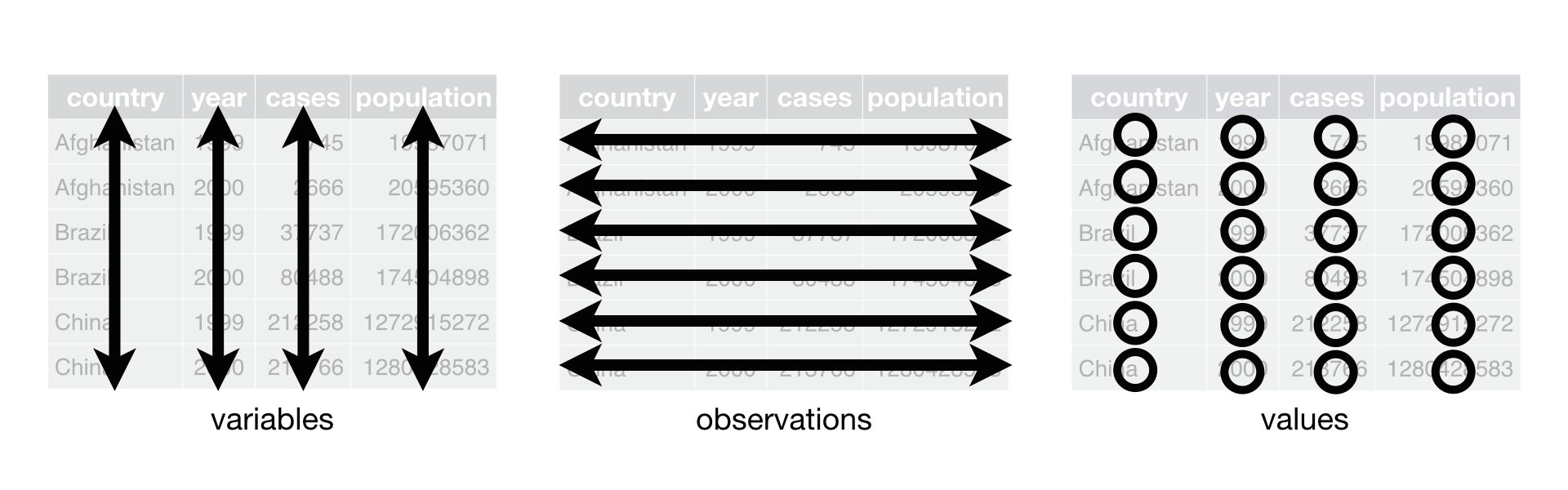
Figure 1.1: Following three rules makes a dataset tidy: variables are in columns, observations are in rows, and values are in cells.
These three rules are interrelated because it’s impossible to only satisfy two of the three. That interrelationship leads to an even simpler set of practical instructions:
Put each dataset in a tibble. (Don’t worry if you’ve never heard of a tibble before. For now, just think of it as a dataset that follows the rules of being tidy. Read here for more information if you’re curious. Tibbles will have a lot more meaning if you ever program in the R language.)
Put each variable in a column.
In this example, only table1 is tidy. It’s the only representation where each column is a variable.
Why ensure that your data is tidy?:
There’s a general advantage to picking one consistent way of storing data. If you have a consistent data structure, it’s easier to learn the tools that work with it because they have an underlying uniformity.
Excerpts from Data Science with R by Garrett Grolemund
The following paragraphs in quotes come from the chapter on Data Tidying in Data Science with R by Garrett Grolemund.
"Tidy data builds on a premise of data science that data sets contain both values and relationships. Tidy data displays the relationships in a data set as consistently as it displays the values in a data set.
“At this point, you might think that tidy data is so obvious that it is trivial. Surely, most data sets come in a tidy format, right? Wrong. In practice, raw data is rarely tidy and is much harder to work with as a result.”
“Tidy data arranges values so that the relationships in the data parallel the structure of the data frame. Recall that each data set is a collection of values associated with a variable and an observation. In tidy data, each variable is assigned to its own column, i.e., its own vector in the data frame.”
For further reading about how to tidy data and more examples see here. Note: This page discusses tidying data in relation to the R programming language.
We will be using Google Sheets for this course to store and manipulate data. Google Sheets doesn’t require data to be stored in a tidy format, but you should choose to keep your data tidy. Your life will be much easier for it.
1.2 Course Tools
For this course, we will use both Google Sheets and Tableau to work with our data and complete assignments.
1.2.1 Using Google Sheets
With Google Sheets, you can create and edit spreadsheets directly in your web browser—no special software is required. Multiple people can work simultaneously, you can see people’s changes as they make them, and every change is saved automatically. A more extensive guide can be found in Tools, but you can refer to their cheat sheet here.
1.3 Numerical Summaries
When data is numeric in nature, it is often helpful to look at summaries of the data, rather than try and take in the data as a whole. There are more summary statistics than are shown here in this book, but this book will cover the most commonly used numerical summaries. This chapter is split into measures of center and measures of spread.
1.3.1 Measures of Center
Think about conversations you may have had about data. That may be the average score on an exam, the average miles per gallon on a tank of gas, or the median starting salary for a given degree or job. Note that all of these values are just that, values. These values don’t tell us anything about the spread of the data, but they tell us about the likely values of the distribution. Understanding the spread as well can be very useful (see Data vs. Summaries for more on that conversation) but understanding the center by itself has plenty of use. When buying a car, you probably don’t feel the need to ask about the standard deviation of the car’s reported gas mileage because the average alone is probably enough for you to make a decision.
There are more measures of center than are listed here, but these are arguably the most common and useful for general purpose uses.
The material below on numerical and graphical summaries is almost entirely from the Statistics Notebook.
Mean
1 Quantitative Variable
Formula: \[ \bar{x} = \frac{\sum_{i=1}^n x_i}{n} \]
- Although the formula looks complicated, all it states is “add all the data values up and divide by the total number of values.”
Symbols in the Formula
\(\bar{x}\) is read “x-bar” and is the symbol typically used for the sample mean, the mean computed on a sample of data from a population.
\(\Sigma\), the capital Greek letter “sigma,” is the symbol used to imply “add all of the data values up.”
The \(x_i\)’s are the data values. The \(i\) in the \(x_i\) is stated to go from \(i=1\) all the way up to \(n\). In other words, data value 1 is represented by \(x_1\), data value 2: \(x_2\), \(\ldots\), up through the last data value \(x_n\). In general, we just write \(x_i\).
\(n\) represents the sample size, or number of data values.
Explanation:
- The “balance point” or “center of mass” of quantitative data. It is calculated by taking the numerical sum of the values divided by the number of values. Typically used in tandem with the standard deviation. Most appropriate for describing the most typical values for relatively normally distributed data. Influenced by outliers, so it is not appropriate for describing strongly skewed data.
Physical Interpretation
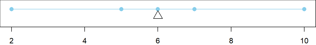
The mean is sometimes described as the “balance point” of the data. The following example will demonstrate.
Say there are \(n=5\) data points with the following values.
\(x_1 = 2\)
\(x_2 = 5\)
\(x_3 = 6\)
\(x_4 = 7\)
\(x_5 = 10\)
The sample mean is calculated as follows. \[ \bar{x} = \frac{\sum_{i=1}^n x_i}{n} = \frac{2 + 5 + 6 + 7 + 10}{5} = 6 \]
If these values were plotted, and an “infinitely thin bar” connected the points, then the bar would “balance” at the mean (the triangle) as shown below.
Middle of the Deviations
- The above plot demonstrates that there are equal, but opposite, “sums of deviations” to either side of the mean. Note that a deviation is defined as the distance from the mean to a given point. Thus, \(x_1\) has a deviation of -4 from the mean, \(x_2\) a deviation of -1, \(x_3\) a deviation of 0, \(x_4\) a deviation of 1, and \(x_5\) a deviation of 4. To the left there is a sum of deviations equal to -5 and on the right, a sum of deviations equal to 5. This can be verified to hold for any scenario.
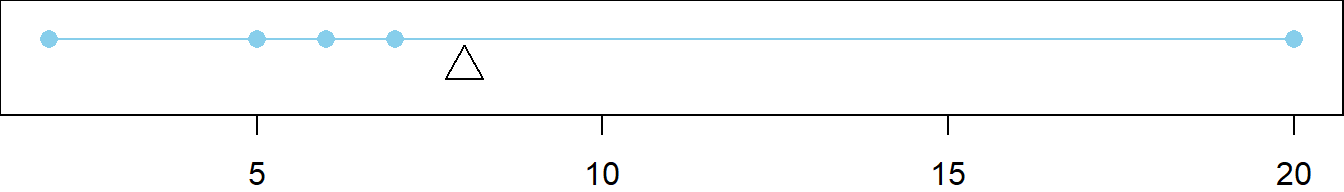
Effect of Outliers
The mean can be strongly influenced by outliers, points that deviate abnormally from the mean. This is shown below by changing \(x_5\) to be 20. Note that the deviation of \(x_5\) is 12, and the sum of deviations to the left of the mean (\(\bar{x}=8\)) is \(-1 + -2 + -3 + -6 = -12\).
The mean of the altered data
\(x_1 = 2\)
\(x_2 = 5\)
\(x_3 = 6\)
\(x_4 = 7\)
\(x_5 = 20\)
is now \(\bar{x} = \frac{\sum_{i=1}^n x_i}{n} = \frac{2 + 5 + 6 + 7 + 20}{5} = 8\).
Population Mean
- When all of the data from a population is available, the population mean is calculated instead of the sample mean. The mathematical formula for the population mean is the same as the formula for the sample mean, but is written with slightly different notation.
\[ \mu = \frac{\sum_{i=1}^N x_i}{N} \]
- Notice that the symbol for the population mean is \(\mu\), pronounced “mew,” another Greek letter. The only other difference between the two formulas is that the sample mean uses a sample of data, denoted by \(n\), while the population mean uses all the population data, denoted by \(N\).
Median
1 Quantitative Variable
Formula:
The mathematical formula used to compute the median of data depends on whether \(n\), the number of data points in the sample, is even or odd.
If \(n\) is even, then there is no “middle” data point, so the middle two values are averaged. \[ \text{Median} = \frac{x_{(n/2)}+x_{(n/2+1)}}{2} \]
If \(n\) is odd, then the middle data point is the median. \[ \text{Median} = x_{((n+1)/2)} \]
Symbols in the Formula
There is no generally accepted symbol for the median. Sometimes a capital \(M\) or even lower-case \(m\) is used, but generally the word median is just written out.
\(x_{(n/2)}\) represents the data value that is in the \((n/2)^{th}\) position in the ordered list of values. It only exists when \(n\) is even.
\(x_{(n/2+1)}\) represents the data value that immediately follows the \((n/2)^{th}\) value in the ordered list of values. It only exists when \(n\) is even.
\(x_{((n+1)/2)}\) represents the data value that is in the \(((n+1)/2)^{th}\) position in the ordered list of values. It only exists when \(n\) is odd.
\(n\) represents the sample size, or number of data values in the sample.
Explanation
The “middle data point,” i.e., the 50\(^{th}\) percentile. Half of the data is below the median and half is above the median. Typically used in tandem with the five-number summary to describe skewed data because it is not heavily influenced by outliers, i.e., it is robust. Can also be used with normally distributed data, but the mean and standard deviation are more useful measures in such cases.
Population Median
When all of the data from a population is available, the population median is calculated by the above formulas with the slight change that \(N\), the total number of data values in the population, instead of \(n\), the number of values in the sample, is used.
If \(N\) is even, then there is no “middle” data point, so the middle two values are averaged. \[ \text{Median} = \frac{x_{(N/2)}+x_{(N/2+1)}}{2} \]
If \(N\) is odd, then the middle data point is the median. \[ \text{Median} = x_{((N+1)/2)} \]
Physical Interpretation
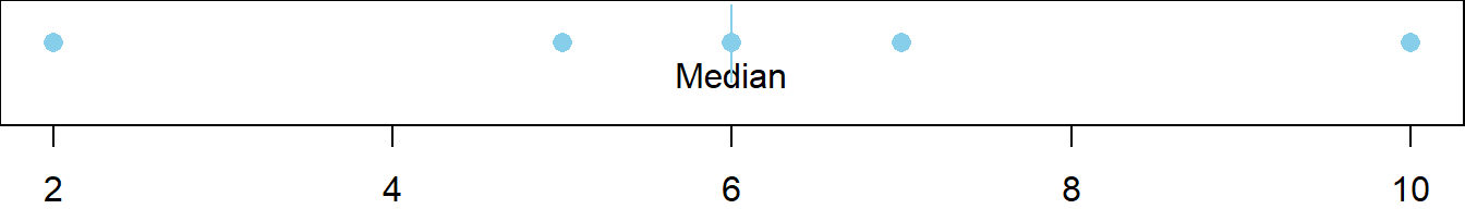
The median is the \(50^{th}\) percentile of the data.
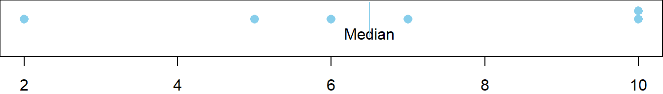
Say there are \(n=5\) data points in the sample with the following values.
- \(x_1 = 2\)
- \(x_2 = 5\)
- \(x_3 = 6\)
- \(x_4 = 7\)
- \(x_5 = 10\)
The sample median is calculated as follows. Note that \(n=5\) is odd. \[ \text{Median} = x_{((n+1)/2)} = x_{((5+1)/2)} = x_{(3)} = 6 \] When these values are plotted it is clear that exactly 50% of the data (excluding the median) is to either side of the median.
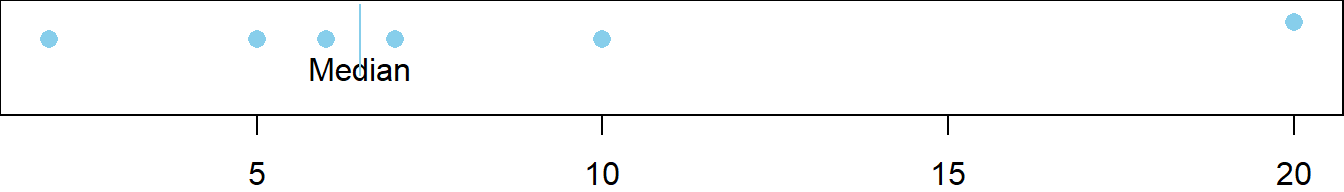
Second Example
Say there was a sixth value in the data set equal to 10, so that \(n=6\) is even.
- \(x_1 = 2\)
- \(x_2 = 5\)
- \(x_3 = 6\)
- \(x_4 = 7\)
- \(x_5 = 10\)
- \(x_6 = 10\)
\[ \text{Median} = \frac{x_{(n/2)}+x_{(n/2+1)}}{2} = \frac{x_{(6/2)}+x_{(6/2+1)}}{2} = \frac{x_{(3)}+x_{(4)}}{2} = \frac{6+7}{2} = 6.5 \]
Effect of Outliers
The median is not greatly influenced by outliers. It is said to be robust. This is shown below by changing \(x_6\) to be 20, which does not change the value of the median.
Mode
1 Quantitative or Qualitative Variable
The most commonly occurring value. There may be more than one mode.
Example:
A set of data might contain the following values: 5, 7, 8, 8, 8, 11, 15, 16, 17, 17, 20.
The mode would be 8, because it occurred most often in the data.
If another 17 were added, then the data would be: 5, 7, 8, 8, 8, 11, 15, 16, 17, 17, 17, 20.
The new modes would be 8 and 17 because they’re tied for the highest number of occurrences.
Percentile
1 Quantitative Variable
The percent of data that is equal to or less than a given data point. Useful for describing the relative position of a data point within a data set. If the percentile is close to 100, then the observation is one of the largest. If it is close to zero, then the observation is one of the smallest.
An example may help this make more sense. Imagine a very long street with houses on one side. The houses increase in value from left to right. At the left end of the street is a small cardboard box with a leaky roof. Next door is a slightly larger cardboard box that does not leak. The houses eventually get larger and more valuable. The rightmost house on the street is a huge mansion.
Notice that if there was a fence between each house, it would take 99 fences to separate the houses.
house 1 | house 2 | … | house 99 | house 100
The home values are representative of data. If we have a list of data, sorted in increasing order, and we want to divide it into 100 equal groups, we only need 99 dividers (like fences) to divide up the data. The first divider is as large or larger than 1% of the data. The second divider is as large or larger than 2% of the data, and so on. The last divider, the 99th, is the value that is as large or larger than 99% of the data. These “dividers” (i.e. the fences) are called percentiles. A percentile is a number such that a specified percentage of the data are at or below this number. For example, the 99th percentile is a number such that 99% of the data are at or below this value. As another example, half (50%) of the data lie at or below the 50th percentile. The word “percent” means “÷100.” This can help you remember that the percentiles divide the data into 100 equal groups.
Quartiles are special percentiles. The word “quartile” is from the Latin quartus, which means “fourth.” The quartiles divide the data into four equal groups. The quartiles correspond to specific percentiles. The first quartile, Q1, is the 25th percentile. The second quartile, Q2, is the same as the 50th percentile or the median. The third quartile, Q3, is equivalent to the 75th percentile.
Understanding the five-number summary will help percentiles and quartiles have more meaning.
1.3.2 Measures of Spread
Quartiles (five-number summary)
25\(^{th}\), 50\(^{th}\), 75\(^{th}\) and 100\(^{th}\) Percentiles
1 Quantitative Variable
Good for describing the spread of data, typically for skewed distributions. There are four quartiles. They make up the five-number summary when combined with the minimum. The second quartile is the median (50\(^{th}\) percentile) and the fourth quartile is the maximum (100\(^{th}\) percentile). The first quartile (\(Q_1\) or lower quartile) and third quartile (\(Q_3\) or upper quartile) show the spread of the “middle 50%” of the data, which is often called the interquartile range. Comparing the interquartile range to the minimum and maximum shows how the possible values spread out around the more probable values.
Standard Deviation
1 Quantitative Variable
Formula:
\[ s = \sqrt{\frac{\sum_{i=1}^n(x_i-\bar{x})^2}{n-1}} \]
Data often varies. The values are not all the same. To capture, or measure how much data vary with a single number is difficult. There are a few different ideas on how to do it, but by far the most used measurement of the variability in data is the standard deviation.
The first idea in measuring the variability in data is that there must be a reference point. Something from which everything varies. The most widely accepted reference point is the mean.
A deviation is defined as the distance an observation lies from the reference point, the mean. This distance is obtained by subtraction in the order \(x_i - \bar{x}\), where \(x_i\) is the data point value and \(\bar{x}\) is the mean of the data. There are thus \(n\) deviations because there are \(n\) data points.
Unfortunately, because of the order of subtraction in obtaining deviations, the average deviation will always work out to be zero. This is because the mean by nature splits the deviations evenly.
One solution would be to take the absolute value of the deviations and obtain what is known as the “absolute mean deviation.” This is sometimes done, but a far more attractive choice (to mathematicians and statisticians) is to square each deviation. You’ll have to trust us that this is the better choice.
Squaring a deviation results in the expression \((x_i-\bar{x})^2\). SQUARE
Summing up all of the squared deviations results in the expression \(\sum_{i=1}^n (x_i-\bar{x})^2\).
Dividing the sum of the squared deviations by \(n\) would seem like an appropriate thing to do. Experience (and some fantastic statistical theory!) demonstrated that this is wrong. Dividing by \(n-1\), the degrees of freedom is right. MEAN
To undo the squaring of the deviations, the final results are square rooted. ROOT
The end result is the beautiful formula for \(s\), the standard deviation! (At least the symbol for standard deviation is a simple \(s\).) It is also known as the ROOT-MEAN-SQUARED ERROR. Error is another word for deviation.
The standard deviation is thus the representative deviation of all deviations in a given data set. It is never negative and only zero if all values are the same in a data set. Larger values of \(s\) imply the data is highly variable, very spread out or very inconsistent. Smaller values mean the data is consistent and not as variable.
Population Standard Deviation
When all of the data from a population is available, the population standard deviation \(\sigma\) (the lower-case Greek letter “sigma”) is calculated by the following formula.
\[ \sigma = \sqrt{\frac{\sum_{i=1}^N(x_i-\mu)^2}{N}} \]
Note that \(N\) is the number of data points in the full population. In this formula the denominator is actually \(N\) and the deviations are calculated as the distance each data point is from the population mean \(\mu\).
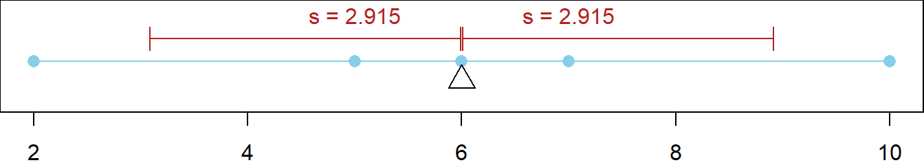
An Example
Say there are five data points given by
- \(x_1 = 2\)
- \(x_2 = 5\)
- \(x_3 = 6\)
- \(x_4 = 7\)
- \(x_5 = 10\)
The mean of these values is \(\bar{x}=6\).
The five deviations are
- \((x_1 - \bar{x}) = (2 - 6) = -4\)
- \((x_2 - \bar{x}) = (5 - 6) = -1\)
- \((x_3 - \bar{x}) = (6 - 6) = 0\)
- \((x_4 - \bar{x}) = (7 - 6) = 1\)
- \((x_5 - \bar{x}) = (10 - 6) = 4\)
The squared deviations are
- \((x_1 - \bar{x})^2 = (2 - 6)^2 = (-4)^2 = 16\)
- \((x_2 - \bar{x})^2 = (5 - 6)^2 = (-1)^2 = 1\)
- \((x_3 - \bar{x})^2 = (6 - 6)^2 = (0)^2 = 0\)
- \((x_4 - \bar{x})^2 = (7 - 6)^2 = (1)^2 = 1\)
- \((x_5 - \bar{x})^2 = (10 - 6)^2 = (4)^2 = 16\)
The sum of the squared deviations is
\[ \sum_{i=1}^n (x_i-\bar{x})^2 = 16 + 1 + 0 + 1 + 16 = 34 \]
Dividing this by the degrees of freedom, \(n-1\), gives
\[ \frac{\sum_{i=1}^n (x_i-\bar{x})^2}{n-1} = \frac{34}{5-1} = \frac{34}{4} = 8.5 \]
Finally, \(s\) is obtained by taking the square root
\[ s = \sqrt{\frac{\sum_{i=1}^n(x_i-\bar{x})^2}{n-1}} = \sqrt{8.5} \approx 2.915 \]
The red lines below show how the standard deviation represents all deviations in this data set. Recall that the magnitudes of the individual deviations were \(4, 1, 0, 1\), and \(4\). The representative deviation is \(2.915\).
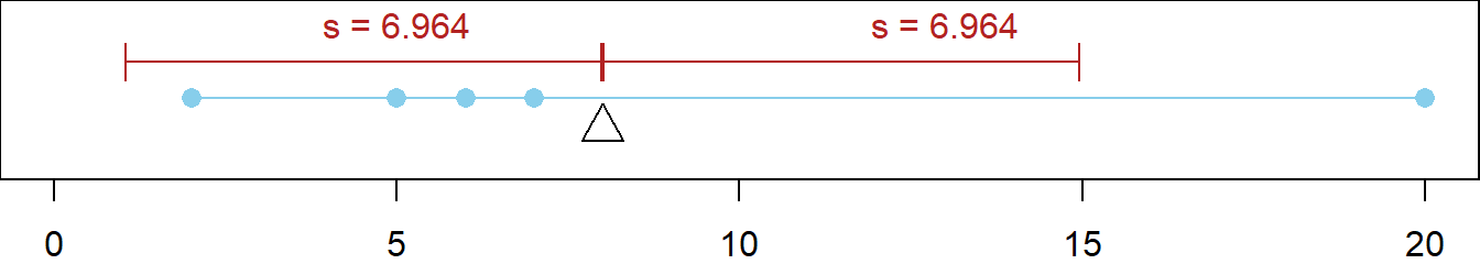
Effect of Outliers
Like the mean, the standard deviation is influenced by outliers. This is shown below by changing \(x_5\) to be 20. Note that the deviation of \(x_5\) is now 12 (instead of 4 like it was previously) and that the mean is now \(8\). The standard deviation of the altered data
- \(x_1 = 2\)
- \(x_2 = 5\)
- \(x_3 = 6\)
- \(x_4 = 7\)
- \(x_5 = 20\)
is now \(s \approx 6.964\). Not very “representative” of all the deviations. It is biased towards the largest deviation. It is important to be aware of outliers when reporting the standard deviation \(s\).
Variance
1 Quantitative Variable
Formula:
\[ s^2 = \frac{\sum_{i=1}^n(x_i-\bar{x})^2}{n-1} \]
Notice that the formula is just the formula for standard deviation without the square root. This is because variance is just standard deviation squared. Great theoretical properties, but seldom used when describing data. Difficult to interpret in context of data because it is in squared units. The standard deviation is typically used instead because it is in the original units and is thus easier to interpret.
1.4 Graphical Summaries
Section 6.2.4 provides links to information about using Tableau to create some of the different types of graphics we will be discussing and using in this cousrse. This section will talk about these graphical summaries more generally, as well as their relevance in statistics and analysis.
Histograms
1 Quantitative Variable
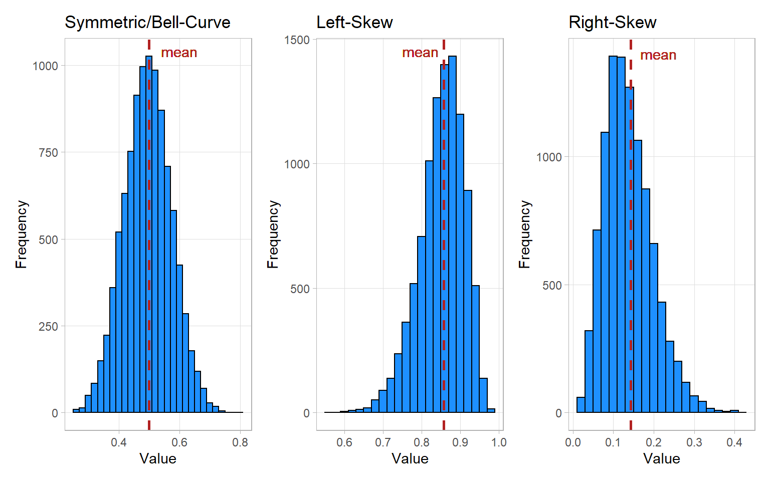
Histograms are great for showing the distribution of data for a single quantitative variable when the sample size is large. Dotplots are a good alternative for smaller sample sizes. Histograms are generally either symmetric/bell-shaped, left-skewed, or right-skewed.
Histograms group data that are close to each other into “bins” (the vertical bars in the plot). The height of a bin is determined by the number of data points that are contained within the bin.
Here is an excellent visualizer for histograms, with a walkthrough of how they’re created. You should take some time to interact with and understand it.
Boxplots
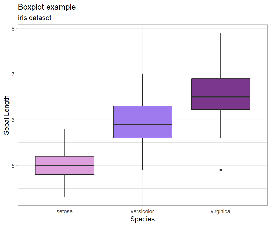
1 Quantitative Variable | 2+ Groups
Graphical depiction of the five-number summary. Great for comparing the distributions of data across several groups or categories. Provides a quick visual understanding of the location of the median as well as the range of the data. Can be useful in showing outliers. Sample size should be larger than at least five, or computing the five-number summary is not very meaningful. Side-by-side dotplots are a good alternative for smaller sample sizes.
How Boxplots are Made
- The five-number summary is computed.
- A box is drawn with one edge located at the first quartile and the opposite edge located at the third quartile.
- This box is then divided into two boxes by placing another line inside the box at the location of the median.
- The maximum value and minimum value are marked on the plot.
- Whiskers are drawn from the first quartile out towards the minimum and from the third quartile out towards the maximum.
- If the minimum or maximum is too far away, then the whisker is ended early.
- Any points beyond the line ending the whisker are marked on the plot as dots. This helps identify possible outliers in the data.
Bar Charts
1 (or 2) Qualitative Variable(s)
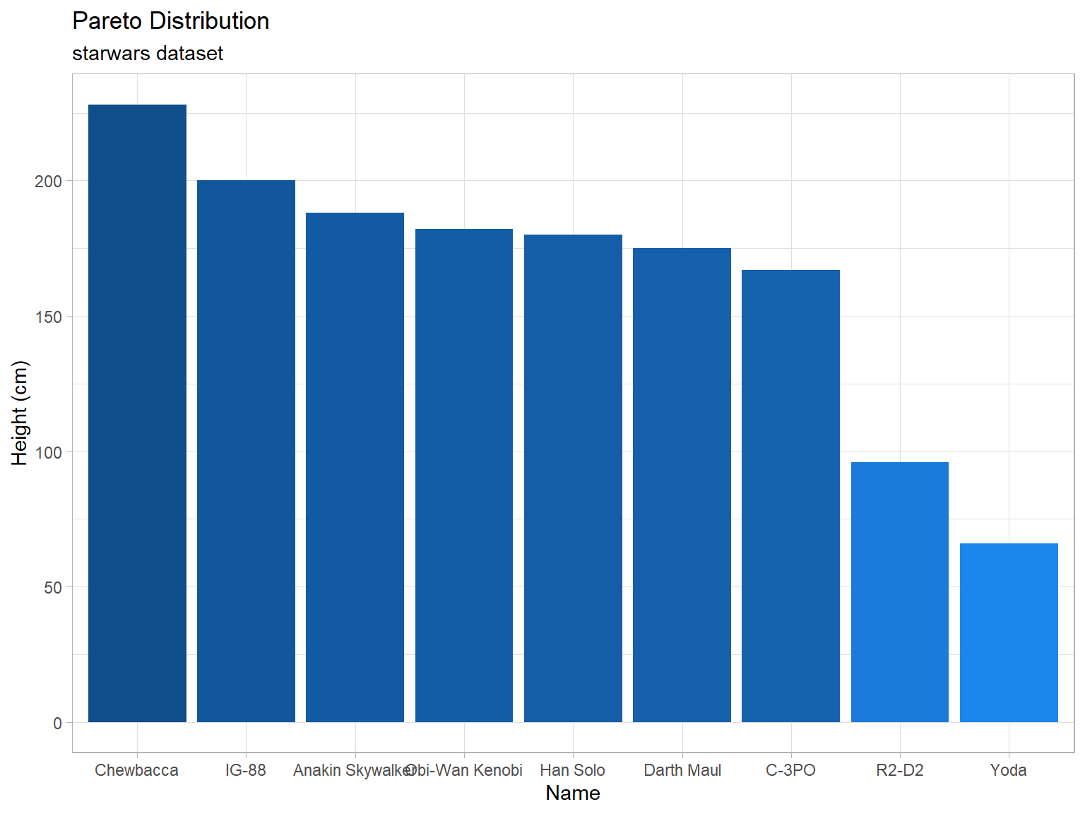
Depicts the number of occurrences for each category, or level, of the qualitative variable. Similar to a histogram, but there is no natural way to order the bars. Thus the white-space between each bar. It is called a Pareto chart if the bars are ordered from tallest to shortest. Grouped and stacked bar charts are often used to display information for two qualitative variables simultaneously.
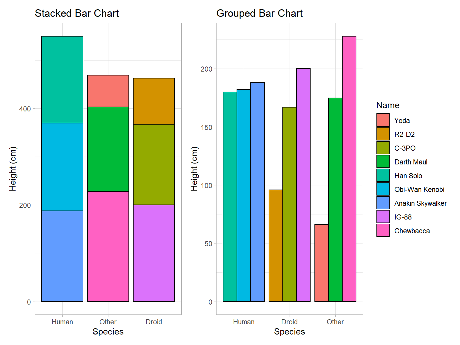
Note that stacked and grouped bar charts each come with their own advantages and disadvantages. Stacked bar charts are an effective way to compare the groups as a whole, while leaving some ability to compare the individual components of the group. Grouped bar charts are excellent for comparing the individuals both within and across groups, while also distinguishing the different groups that the individuals belong to. If you look at the stacked bar chart, you will find that it is hard to tell who is taller between Obi-Wan Kenobi and Darth Maul. You will find that this question is easy to answer though on the grouped plot, Obi-Wan is clearly taller, even if it is only by a handful of centimeters. On the other hand, it is difficult to tell from the grouped bar chart whether the Droid or Other species has the greatest total height. This becomes very easy to answer though using the stacked plot, the Other species has a greater total height.
Stacked bar charts are good for comparing groups as a whole, grouped bar charts are good for comparing individuals within and across groups. Both have their uses, but the decision of which to use should be a deliberate one.
Scatterplots
2 Quantitative Variables
Depicts the actual values of the data points, which are (x,y) pairs. Works well for small or large sample sizes. Visualizes well the correlation between the two variables. Should be used in linear regression contexts whenever possible.
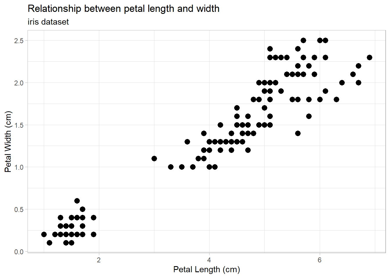
A lot of what you learned in your algebra classes comes into play with scatter plots and linear regression. A positive slope (like in the iris plot above) means that as the x-variable increases the y-variable also increases. A negative slope would mean that an increase in x would correspond with a decrease in y (example: an increase of mileage on a car corresponds with a decrease in its value). We must be careful here though to recognize the difference between correlation and causation. The iris plot is a good example of correlation. There is an obvious trend between petal length and petal width; when petal length is large we can be confident that the petal width will also be large. This doesn’t mean that a long petal causes a wide petal, but simply that iris flowers with long petals will usually also have wide petals. There is no causation between the two, just correlation. On the other hand, consider the relationship between how much you use your cell phone and its battery. The more you use your phone, the lower its battery level will be, and this is an example of a causal relationship, or causation. Additionally, this is a negative relationship. As one variable increases, the other decreases.
1.5 Data vs. Summaries
The word “data” has come to take on many different meanings and uses, only some of which refer to data in the way data scientists think and talk about it. This is in part because all too often, and even data scientists themselves may be guilty of this, data is confused with data summaries. The purpose of this section is to differentiate the two, as well as clear up some other misconceptions about data and how we use it. Data and data summaries both have their own unique uses, we just need to be sure which of the two we’re talking about and working with.
1.5.1 Raw Data
The following came from “What is Raw Data?” by Tim Bock.1
Raw data typically refers to tables of data where each row contains an observation and each column represents a variable that describes some property of each observation. Data in this format is sometimes referred to as tidy data, flat data, primary data, atomic data, and unit record data. Sometimes raw data refers to data that has not yet been processed.
Example
In the table below, each row (observation) represents a business customer of a telecommunications company, and the columns (variables) represent each company’s: industry, the value that the company represents to the owner of the data, and number of employees. Typically, raw data tables are much larger than this, with more observations and more variables.
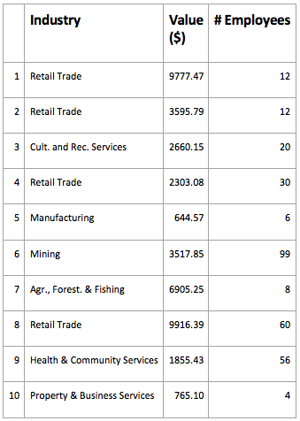
The importance of raw data
Most data analysis and machine learning techniques require data to be in this raw data format.
Obtaining raw data
Although it is typically required for data analysis, it is not a space-efficient format, nor is it an efficient format for data entry, so it is rare that data is stored in this format for purposes other than data analysis. Consequently, it is typically obtained by extracting a data file which is explicitly created to be in this format. The most common format is a CSV data file, but there are many other file formats.
Other names for observations and variables
Other names for an observation in raw data include: row, case, response, unit of analysis, unit, record, and measurement. A variable can be referred to as a column, field, property, characteristic, quality, and, confusingly, measurement.
Data that has not yet been processed
Typically, the data that is most readily available for use is not in a state in which it can be used easily. For example, data recording what people may have purchased when buying their groceries may initially be in the form of a long list, consisting of the name of each person and the date, followed by what they purchased. Such data is difficult to manipulate and typically needs to be processed in some way before it can be used in standard data analysis software. Data which has yet to be processed is sometimes referred to as raw data, although source data is a more useful term.
1.5.2 Comparison of summarized data, frequency data, and raw data
The following was originally published by Minitab.2
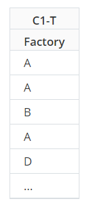
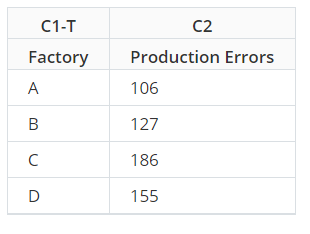
Data that summarize all observations in a category are called summarized data. The summary could be the sum of the observations, the number of occurrences, their mean value, and so on. When the summary is the number of occurrences, this is known as frequency data. This is in contrast to raw data, where each row in the worksheet represents an individual observation.
Raw Data
When a factory has a production error, the manager records which factory it was in the worksheet.
Frequency Data
The manager summarizes the number of occurrences in this worksheet. The first row shows that factory A had 106 errors.
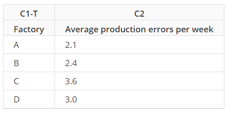
Summarized Data
Suppose the manager wanted the average number of errors, not the total. They record the number of productions errors per week in each factory for a year. The worksheet has a column with the factory name and a column with the number of errors that week. But because the manager recorded data for an entire year, his worksheet has 208 rows (52 weeks x 4 factories). The manager can use summarized data to determine the average number of errors per week in each factory.
1.5.3 Further Reading
Here are a couple more readings that may help you understand just what data is as well as what it isn’t:
1.5.4 Data Adds Insight to Summary
Hopefully by now it is very clear that there is a very important difference between data and data summaries. Data summaries can give us insight into data, but they are not data. Consider the idea of a mean. The mean is generally a good measure of the center of data (at least when the data is non-skewed) and is therefore able to give us some insight into the data. We have to be careful though to remember what the mean doesn’t tell us about the data. It doesn’t tell us the spread, (see variance and standard deviation) the number of observations that were used to produce it, or really anything about the distribution of the data.
As another example, consider again the boxplot for the iris dataset from above:

From this graphic, we are able to understand the five-number summary of each type of iris - and from there make comparisons and even decisions. That said, there is still a lot we don’t know. For example, how many observations are there in the dataset? Is it the same number in each group? When there are very few observations, boxplots can be very deceptive. In this case, it turns out that there are 50 observations in each group so the boxplot works well here, but that’s not something we could know just from the graphic.
See how the effect of the graphic changes once the data is added into the graphic:
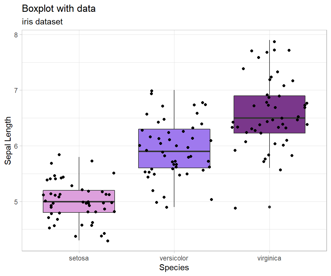
Notice that with the data laid on top of the boxplots we can see that there is indeed more variance in the virginica group than the setosa, as we saw just from the boxplot. Having an understanding of the data itself allows data summaries to have power in decision making.