Graphical Summaries
There are many ways to display data. The fundamental idea is that the graphical depiction of data should communicate the truth the data has to offer about the situation of interest.
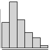
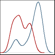
Histograms
|
1 Quantitative Variable Great for demonstrating the distribution of data with larger sample sizes. Dotplots are a good alternative for smaller sample sizes. Gives a good feel for the mean and standard deviation of the data. | R Instructions | |
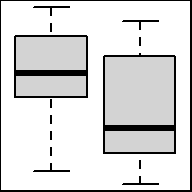
Boxplots
|
1 Quantitative Variable & 1+ Qualitative Variable(s) Graphical depiction of the five-number summary. Great for comparing the distribution of data across several groups or categories. Sample size should be larger than at least five for obvious reasons. Side-by-side dotplots are a good alternative for smaller sample sizes. | R Instructions | |
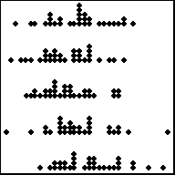
Dot Plots
|
1 Quantitative Variable & 1+ Qualitative Variable(s) Depicts the actual values of each data point. Best for small sample sizes. Histograms or boxplots are better alternatives for large sample sizes. Great for comparing the distribution of data across several groups or categories. | R Instructions | |
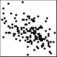
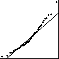
Scatterplots
|
2 Quantitative Variables Depicts the actual values of the data points, which are (x, y) pairs. Works well for small or large sample sizes. Visualizes well the correlation between the two variables. Should be used in linear regression contexts whenever possible. | R Instructions | |
Bar Charts
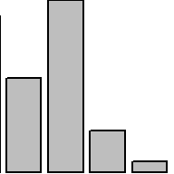
|
1 (or 2) Qualitative Variable(s) Depicts the number of occurrances for each category, or level, of the qualitative variable. Similar to a histogram, but there is no natural way to order the bars. Thus the white-space between each bar. It is called a Pareto chart if the bars are ordered from tallest to shortest. Clustered and stacked bar charts are often used to display information for two qualitative variables simultaneously. | R Instructions | |
QQ-Plots
|
1 Quantitative Variable Used to compare the distribution of data to some theoretical distribution. If the points in the plot follow the line, then it is likely that they are from the proposed theoretical distribution. Typically, reference to a QQ-Plot actually refers to a Normal Probability Plot, but theoretical distributions other than the normal distribution can be used. | R Instructions | |
Custom Plots
|
Creativity Required Sometimes no standard plot sufficiently describes the data. In these cases, the only guideline is the one stated originally, “the graphical depiction of data should communicate the truth the data has to offer about the situation of interest.” | R Instructions | |