Comparing Means (Chapter 9)
Comparing Dart Throwing Monkeys to Experts
From Automatic Finances we read,
In his popular personal finance book arguing that investors can’t consistently beat the market (A Random Walk Down Wall Street), economist Burton Malkiel says that “a blindfolded monkey throwing darts at a newspaper’s financial pages could select a portfolio that would do just as well as one carefully selected by experts.”
Sounds like a challenge.
So, in 1988, the Wall Street Journal decided to see if Malkiel’s theory would hold up, and created the Dartboard Contest.
How it worked: Wall Street Journal staffers, acting as the monkeys, threw darts at a stock table, while investment experts picked their own stocks. After six months, they compared the results of the two methods. The WSJ even solicited stock picks from some of its readers, and compared them, too.
Your Job
We have the data to compare the performance of the two groups. Let’s compare their performance
- Compare the Monkeys to the Pros and find the most precise confidence interval.
- Interpret the confidence interval like a statistical nerd.
- Interpret the confidence interval in a sentence that a New York times writer would write in an article to the general public.
- Read this website and write some concerns you have about our data and if it the analysis we have done is based on good data.
# might need https
temp = read.csv("http://github.com/byuistats/data/raw/master/Dart_Expert_Dow_6month_anova/Dart_Expert_Dow_6month_anova.csv")

sdata = subset(temp,variable!="DJIA")

datatable(sdata)
Comparing Groups (Simulated)
In many circumstances, statistical tests are not needed to tell the difference between the means of two groups. A good visualization (or statistical plot) can convey meaning much stronger than the results of a two-sample statistical test.
While statistics can be confusing, plots of raw data can be misleading or may not be able to distinguish differences visually. If the graphics are not clear cut, then statistics is needed to state with confidence that a true difference exists.
Your Job
Below are some examples of two groups of data simulated to have a known true difference. Look through them and answer the following questions
- For the sample size of 15, when do you think the plots of the raw data are insufficient to show if there is a true mean difference?
- Repeat question 1 for the 250 sample size plots.
- Go to the question data and pull the data into R. With the data in R calculate the confidence interval on the true mean difference and check that it matches the output on this page.
- Write out in a sentence what that confidence interval is saying.
two_groups = function(diff=1,sd=3,n=15,return_data=FALSE,mean=52,ci=FALSE){

  g1 = round(rnorm(n=n,mean=mean,sd=sd),2)
  g2 = round(rnorm(n=n,mean=mean+diff,sd=sd),2)

  gdata = data.frame(group=rep(c("Group 1","Group 2"),each=n),value=c(g1,g2))

  mean1 = mean(g1)
  mean2 = mean(g2)

  interval1 = as.numeric(t.test(g1)$conf.int)
  interval2 = as.numeric(t.test(g2)$conf.int)

  intervalD = t.test(g1,g2)$conf.int
  print(intervalD)
  print(paste("True Difference is", diff))

  conf_data = data.frame(group=c("Group 1","Group 2"),
                         value=c(mean1,mean2),
                         lower=c(interval1[1],interval2[1]),
                         upper=c(interval1[2],interval2[2]))


  p  = ggplot(data=gdata,aes(x=group,y=value))+
         geom_boxplot(outlier.size=NA)+
         geom_jitter(height=0,width=.2,size=2,colour="darkred",shape=15)+
         labs(x="Group",y="Measurement")
  if(ci==TRUE) p = p + geom_pointrange(data=conf_data,aes(ymin=lower,ymax=upper),colour="darkgreen",lwd=1.25)

  out = list(data=gdata,plot=p)
  if (return_data==FALSE) out = p

  out

}
Sample size of 15
two_groups(diff=10,ci=FALSE)## [1] -12.015429 -8.119238
## attr(,"conf.level")
## [1] 0.95
## [1] "True Difference is 10"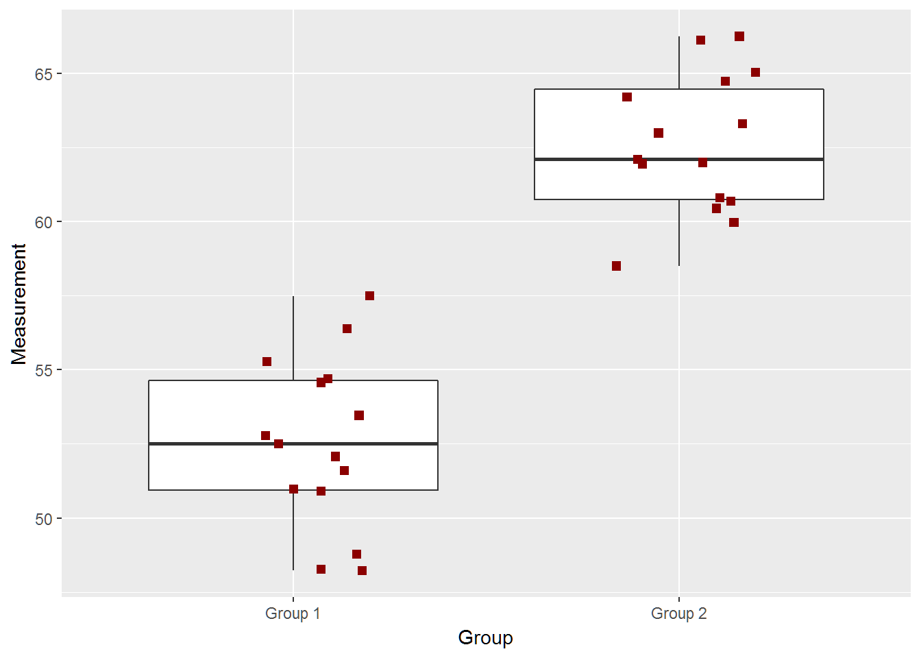
two_groups(diff=8)## [1] -6.774220 -2.831113
## attr(,"conf.level")
## [1] 0.95
## [1] "True Difference is 8"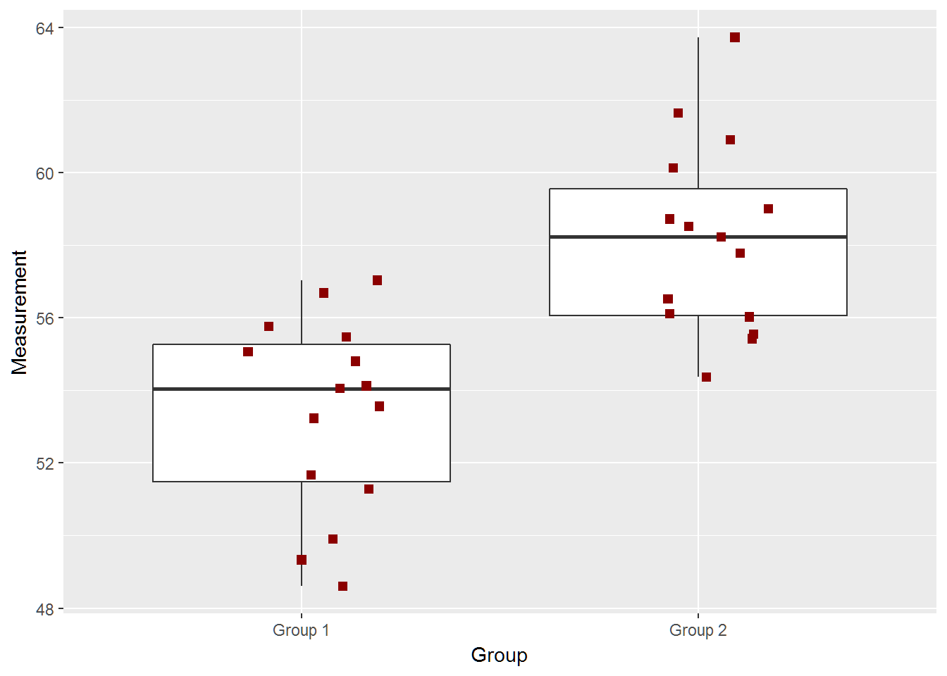
Question Data
out = two_groups(diff=5,ci=TRUE,return_data=TRUE)## [1] -7.168952 -2.067048
## attr(,"conf.level")
## [1] 0.95
## [1] "True Difference is 5"out$plot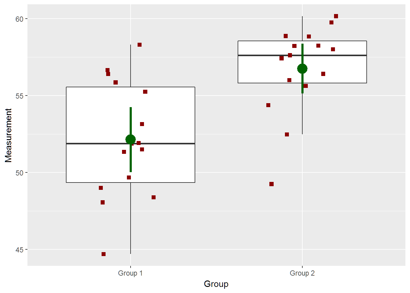
datatable(out$data,options = list(pageLength=2,lengthMenu=c(2,5,15)),
          caption = 'Table 1: Data for Random sample with a true mean difference of 5.', rownames=FALSE)
paste(subset(out$data,group=="Group 1")$value,collapse=",")## [1] "49.67,48.05,58.31,53.14,51.33,56.66,51.49,55.85,48.99,44.69,51.88,51.91,48.38,56.4,55.24"paste(subset(out$data,group=="Group 2")$value,collapse=",")## [1] "56,57.62,59.76,49.24,58.25,54.38,58.87,57.42,58.22,58,58.84,52.47,55.62,60.16,56.41"two_groups(diff=3)## [1] -4.93925414 0.02192081
## attr(,"conf.level")
## [1] 0.95
## [1] "True Difference is 3"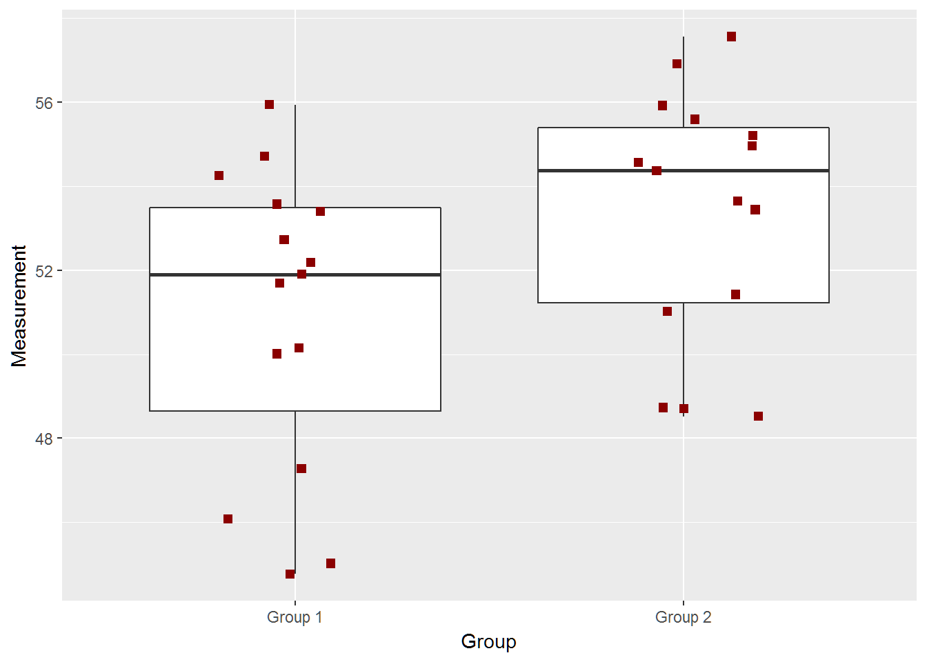
two_groups(diff=2)## [1] -4.7241376 -0.2251957
## attr(,"conf.level")
## [1] 0.95
## [1] "True Difference is 2"
two_groups(diff=1)## [1] -5.699707 -0.497626
## attr(,"conf.level")
## [1] 0.95
## [1] "True Difference is 1"
two_groups(diff=.5)## [1] -2.099546 2.390213
## attr(,"conf.level")
## [1] 0.95
## [1] "True Difference is 0.5"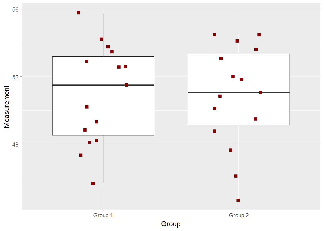
Sample size of 250
two_groups(diff=10,n=250)## [1] -10.802209 -9.734271
## attr(,"conf.level")
## [1] 0.95
## [1] "True Difference is 10"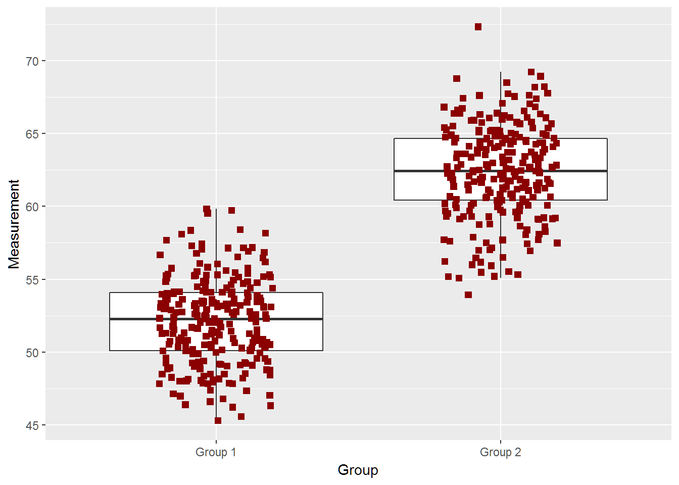
two_groups(diff=8,n=250)## [1] -8.749091 -7.668349
## attr(,"conf.level")
## [1] 0.95
## [1] "True Difference is 8"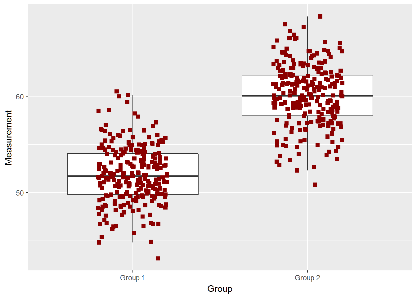
two_groups(diff=5,n=250)## [1] -5.676559 -4.628561
## attr(,"conf.level")
## [1] 0.95
## [1] "True Difference is 5"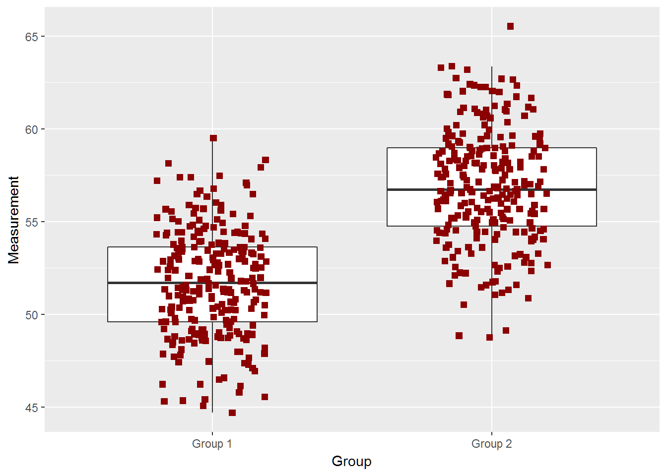
two_groups(diff=3,n=250)## [1] -3.455734 -2.366426
## attr(,"conf.level")
## [1] 0.95
## [1] "True Difference is 3"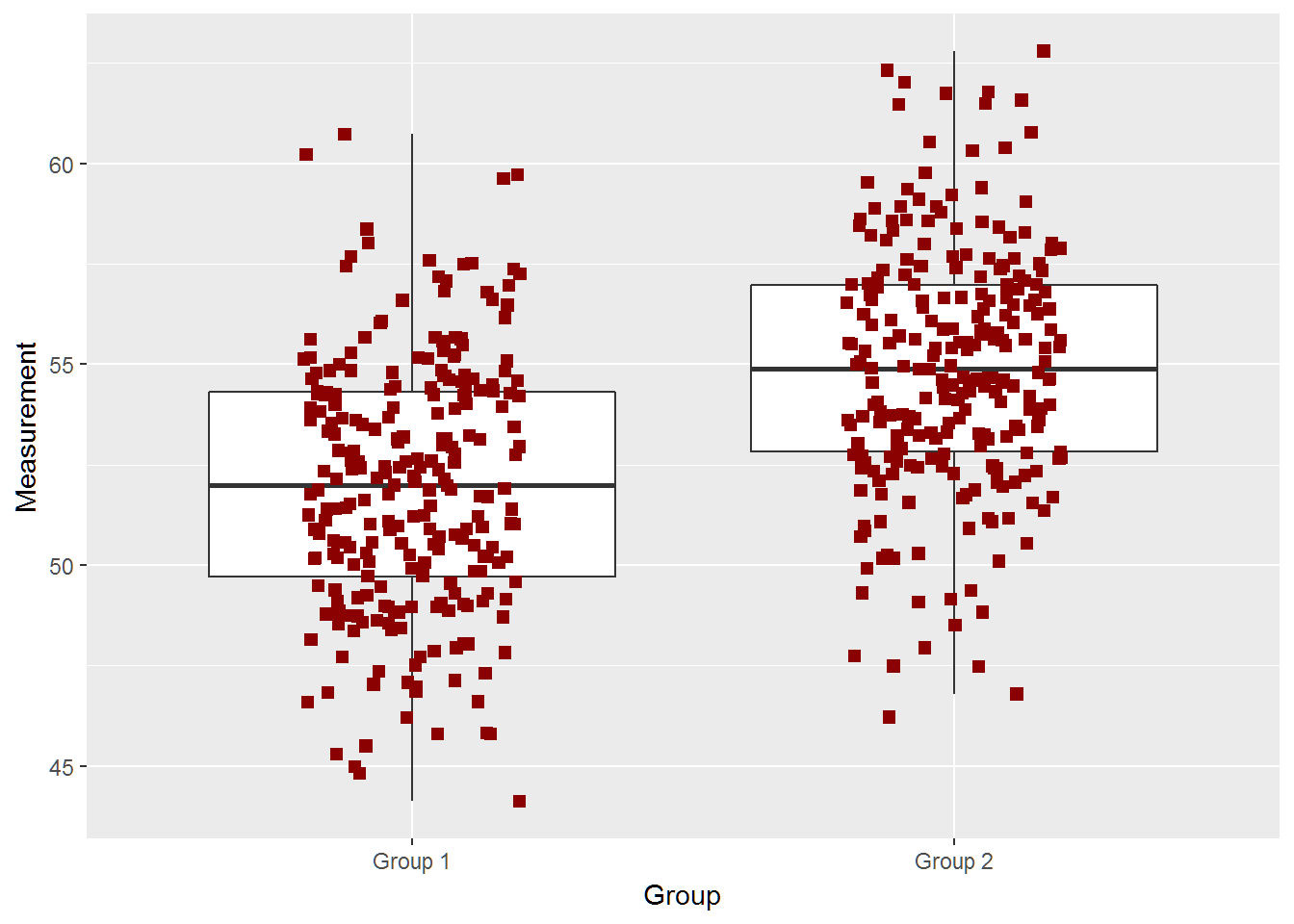
two_groups(diff=2,n=250,ci=TRUE)## [1] -2.541285 -1.515675
## attr(,"conf.level")
## [1] 0.95
## [1] "True Difference is 2"
two_groups(diff=1,n=250,ci=TRUE)## [1] -1.7092729 -0.6068871
## attr(,"conf.level")
## [1] 0.95
## [1] "True Difference is 1"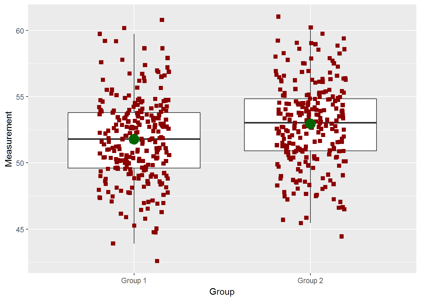
two_groups(diff=.5,n=250,ci=TRUE)## [1] -1.171691 -0.109989
## attr(,"conf.level")
## [1] 0.95
## [1] "True Difference is 0.5"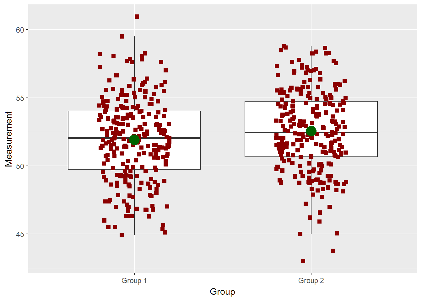
Climate Example On Large Variability with Big Mean Shift Impacts
The average temperature on Earth is about 61 degrees F (16 C). But temperatures vary greatly around the world depending on the time of year, ocean and wind currents and weather conditions. Summers tend to be warmer and winters colder. Also, temperatures tend to be higher near the equator and lower near the poles[1].
Thanks to Kaggle we have some data that we can use. It looks like there are different ways to calculate the average earth temperature but the important thing is the change.
climate = read.csv(file="http://byuistats.github.io/M330/data/USALandTemperatures.csv",stringsAsFactors = FALSE)

years1=unlist(lapply(strsplit(climate$dt,"-"),function(x) x[1]))
years2=unlist(lapply(strsplit(climate$dt,"/"),function(x) x[3]))

months1 = unlist(lapply(strsplit(climate$dt,"-"),function(x) x[2]))
months2 = unlist(lapply(strsplit(climate$dt,"/"),function(x) x[1]))

years1[is.na(months1)] = years2[is.na(months1)]
months1[is.na(months1)] = months2[is.na(months1)]


climate$year = as.numeric(years1)
climate$month = as.numeric(months1)

climate_year = as.data.frame(climate%>%group_by(year)%>%summarise(mean=mean(AverageTemperature.f)))
sd(climate_year$mean)

hist(climate$AverageTemperature.f,breaks=45)

ggplot(data=climate,aes(x=AverageTemperature.f))+
  geom_histogram()+
  facet_wrap(~month)+
  theme_bw()