1.5 Graphs for Understanding Homework
- 1.5: 1-4,6:7,11,12,16,17 (these are the ones you grade)
1 Concrete
data.dir = "http://media.pearsoncmg.com/cmg/pmmg_mml_shared/mathstatsresources/Akritas"
#1 Concrete Strength
cs = read.table(file.path(data.dir,"Concr.Strength.1s.Data.txt"),header=T)
# code from Akritas
with(cs,{
  hist(Str,freq=FALSE);
  lines(density(Str));
  stem(Str)
})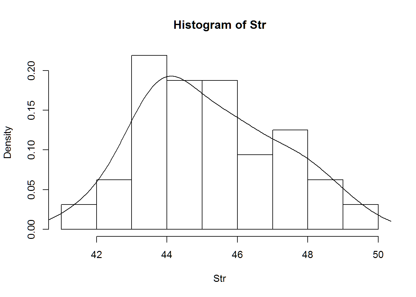
##
##   The decimal point is at the |
##
##   41 | 5
##   42 | 39
##   43 | 1445788
##   44 | 122357
##   45 | 1446
##   46 | 00246
##   47 | 3577
##   48 | 36
##   49 | 3
# hathaway code with ggplot2
#install.packages("ggplot2")
library(ggplot2)
qplot(data=cs,x=Str,colour=I("white"),bins=9)+theme_bw()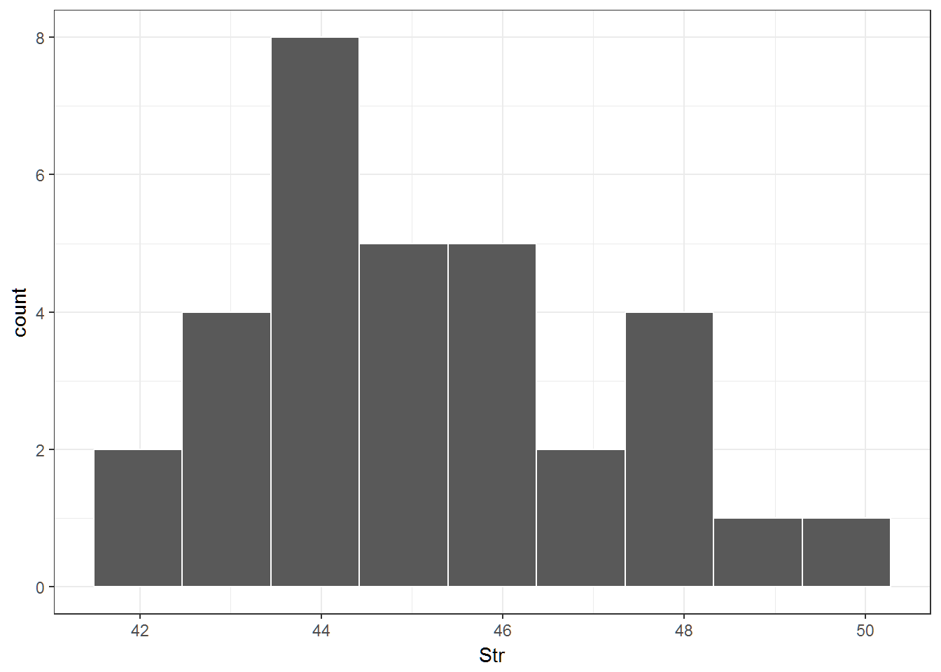
qplot(data=cs,x=Str,colour=I("black"),geom="density")+theme_bw()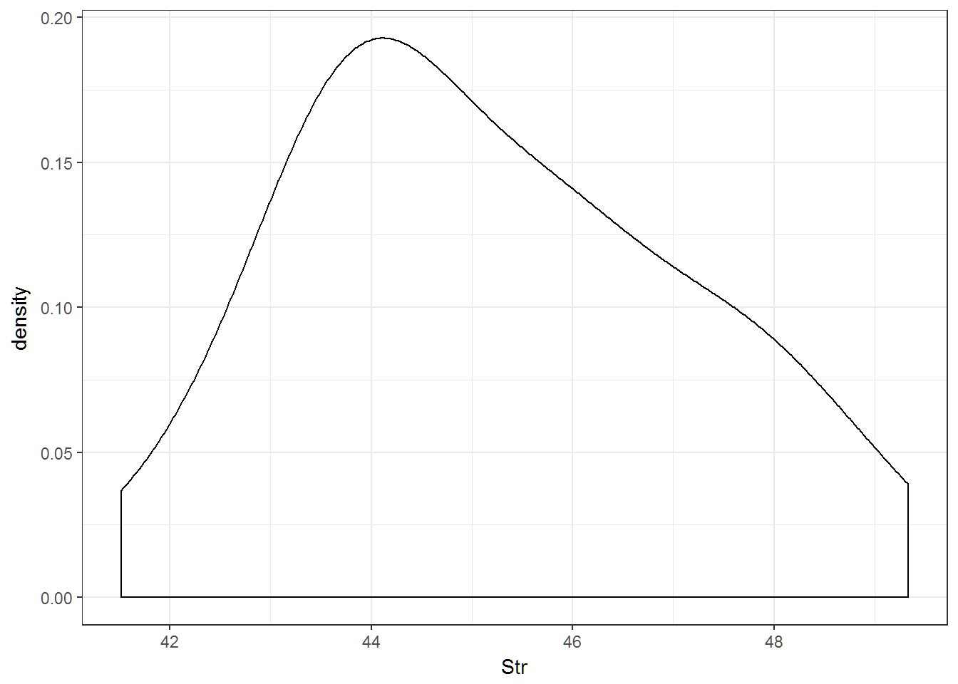
# Generally I would plot the density line or the histogram.  Not both.
ggplot(data=cs, aes(x=Str)) +
    geom_histogram(aes(y=..density..),bins=8, colour="black")+
    geom_density(adjust=1,colour="red",size=1.25)+theme_bw()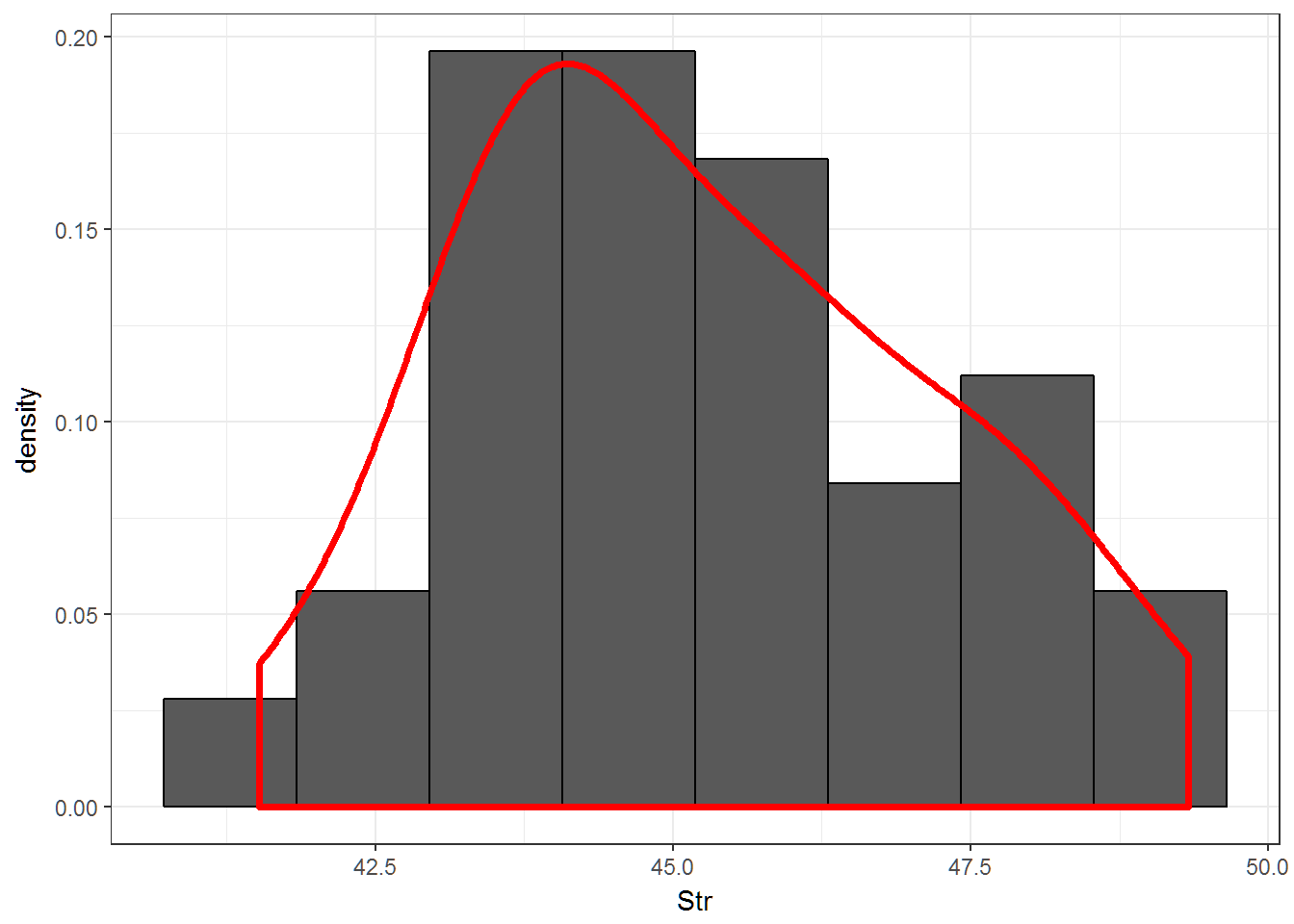
2 Old Faithful
#faithful is in R allready
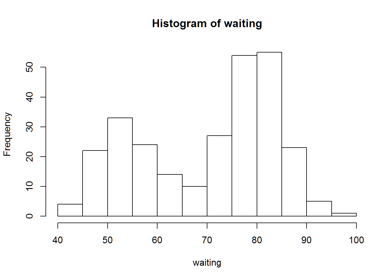
with(faithful,{
hist(waiting);
stem(waiting)
})
##
##   The decimal point is 1 digit(s) to the right of the |
##
##   4 | 3
##   4 | 55566666777788899999
##   5 | 00000111111222223333333444444444
##   5 | 555555666677788889999999
##   6 | 00000022223334444
##   6 | 555667899
##   7 | 00001111123333333444444
##   7 | 555555556666666667777777777778888888888888889999999999
##   8 | 000000001111111111111222222222222333333333333334444444444
##   8 | 55555566666677888888999
##   9 | 00000012334
##   9 | 6
# follow Remark1.5-1
hist(faithful$waiting,freq = FALSE,main="Eruption Durations of the Old Faithful Geyser",xlab=" ",col="grey");
lines(density(faithful$waiting),col="red")
# Hathaway code with ggplot2
qplot(data=faithful,x=waiting,fill=I("grey"),colour=I("black"))+theme_bw()+
  labs(title="Eruption Durations of the Old Faithful Geyser",x=" ")
## `stat_bin()` using `bins = 30`. Pick better value with `binwidth`.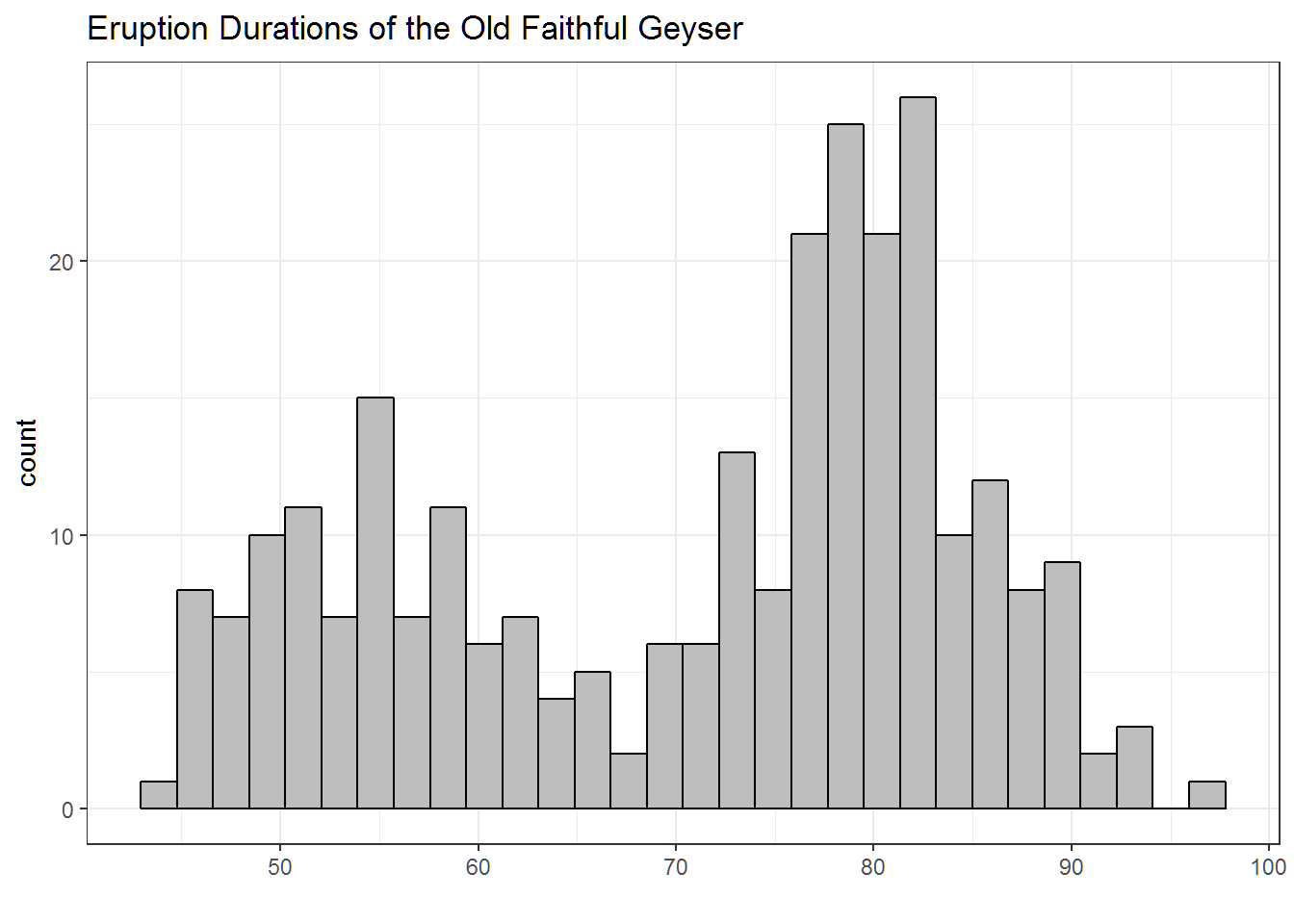
3 Old Faithful with Duration
# Akritas Code
plot(faithful$waiting,faithful$eruptions)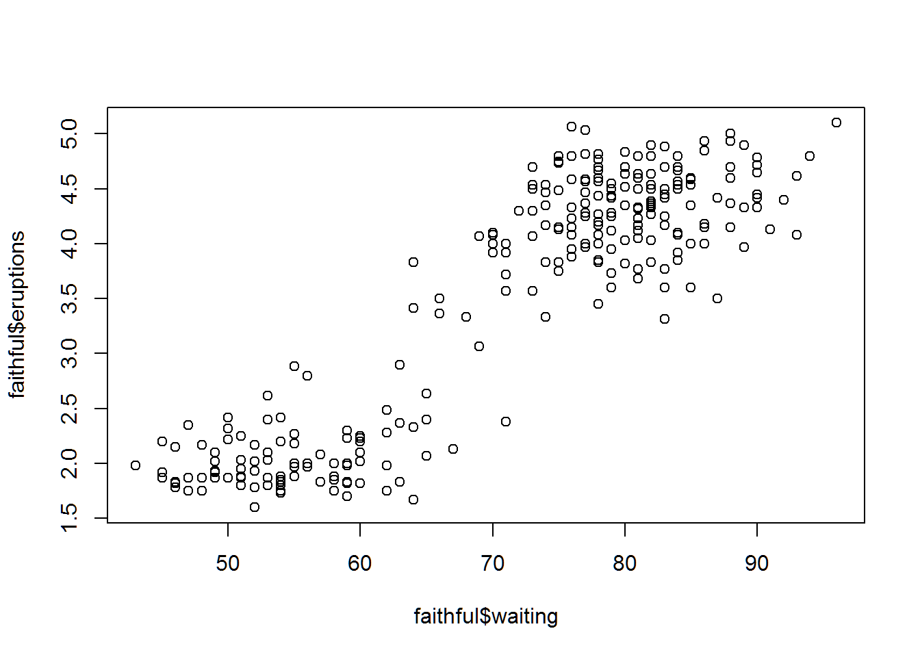
# Hathaway Code
qplot(data=faithful,x=waiting,y=eruptions)+theme_bw()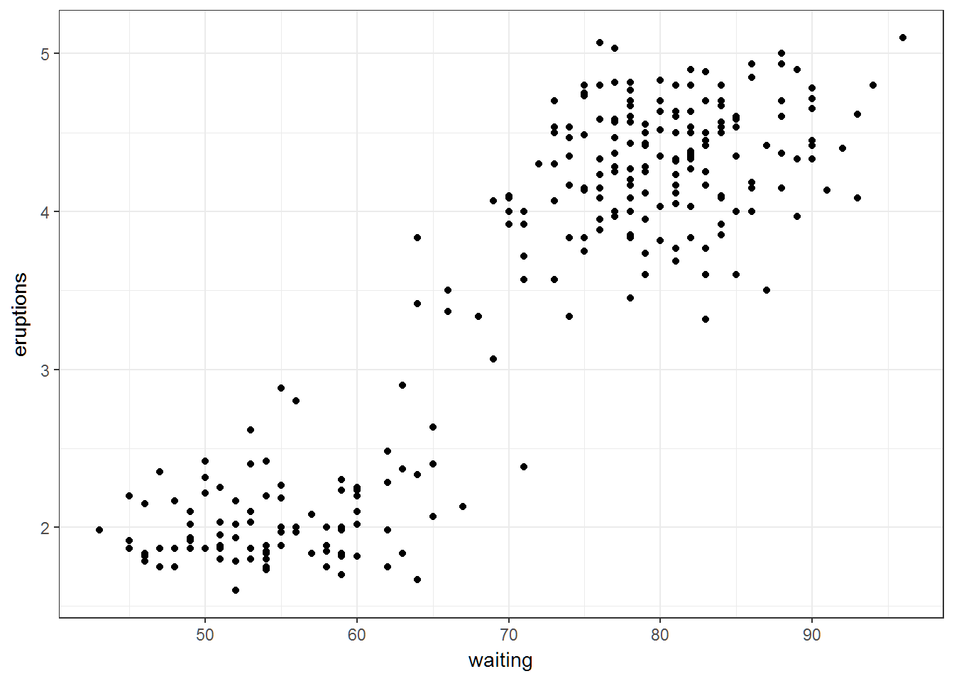
4 Temperature
tempf = read.table(file.path(data.dir,"Temp.Long.Lat.txt"),header=T)
#construct scatterplot matrix
pairs(tempf[2:4])
# Hathaway
#install.packages("GGally")
library(GGally)
ggpairs(tempf,columns=2:4)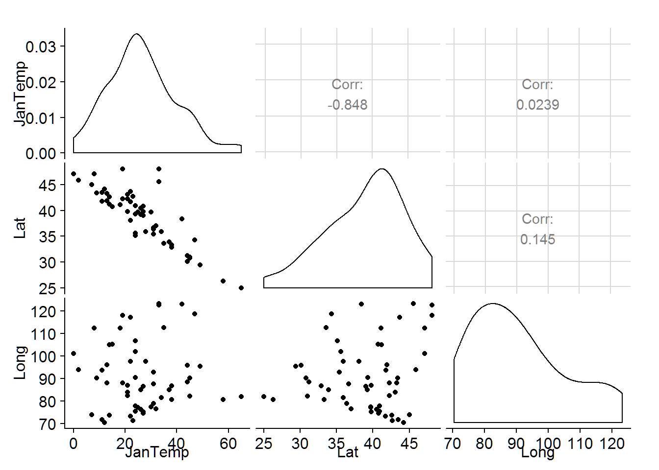
# instead of 3d plots I would add the third variable as a color or use the pairs plot
qplot(data=tempf,x=Lat,y=JanTemp,colour=Long,size=I(2))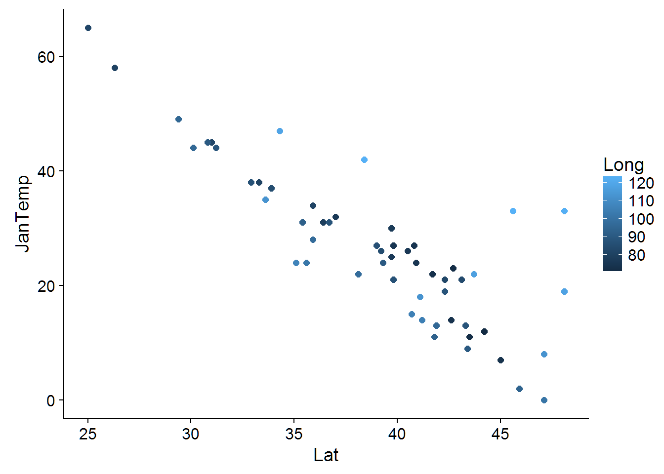
qplot(data=tempf,x=Long,y=JanTemp,colour=Lat,size=I(2))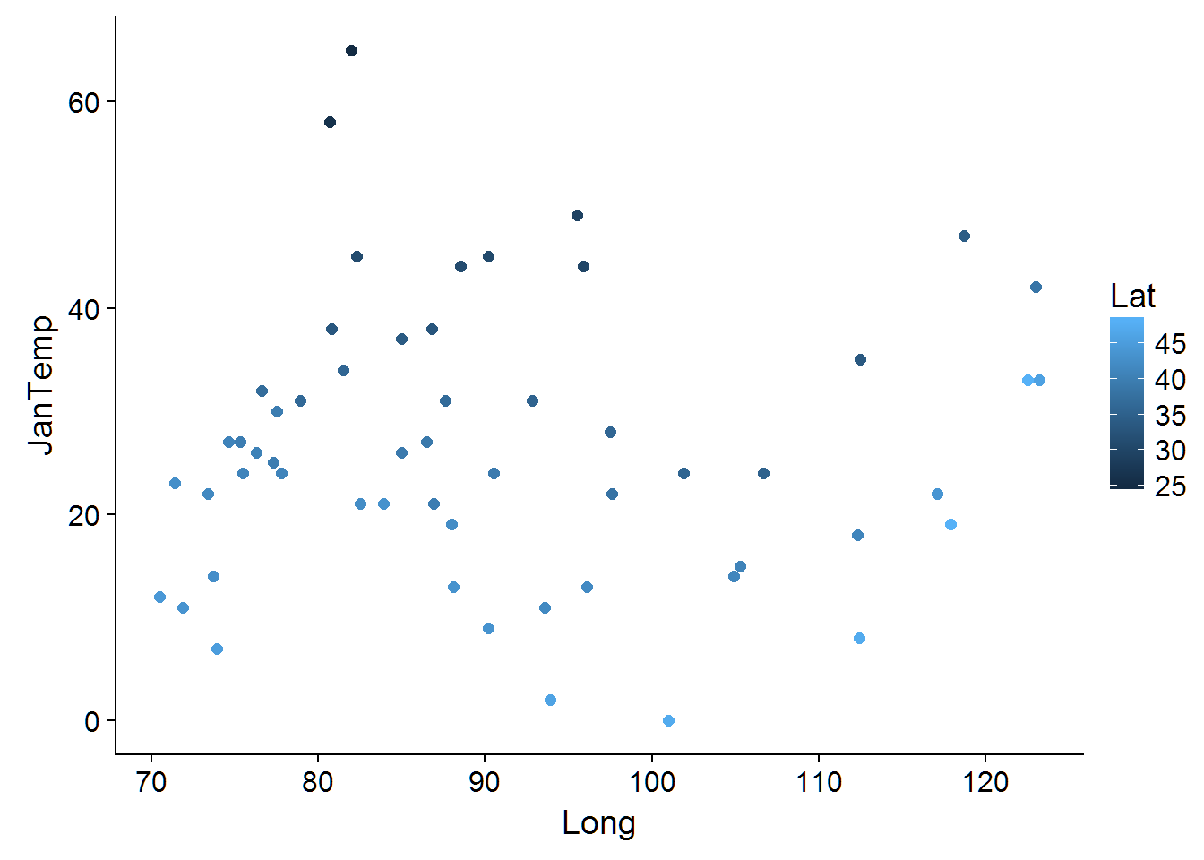
6 Braking Distance
# Akritas Code
#with(cars,plot(speed,dist))
#plot(cars$speed,cars$dist)
with(cars,plot(speed,dist))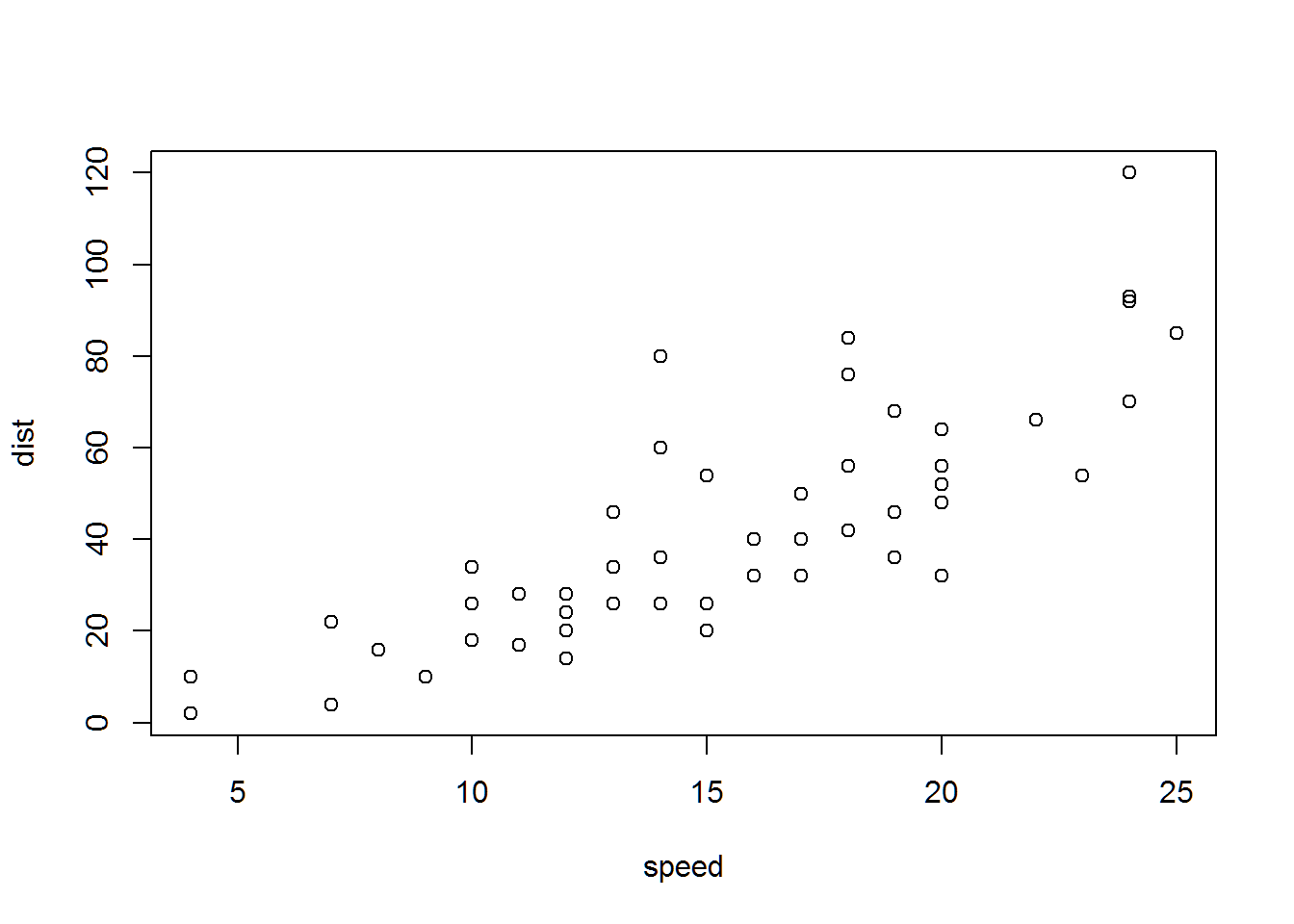
# Hathaway code
qplot(data=cars,x=speed,y=dist)+theme_bw()
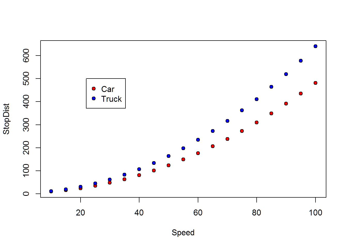
7 Braking Cars & Trucks
bd = read.table(file.path(data.dir,"SpeedStopCarTruck.txt"),header=T)
#Use the pch= option to specify symbols to use when plotting points. For symbols 21 through 25, specify border color (col=) and fill color (bg=).
# Akritas Code
# notice that his example on pg 17 uses col in the legend.  He should be using pt.bg
with(bd,{
  plot(x=Speed,y=StopDist,pch=21,bg=c("red","blue")[unclass(Auto)])
  legend(x=22,y=500,pch=c(21,21),pt.bg=c("red","blue"),legend=c("Car","Truck"))
})
11 Rainfall
Rv = read.table(file.path(data.dir,"SoilRunOffData.txt"),header=T)
# assuming that rainfall is X and runoff is y
# Akritas Code
plot(Rv$X,Rv$Y)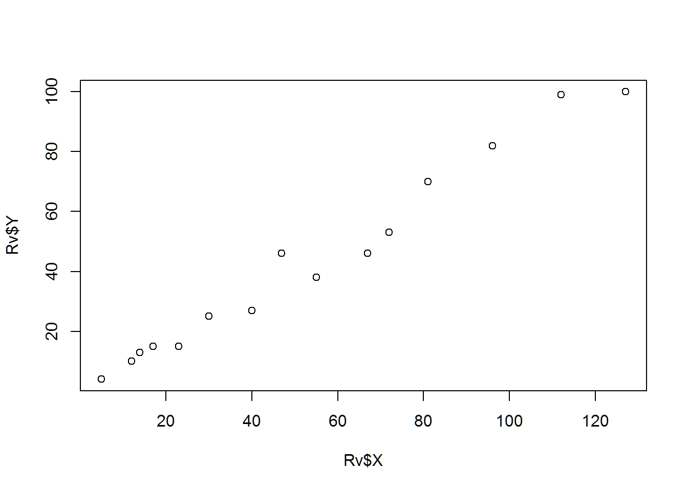
# Hathaway Code
qplot(data=Rv,x=X,y=Y)+theme_bw()+labs(x="Rain Fall",y="Runoff")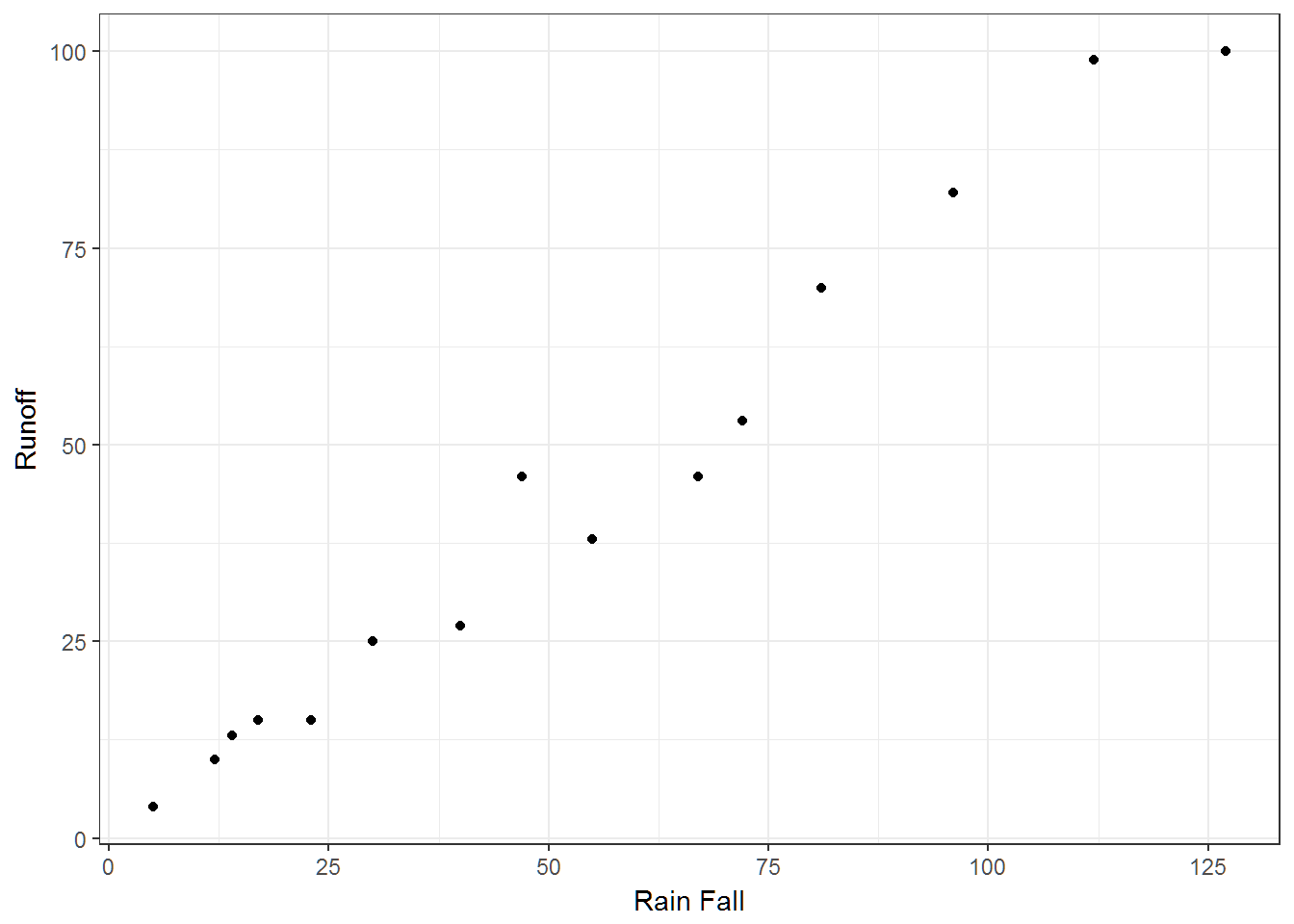
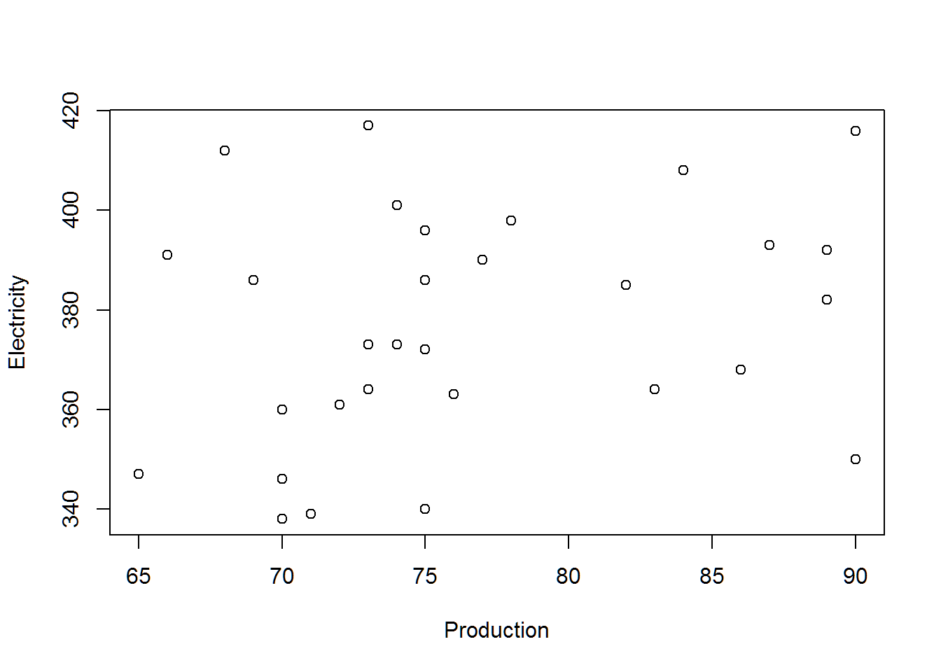
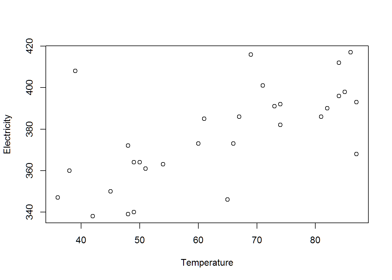
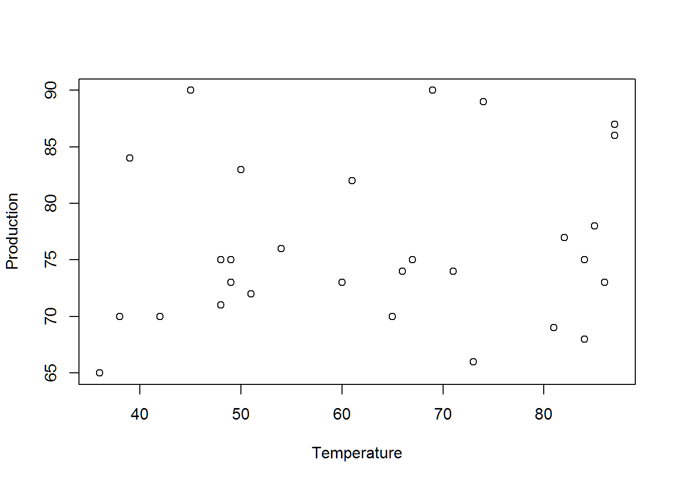
12 Electricity
Ok. Before we make the plot, what do we want to know?
- The power plant wants to understand how the energy costs are affected by their production levels.
- How can you show them that they shouldn’t worry about it.
- What could you show them that is affecting their Electricity demand?
el = read.table(file.path(data.dir,"ElectrProdTemp.txt"),header=T)
# Akritas
with(el,{
  plot(Production,Electricity)
  plot(Temperature,Electricity)
  plot(Temperature, Production)
})
pairs(el)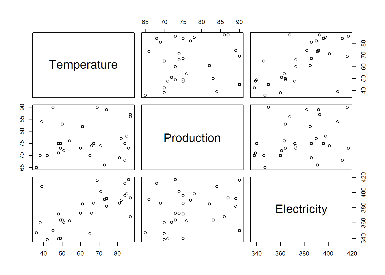
# Hathaway
#install.packages("GGally")
library(GGally)
qplot(data=el,x=Production,y=Electricity)+theme_bw()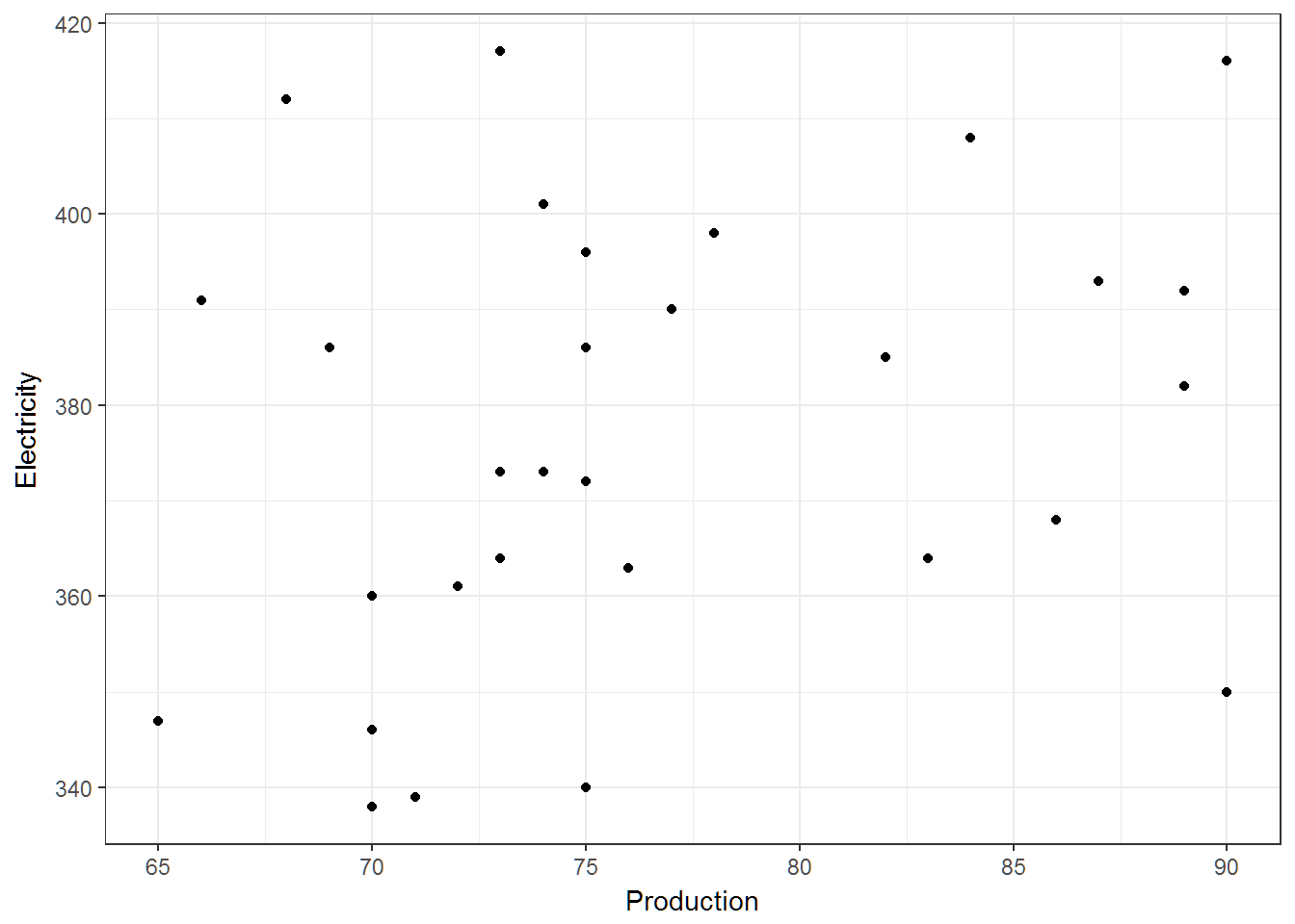
qplot(data=el,x=Temperature,y=Electricity)+theme_bw()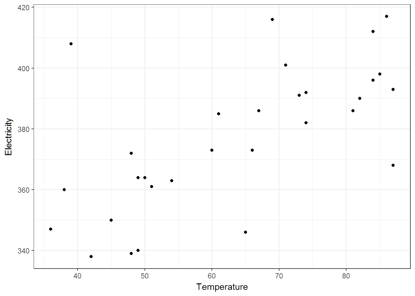
ggpairs(el)+theme_bw()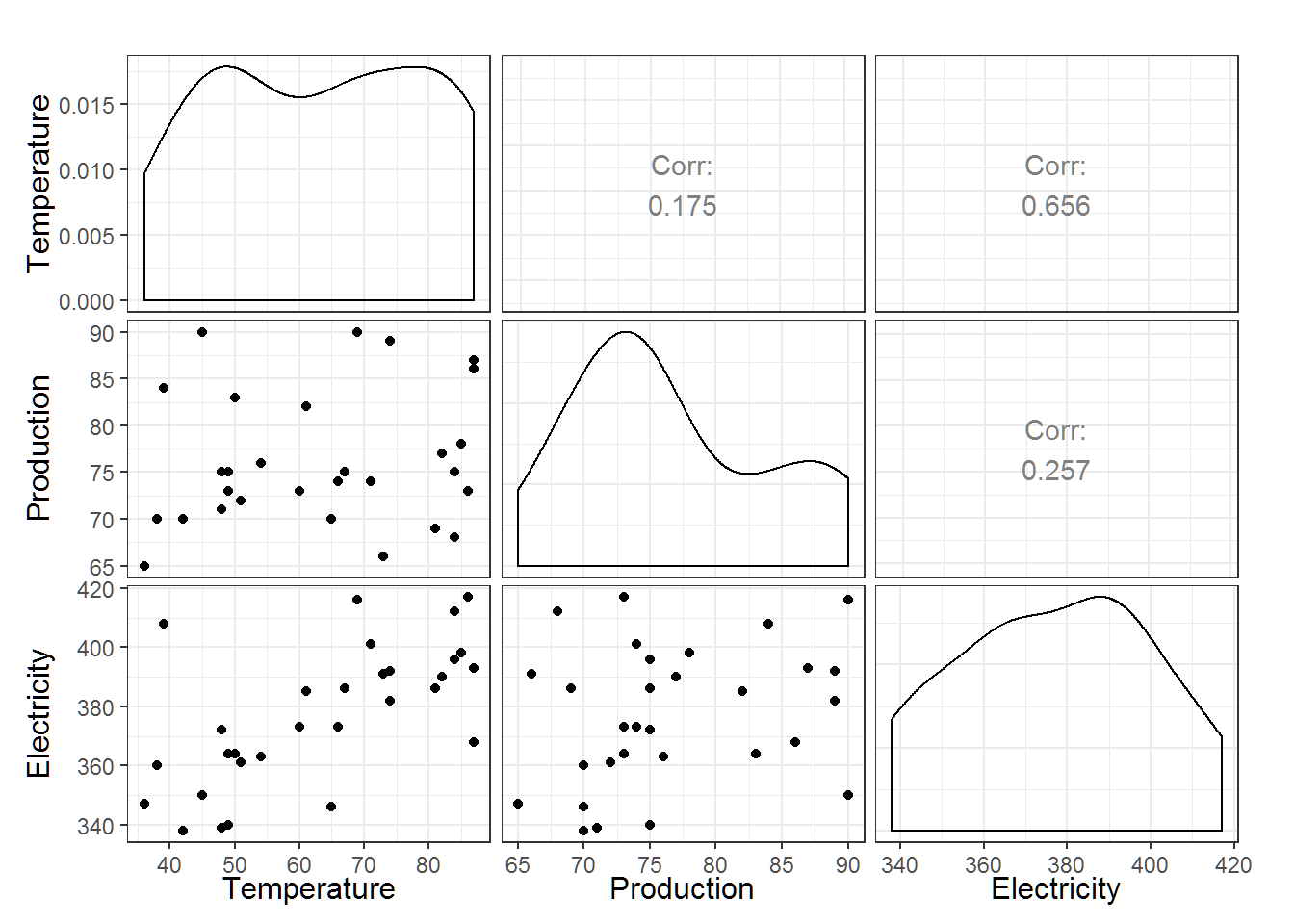
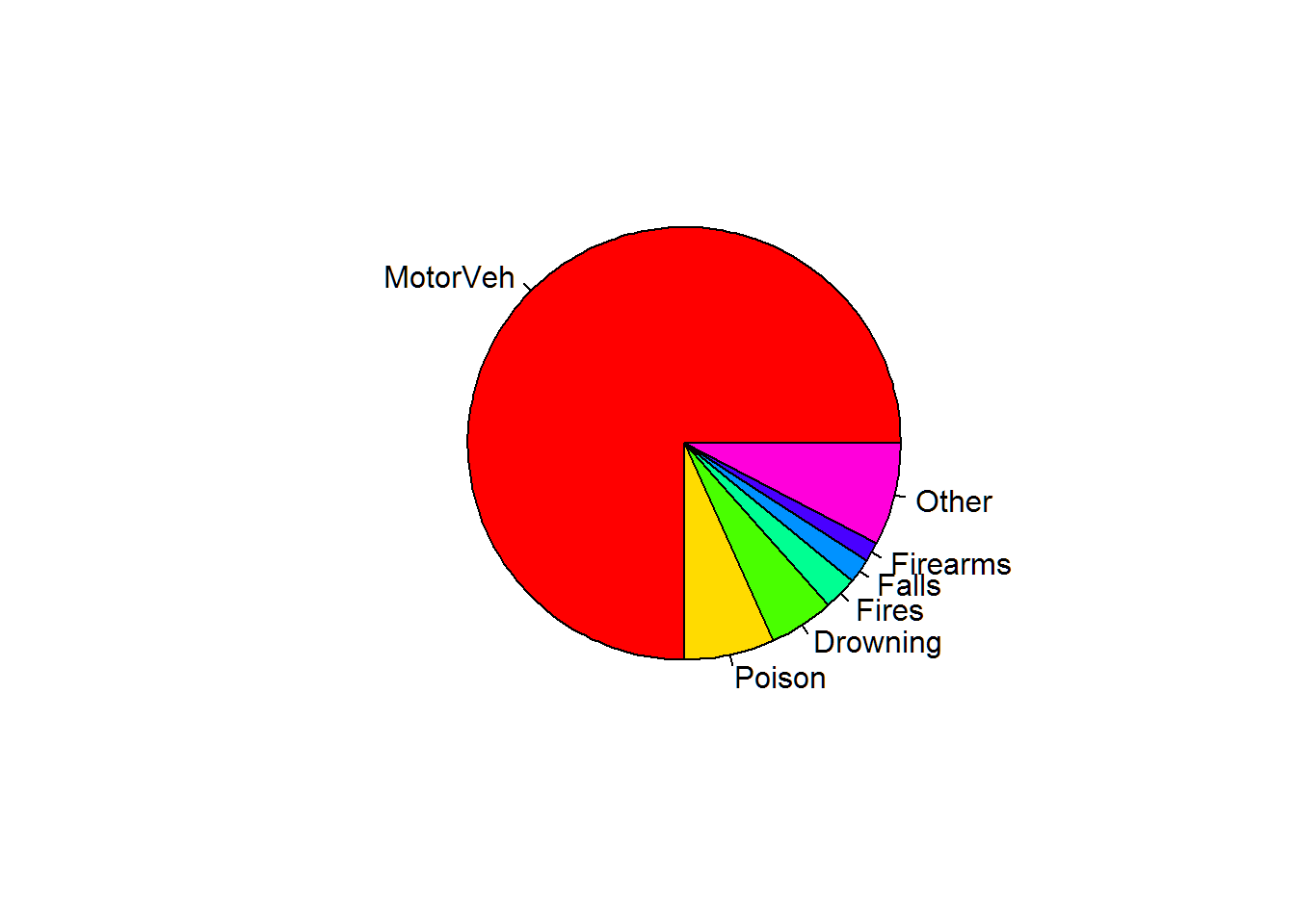
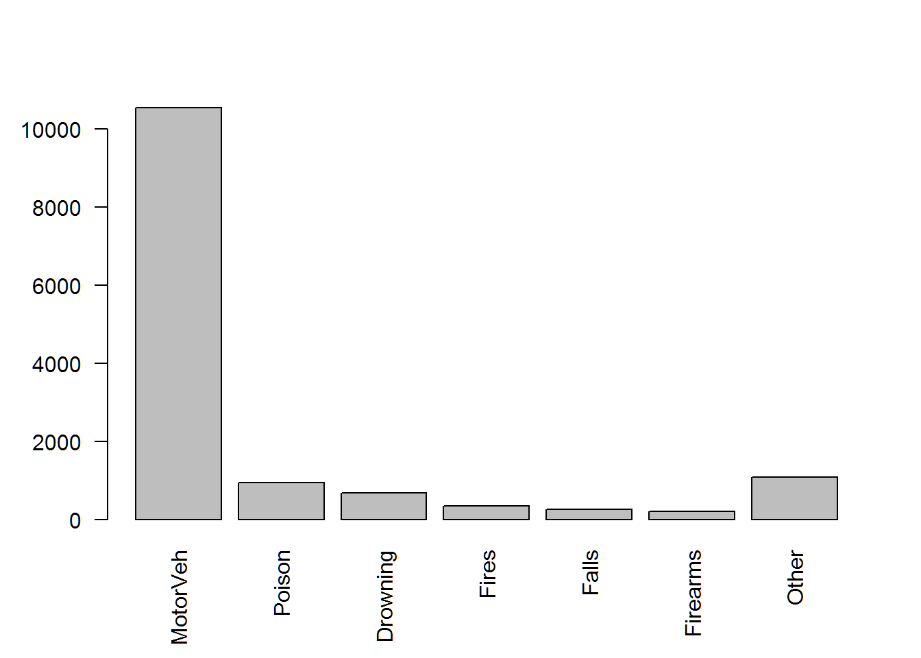
16 Death
aT = read.table(file.path(data.dir,"AccidentTypes.txt"),header=T)
# Akritas Code
with(aT,{
  pie(Deaths,labels = AccidType,col=rainbow(length(Deaths)))
  barplot(Deaths,names.arg=AccidType,las=2)
})
# hathaway code
# Pie charts don't exist in my code!
# although we have to use ggplot2 a little different than previously shown
ggplot(data=aT,aes(x=reorder(AccidType,Deaths),y=Deaths))+
  geom_bar(stat="identity")+
  theme_bw()+labs(x="Accident Types")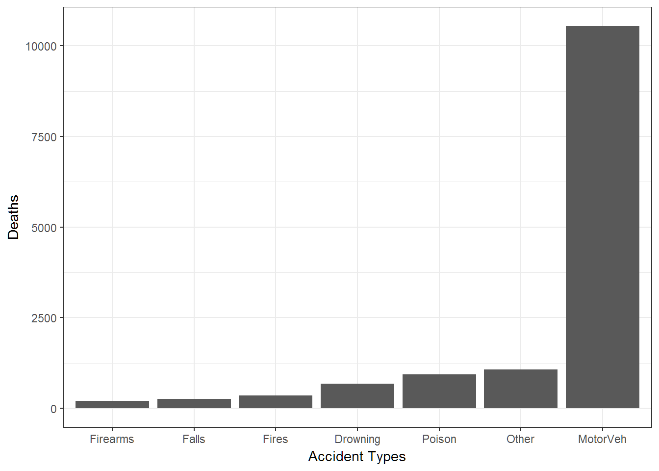
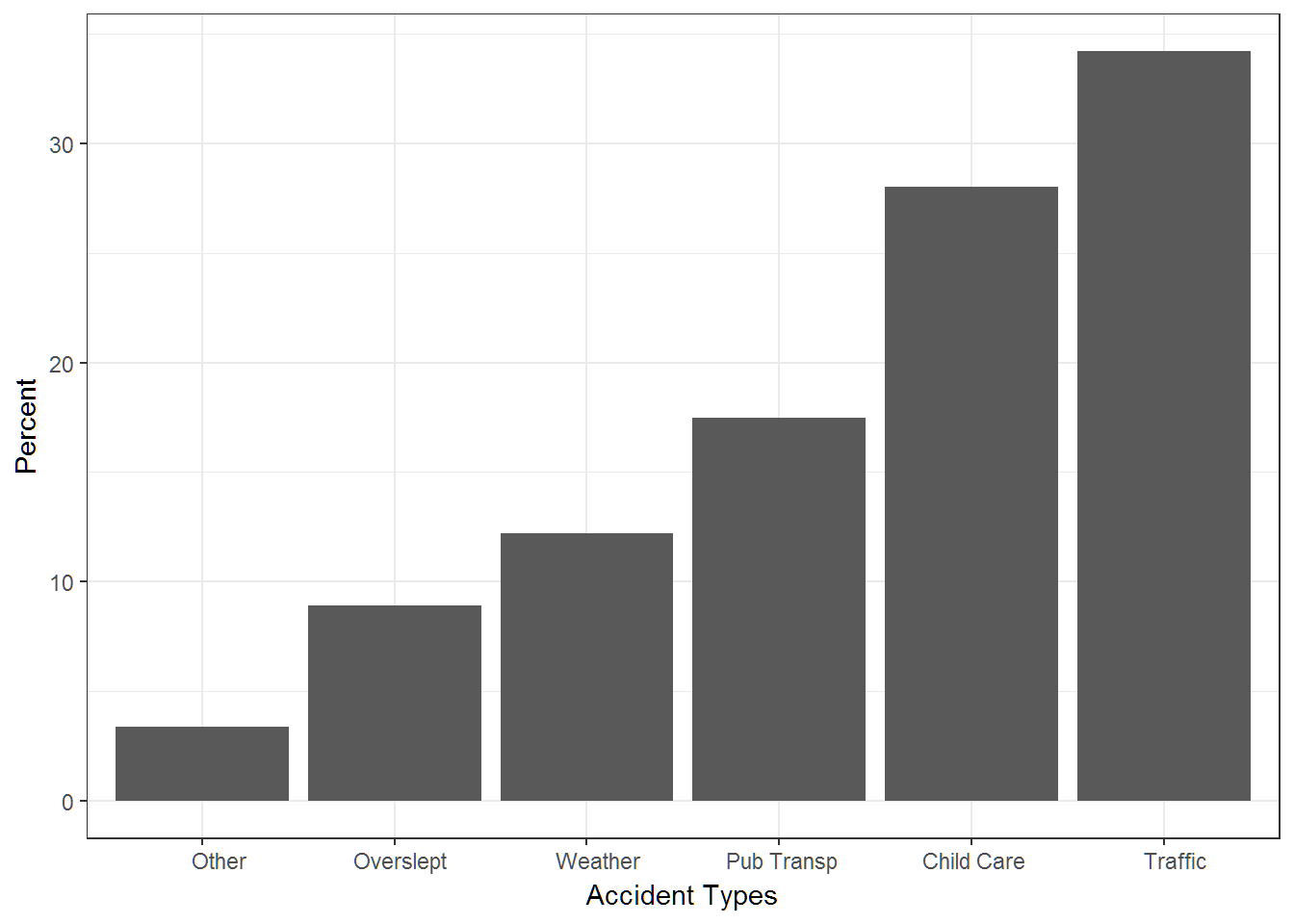
17 Late for Work
# note the new use of sep in the read.table function
lw = read.table(file.path(data.dir,"ReasonsLateForWork.txt"),sep=",",header=T)
# Akritas Code
with(lw,{
  pie(Percent,labels = Reason,col=rainbow(length(Reason)))
  barplot(Percent,names.arg=Reason,las=2)

})

# hathaway code
# Pie charts don't exist in my code!
# although we have to use ggplot2 a little different than previously shown
ggplot(data=lw,aes(x=reorder(Reason,Percent),y=Percent))+
  geom_bar(stat="identity")+
  theme_bw()+labs(x="Accident Types")