Case Study 4: Reducing Gun Deaths (FiveThirtyEight)

Background

The world is a dangerous place. During 2015 and 2016 there was a lot of discussion in the news about police shootings. FiveThirtyEight reported on gun deaths in 2016. As leaders in data journalism, they have posted a clean version of this data in their GitHub repo called full_data.csv for us to use.

While their visualizations focused on yearly averages, our client wants to create commercials that help reduce the gun deaths in the US. They would like to target the commercials in different seasons of the year (think month variable) to audiences that could have the most impact in reducing gun deaths. Our challenge is to summarize and visualize seasonal trends accros the other variables in these data.

Reading

This reading will help you complete the tasks below.

Tasks

  • Provide a brief summary of the FiveThirtyEight article
    • Create one plot that provides similar insight to their visualization in the article. It does not have to look like theirs.
    • Write a short paragraph summarizing their article
  • Address the client’s need for emphasis areas of their commercials for different seasons of the year.
    • Provide plots that help them know the different potential groups (variables) they could address in different seasons (2-4 visualizations seem necessary)
    • Write a short paragraph describing each image
  • Compile your .md and .html file into your git repository
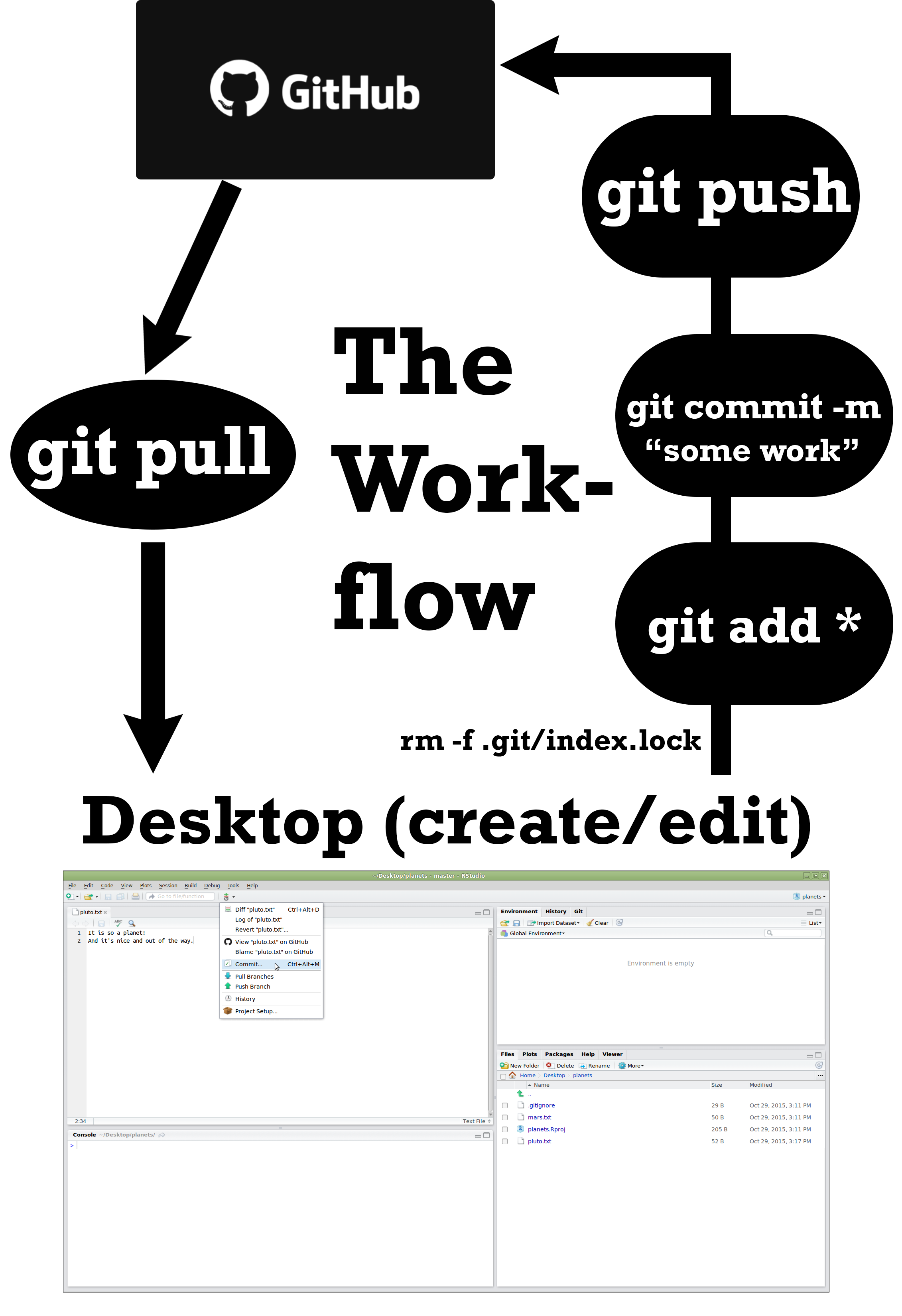
  • Find two other student’s compiled files in their repository and provide feedback using the issues feature in GitHub (If they already have three issues find a different student to critique)
  • Address 1-2 of the issues posted on your project and push the updates to GitHub