and the Critique
J. Hathaway
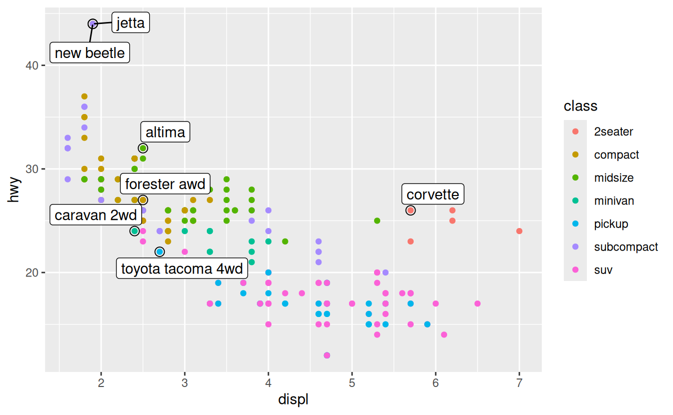
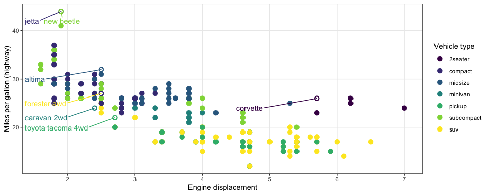
Code and graphic (scales)
Here is the book’s graphic.
Use the code from 28.3 and update their graphic to match mine.
Clarity vs. Complication (2)
- What do we know after looking at this plot? How do we provide depth of variability understanding without overwhelming the visualization user?
Remember, data can get complicated very fast.
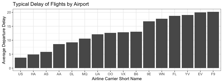
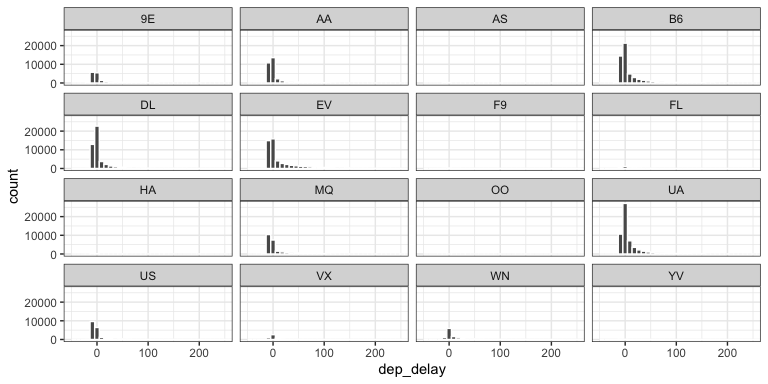
Histograms (1)
What don’t we like about this plot?
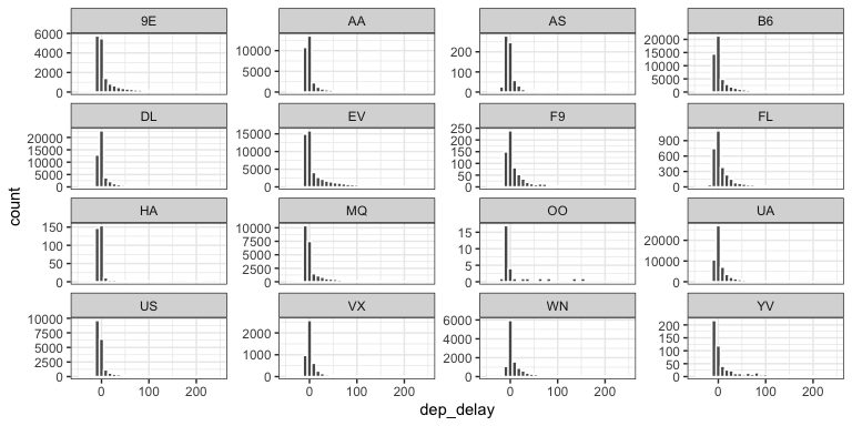
Histograms (2)
- What changed in this histogram?
- What don’t we like about this plot?
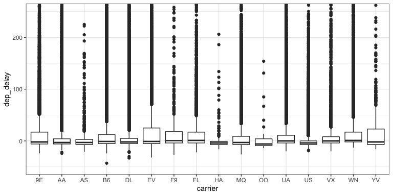
Boxplots
- What don’t we like about this plot?
- How hard is it to explain?
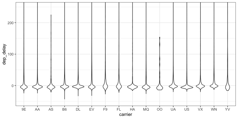
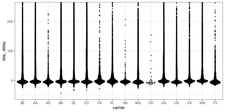
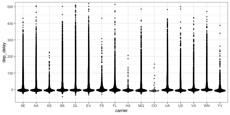
Violin plots
- What don’t we like about this plot?
- How hard is it to explain?
Beeswarm plots (1)
- What don’t we like about this plot?
- How hard is it to explain?
Beeswarm plots (1)
- What don’t we like about this plot?
- How hard is it to explain?
Letter-Value boxplots (1)
- What don’t we like about this plot?
- How hard is it to explain?
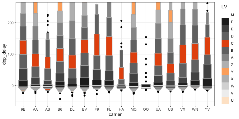
Letter-Value boxplots (2)
- What don’t we like about this plot?
- How hard is it to explain?
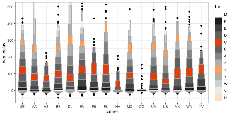
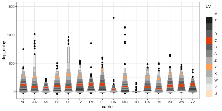
Letter-Value boxplots (3)
- What don’t we like about this plot?
- How hard is it to explain?