class: center, middle, inverse, title-slide # Visualizing Large Datasets ## with ggplot ### David Palmer --- # Grammar of Graphics Basics <iframe width="760" height="445" src="https://www.youtube.com/embed/uiTc55clwuA" frameborder="0" allow="autoplay; encrypted-media" allowfullscreen></iframe> --- # How Ggplot Implements Grammar of Graphics <iframe width="760" height="445" src="https://www.youtube.com/embed/PiY9hwOkL8U" frameborder="0" allow="autoplay; encrypted-media" allowfullscreen></iframe> --- ## Read Task 3 to get familiar with the problem First install the nycflights13 package: `install.packages("nycflights13")`. -- Load required libraries: ```r library(nycflights13) library(tidyverse) #install.packages("ggbeeswarm") #Run this just one time library(ggbeeswarm) ``` -- Get to know the flights data set ```r glimpse(flights) #or View(flights) ?flights ``` I suspect there is a relationship between carrier and departure delay. Before looking at the relationship (a bivariate plot), let's look at each variable by itself (a univariate plot). **When you do Task 3, you cannot simply do the same variables demonstrated here**. --- # Univariate, Categorical: Carrier Let's start by creating a barplot to show the number of flights for each carrier. There are two geom's that can be used to create a bar graph. Read the help manual to decide which to use. ```r ?geom_col() ?geom_bar() ``` --- From the reading you should have noticed: -- - geom_col() assumes you are giving it summarized value. In other words, it will look for the value for the bar explicitly stated in the dataset. It will not do any summarizing on its own. It needs an x and a y for input. -- - geom_bar() will count up the items in the data set and then plot those frequencies --- count: false The carrier data in flights is not summarized, so we will use geom_bar() .panel1-first_bar-rotate[ ```r ggplot(data = flights) + * aes(x=carrier) + geom_bar() ``` ] .panel2-first_bar-rotate[ 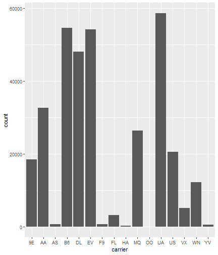<!-- --> ] --- count: false The carrier data in flights is not summarized, so we will use geom_bar() .panel1-first_bar-rotate[ ```r ggplot(data = flights) + * aes(x= fct_infreq(carrier)) + geom_bar() ``` ] .panel2-first_bar-rotate[ 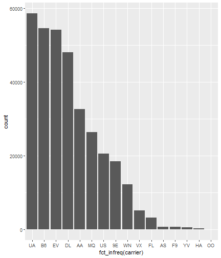<!-- --> ] <style> .panel1-first_bar-rotate { color: black; width: 38.6060606060606%; hight: 32%; float: left; padding-left: 1%; font-size: 80% } .panel2-first_bar-rotate { color: black; width: 59.3939393939394%; hight: 32%; float: left; padding-left: 1%; font-size: 80% } .panel3-first_bar-rotate { color: black; width: NA%; hight: 33%; float: left; padding-left: 1%; font-size: 80% } </style> *note:* `fct_infreq()` reorders the categories in descending order. --- # Univariate, Continuous: Departure Delay Now let's investigate departure delays, contained in the variable `dep_delay`. We cannot use frequency counts like we did for summarizing `carrier` because `dep_delay` is a continuous variable. `geom_bar()` will throw an error. We should use a histogram instead. --- count: false .panel1-dep_delay_hist-auto[ ```r *ggplot(data = flights, * aes(x = dep_delay)) ``` ] .panel2-dep_delay_hist-auto[ <!-- --> ] --- count: false .panel1-dep_delay_hist-auto[ ```r ggplot(data = flights, aes(x = dep_delay)) + * geom_histogram(color = "white") ``` ] .panel2-dep_delay_hist-auto[ <!-- --> ] <style> .panel1-dep_delay_hist-auto { color: black; width: 38.6060606060606%; hight: 32%; float: left; padding-left: 1%; font-size: 80% } .panel2-dep_delay_hist-auto { color: black; width: 59.3939393939394%; hight: 32%; float: left; padding-left: 1%; font-size: 80% } .panel3-dep_delay_hist-auto { color: black; width: NA%; hight: 33%; float: left; padding-left: 1%; font-size: 80% } </style> --- # Strategies for Dealing with Large Datasets 1. Transform the scale 2. Zoom in on the part of the plot you are most interested in 3. Facetting (covered in a later lesson) 4. Take a smaller subset/sample (not preferred) -- We will now take a deeper look at strategies 1 and 2. --- ## Transform the scale Apply a function to the scale variable being plotted to allow more visual space and emphasis to be placed on the parts of the scale that are more interesting. Often a log is applied to the scale variable. The log of zero is undefined and will return an NA. With so many zeros for dep_delay a square root transformation may be better. Unfortunately, the square root function will still cause a missing value for negative departure delays. --- count: false The square root transformation gives us better visibility where the bulk of the data is. .panel1-scale_trans-auto[ ```r *ggplot(data = flights, * aes(x = dep_delay)) ``` ] .panel2-scale_trans-auto[ <!-- --> ] .panel3-scale_trans-auto[ ``` [1] "--" ``` ] --- count: false The square root transformation gives us better visibility where the bulk of the data is. .panel1-scale_trans-auto[ ```r ggplot(data = flights, aes(x = dep_delay)) + * geom_histogram(color = "white") ``` ] .panel2-scale_trans-auto[ <!-- --> ] .panel3-scale_trans-auto[ <!-- --> ] --- count: false The square root transformation gives us better visibility where the bulk of the data is. .panel1-scale_trans-auto[ ```r ggplot(data = flights, aes(x = dep_delay)) + geom_histogram(color = "white") + * scale_x_continuous(trans = "sqrt") ``` ] .panel2-scale_trans-auto[ <!-- --> ] .panel3-scale_trans-auto[ 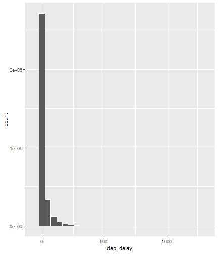<!-- --> ] --- count: false The square root transformation gives us better visibility where the bulk of the data is. .panel1-scale_trans-auto[ ```r ggplot(data = flights, aes(x = dep_delay)) + geom_histogram(color = "white") + scale_x_continuous(trans = "sqrt") * #scale_x_sqrt() #ROTATE #scale_x_sqrt() ``` ] .panel2-scale_trans-auto[ <!-- --> ] .panel3-scale_trans-auto[ 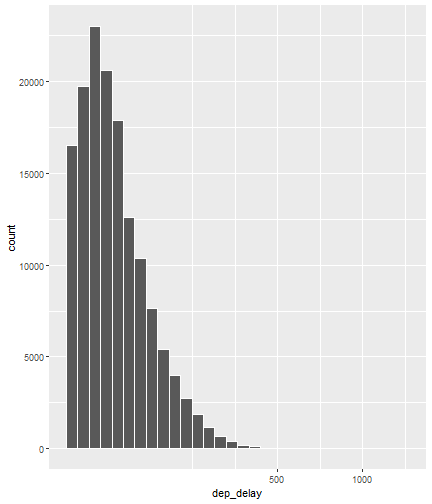<!-- --> ] <style> .panel1-scale_trans-auto { color: black; width: 43.1111111111111%; hight: 32%; float: left; padding-left: 1%; font-size: 80% } .panel2-scale_trans-auto { color: black; width: 26.9444444444444%; hight: 32%; float: left; padding-left: 1%; font-size: 80% } .panel3-scale_trans-auto { color: black; width: 26.9444444444444%; hight: 33%; float: left; padding-left: 1%; font-size: 80% } </style> *Note:* scale_x_sqrt() is a short cut command and will produce the same square root transformation. ggplot has quite a few shortcut commands, which can be confusing sometimes in learning what is a shortcut command and what is the general form of the syntax. --- ## Zoom in on the part of the plot that matters most There are two ways to adjust what part of the dataset you are looking at. 1. use `scale_x_continuous(limits = c())` to adjust the range of the scale being shown. You can change x to y if you want to adjust the y scale instead. You can also adjust things like the color and size scales. Caution: adjusting limits within a scale statement will actually eliminate the data points from the plotting function and any additional calculations you make as part of the plot. For example, if you plot a regression line and take this approach, points outside of the limits will not be included when calculating the regression line. -- 2. use `coord_cartesian()`. This adjusts the plotting window but does not eliminate the points, so this is generally the preferred method for zooming in on a plot. --- count: false #Zoom in on the area of interest .panel1-zoom_in-auto[ ```r *ggplot(data = flights, * aes(x = dep_delay)) ``` ] .panel2-zoom_in-auto[ <!-- --> ] --- count: false #Zoom in on the area of interest .panel1-zoom_in-auto[ ```r ggplot(data = flights, aes(x = dep_delay)) + * geom_histogram() ``` ] .panel2-zoom_in-auto[ <!-- --> ] --- count: false #Zoom in on the area of interest .panel1-zoom_in-auto[ ```r ggplot(data = flights, aes(x = dep_delay)) + geom_histogram() + * scale_x_continuous( * limits = c(-50, 250)) ``` ] .panel2-zoom_in-auto[ <!-- --> ] --- count: false #Zoom in on the area of interest .panel1-zoom_in-auto[ ```r ggplot(data = flights, aes(x = dep_delay)) + geom_histogram() + scale_x_continuous( limits = c(-50, 250)) ``` ] .panel2-zoom_in-auto[ <!-- --> ] <style> .panel1-zoom_in-auto { color: black; width: 38.6060606060606%; hight: 32%; float: left; padding-left: 1%; font-size: 80% } .panel2-zoom_in-auto { color: black; width: 59.3939393939394%; hight: 32%; float: left; padding-left: 1%; font-size: 80% } .panel3-zoom_in-auto { color: black; width: NA%; hight: 33%; float: left; padding-left: 1%; font-size: 80% } </style> --- count: false #Zoom in using coord_cartesian() .panel1-simple-non_seq[ ```r ggplot(data = flights, aes(x = dep_delay)) + geom_histogram( ) + coord_cartesian( xlim = c(-25, 250)) ``` ] .panel2-simple-non_seq[ <!-- --> ] --- count: false #Zoom in using coord_cartesian() .panel1-simple-non_seq[ ```r ggplot(data = flights, aes(x = dep_delay)) + geom_histogram( ) + coord_cartesian( xlim = c(-25, 250)) ``` ] .panel2-simple-non_seq[ <!-- --> ] --- count: false #Zoom in using coord_cartesian() .panel1-simple-non_seq[ ```r ggplot(data = flights, aes(x = dep_delay)) + geom_histogram( * color = "white", ) + coord_cartesian( xlim = c(-25, 250)) ``` ] .panel2-simple-non_seq[ <!-- --> ] --- count: false #Zoom in using coord_cartesian() .panel1-simple-non_seq[ ```r ggplot(data = flights, aes(x = dep_delay)) + geom_histogram( color = "white", * binwidth = 10 ) + coord_cartesian( xlim = c(-25, 250)) ``` ] .panel2-simple-non_seq[ <!-- --> ] <style> .panel1-simple-non_seq { color: black; width: 38.6060606060606%; hight: 32%; float: left; padding-left: 1%; font-size: 80% } .panel2-simple-non_seq { color: black; width: 59.3939393939394%; hight: 32%; float: left; padding-left: 1%; font-size: 80% } .panel3-simple-non_seq { color: black; width: NA%; hight: 33%; float: left; padding-left: 1%; font-size: 80% } </style> --- count: false #Coordinate Flipping .panel1-flip-auto[ ```r *ggplot(data = flights, aes(x = dep_delay)) ``` ] .panel2-flip-auto[ <!-- --> ] --- count: false #Coordinate Flipping .panel1-flip-auto[ ```r ggplot(data = flights, aes(x = dep_delay)) + * geom_boxplot() ``` ] .panel2-flip-auto[ 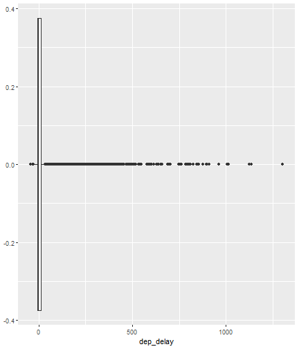<!-- --> ] --- count: false #Coordinate Flipping .panel1-flip-auto[ ```r ggplot(data = flights, aes(x = dep_delay)) + geom_boxplot() + * coord_flip() ``` ] .panel2-flip-auto[ 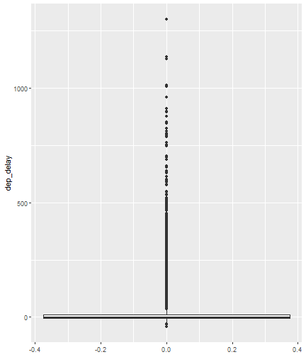<!-- --> ] <style> .panel1-flip-auto { color: black; width: 38.6060606060606%; hight: 32%; float: left; padding-left: 1%; font-size: 80% } .panel2-flip-auto { color: black; width: 59.3939393939394%; hight: 32%; float: left; padding-left: 1%; font-size: 80% } .panel3-flip-auto { color: black; width: NA%; hight: 33%; float: left; padding-left: 1%; font-size: 80% } </style> --- # Bivariate visualization The real benefit of a boxplot is the ability to compare distributions side-by-side. For example, we can see the distribution of departure delay for each carrier side-by-side for easy comparison. --- count: false #Departure Delay by Carrier .panel1-bivariate1-rotate[ ```r ggplot(data = flights) + * aes(x = carrier) + aes(y = dep_delay) + geom_boxplot() ``` ] .panel2-bivariate1-rotate[ 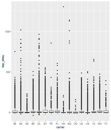<!-- --> ] --- count: false #Departure Delay by Carrier .panel1-bivariate1-rotate[ ```r ggplot(data = flights) + * aes(x = fct_reorder(carrier, dep_delay, na.rm = TRUE)) + aes(y = dep_delay) + geom_boxplot() ``` ] .panel2-bivariate1-rotate[ 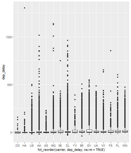<!-- --> ] <style> .panel1-bivariate1-rotate { color: black; width: 38.6060606060606%; hight: 32%; float: left; padding-left: 1%; font-size: 80% } .panel2-bivariate1-rotate { color: black; width: 59.3939393939394%; hight: 32%; float: left; padding-left: 1%; font-size: 80% } .panel3-bivariate1-rotate { color: black; width: NA%; hight: 33%; float: left; padding-left: 1%; font-size: 80% } </style> --- *Note* the use of `fct_reorder`. This command reordered the carriers by their departure delays. (The default statistic used for reordering is the median, but you can specify a different statistic to use, such as the mean or max). Because of missing values in the `dep_delay` variable the na.rm = TRUE argument is needed; without it the median (or any other statistic) would be calculated as NA. -- What do you like / not like about displaying the data as boxplots? Can we do better? -- In this case it is hard to see the quartiles because they are all so close together. Let's try zooming in on where the bulk of the data points occur. --- count: false #Departure Delay by Carrier .panel1-box_zoom-user[ ```r *ggplot(data = flights) + * aes(x = fct_reorder(carrier, dep_delay, na.rm = TRUE)) + * aes(y = dep_delay) + *geom_boxplot() ``` ] .panel2-box_zoom-user[ <!-- --> ] --- count: false #Departure Delay by Carrier .panel1-box_zoom-user[ ```r ggplot(data = flights) + aes(x = fct_reorder(carrier, dep_delay, na.rm = TRUE)) + aes(y = dep_delay) + geom_boxplot() + * coord_cartesian(ylim = c(-50,250)) ``` ] .panel2-box_zoom-user[ <!-- --> ] <style> .panel1-box_zoom-user { color: black; width: 38.6060606060606%; hight: 32%; float: left; padding-left: 1%; font-size: 80% } .panel2-box_zoom-user { color: black; width: 59.3939393939394%; hight: 32%; float: left; padding-left: 1%; font-size: 80% } .panel3-box_zoom-user { color: black; width: NA%; hight: 33%; float: left; padding-left: 1%; font-size: 80% } </style> --- count: false #Try A New Type of Plot: Violin Plot .panel1-violin_zoom-auto[ ```r *ggplot(data = flights, * aes(x = fct_reorder(carrier, dep_delay), * y = dep_delay)) ``` ] .panel2-violin_zoom-auto[ <!-- --> ] --- count: false #Try A New Type of Plot: Violin Plot .panel1-violin_zoom-auto[ ```r ggplot(data = flights, aes(x = fct_reorder(carrier, dep_delay), y = dep_delay)) + * geom_violin() ``` ] .panel2-violin_zoom-auto[ <!-- --> ] --- count: false #Try A New Type of Plot: Violin Plot .panel1-violin_zoom-auto[ ```r ggplot(data = flights, aes(x = fct_reorder(carrier, dep_delay), y = dep_delay)) + geom_violin() + * coord_cartesian(ylim = c(-50, 250)) ``` ] .panel2-violin_zoom-auto[ <!-- --> ] <style> .panel1-violin_zoom-auto { color: black; width: 38.6060606060606%; hight: 32%; float: left; padding-left: 1%; font-size: 80% } .panel2-violin_zoom-auto { color: black; width: 59.3939393939394%; hight: 32%; float: left; padding-left: 1%; font-size: 80% } .panel3-violin_zoom-auto { color: black; width: NA%; hight: 33%; float: left; padding-left: 1%; font-size: 80% } </style> --- The violin plot preserves the continuous nature of the data, but does not allow you to observe the data itself, thereby obscuring things like sample size. Another plotting technique that combines the idea of a violin plot with the ability to see actual all the data points is called a bee swarm plot. This plot can take a long time to run on a large dataset like `flights`. Therefore, for demonstration purposes and in order to not crash the computer I will apply this technique on a smaller dataset: iris. I will also apply it to a smaller version of the flights dataset. If you use this technique, try it on the entire `flights` dataset before scaling back. There are two types of beeswarm plot illustrated on the next slides, both of which can be used if you install and load the ggbeeswarm package. `install.packages("ggbeeswarm")` `library(ggbeeswarm)` Take time to note the advantages and disadvantages of the boxplot vs. violin plot vs. bee swarm plots. --- count: false #Iris Dataset .panel1-compare-rotate[ ```r ggplot(data = iris, aes(x = Species, y = Petal.Length)) + * geom_boxplot() ``` ] .panel2-compare-rotate[ 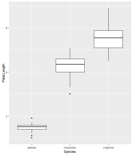<!-- --> ] --- count: false #Iris Dataset .panel1-compare-rotate[ ```r ggplot(data = iris, aes(x = Species, y = Petal.Length)) + * geom_violin() ``` ] .panel2-compare-rotate[ 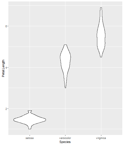<!-- --> ] --- count: false #Iris Dataset .panel1-compare-rotate[ ```r ggplot(data = iris, aes(x = Species, y = Petal.Length)) + * geom_beeswarm() ``` ] .panel2-compare-rotate[ 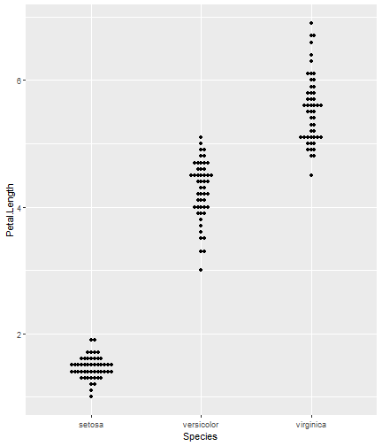<!-- --> ] --- count: false #Iris Dataset .panel1-compare-rotate[ ```r ggplot(data = iris, aes(x = Species, y = Petal.Length)) + * geom_quasirandom() ``` ] .panel2-compare-rotate[ 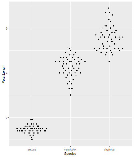<!-- --> ] <style> .panel1-compare-rotate { color: black; width: 38.6060606060606%; hight: 32%; float: left; padding-left: 1%; font-size: 80% } .panel2-compare-rotate { color: black; width: 59.3939393939394%; hight: 32%; float: left; padding-left: 1%; font-size: 80% } .panel3-compare-rotate { color: black; width: NA%; hight: 33%; float: left; padding-left: 1%; font-size: 80% } </style> --- count: false #Reduced Flights Dataset .panel1-compare2-rotate[ ```r flights %>% sample_n(size=1000) %>% ggplot( aes(x = carrier, y = dep_delay)) + * geom_boxplot() + coord_cartesian(ylim = c(-50, 500)) ``` ] .panel2-compare2-rotate[ 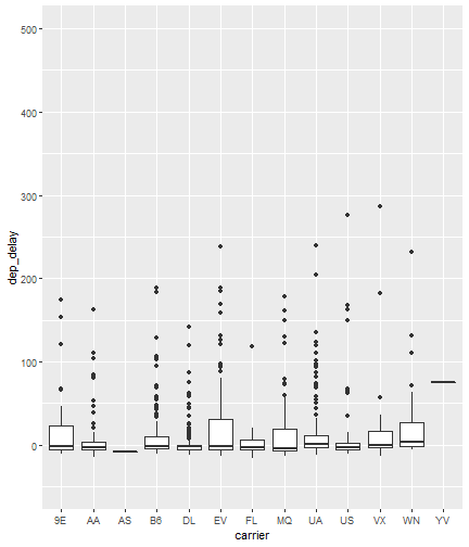<!-- --> ] --- count: false #Reduced Flights Dataset .panel1-compare2-rotate[ ```r flights %>% sample_n(size=1000) %>% ggplot( aes(x = carrier, y = dep_delay)) + * geom_violin() + coord_cartesian(ylim = c(-50, 500)) ``` ] .panel2-compare2-rotate[ 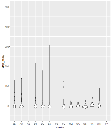<!-- --> ] --- count: false #Reduced Flights Dataset .panel1-compare2-rotate[ ```r flights %>% sample_n(size=1000) %>% ggplot( aes(x = carrier, y = dep_delay)) + * geom_beeswarm(cex = .15) + coord_cartesian(ylim = c(-50, 500)) ``` ] .panel2-compare2-rotate[ 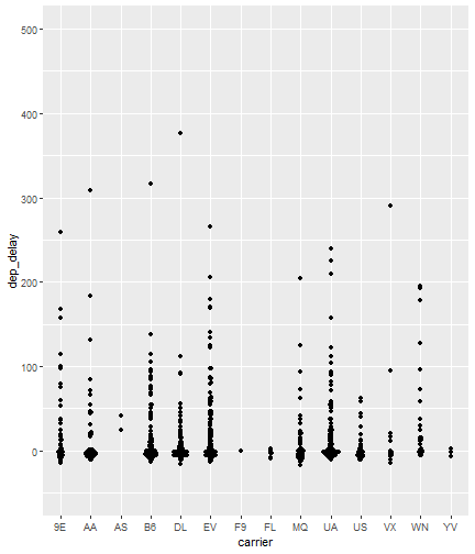<!-- --> ] --- count: false #Reduced Flights Dataset .panel1-compare2-rotate[ ```r flights %>% sample_n(size=1000) %>% ggplot( aes(x = carrier, y = dep_delay)) + * geom_quasirandom() + coord_cartesian(ylim = c(-50, 500)) ``` ] .panel2-compare2-rotate[ 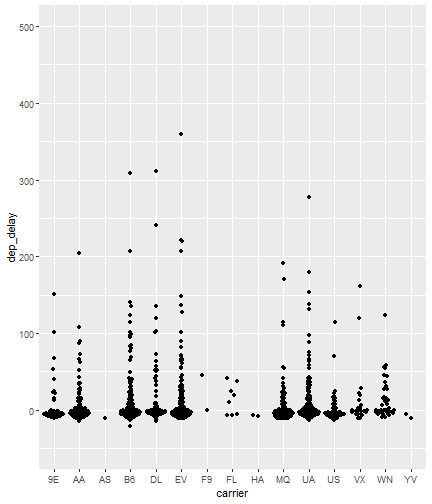<!-- --> ] <style> .panel1-compare2-rotate { color: black; width: 39.2%; hight: 32%; float: left; padding-left: 1%; font-size: 80% } .panel2-compare2-rotate { color: black; width: 58.8%; hight: 32%; float: left; padding-left: 1%; font-size: 80% } .panel3-compare2-rotate { color: black; width: NA%; hight: 33%; float: left; padding-left: 1%; font-size: 80% } </style> --- # Two quantitative variables If we want to visualize the relationship between 2 quantitative variables we typically rely on a scatterplot. However, when the datasets are large, there can be quite a lot of overplotting, making it impossible to detect a trend. If overplotting isn't severe, simply decreasing the opacity (using the alpha argument) can help. You can also investigate `geom_hex()` and `geom_density2d()` as possible ways of visualizing the data. To learn more about them, read the help file (?) or look at the [cheat sheet](https://rstudio.com/wp-content/uploads/2016/11/ggplot2-cheatsheet-2.1.pdf). --- # In Summary In this lesson you should have learned the following: 1. Strategies for visualizing univariate and bivariate relationships for large datasets 2. The following geoms: bar, column, histogram, boxplot, violin, beeswarm, quasirandom 3. How to adjust aspects of a particular scale using `scale_*_*()` The first asterik is a place holder where you specify which scale you want to work with, and the second asterik is a placeholder for you to specify what type of scale it is (e.g. continuous, discrete, date/time). 4. The purpose of, similarities and differences between using a `limits` statement within a `scale_*_*()` statement vs. using `coord_cartesian()`. 5. How `coord_flip` affects the graph 6. A couple of methods for re-ordering a categorical variable on a plot