Presenting Data & Histograms
Chapter 5: Refine to impress (Pg. 109-120)
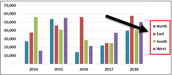
The ambiguity is paralyzing! People don’t want to crash into your chart.
The traffic metaphor of visualization
With bad charts, instead of using the chart to guide the meeting, each member has to assign meaning themselves. The team members must slow down purposeful thinking and shift the focus of the meeting to understanding the chart instead of insight and decision making. Everyone gets distracted trying to figure the chart out as quickly as possible. The stress rises as understanding fades. A thought accident is grinding insight to a halt. Some participants are shifting attention to their phones or screens to avoid the collision. We are reading the chart instead of using it to get where the meeting is intended to go!
Look-up Effect (Limit eye travel)
Which was better - 2014 East or 2018 South?